
If you’ve just launched a WooCommerce store, you’ve likely heard horror stories about high levels of cart abandonment. You may be wondering how to avoid this by creating an optimized WooCommerce checkout page. Fortunately, using Beaver Builder and the WooPack add-on, you can easily design an intuitive checkout that supports sales.
In this post, we’ll discuss why a straightforward checkout process is vital for the success of e-commerce stores. Then, we’ll explore the qualities of an ideal checkout. Finally, we’ll show you how to create a checkout page using Beaver Builder and WooCommerce. Let’s get to it!
Table of Contents
- How the Checkout Process Can Impact Your Online Store
- What to Consider When Creating a WooCommerce Checkout Page
- Creating a WooCommerce Checkout Page Using Beaver Builder (In 4 Steps)
- Step 1: Install Beaver Builder and WooPack
- Step 2: Insert Your Checkout Page Module
- Step 3: Customize Your Checkout Page
- Step 4: Explore Further Customization Options
- Conclusion
How the Checkout Process Can Impact Your Online Store
For customers, getting to the checkout stage is an important crossroads in their sales journey. Your marketing may have guided them in the direction you had hoped for, but now it’s decision time.
At this stage, 59 percent of customers will abandon their cart, according to cart recovery results from Fresh Relevance. Ecommerce data from SaleCycle even suggests this number may go as high as 84 percent. Simply put, if you don’t want your efforts to be lost at the final hurdle, discovering why customers abandon carts is key.
The latest data on cart abandonment suggests numerous reasons, but most are directly related to the checkout process. For example, 24 percent of U.S. customers who abandoned a cart didn’t want to create an account. This shows the importance of a ‘guest’ checkout option.
Another 17 percent found the checkout process too long or complicated. Moreover, 16 percent complained that they couldn’t see the final amount of their purchase.
Luckily, most of these issues can be resolved by a high-quality checkout process. Creating a good user experience (UX) is essential if you want a user to make a purchase.
Further statistics from the current state of checkout UX from Baymard Institute have shown that the average site has 31 preventable usability issues as part of its checkout process. These range from issues with the checkout layout to problems with payment methods. Therefore, ease of payment should also be a high priority.
What to Consider When Creating a WooCommerce Checkout Page
As we have learned, cart abandonment is likely an e-commerce challenge for every store owner. Now let’s consider how you can help prevent it by creating an optimal WooCommerce checkout page.
Firstly, you may be tempted to get creative and include special graphics and tools, but these can distract customers from making a purchase. It’s best not to complicate the process. Ideally, your checkout should be straightforward and easy to navigate.
You’d be wise to implement a simple design with plenty of white space and clear labels. Furthermore, the most important information, such as pricing, should be featured prominently.
Since one of the primary reasons for cart abandonment is a lengthy checkout, you’ll also want to simplify as much as possible. After all, the faster the checkout flow, the less time a user has to second guess their choice.
To do this, you can use fewer checkout fields. That way, potential customers only need to supply the most essential information. Additionally, consider using columns if you want to get more information onto the screen without requiring scrolling.
You’ll also want to avoid hard-to-read text colors and sizes, or options that can be presented in a more efficient format. For example, consider using drop-down menus.
Finally, you’ll want to ensure that you provide enough payment options and that your payment gateways are set up correctly. With so much fraud and identity theft, users will want your payment process to make them feel secure in their decision to share personal details.
Creating a WooCommerce Checkout Page Using Beaver Builder (In 4 Steps)
If you want to create a WooCommerce checkout page that will drive conversions, Beaver Builder is an excellent tool for the job. Our intuitive, drag-and-drop builder allows you to preview your designs in real-time. That way, you can prevent the most common checkout issues.
Plus, with modules for your every need, Beaver Builder can save you time when creating pages or entire websites. Keep in mind that you will need an active WooCommerce store to complete this tutorial.
To quickly recap before we get started, our initial tips for creating an optimized WooCommerce checkout design were:
- Use fewer checkout fields.
- Consider using columns to minimize scrolling.
- Avoid hard-to-read text colors and sizes.
- Utilize drop-down menus to present options more efficiently.
Now, let’s get to it!
Step 1: Install Your Beaver Builder Tools
The first step is to get set up with Beaver Builder. If you haven’t signed up yet, you will need to choose a plan. After that, you can download the Beaver Builder theme, page builder and theme builder from your My Account page and head over to your WordPress dashboard.
Go to Plugins > Add New. Then, click on Upload Plugin at the top of your screen:
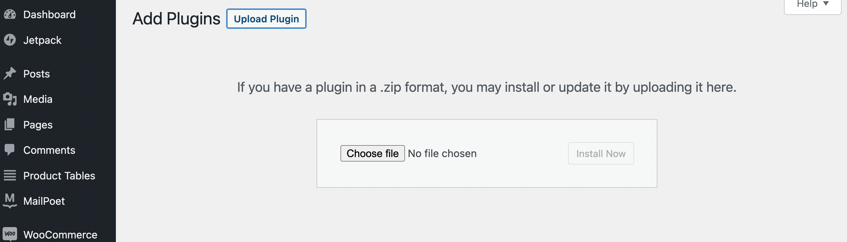
Now, locate the Beaver Builder page builder .zip file you downloaded previously and select it. Click on Install Now, followed by Activate Plugin.
You will also need to input your license information. To do this, go back to your My Account page and copy your License Key number. Then, from your WordPress dashboard, navigate to Settings > Beaver Builder > License and click on Enter License Key:
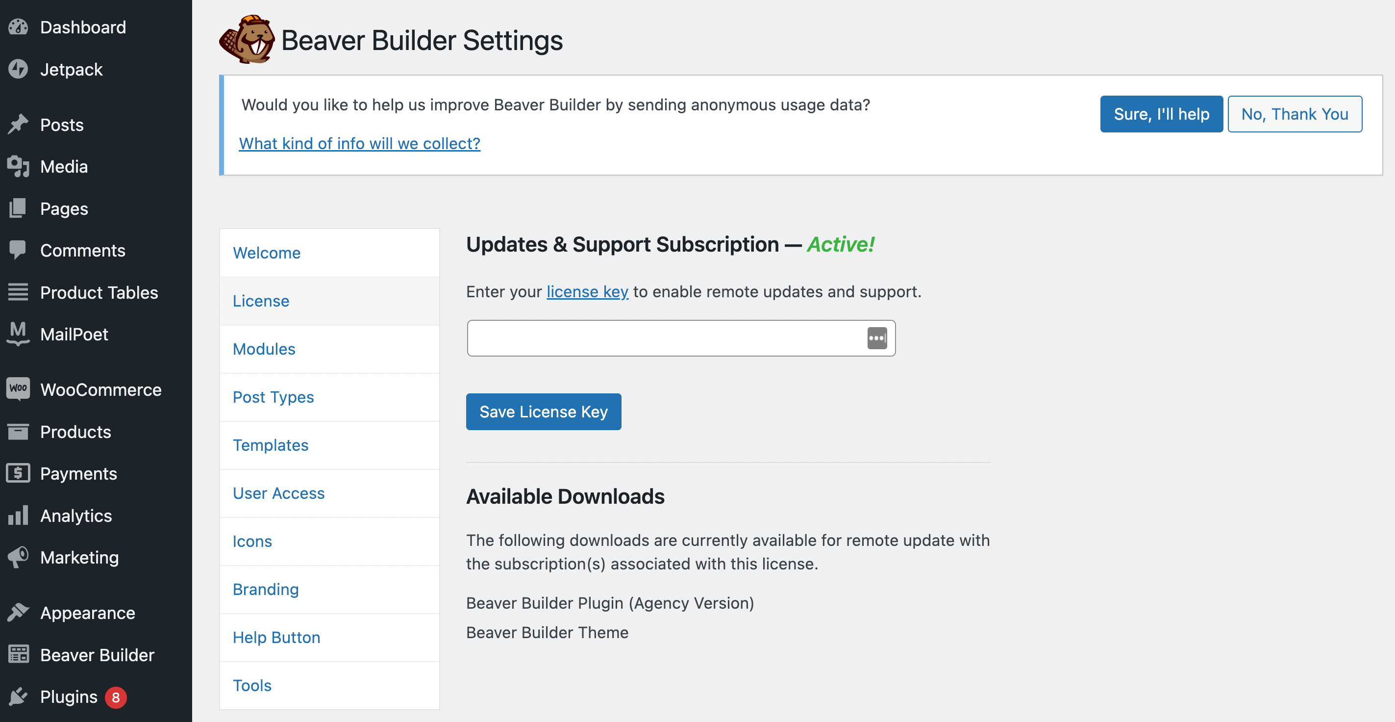
After you paste your License Key in the above field, click on Save License Key. That’s it!
Next, you’ll need to purchase WooPack, which is one option in a larger collection of Beaver Builder add-ons. This tool gives you more than ten additional Beaver Builder modules specifically designed for use with WooCommerce.
Alongside a variety of advanced product modules, you’ll also get the WooCommerce Checkout Styler. This sophisticated styler drastically increases the potential for customizing your checkout process. For instance, you can create a one or two-column layout, style the input fields, section titles, colors, buttons, and more.
After you’ve purchased your WooPack plan, simply download, install, and activate it as you did with the Beaver Builder plugin.
Step 2: Insert Your Checkout Page Module
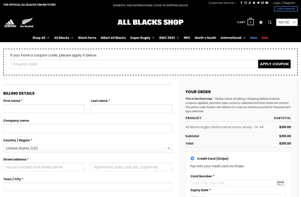
With everything installed, now it’s time to start creating your WooCommerce checkout page. One of the most popular WordPress themes is Storefront. If you’re using this theme, it comes with a default checkout page that looks something like this:
Here, we’re already seeing one of the major advantages of working with WooCommerce. With this theme, we already have a professional-looking checkout. It displays minimal required fields and an order summary presented in an efficient format.
However, there is certainly room for improvement. Let’s see how we can further optimize our checkout using Beaver Builder and WooPack. At this point, you may want to add a few sample items to your cart so you can see how they will be reflected in your checkout.
Then, the first step is to insert your Checkout module. To start, go to Pages in your WordPress dashboard and open your default WooCommerce checkout page using Beaver Builder.
Now, delete the default WooCommerce module, leaving your page blank. Then, click on the + button at the top right corner of your screen. From the menu, select Standard Modules then WooPack Modules:
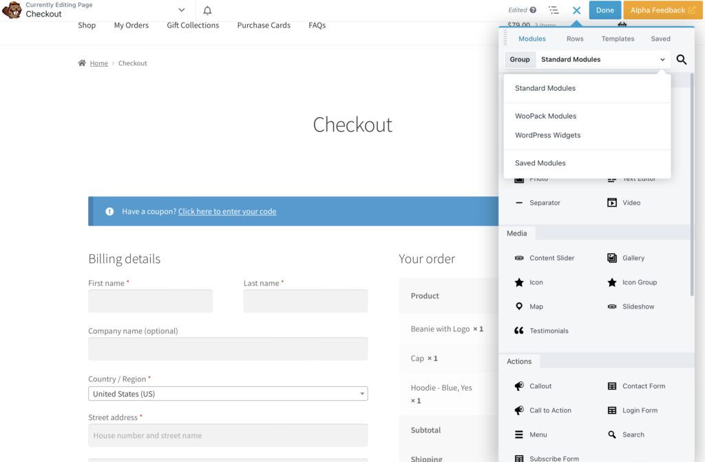
Next, drag and drop the Checkout module onto your page:
You may notice that this checkout design doesn’t look that different from the default WooCommerce design in Storefront. However, we now have our Beaver Builder customization options in the settings window on the left of the screen.
Step 3: Customize Your Checkout Page
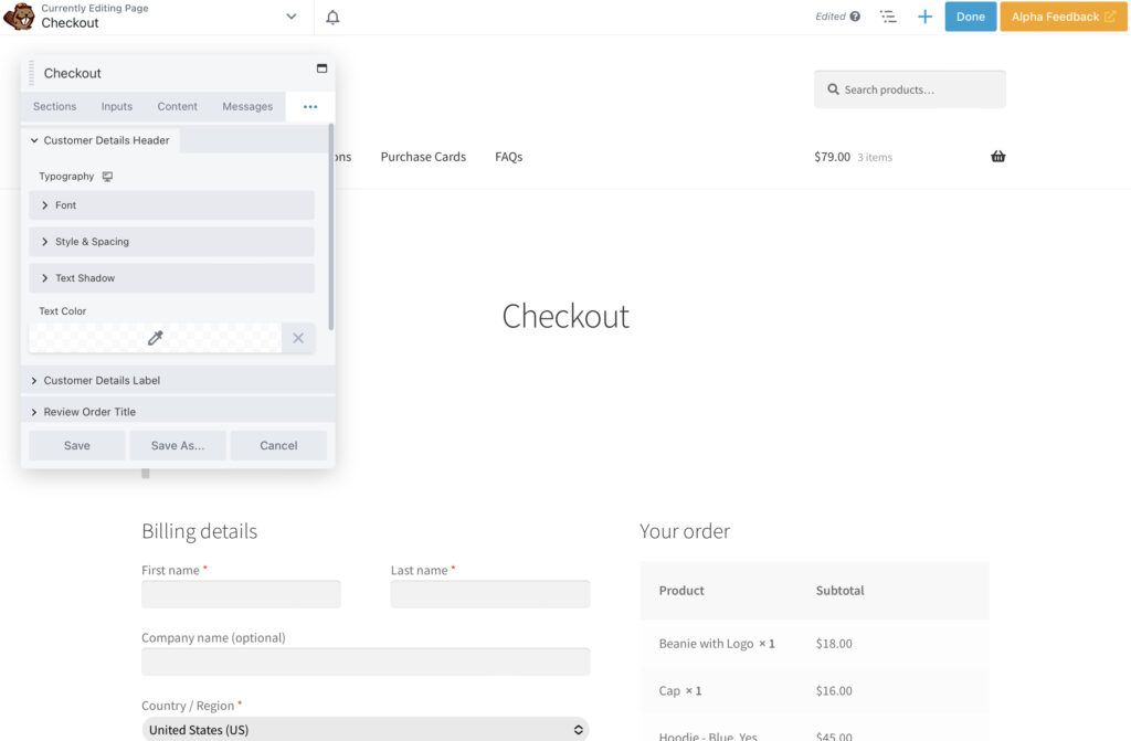
As you’ll see, the customization menu for the Checkout module is divided into Sections, Inputs, Content, Messages, Button, Typography, and Advanced.
First, let’s change the layout to Two Column. This allows us to modify the width of the two columns on the page:
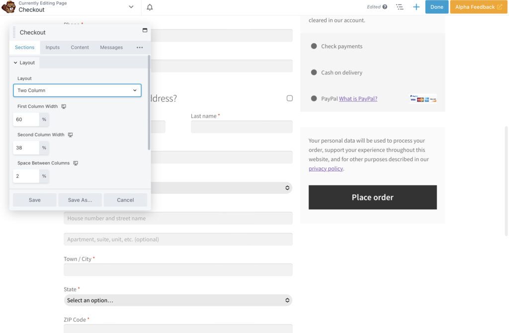
Here, you can play around with what looks best. Keep in mind that you’ll want to ensure the three values add up to 100 percent. If you go above this, the second column won’t appear on the same row.
Beyond the general structure of your checkout page, one critical element to consider is your company’s visual branding. Gray default designs may cause customers to second-guess the authenticity of an online store. However, a checkout that reflects your visual aesthetic can make your website appear more trustworthy.
In this respect, colors can go a long way. First of all, a white or light background is likely the best choice, regardless of your branding. This way, users can easily read the contrasting content.
Now, let’s imagine our brand’s color palette includes cream, orange, black, and white. While the default hues are nicely minimalist, they don’t stand out very well.
To make our fields pop, we’ll go to the Input section. We’ll change the input field background to white and give our fields a 1px black border which helps them stand out a bit more on the page:
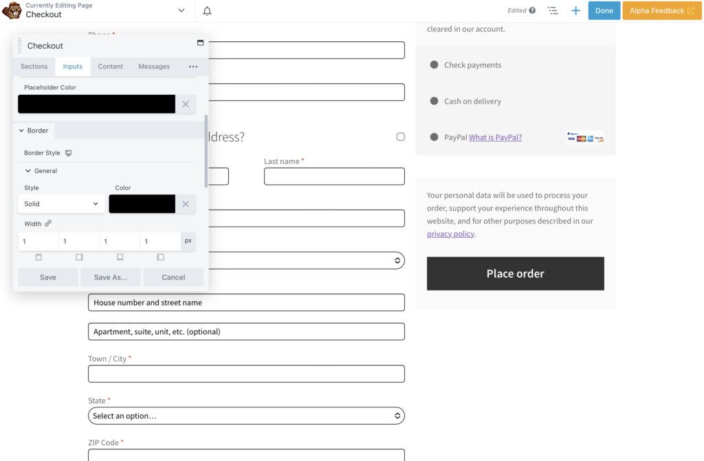
Feel free to explore the other options for background colors and text. You even have the possibility of adding shadows or realigning fields. Remember to keep it simple and in line with your website’s overall look and feel.
Step 4: Explore Further Customization Options
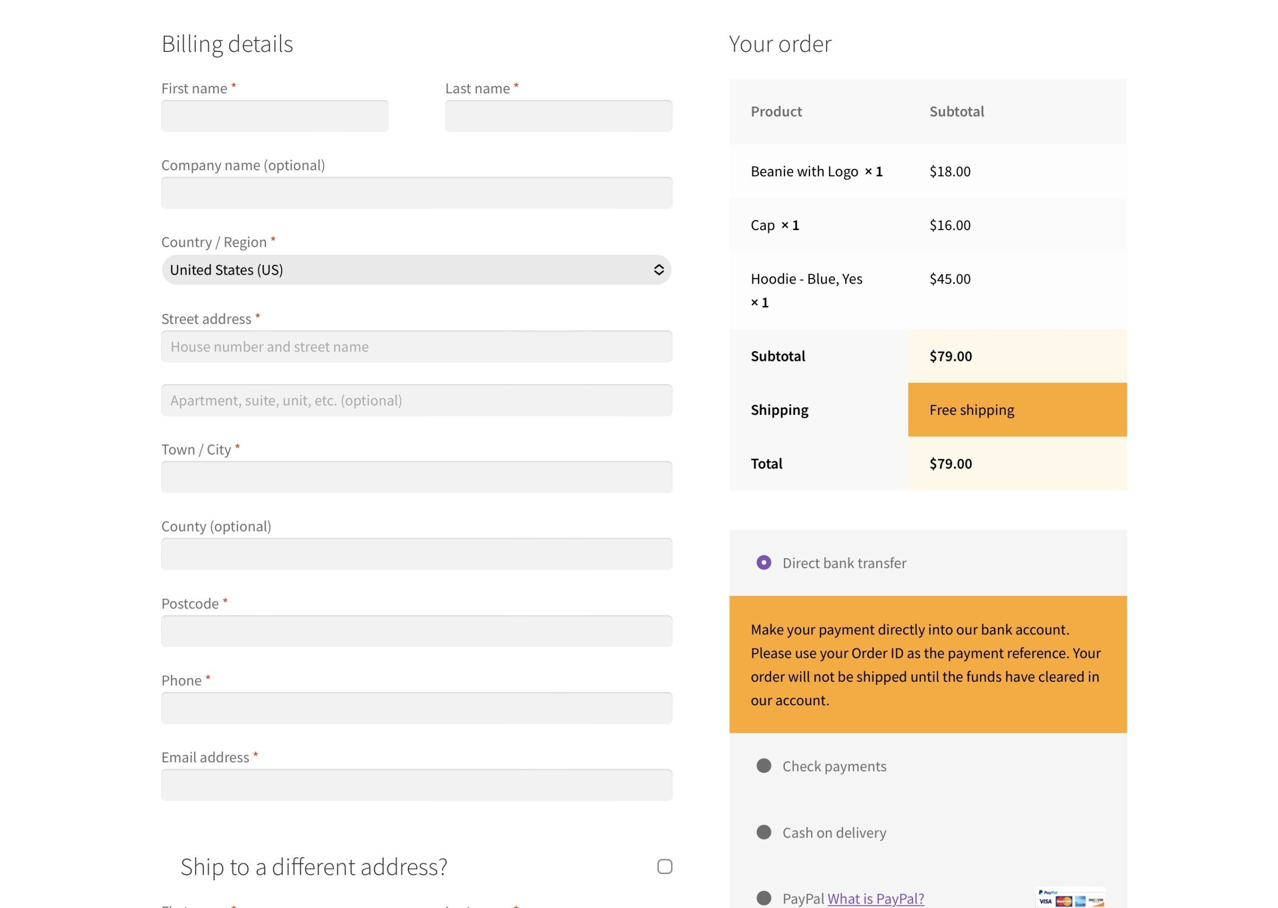
Now let’s use more color detailing to further customize our checkout. We’ve changed the odd and even items in the right-hand column to orange and cream:
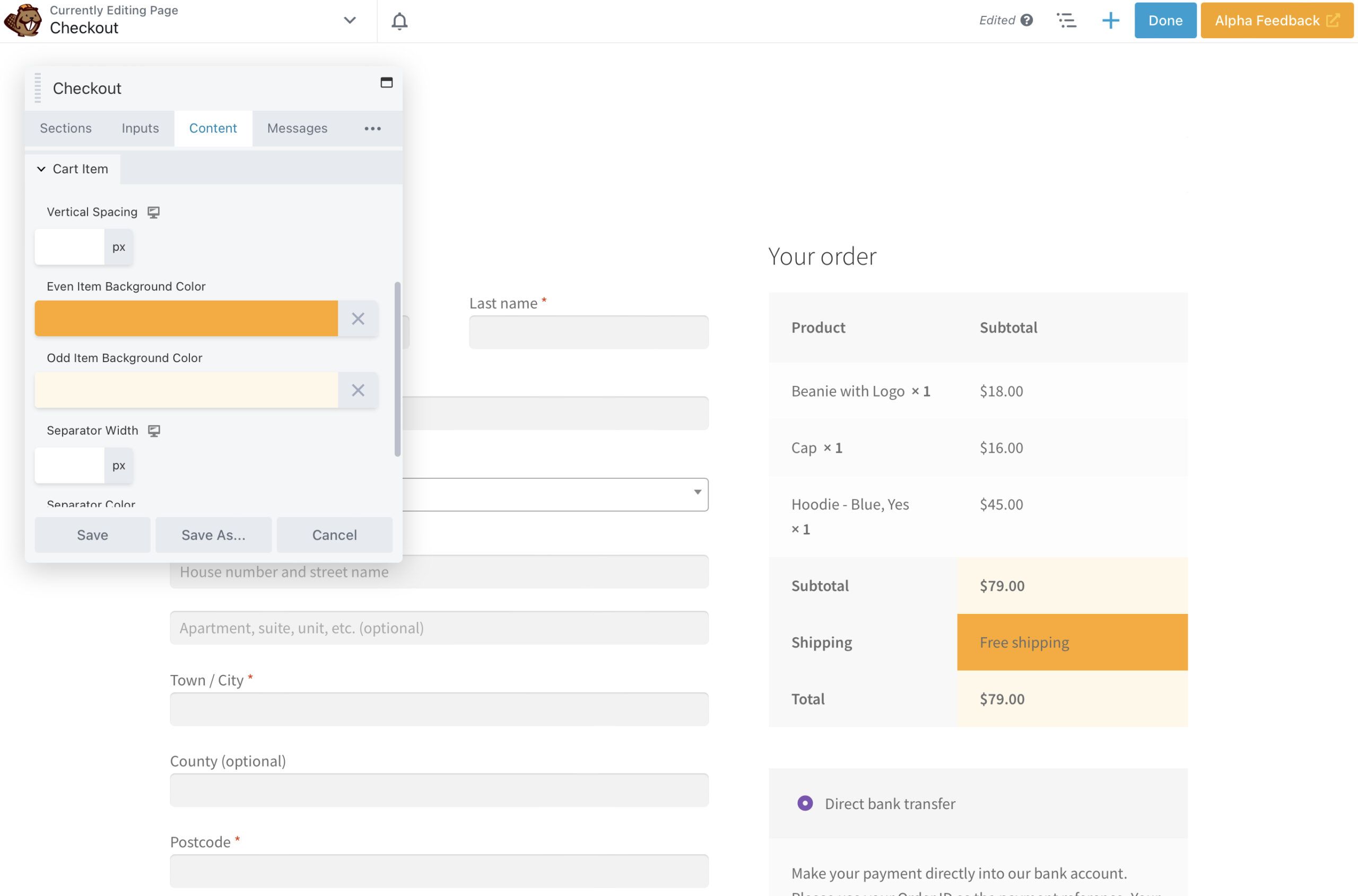
As you can see, this subtle contrast highlights key information for the customer. This way, they can reference it quickly. In the Typography section, we can also change the text color.
Moving on to the payment section, we can use the Content tab to bring these fields in line with our branding too. We have ensured that our brand orange highlights the critical message about utilizing your Order ID:
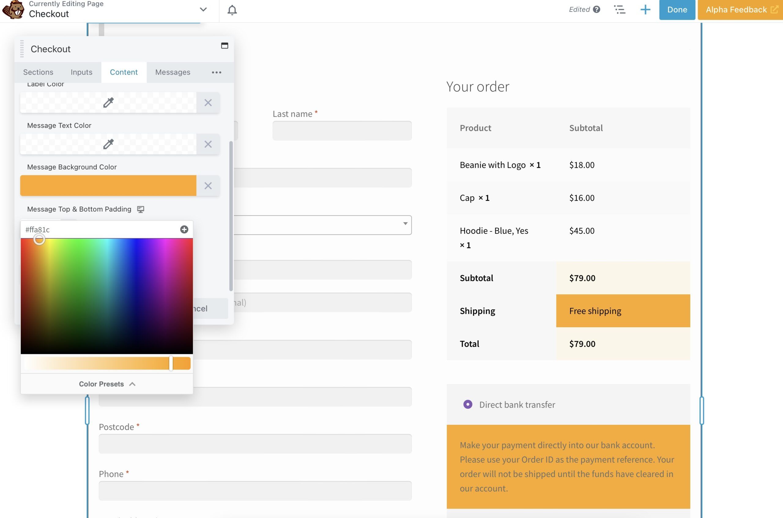
You can change other elements in this section, such as Cart Heading, Cart Item, and Payment Method.
Since the black button doesn’t look quite right after changing the payment message, let’s try modifying that as well. When you click the three dots in your settings menu, you’ll find a few more options, which are Button, Typography, and Advanced.
Go ahead and select Button. Let’s change the button’s Background Color to orange and set black as our Background Hover Color. We’ve also made the text black, so it will stand out nicely:
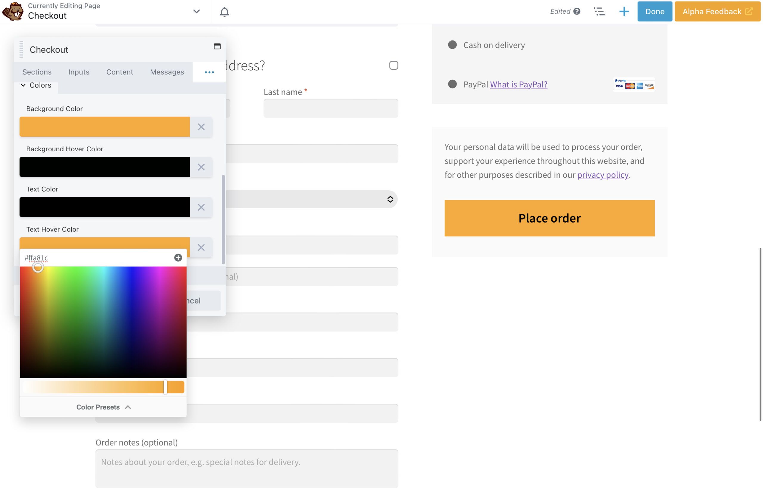
Scrolling down, we’ve also added a black 1px border to make the message even clearer.
Heading over to the Typography section, we can see options for editing every part of the checkout’s lettering. You can alter fonts, sizes, alignment, line height, and color:
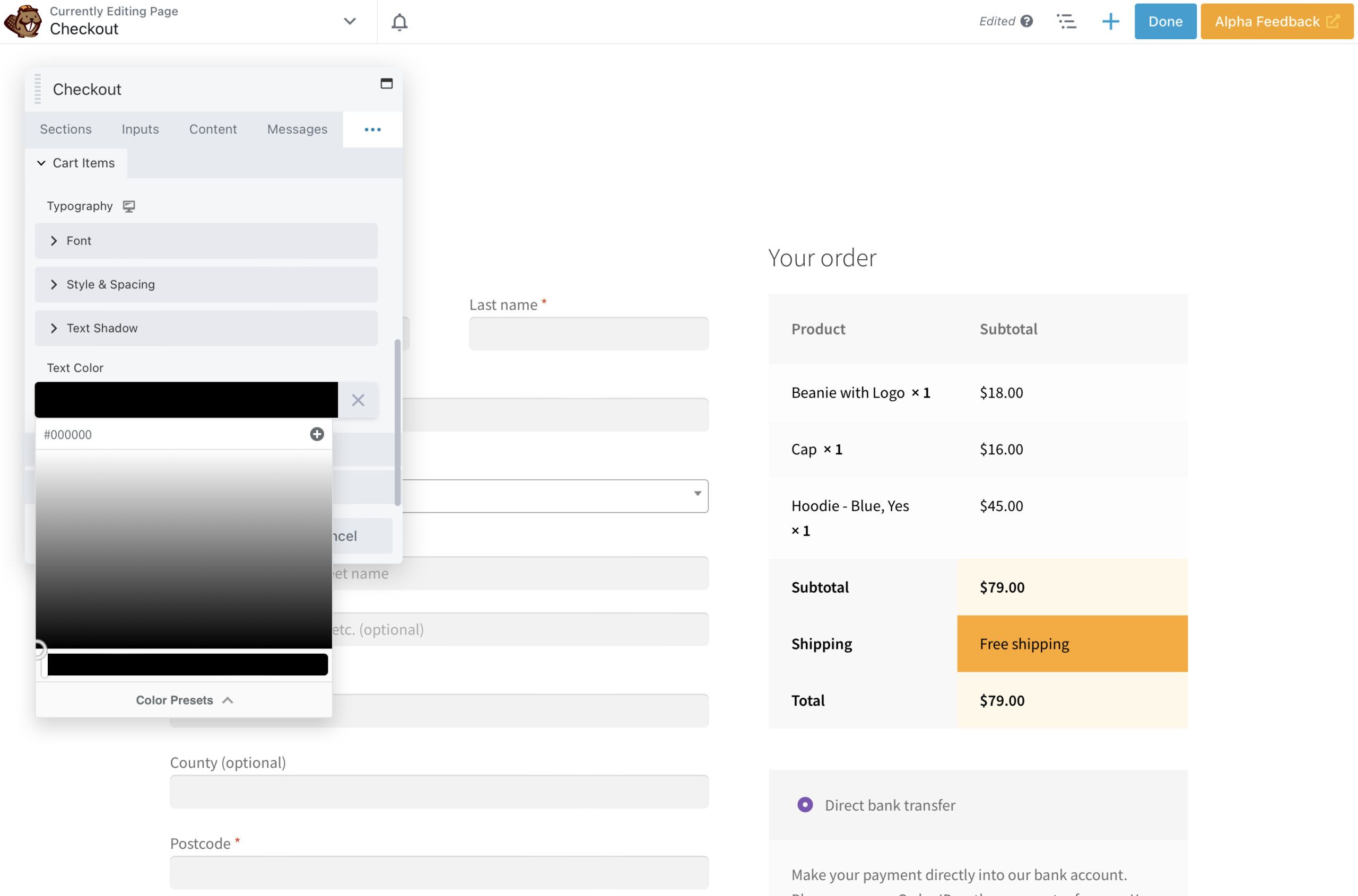
Here, we’ll go ahead and set the text to a uniform black. As you can see, we’ve maintained the sound initial structure of the checkout while adding a few touches to bring it in line with our overall site design:
You’d be wise to explore your checkout design options even further. That way, you can discover the exact settings you’re looking for.
Conclusion
Creating a straightforward checkout page isn’t always easy. However, the process can be simple with Beaver Builder and the WooPack add-on. Using a range of customization options, you can create a seamless checkout process that matches your website’s unique design.
To recap, here are the four steps to creating a WooCommerce checkout page:
- Install Beaver Builder and the WooPack add-on.
- Remove the existing WooCommerce checkout page and insert the WooPack Checkout module.
- Customize basic elements like columns and background colors.
- Personalize more advanced details such as buttons and text.
Do you have any questions about using Beaver Builder to build your WooCommerce checkout page? Ask us in the comments section below!
Our Newsletter
Our newsletter is personally written and sent out about once a month. It's not the least bit annoying or spammy.
We promise.
Try Beaver Builder Today

Related articles
How to Create a Mobile-First WooCommerce Store Using Beaver Builder
In today’s digital age, mobile shopping dominates online behavior. Recent studies show that over 70% of ecommerce traffic comes from…
How to Speed Up Your WooCommerce Store Built with Beaver Builder
Imagine a customer landing on your store, ready to buy, only to hit the back button because the page takes…
North Commerce Module for Beaver Builder
With all the excitement surrounding Beaver Builder 2.8 and our new Box Module, you might have missed the announcement of…
Join the community
We're here for you
There's a thriving community of builders and we'd love for you to join us. Come by and show off a project, network, or ask a question.
Since 2014
Build Your Website in Minutes, Not Months
Join Over 1 Million+ Websites Powered By Beaver Builder.