
As a web designer, you want every website you create to be a great one. This is easier said than done. One way to keep your sites looking fresh is to stay on top of the latest web design trends and incorporate them into your work.
In this article, we describe how following trends can be a sound strategy for your online business. Then we share ten of the top web design trends for 2023.
Why Following Web Design Trends Is a Good Idea
While being creative and breaking the rules are integral parts of establishing your personal design style, it’s also wise to include some timely trends in your work. If a website looks completely dated, visitors are less likely to trust it and the business behind it. In extreme cases, it may even appear as if your client has gone out of business.
Furthermore, ignoring the latest trends risks delivering a poor User Experience (UX). Visitors may get frustrated if an outdated or unintuitive design makes it difficult to interact with the website.
On the other hand, a website that’s on-trend is far more likely to be user-friendly, attractive, and convey the message that the business is successful and conscientious. As a designer, if you’re familiar with the latest styles, you’re more likely to make yourself stand out by offering new and exciting ideas.
Top Web Design Trends for 2023 (10 Best Trends)
Check out some styles that you might want to incorporate into your next projects.
1. Subtle Parallax Effects
Adding a parallax effect, where a web page’s background moves slower than its foreground, can add a lot of visual interest to a website:
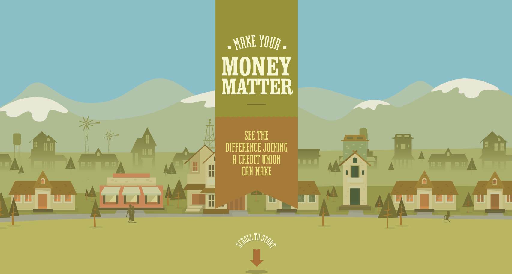
While this trend has been around for a while, more websites are starting to use parallax scrolling in more subtle ways.
While parallax scrolling can be attention-grabbing, it can grab a little too much attention if done poorly. Use this effect sparingly and carefully select a background image that won’t be too distracting. Otherwise, you risk compromising the overall design of the site.
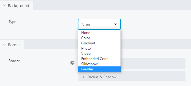
You can use Beaver Builder to add a parallax row to a web page. Start by opening the Row Settings and navigating to the Style tab. Next, head to the Background options and select Parallax from the dropdown menu:
Now you should see a new set of options for your parallax effect:
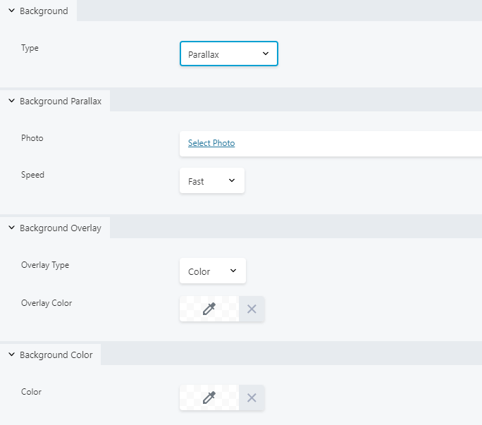
You can use these menus to set your background image and scroll speed. If you’d like to tone down your background image, consider adding a background overlay.
2. Effective Use of Multimedia
Including sound, video, and animation on a webpage can add a lot of excitement. It can also quickly become overwhelming if you try to add too much, so you should try to strike a balance:
Consider using visual media when you need to convey a complicated concept. You could also add subtle animation to page elements that you want to draw readers’ attention to, such as buttons. If you’re feeling especially creative, sound effects or instrumental music are fun ways to set a mood.
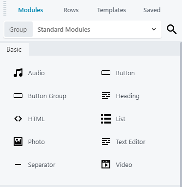
There are Beaver Builder modules for just about any type of media you’d like to use, including audio, video, and images. You can find these in the Standard Modules group:
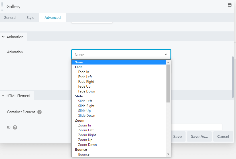
You can also add animation to any module, including the Gallery. These options are located in the feature’s Advanced settings tab:
When adding multimedia elements, try to keep accessibility in mind. If you’re using video, be sure to include captions or a transcript as well as playback controls. Autoplaying a video or music that a user can’t easily stop can be very annoying and may cause them to leave the website.
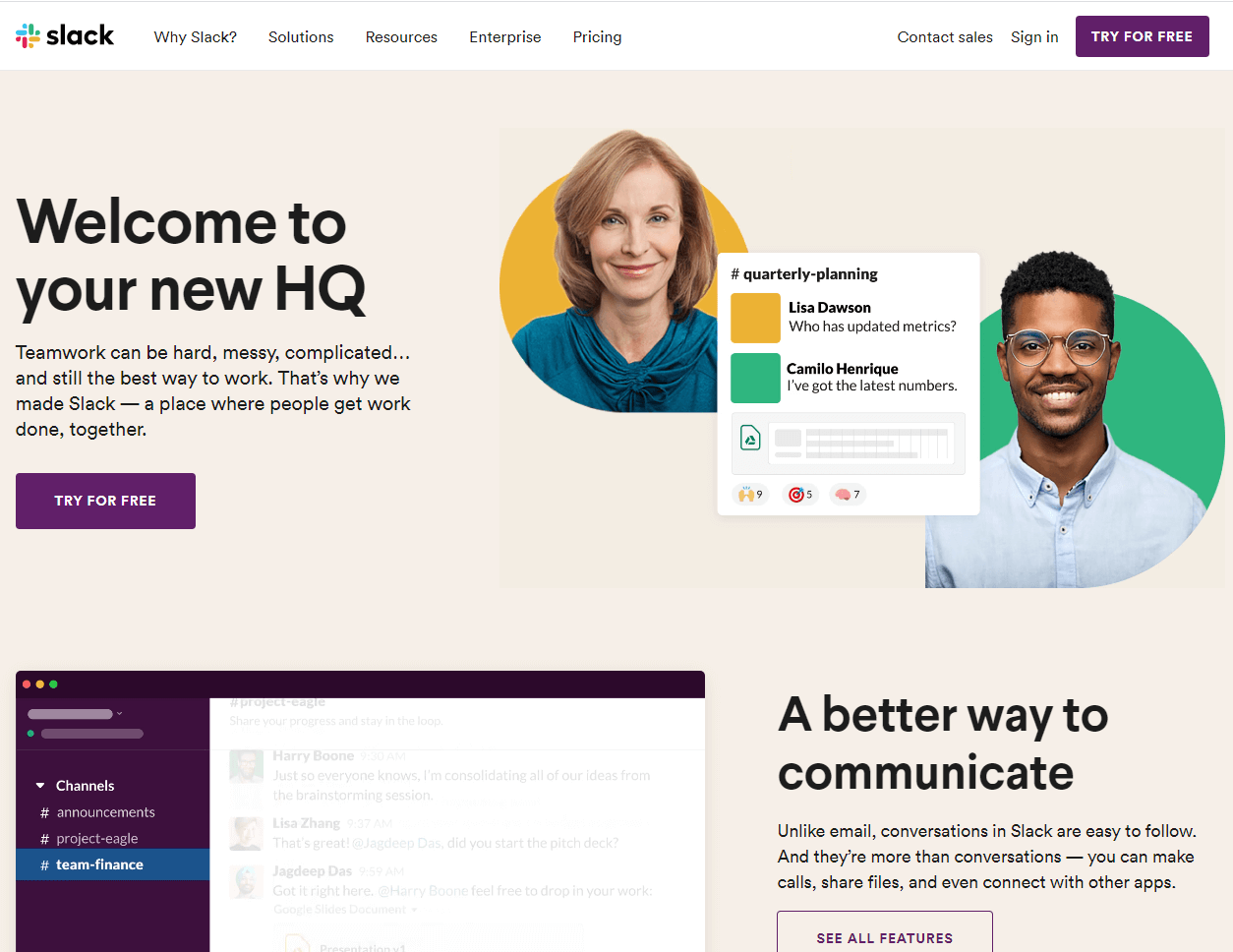
3. Design in Dark Mode
An emerging trend in website design is based on the dark mode aesthetic. Think black or grey, moody backgrounds with contrasting text elements:
Keeping the background dark and simple provides a compelling backdrop for your text and images. If you want to bring some drama and elegance to a webpage, this is a trend to consider.
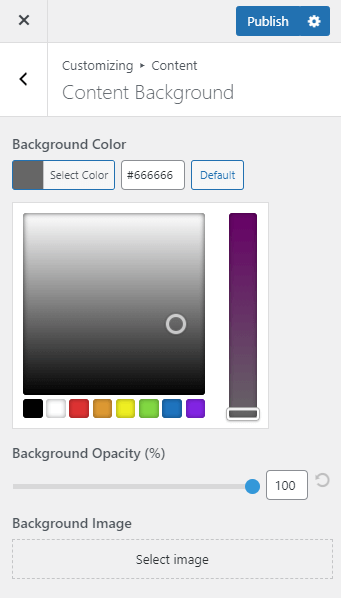
Beaver Builder Theme users can easily change the background color of the entire content area. From the theme customizer, navigate to Content > Content Background and use the selector to adjust the shade and opacity:
If you plan to experiment with dark backgrounds, be sure there is enough contrast between them and your text so that the words are still easily readable. For example, you can opt for white or light-colored written content so that it stands out.
4. Asymmetrical Geometry
Geometric shapes can be very pleasing to the eye, but they aren’t always the most exciting choice. Adding asymmetry can help draw attention to important elements and keep a website from blending into the crowd:
You can try varying the size of the boxes in your grids or change the thickness of the dividing lines. In most Beaver Builder modules, you’ll find the border settings on the Style tab:
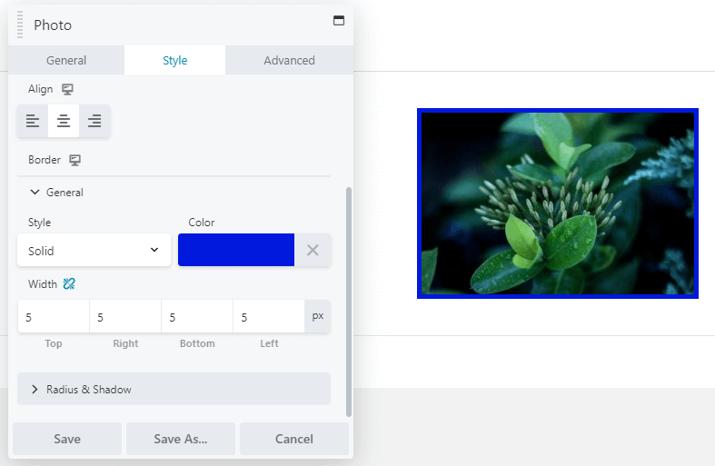
You can experiment with the style, colors, and thickness of the borders to add some interest to the geometric elements on a website.
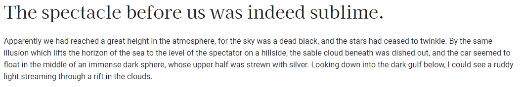
5. Eye-Catching Serif Fonts
Serif fonts, which have been frowned upon in web design because they were considered difficult to read. With larger screens, higher resolutions, and better font design, this concern is no longer valid. Traditionally, sans-serif fonts are used for headings and serif fonts are used for text, but here’s an example in which that’s flipped:
We expect more designers to embrace serif fonts this year as they’re beautiful and elegant. With Beaver Builder, you have access to the entire library of Google fonts. You can choose global heading and text fonts in the Beaver Builder Theme, and in the Beaver Builder editor you can choose a font in many of the module types, such as the Text Editor module:
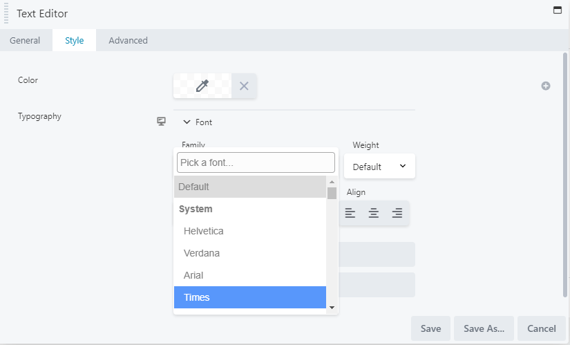
Be aware that loading a font family impacts page load performance, and from a design perspective it’s also a good idea to stick with two or three fonts throughout your site. Pay attention to font readability as well. You should also ensure the text size is large enough to display clearly on all screen types. When you set typography in Beaver Builder, you can create different settings for large, medium, and small devices, and there’s also a choice of measurement units (px, em, rem, vw).
6. Adding Emojis
Emojis are pictograms used commonly to convey emotions in written text. They are now making a move from text messages and social media to web design. Careful use of emojis can help set the tone for a website that can be difficult with text alone.
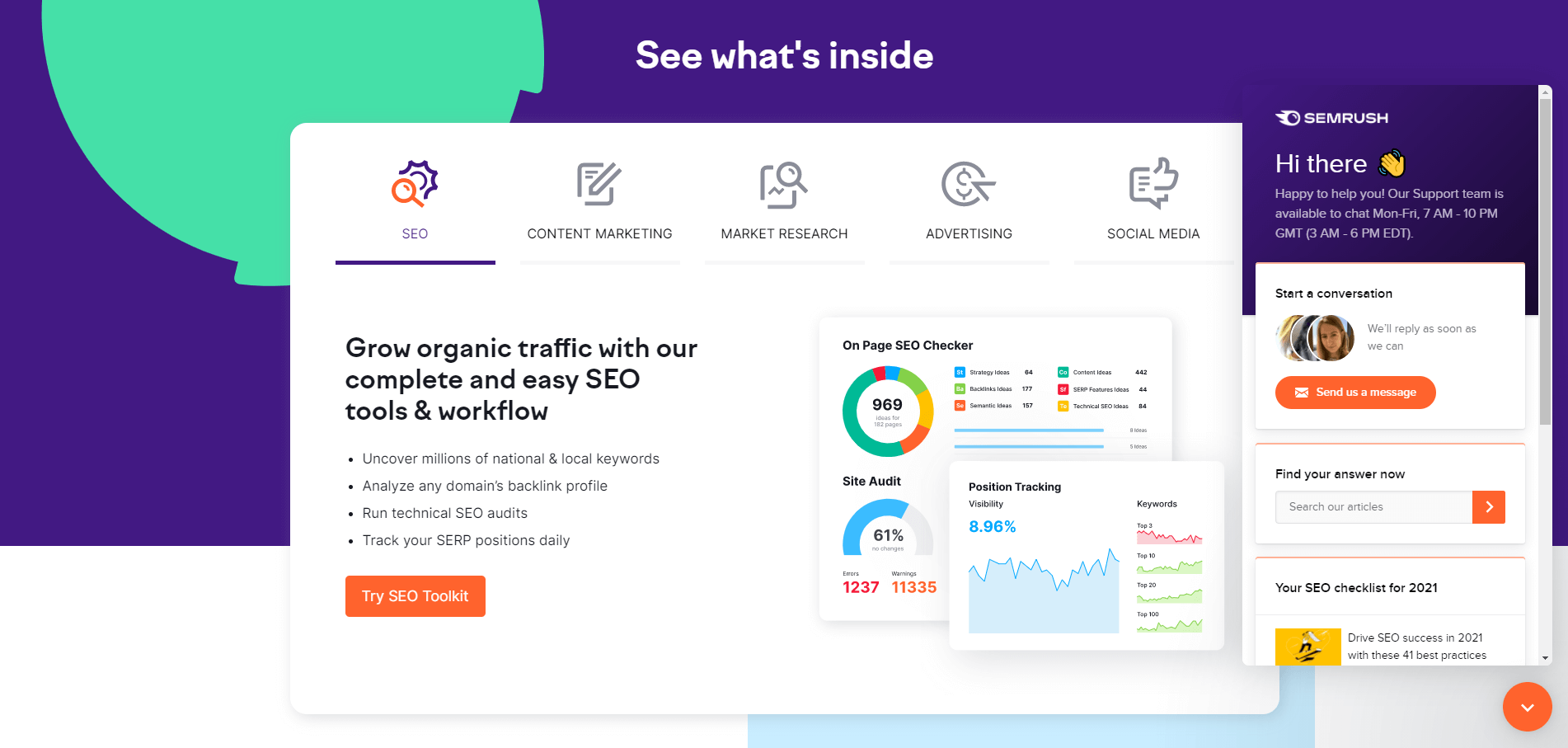
For example, Semrush uses a waving hand emoji to make its live chat seem a bit friendlier:
One advantage of using emojis is that nearly everyone understands them. You can even create custom emoticons for your web design clients to help improve their branding.
Emojis can be considered unprofessional in specific industries or groups, such as lawyers or business professionals, so ensure this trend is a good fit before using them.
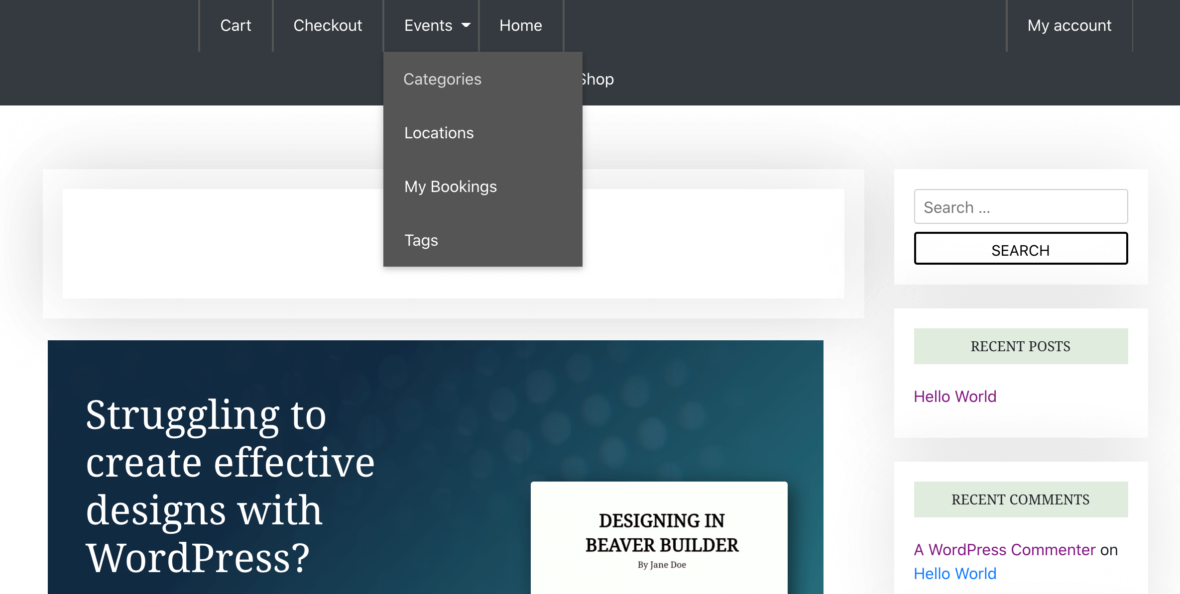
7. Designing Larger Menus
Rather than cramming a menu full of links, you can create high-level categories and reveal submenus in interesting ways.
Both Beaver Builder Menu modules and menus controlled by the Beaver Builder Theme display submenus on hover over the top-level item, but for even more hierarchically complex menus you can easily create a Beaver Builder mega menu in this format:
Beaver Builder also works with a number of mega menu plugins that further enhance the presentation. The third-party MegaMenu plugin turns Beaver Builder rows into various types of mega menus:
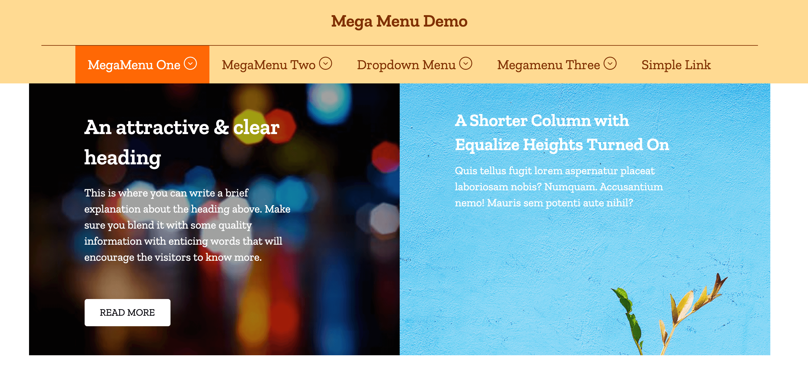
Using this plugin, you can turn any Beaver Builder design or layout into a mega menu. These menus are mobile responsive by default and fully customizable.
8. Soft, Balanced Color Schemes
Soothing, pleasant color schemes are definitely something to consider in 2023. These colors can feel more natural and help set a peaceful mood for your client’s website:
Soft color schemes can be particularly suitable for health and wellness websites. The muted color palettes can convey natural and organic feelings, supporting the key messages of many health-based companies.
However, subdued doesn’t have to mean boring. You can still integrate understated textures into your backgrounds to provide some interest without being overwhelming. You can also choose photography with soft tones that compliment your overall color scheme.
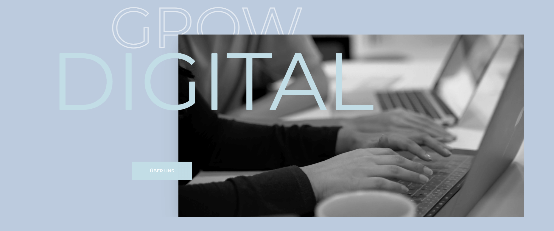
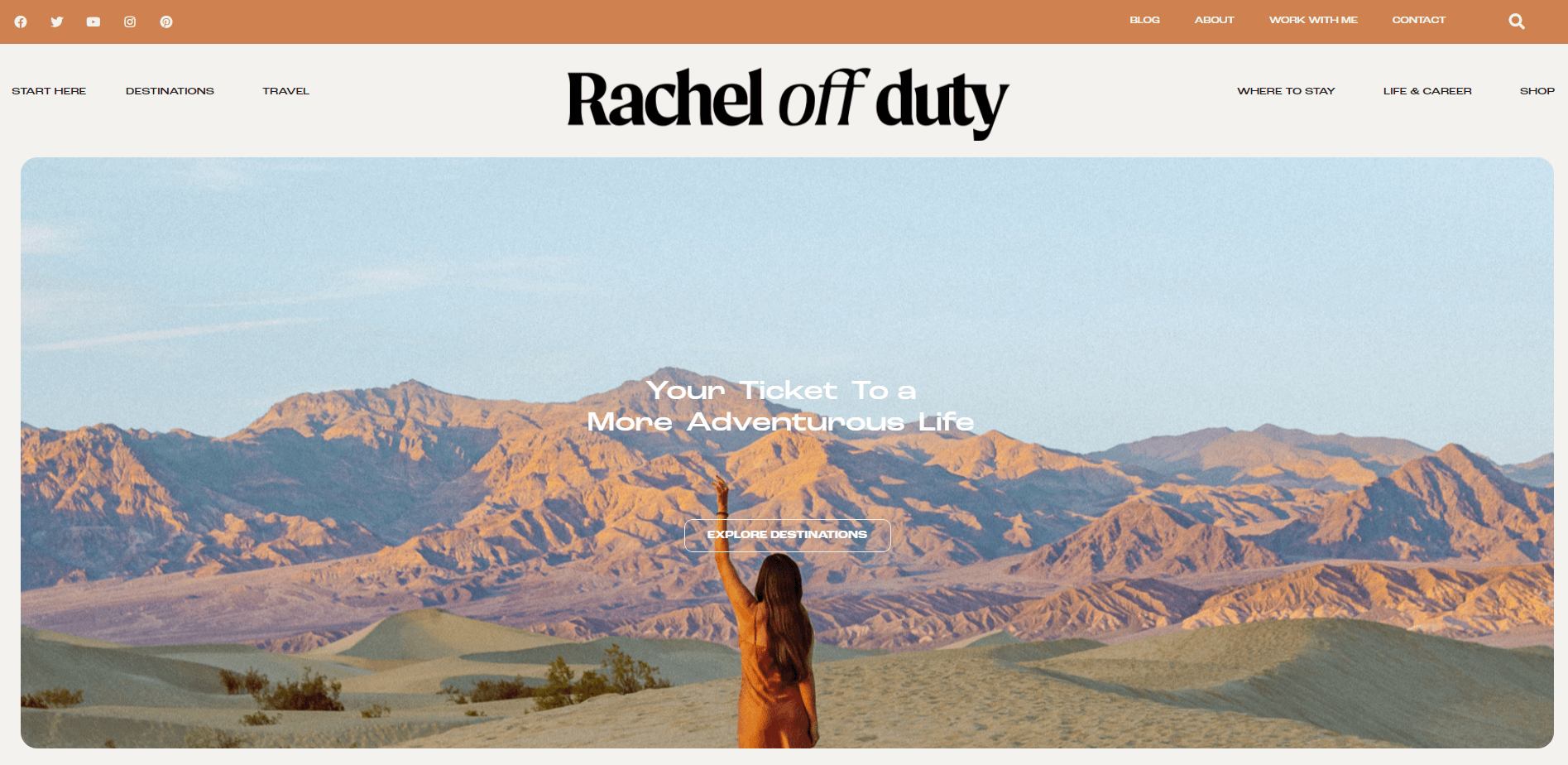
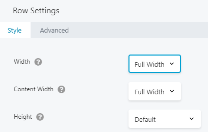
9. Large Hero Sections
The hero section is a prominent area beneath the menu that users encounter when they first visit a website. Ideally, it should convey the purpose of the site, including any products or services it offers. The hero section can also express the trustworthiness of a brand and sell the overall benefits of the business.
Hero sections are becoming very popular, and in most cases, there’s no reason not to fill the screen with one:
This section could also be an excellent opportunity to add some of that parallax scrolling we discussed earlier.
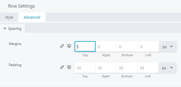
To create a large hero section in Beaver Builder, be sure you’re using a theme that enables you to edit the entire width of the screen. Start by adding a row and setting it to Full Width:
Next, click on the Advanced tab and ensure that you set all margins to zero:
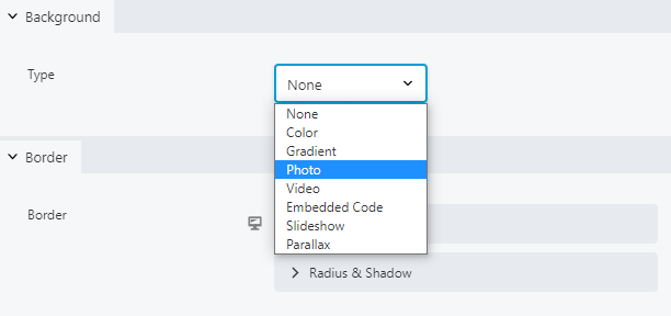
Back on the Style tab, choose your desired background type from the Background dropdown:
Finally, add whatever kind of module you’d like. You can even use a combination of modules for your hero section.
10. Engaging Landing Pages
Engaging landing pages are essential to conversions, and there’s a lot that goes into designing them. Make sure the landing page design is interesting enough to hold visitors’ attention without distracting them from the page’s copy. Also, consider using photos of real people as they perform better than stock images:
Beaver Builder is a powerful tool for building landing pages. You can start with one of our landing page layout templates and add or rearrange modules to add more functionality.
The Call to Action (CTA) module is particularly beneficial for landing page design. It enables you to customize every aspect of a CTA, from buttons to surrounding text:
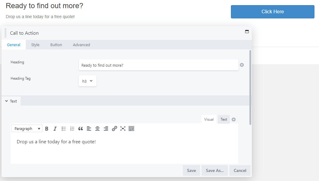
Take advantage of this feature, because customized CTAs convert around 202 percent more than generic ones.
That’s the end of our 2023 web design trends roundup! We bet you’ll find plenty of ways to embrace these top trends the next time you’re working on a website for your clients.
Conclusion
Thoughtfully incorporating trends into your designs can result in great websites and satisfied customers. It’s also a sound business strategy because you’ll always have something new to offer potential clients.
For maximum visual impact, try using serif fonts and parallax effects. If your client is going for an elegant minimalist vibe, try a dark mode aesthetic along with some geometric grids.
3 Comments
Our Newsletter
Our newsletter is personally written and sent out about once a month. It's not the least bit annoying or spammy.
We promise.
Try Beaver Builder Today

Related articles
How Beaver Builder Products Work Together to Build Flexible WordPress Websites
Building a WordPress website often means stitching together a theme from one developer, a page builder from another, and a…
Growing a Facebook Group to 14,000 Members: Community Management Tips with David McCan
David McCan grew the Dynamic WordPress Facebook group to over 14,000 members. We sat down to talk about his moderation...
Why Agencies Are Switching to Beaver Builder: Performance Testing Results
By Chris Smith – HYPEsites.com For WordPress agencies, page builder choice directly impacts the metrics that matter most: project margins,…
Join the community
We're here for you
There's a thriving community of builders and we'd love for you to join us. Come by and show off a project, network, or ask a question.
Since 2014
Build Your Website in Minutes, Not Months
Join Over 1 Million+ Websites Powered By Beaver Builder.
What type of layout or website do you recommend for a public library? The audience are adults, kids, seniors, students, basically everyone.
Thanks for this post. I’m currently in the process of changing my website design-it was designed on Thrive but there are many performance issues due to which page speed insights score is pretty poor. To be more specific, the mobile page hamburger loads in an expanded view completely for a microsecond before it gets compressed which causes LCP issue. Will this problem exist if I’m using WPBeaverBuilder?
That shouldn’t be problem with BB. 🙂