
How to Build Landing Pages With WordPress and Beaver Builder: A Complete Guide
Developing a marketing campaign can be daunting, especially when it comes to designing landing pages. There’s a healthy dose of marketing science that goes into creating them, which may make you hesitant to try them out.
That said, once you understand some of the finer details of what makes an effective landing page, you can take your marketing strategy to the next level. By directing visitors where you want them to go, landing pages can increase conversions on your site.
Creating landing pages is fast and simple with the use of WordPress tools. Our Beaver Builder plugin, for instance, can cut your design time down and provide multiple options for testing and running simultaneous campaigns.
In this guide, we’ll go in-depth and discover what it takes to create a high-converting landing page. We’ll explore key topics such as:
- Common language. If digital marketing is new to you, the associated vocabulary can be a bit confusing. We’ll break down the terms you need to know and give them context.
- Expert insights. This guide will help you tap into expert research on how your landing pages can help you fill your marketing funnel with quality leads.
- Beneficial tools. You’ll get to know the Beaver Builder plugin for WordPress. We’ll cover how to use this page builder to create and test effective landing pages quickly.
- Effective Calls to Action (CTAs). Knowing the psychology and science behind designing CTAs can help you bring about maximum conversion rates. We’ll look at what that means for your landing pages.
From foundational design elements to optimization and testing, this guide will teach you everything there is to know about landing pages. That’s a lot of ground to cover, so let’s dive in!
The Important Elements of Effective Landing Pages
So, what exactly are landing pages? First and foremost, they’re designed as reception areas for paid web traffic. These pages are where a web user will typically end up if they click one of your banners, Facebook ads, or Google ads.
Landing pages differ from other web pages in that they are designed specifically for individual marketing campaigns. They generally contain tailored messages meant to encourage each visitor to click on a CTA (more on those later).
Before you can start creating your landing pages, however, it’s important to understand their basic elements and how they fit into your marketing strategy.
Helpful Terms for Understanding Landing Pages
To get started, let’s take a look at five common terms associated with a landing page strategy. Knowing their definitions will make understanding the rest of this guide easier.
Key landing page vocabulary includes:
- Lead. In simplest terms, a lead is a person who may eventually buy your product or service. They have likely shown interest in what you’re offering via a keyword search, your social media accounts, or your website. You can also define leads using passive data such as social habits or demographics.
- Funnel. The “marketing funnel” or “marketing pipeline” is an analogy for the process that leads take to become converted customers. Those who are ambiguously interested in your brand are at the widest part of the funnel, and those who have answered your CTA are at the narrowest.
- High-quality lead. This term refers to leads generated from more in-depth and diverse demographics such as work, shopping, travel, eating, and sleep habits. They are typically acquired through higher-end data tracking technology than what your average social media advertising account or WordPress dashboard might give you.
- Conversion. The process of a lead following through on one of your CTAs. Depending on your website’s goals, conversions might include purchases, newsletter subscriptions, quote requests, or a variety of other actions that benefit your brand.
- CTA. We might venture to say that you can’t have a landing page without a CTA. The Call to Action is a directive to visitors that shows them how to convert.
Now that you have some of the basic terms under your belt, we’ll tackle the next pieces of the landing page puzzle.
Why You Should Consider Landing Pages for Your Website
Landing pages have become key players in digital marketing because they’re proven to convert leads at a higher rate than normal web pages.
To be clear, it’s still important to have a comprehensive website to represent your brand. Traditional site pages and landing pages simply serve different purposes. Including both on your site provides multiple channels for leads to move down the marketing funnel.
Landing pages can also lower the cost of acquiring leads. The specificity that this type of content provides and its ability to eliminate distractions help reap a much larger Return On Investment (ROI).
4 Important Elements of Effective Landing Pages
Creating landing pages is a bit of an art form. Combining design and marketing science requires both strategic thinking and a sharp eye. The following features can help serve as a guide.
1. Incentives
Offering incentives on your landing pages can be a worthwhile approach to gaining leads. People like to feel that they’re getting a deal, and free or discounted products and services play into that desire.
Ideally, your incentive should act as a step towards your end goal or CTA. For example, if you ultimately want your leads to purchase a personalized cooking plan, you might offer them a free recipe guide or grocery list.
2. Testimonials
Including customer feedback in the form of testimonials can be an effective marketing strategy. Showcasing them on your landing pages may encourage leads to convert.
Following up on purchases by asking customers to complete a survey can help you gather reviews to use on your site, assuming you have permission. You can also reach out to key clients to ask if they will write a testimonial for use on your site.
3. A CTA
Each landing page should build towards a goal. It’s wise to incorporate a CTA to direct visitors to take action and make it as straightforward as possible for them to convert.
Beaver Builder’s Call to Action module offers highly-customizable styling to help you create the most effective buttons for your landing page. We also recommend following best practices such as crafting compelling link text.
4. Forms
Landing pages often include forms. This is an easy way to gather information about your leads, such as their email addresses and which offers they’re interested in.
Beaver Builder offers an excellent Contact Form module for you to utilize on your landing pages. If you’re looking to extend the functionality of your forms, several contact form plugins pair well with our page builder.
Examples of High-Converting Landing Pages
To get a sense of what a high-converting landing page looks like, let’s examine two top-notch examples. This one from Shopify includes all the elements mentioned above:
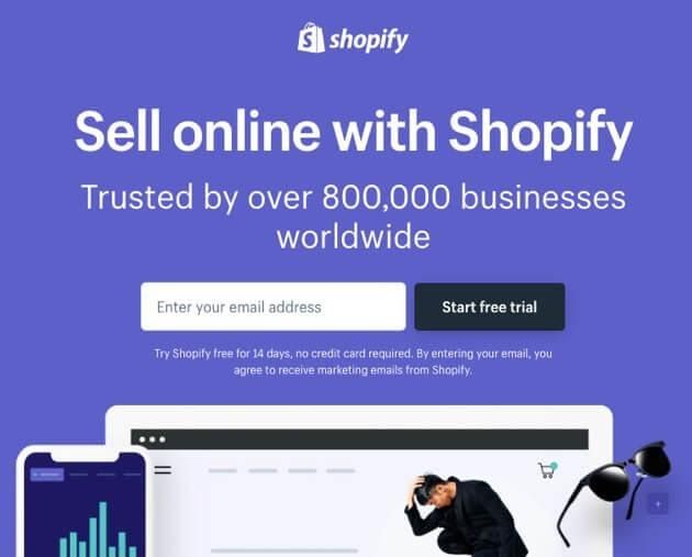
Its purpose is to convince visitors to submit their email addresses. The page leads with a clear headline, is short in length, and offers the visitor a free trial in exchange for their contact information.
Another strong landing page example is this one from Airbnb. The CTA invites site visitors to become short-term-rental hosts:
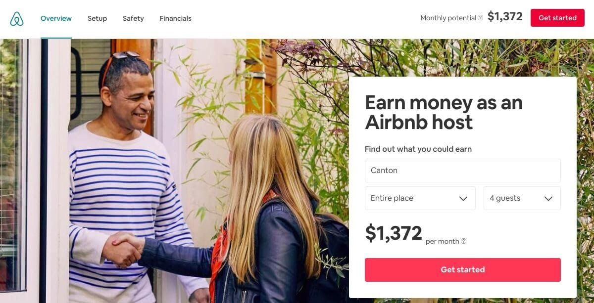
This page offers a creative incentive by displaying a form that calculates potential hosts’ estimated earnings. This not only provides an interactive element to engage users but also helps Airbnb gather data on their leads’ locations.
An Introduction to Beaver Builder
Now that you have a better sense of what a landing page is, we’ll take a look at Beaver Builder. Our page builder provides drag-and-drop functionality and templates to help you create landing pages quickly.
Choosing the Right Beaver Builder Option for Your Business
The Beaver Builder plugin comes in a free, “lite” version as well as a choice of paid premium versions. You can also use free or premium third-party add-ons to enhance either the free or premium version of Beaver Builder. Here are some key factors to consider when choosing between Beaver Builder Lite vs Premium:
1. Beaver Builder Lite
Beaver Builder Lite is a nice way to get started as a beginner and see how the page builder works. It comes with a good selection of modules:
- ACF Blocks
- Audio
- Box
- Button
- Button Group
- Callout
- CTA
- Heading
- HTML
- Icon
- Menu
- North Commerce
- Number Counter
- Photo
- WordPress Patterns (Reusable-Blocks)
- Text Editor
- Sidebar
- Video
- WordPress Widgets
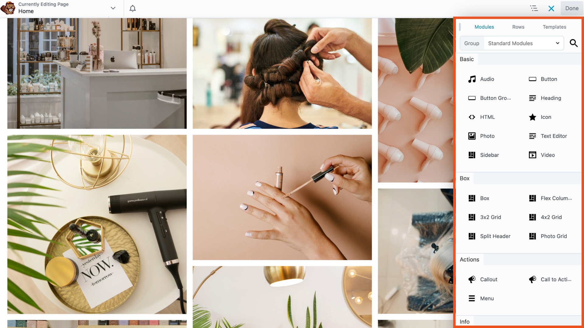
Beaver Builder can be used with pages, posts, and custom post types. The menu makes it easy to drag and drop elements to create the ideal layout for your landing pages. In this screenshot, you’d drag your module of choice and drop it into your layout:
Beaver Builder Lite is a low-risk option for beginners and smaller businesses to improve their sites without investing money in a premium plugin. You can always upgrade or enhance the page builder to take your site to the next level.
2. Beaver Builder Premium
All premium versions of Beaver Builder include all the modules from the Lite version and over 20 additional modules, including CTAs, callouts, contact forms, and more. These modules are particularly helpful for designing effective landing pages.
The premium version also comes with many ready-to-use templates. You can customize and reuse them to meet your site’s specific needs.
Our Beaver Builder plugin has several flexible pricing options. Our Standard package starts at $99 per year, and you’ll receive a 40 percent discount if you sign up for automatic renewals. Large brands and those with multiple sites may want to consider our Agency package. It includes WordPress Multisite compatibility, an integrated Beaver Builder Theme, white labeling, and more for $399 per year.
2. Beaver Builder Premium
Beaver Builder Premium takes all the features of the Lite version and adds advanced modules including CTAs, callouts, contact forms, and more—perfect for creating high-converting landing pages. Additionally, it offers a variety of customizable templates to streamline the design process and match your site’s or client’s specific needs.
Our premium plans offers flexible pricing options:
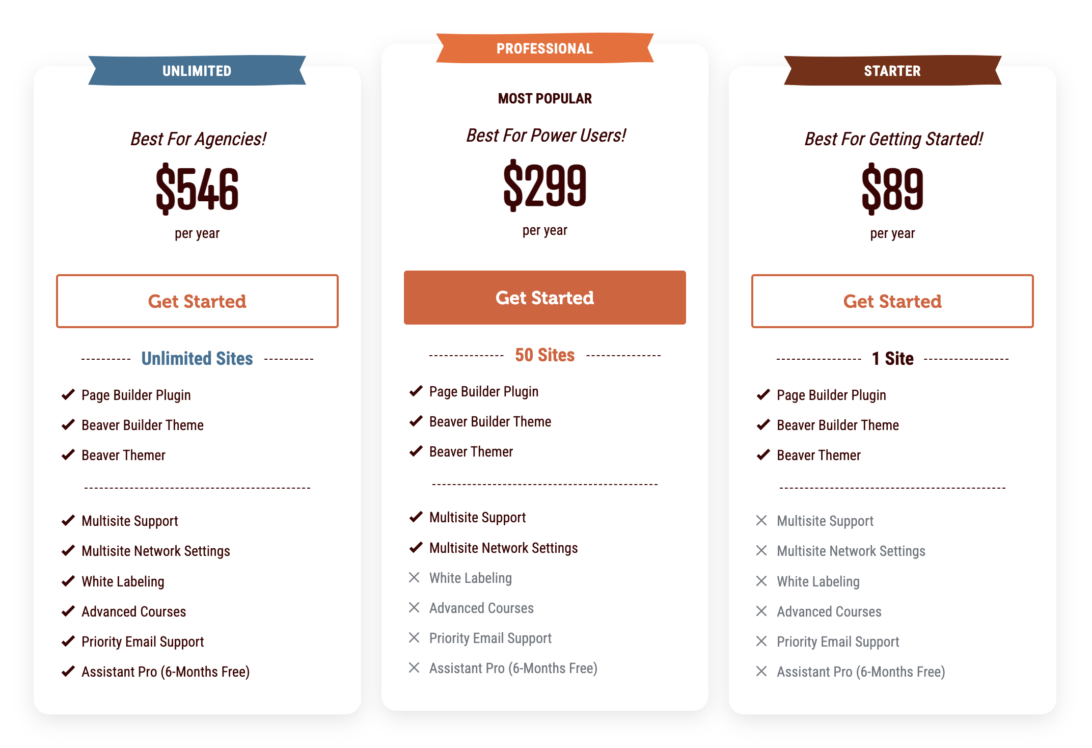
The Starter Plan begins at $89 per year and includes the full suite of Beaver Builder products: Beaver Builder Page Builder, Beaver Builder Theme, and Beaver Themer. For those needing support for up to 50 sites, the Professional Plan includes everything in the Starter Plan, plus WordPress Multisite compatibility. Larger brands or agencies can opt for the Unlimited Plan, which offers everything in the Professional Plan for use on an unlimited number of sites, along with white labeling and six months of free access to Assistant Pro.
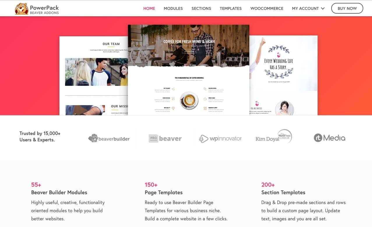
3. Beaver Builder With Add-Ons
No matter if you’re using the free or premium version of Beaver Builder, there are plenty of powerful add-ons and integrations to enhance your site-building experience.
One popular option is PowerPack for Beaver Builder, which offers advanced modules like pop-up boxes, subscriber forms, and more:
How to Get Started With Beaver Builder
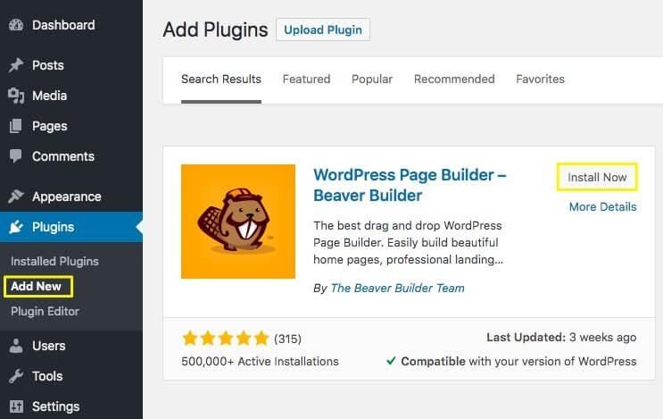
Once you decide which plan is right for you, it’s time to install Beaver Builder. You’ll either add the free plugin from your WordPress dashboard or upload the premium plugin zip file to your site by navigating to Plugins > Add New > Upload Plugin:
Try out the Page Builder plugin demo at wpbeaverbuilder.com to see it in action.
How to Build and Optimize Landing Pages to Maximize Lead Generation
Now that you have an idea of what a strong landing page entails, let’s walk through the process of creating one with Beaver Builder. With so many modules available between any premium version of Beaver Builder and our PowerPack extensions, the possibilities are endless.
Below, we’ll cover how to set up the basic components for a successful landing page. You can then adapt the process to meet your specific requirements.
How to Build and Optimize Landing Pages With Beaver Builder (In 4 Steps)
Beaver Builder brings a lot to the party when it comes to crafting a landing page. Our plugin puts flexibility and customization at your fingertips. You can take control of the most important elements, and configure them with conversion rates in mind.
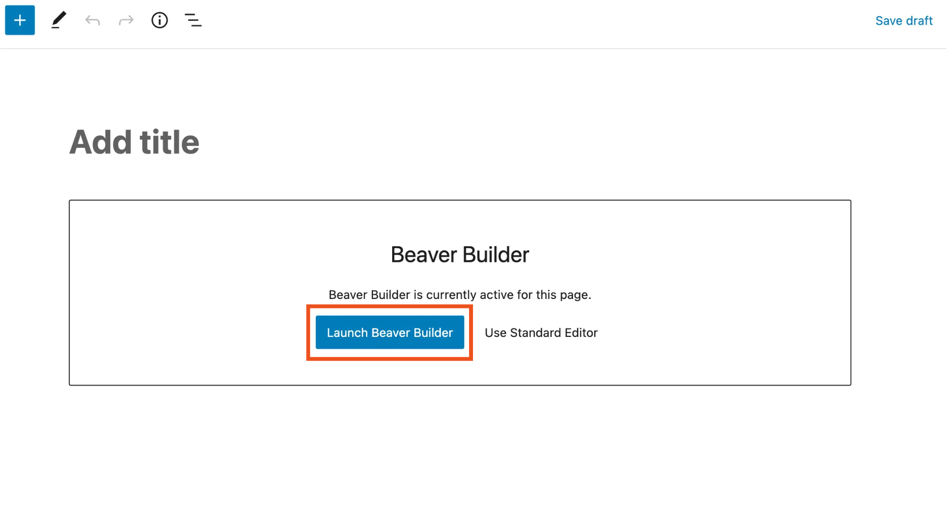
1. Create a New Page and Access Your Beaver Builder Modules
Once you’re ready to start working on your new landing page, navigate to Pages > Add New in your WordPress dashboard. Then, click on the Launch Beaver Builder button:
This opens the editor, which shows you a preview of the front end of your landing page and provides you with access to drag-and-drop modules and templates and the ability to save custom templates, rows, and modules. While editing, you’ll see your page from your future visitors’ perspective.
Click on the plus (+) sign in the upper right-hand corner of your screen to reveal the Content Panel with module options. After you open the Content Panel, the plus sign changes to an X that closes it:
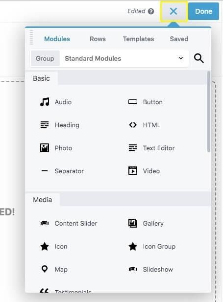
You can browse through the palette using the Modules, Rows, Templates, and Saved tabs at the top of the window. Each includes prebuilt elements you can use on your landing page.
2. Select a Template or Start From Scratch
You can decide whether you want to create a layout from scratch or adapt one of ours. Beaver Builder provides some excellent landing page templates that you can use as a springboard for creativity.
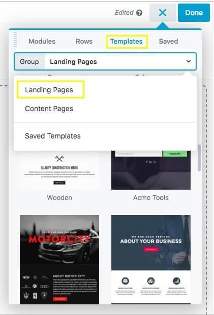
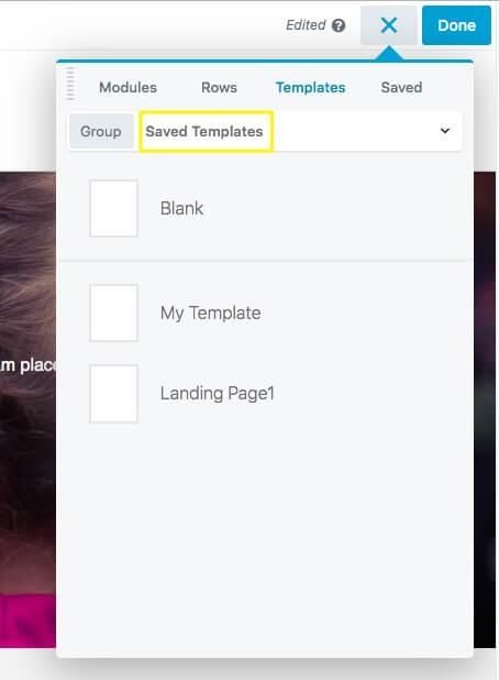
If you already have a structure for your landing page in mind, you’re ready to start dragging and dropping and can skip down to Step 3. To browse our templates, open the Content Panel and click the Templates tab, then click on the Group field and choose Landing Pages:
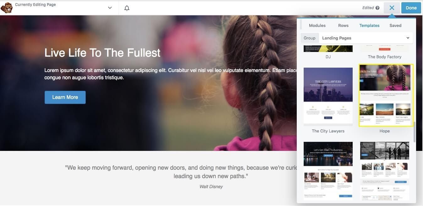
Choose a template by clicking it to load it into the page:
You’ll then be ready to customize the template modules and copy. Just hover your mouse over any area you want to edit, and a blue toolbar appears around the selected row, column, or module:
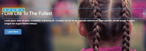
You can see what the element is by hovering over the Wrench icon in the toolbar, and click that icon to open its settings for editing, and you can edit content either inline or in the Settings window. Use the other icons to move the element, duplicate it, edit the column, or delete the element.
3. Select Modules to Enhance Your Landing Page
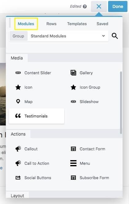
Whether you start from scratch or take advantage of our landing page templates, you can add new rows and modules to the layout by dragging and dropping. To view the modules available, click the Modules tab at the top of the Content Panel.
There are several module categories, including Basic, Media, Actions, and more:
Depending on other plugins you have installed, there may be more categories, such as WooCommerce. There are also groups of modules, which you can view by clicking on the Group field at the top of the Modules tab. For example, in the WordPress Widgets group, you can use any widget as a module.
These modules are especially relevant to landing pages:
- Testimonials: Testimonials and reviews can help convince leads to convert.
- Call to Action: We’ll discuss CTAs more in the next chapter, but remember that this module is available because it’s an invaluable piece of the landing page puzzle.
- Callout: This module is very similar to a CTA, with some styling differences, including the ability to use both content and an image.
- Contact form: Include a contact form to gather information about and get in touch with your leads.
- Subscribe form: Make it easy for leads to join your email list so you have more opportunities to send them promotional content and encourage them to convert.
Of course, you can incorporate basic modules too, such as text, images, buttons, and videos. Drag each element wherever you want it to appear on the page. You can drag modules into existing rows and columns or create new rows and columns when you drag the module into new parts of the layout.
When you drop a module onto the page, its settings panel opens. Changes are saved as you make them, but the page doesn’t go live until you publish the page, described in the next section.
4. Save or Publish Your Landing Page
Beaver Builder automatically saves your work while you’re editing, so even if you leave the page by mistake, your changes should be preserved so you see them the next time you open the Beaver Builder editor. Within the editor, there are several options about how to save or publish your page.
If you’re done editing and ready for the page to go live, click the Done button in the upper right corner, then click Publish:
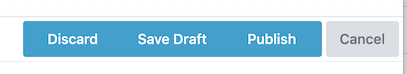
If you’re not ready for the page to be published yet, choose Save Draft to save your changes but not publish. Choose Discard to revert to the layout that was in place the last time you published the page. Or choose Cancel to close these choices and revert to the editor.
The Tools menu offers a couple of additional choices. Click the downward arrow next to the page title area in the upper left-hand corner to open the Tools menu:
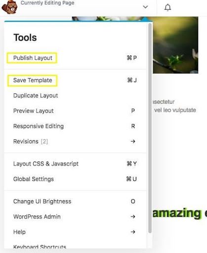
Click Publish Layout to make your page live. This is identical to clicking Publish in the Done menu, but you won’t leave the editor.
If you plan to create additional landing pages and want to use your layout again with slight variations, you can select Save Template instead. This will add your current page to the Templates tab in the Content panel:
Designing an Effective Call to Action
In the previous chapter, we took a look at how to get your landing page up and running with a template. Now, we’re going to take a deeper dive into one specific yet crucial element – the CTA.
Why Your CTA Design Matters
Every element on your landing page should ultimately build-up to your CTA. It’s a vital feature for turning visitors into returning customers.
Several variables related to your CTA can impact your conversion rates, including:
- How many times the CTA appears on the page
- The size, shape, and color of the CTA button
- The number and type of words used in the CTA
These variables also help web users spot the most valuable information when they scan the page. The attention span of the average website visitor is short, so a well-thought-out CTA can help you make the most of the brief time you have to convert your leads.
5 Tips for Designing an Effective CTA
Now, let’s take a closer look at what makes a successful CTA. All premium versions of Beaver Builder include a CTA module, and here are five tips to help you maximize this module’s effectiveness.
1. Pick the Right Color
The color of your button matters quite a bit. Research suggests that buttons with contrasting colors yield higher conversion rates. This example from the popular streaming site Netflix provides a useful demonstration:
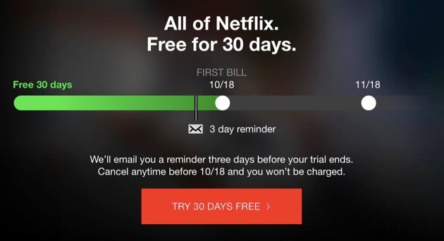
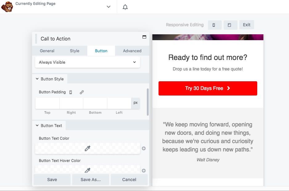
The red button against the dark background draws attention to the CTA and utilizes the company’s already-established brand colors. You can replicate this effect by using dark buttons against a light background or vice versa. Consider your button’s text and hover colors as well. Make sure the words are readable and that your CTA won’t blend into the background when visitors mouse over it.
To customize button settings, go to the Button tab in your CTA module settings. You can tweak almost any aspect of the button portion of your CTA and check its appearance and responsiveness on mobile devices as you edit:
2. Use Actionable Language
Designing your CTA presents an opportunity for you to create a sense of urgency around your products or services. Now is not the time to be coy or ambiguous. Your CTA text should contain direct and “actionable” language.
One strategy is to appeal to your visitors’ fear of missing out. Words such as “limited time only” and “while supplies last” encourage leads to act quickly.
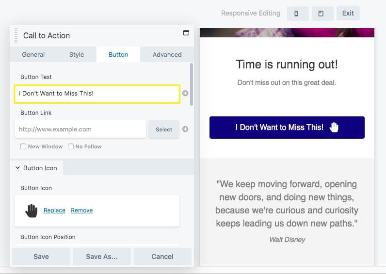
Copy that includes strong verbs tends to get more attention. For example, “Try it now” produces better results than “Demo” if you’re hoping to get visitors to click on your CTA. Keeping your text short is optimal.
One example of the impact of button text comes from a case study by the optimization plugin Sumo. They saw a 182 percent conversion jump when they changed their CTA button copy from “Get it now” to “Gimme.” This demonstrates why overused words such as “Submit” and “Subscribe” are best left on the cutting room floor.
The Beaver Builder CTA module includes a header, body text, and button text. You can edit them on the General and Button tabs in the module’s settings panel:
Playing the different text areas off of one another to incorporate the techniques we just outlined can be especially effective. In the example above, the heading instills a sense of urgency while the button provides an actionable directive.
3. Optimize Your Buttons for Mobile Viewing
Research has shown that the vast majority of web browsing is done on mobile devices and that habit continues to trend upward. Therefore, you might want to focus on optimizing your buttons for smaller screens.
Beaver Builder makes it easy to test whether your button design is responsive. Many module settings have icons that toggle your view and let you assign different settings for large, medium, and small screens:
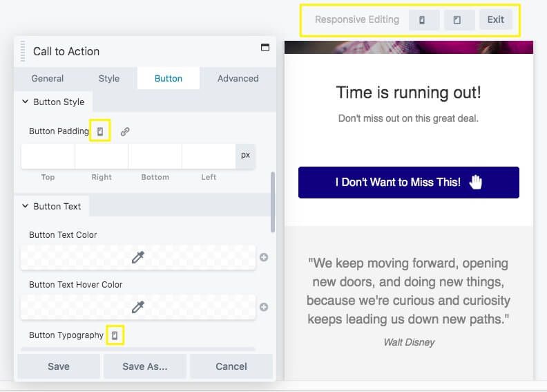
You can also use the keyboard shortcut R to enter Responsive Design Mode, where you can see the entire layout at each screen size and tweak the settings from there.
Make the button to be large enough that users can easily tap it on a small screen, but not so large that they can’t see anything else. It’s important to balance ease of use with attractive design for a professional-looking result.
4. Leverage a Dual-Button CTA for More Conversions
While a straightforward call to action (CTA) often works best, there are cases where offering choices can increase conversions. This is where a dual-button CTA comes in handy.
For example, on the Beaver Builder homepage, we feature two buttons. One directs visitors ready to purchase to our pricing page, while the other offers a free demo for those who want to try our plugin before committing:
This approach helps retain leads who aren’t ready to buy but are still interested in exploring the product.
To create a dual-button CTA in Beaver Builder, drag the Button Group module onto your page. From there, you can customize the buttons by adjusting alignment, colors, and other settings to suit your goals.
5. Place Your CTA Logically in Your Page Flow
After you’ve configured your CTA’s button or buttons, review your entire landing page to make sure it’s laid out logically. There are a few simple tips to keep in mind when making page layout decisions, including:
- Place your CTA button near a supporting message.
- Create longer landing pages with multiple buttons and more opportunities to convert.
- Utilize heatmap technology to find ideal locations for buttons.
- Avoid cluttered layouts – you don’t have to fit everything above the fold.
The best way to find the perfect spot for your CTA is through testing, which we’ll cover in the next chapter. However, the tips above are a solid launchpad to get you started on an effective landing page.
Testing and Improving Your Landing Page
Now that you’ve created an enticing landing page, you should track how it’s performing. While an increase in sales would indicate that it’s doing well, it can be difficult to know exactly what led to that success. Setting up tests can help you find out.
How to Test Your Landing Pages (Two Methods)
There are several different approaches to testing landing pages. Here we share two of the most popular and successful options.
1. A/B Split Testing
A/B testing – sometimes referred to as split testing – is the method you hear about most in marketing. It gives you a simple, straightforward way to determine how a particular element impacts your landing page’s performance on the whole.
Here’s how it works:
Choose a single feature of your landing page that you want to test. For example, you might want to determine how button color impacts your conversion rate.
Create two variations of the page. They should be identical except for the one element you want to test.
Launch both landing pages and carefully track their analytics. The goal is to see if one page achieves significantly higher conversions than the other. If so, then you know the element you varied is influencing visitors’ decisions.
Beaver Builder’s custom template feature makes A/B testing easy. When you finish your landing page, save it as a new template. Then create a new page and load that template.
You can quickly tweak the module you want to test and publish your variation. Alternatively, you can also look into the A/B Split Test plugin:
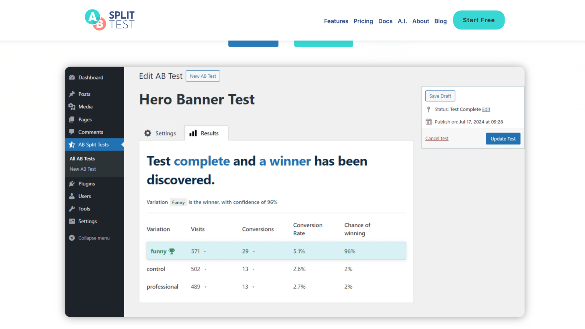
This powerful tool simplifies the testing process with its intuitive interface, helping you test different versions of landing pages, CTAs, headlines, and more. By using A/B Split Test, you can improve the performance of your marketing strategies, boost engagement, and ultimately increase conversion rates without the need for complex coding or technical expertise.
2. Multivariate Testing
Multivariate testing is similar to split testing, except that it compares how different combinations of elements affect performance.
In a multivariate test, you could find out how changing the button’s color and text impacts performance. Implementing this method is the same as the process for running a split test, except that you’ll change multiple elements when creating your variation:

The biggest drawback to multivariate testing is that it requires a larger sample to produce verifiable results. If your site is small or still new, it could take a while before you have any useful information.
3 Landing Page Testing Best Practices To Follow
Regardless of how you test your landing pages, there are some general guidelines you can apply to help them succeed. The better your testing practices are, the more useful information you’ll be able to glean to improve your landing pages.
1. Test Early and Often
Frequent experimenting right out of the gate can help you avoid an ineffective design. If an element of your original landing page isn’t producing results, you don’t want to wait until you’ve missed out on hundreds of conversions to realize it.
Additionally, the internet is a fast-paced environment. Design trends and best practices change frequently. Your offers and audience may evolve, too. To keep your landing pages relevant, test them continuously.
Consider creating a testing schedule and including it in your marketing plan. Having a regular rotation of variations can help you remember to check up on your pages often.
2. Run Your Tests Long Enough to Gather Sufficient Data
To create a testing schedule, you’ll need to know how long to leave each variation up to determine its effectiveness. Unfortunately, figuring out the appropriate length for your test is a difficult balancing act.
The ideal test length is unique to each website. A good starting point is to determine your average site traffic. You can then compare this number against the recommended sample size for your site.
There are several online calculators you can use to find this second factor. The rest is simple math. If you need a sample of 150,000 visitors and your average traffic level is 10,000 users per day, you should run your test for 15 days.
3. Focus in on Key Elements During Testing
There may be quite a few landing page elements that seem like viable testing options. However, narrowing your focus makes your tests more productive.
If you include too many variables in a single test, you may not figure out which one is the most influential. This defeats the purpose of the test.
Changing something as small as a single button’s color is often enough to change behavior. It’s easy to see how you can run landing page tests continuously – there’s always another detail you can tweak.
1 Comment
Our Newsletter
Our newsletter is personally written and sent out about once a month. It's not the least bit annoying or spammy.
We promise.
Try Beaver Builder Today

Related articles
Beaver Builder AI: Build WordPress Layouts with AI (Now in Alpha)
Hey everyone! Big news. After a long time of building behind the scenes, Beaver Builder AI is here. The alpha…
How Beaver Builder Products Work Together to Build Flexible WordPress Websites
Building a WordPress website often means stitching together a theme from one developer, a page builder from another, and a…

From Azeroth to WordPress: How Warcraft Tavern Uses Beaver Builder
Since releasing Beaver Builder 12 years ago, a feeling will come up from time to time that just never gets…
Join the community
We're here for you
There's a thriving community of builders and we'd love for you to join us. Come by and show off a project, network, or ask a question.
Since 2014
Build Your Website in Minutes, Not Months
Join Over 1 Million+ Websites Powered By Beaver Builder.
I like to read well-written articles. It looks like you spent a lot of time and effort on your blog. I learned a lot from your article and I have already bookmarked and am waiting to read a new article. keep up the good work!