
Minimalism vs maximalism: two of the biggest web design trends that involve polar opposite techniques. As a designer, it can be difficult to decide whether to focus on bold, eye-catching visual elements or avoid unnecessary distractions. Once you compare the main differences between minimalism and maximalism, you can easily choose which one will leave a better impression on new visitors.
As a general rule in web design, minimalism embraces the use of simple lines, clean fonts, and flat backgrounds to achieve maximum impact using a minimum amount of elements. In stark contrast, maximalism focuses on abundance including the use of bold colors, dramatic fonts, and loud backgrounds.
In this post, we’ll introduce both minimalism and maximalism in web design. Then, we’ll discuss their key differences and why you might want to use each one. Let’s get started!
Table of Contents:
What Is Minimalism?
Minimalism is a style defined by simplicity. Essentially, it reduces web design to its most important elements.
The goal of minimalist web design is to eliminate any unnecessary and distracting features. Minimalist websites often use more muted color palettes, white space, and a flat graphic interface. This provides a less overwhelming experience for visitors:
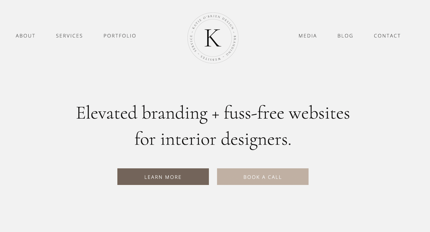
When designing with minimalism in mind, less is more. Although you don’t have to stick to an unengaging black-and-white background, minimalist websites usually take focus away from the design. Instead of having a flashy and gratuitous style, they are calm and appealing to a wide range of users.
What Is Maximalism?
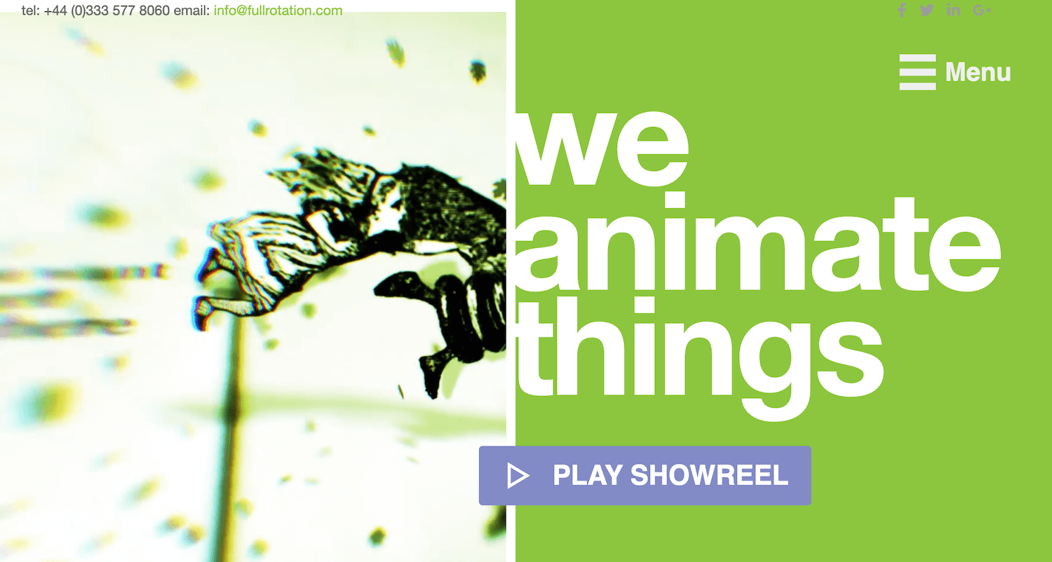
Compared to minimalism, maximalism is the complete opposite. This design style aims to immediately grab a visitor’s attention through bold colors, fonts, and User Interface (UI) elements.
While a minimalist website draws attention away from its design, maximalist sites have an eye-grabbing effect. Maximalism adds a ‘wow’ factor by using a flashy (and sometimes excessive) mix of styles, textures, and color palettes:

Ultimately, the end goal is to have a one-of-a-kind website. Maximalist designs should still focus on usability, but they can also make a site stand apart from competitors. Instead of being more muted and universally appealing, maximalism is quirky, fun, and distinctive.
Minimalism vs Maximalism: 4 Key Differences
Now that you know the basic characteristics of minimalist and maximalist web design, let’s dive a little deeper. When you understand the main differences between the two styles, you can more easily decide how to design your clients’ websites.
1. Color Palette
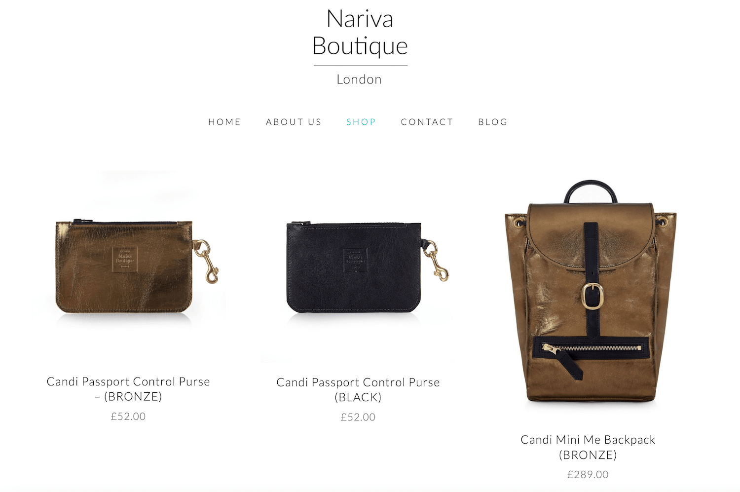
In minimalism, you’ll see a balanced and neutral color scheme. These websites feature complimentary palettes that are calming to look at:

Minimalist sites can use bright colors, but sparingly. Usually, this will only highlight the most important elements, such as call-to-action buttons.
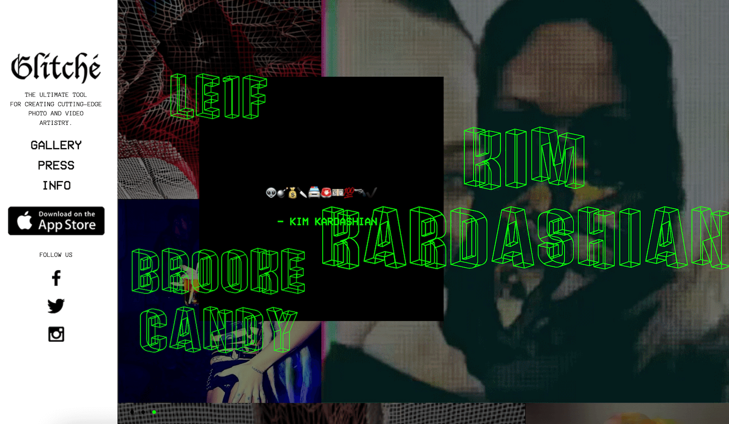
On the other hand, the first thing you’ll likely notice when you look at a maximalist website is its bold color palette. This design style often showcases bright and eccentric combinations to immediately attract the eye:
With maximalism, you’ll occasionally see contrasting, aggressive hues that push the boundaries of ‘good’ design practices. While some designers may suggest using muted tones for mass appeal, maximalists want to develop unique websites. This can result in experimental designs that may be undesirable for some users.
When deciding between these two design trends, it’s best to consider your audience. If you want to attract a variety of users, you might want to go with a minimalist color palette. On the opposite end of the spectrum, maximalism can be immediately distinctive, which can improve brand awareness.
2. Use of Space
Additionally, minimalist websites are known for their use of white space. This is an empty area that creates natural separations for different elements in the design:
Often, white space can accentuate the important information on your site. It can help visitors navigate through your content without becoming overwhelmed by cluttered text or media.
In maximalism, there can be organized chaos. Instead of negative space, you’ll see a combination of different bold visual elements:

Maximalist design can often include so many textures, fonts, and colors that it becomes overwhelming for the reader. With this creative freedom, it’s easy to go overboard and include too many features.
Therefore, as you develop a maximalist website, you should be sure to test its navigation, readability, and usable elements. As you gain experience, you’ll likely learn where to draw the line when it comes to maximalism.
In certain sections of your website, feel free to go all out with features. As readers scroll or view another page, however, you can include more negative space to maximize usability.
3. Number of User Interface (UI) Elements
Some designers choose to remove or hide unimportant elements. For example, minimalist sites might conceal the navigational menu to save space. Plus, this can provide a cleaner home page:

On the other hand, maximalist designs can sometimes include lots of UI elements. By using a combination of different fonts, images, videos, and other features, a website can be cluttered and hard to navigate:
As a designer, your job is to create a memorable website that users want to engage with. A maximalist approach will include an attention-grabbing visual design, but it’s important to avoid alienating visitors with confusing UI features.
Although minimalism can be more visually comforting, be sure to include all the necessary elements. If visitors come searching for specific information, they won’t want to sift through the entire website to find it. In a nutshell, it’s best to keep your interface simple, but still useful.
4. Typography
Minimalist websites will have more simple, readable fonts. Although certain headings might be bigger and bolder than others, there won’t be many distracting elements:
Alternatively, since the goal of maximalism is to grab attention, it can feature flashy and distinctive typography. This can immediately portray the ambiance and branding of the website:
Plus, you might see a mix of different fonts, sizes, and colors on the same page. There are virtually no creative boundaries when it comes to maximalist designs.
There are advantages and disadvantages to both of these techniques, so it’s important to design carefully. Although maximalist typography can be unique, obscure fonts could make your content unreadable. With minimalism, you’ll have safer font options, but these can be a bit dull.
Minimalism vs Maximalism: Which Is the Best Web Design Trend?
As you’re designing a website, you may not know which style would be the best option. Both minimalism and maximalism can have benefits and pitfalls, so it’s best to analyze each one before getting started.
| Feature | Minimalism | Maximalism |
| Bold colors | Limited to call-to-action buttons | Yes |
| White space | Yes | Limited |
| Minimal UI elements | Yes | No |
| Distinctive typography | Limited to important headings | Yes |
| Mass appeal | Yes | No |
| More creative freedom | No | Yes |
With a minimalist style, you can keep your website simple and straightforward. This can save time during the design process. Plus, it ensures that any visitor can have a positive browsing experience.
Minimalism can be an effective choice for college websites or businesses. Since these have high traffic and a variety of visitors, you’ll have to keep the design clear and navigable.
However, there isn’t a lot of room for creativity. If you’re an artist or graphic designer, you’ll likely want to experiment with different colors, fonts, and textures to showcase your skills. A maximalist approach can appeal to bold personalities and one-of-a-kind brands.
If you’re designing for maximalism, it’s fairly easy to add too many distracting visual elements. Although it may align with your personal style, be sure to avoid using unsettling graphics and colors. If you overdo it, you could significantly increase your website’s bounce rate.
Conclusion
When designing your website, the wrong style choices could negatively impact navigation, readability, or brand awareness. While maximalism can offer creative freedom and unique brand visuals, minimalism can remove clutter and optimize negative space. To decide between the two, you’ll need to think about what will be ideal for your particular audience.
To review, here are the main differences between minimalist and maximalist web design:
- Color palette: Maximalist designs can feature bold, clashing colors while minimalism focuses on complementary hues that appeal to most people.
- Use of space: Minimalist websites utilize more negative space to highlight only the most important elements. With maximalism, you’ll often find less white space in favor of an ‘organized chaos’.
- Number of UI elements: Maximalism groups many different elements onto one page, but minimalism aims to make navigation clear and straightforward.
- Typography: While minimalist websites will be limited to one unique font, maximalist designs can use a combination of fonts with different sizes, styles, and weights.
Related Questions
Is Maximalism Better Than Minimalism?
Maximalism can be a better design choice than minimalism if you need more creative flexibility. This style involves bold, flashy visuals that could make a website more unique, youthful, and engaging. However, it’s relatively easy to oversaturate web design with too many colors, textures, and UI elements.
What Are Three Characteristics of Minimalism?
In web design, minimalism is a style choice that focuses on simplicity, clarity, and usability. Minimalistic websites remove unnecessary elements from the interface and include more negative space to improve User Experience (UX).
Why Is Minimalist Design Good for a Website?
A minimalist design can eliminate unimportant elements and avoid overwhelming new visitors. It often contributes to a universally aesthetic website that is easy to use. Ultimately, minimalistic designs are more functional, but they may not be as unique or memorable.
Our Newsletter
Our newsletter is personally written and sent out about once a month. It's not the least bit annoying or spammy.
We promise.
Try Beaver Builder Today

Related articles

How Beaver Builder Products Work Together to Build Flexible WordPress Websites
Building a WordPress website often means stitching together a theme from one developer, a page builder from another, and a…
Growing a Facebook Group to 14,000 Members: Community Management Tips with David McCan
David McCan grew the Dynamic WordPress Facebook group to over 14,000 members. We sat down to talk about his moderation...
Why Agencies Are Switching to Beaver Builder: Performance Testing Results
By Chris Smith – HYPEsites.com For WordPress agencies, page builder choice directly impacts the metrics that matter most: project margins,…
Join the community
We're here for you
There's a thriving community of builders and we'd love for you to join us. Come by and show off a project, network, or ask a question.
Since 2014
Build Your Website in Minutes, Not Months
Join Over 1 Million+ Websites Powered By Beaver Builder.