
How to Center Content in Beaver Builder (Flexbox, Rows & Modules Guide)
 -
April 17, 2026
-
April 17, 2026
Wondering how to center content in Beaver Builder? The most reliable way is to use the Box Module with Flexbox: set the container to Display: Flex, choose a layout direction, and apply center alignment for both horizontal and vertical positioning.
If you’ve tried aligning a button, heading, or full section and it still looks slightly off, you’re not alone. Most centering issues happen because traditional layout tools like rows and columns are designed for structure, not precise alignment. As a result, spacing can feel inconsistent across different screen sizes.
In this guide, you’ll learn how to center elements in Beaver Builder using three methods: module alignment, rows / columns, and the Box Module (Flexbox).
Table of Contents
- How to Center Content in Beaver Builder (3 Methods Explained)
- Method 1: Center Modules with Built-In Alignment
- Method 2: Center Content with Rows and Columns
- Method 3: Center Anything with Flexbox (Box Module)
- Why centering in WordPress gets confusing
- How This Fits Into a Faster Workflow
- Related Guides
- Frequently Asked Questions
How to Center Content in Beaver Builder (3 Methods Explained)
You can center content in Beaver Builder using module-level alignment, row/column settings, or Flexbox inside the Box Module:
- Use module alignment for simple elements like headings, text, buttons, and images
- Use row and column settings for basic layout structure and limited vertical alignment
- Use the Box Module (Flexbox) for precise control over both horizontal and vertical alignment
If you want to understand the bigger system behind alignment in Beaver Builder, start with the
Beaver Builder Box Module Guide
Centering content usually comes down to using the right layout method. In many cases, Flexbox is the most reliable approach, especially when working with modern layouts inside the Box Module.
If you’re still using traditional row-based layouts, you may also want to understand why newer workflows perform better: Build Faster Layouts in Beaver Builder: Skip the Rows and Columns
The sections below walk through each content centering method so you know when to use each one and how to apply it.
Method 1: Center Modules with Built-In Alignment
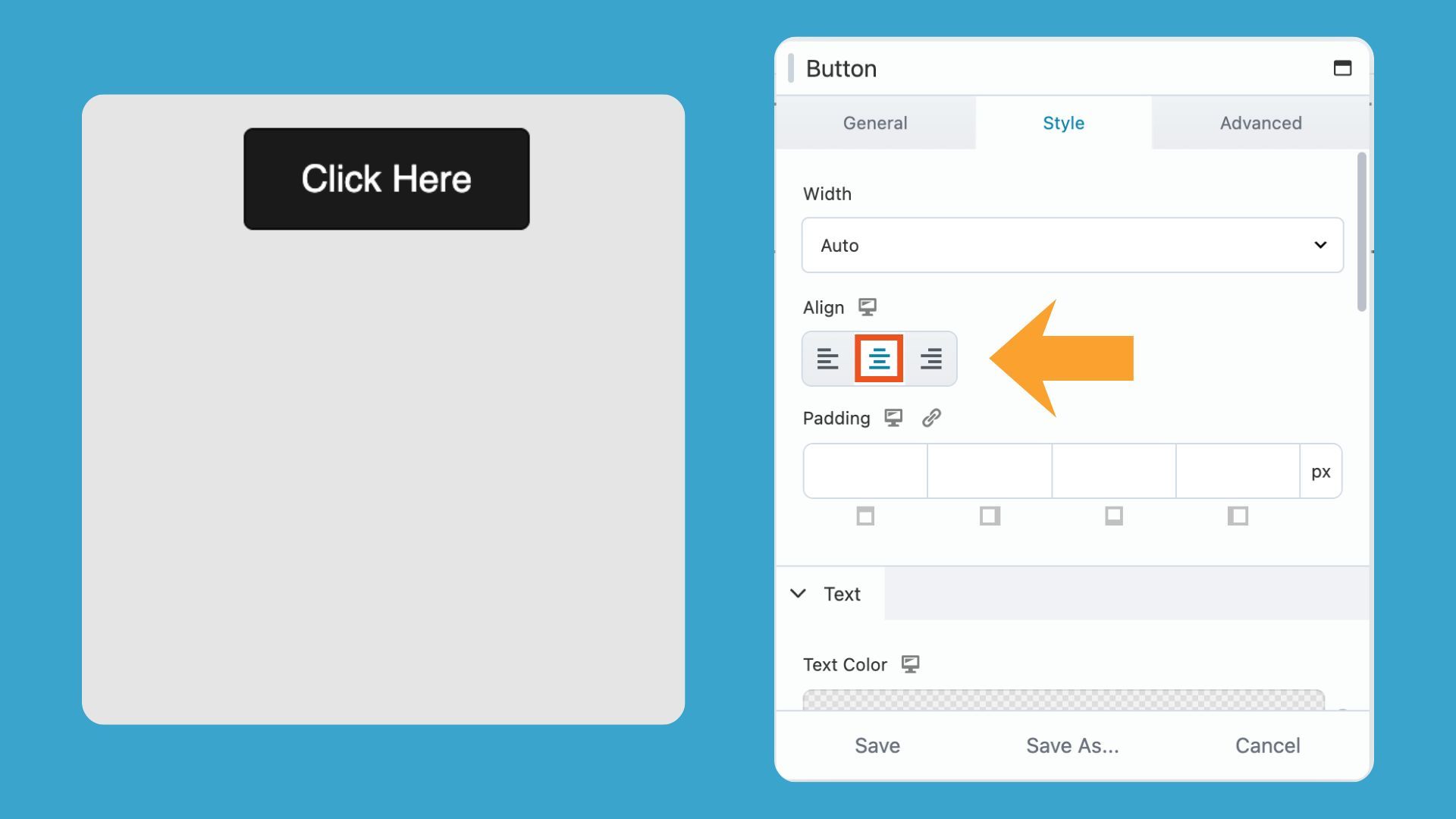
Many Beaver Builder modules handle centering on their own. Text, Heading, and Button modules all include an alignment option inside their settings, so you can center the content without touching your layout at all.
How do you center text, buttons, or other modules in Beaver Builder?
- Open the module settings
- Find the Align option
- Set it to Center
The content centers horizontally inside its container:
Limitations with this method
While this method is fast, it only works when the module itself supports alignment controls, and it does not handle:
- Vertical centering
- Grouping multiple modules together
- Complex layouts (cards, hero sections, multi-element rows)
Method 2: Center Content with Rows and Columns
Rows and columns in Beaver Builder provide basic alignment controls, but they work best for simple layouts.
How Rows and Columns Affect Centering
Rows and columns can influence how content appears centered, but they do so through layout structure.
You can adjust:
- Column widths
- Spacing and padding
- Overall row layout
These settings can help position content toward the center, but they don’t provide precise or consistent centering especially across different screen sizes.
Vertical alignment in Beaver Builder Rows and Columns
Rows and multi-column layouts include basic vertical alignment controls, allowing content to be positioned at the top, middle, or bottom.
Vertical Alignment in Rows
From the Row Style Tab, set Height to Default, Full Height or Minimum Height, and then set Vertical Alignment to Center:
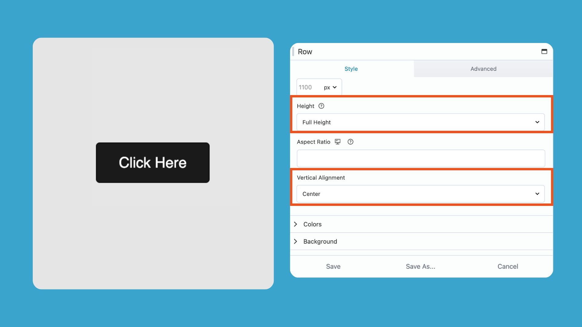
Note that when Height is set to Default, you must also set an Aspect Ratio to choose Vertical Alignment.
Vertical Alignment in Multiple Columns
From the Column Style Tab, set Equalize Heights to Yes, and Vertical Alignment to Center:
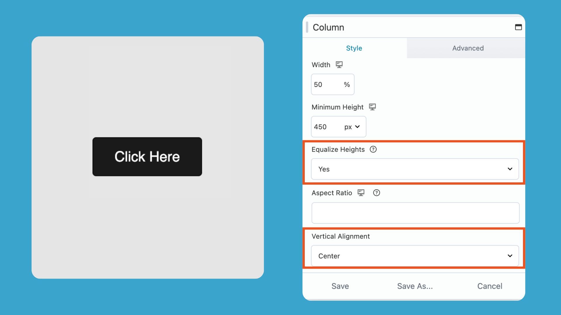
This sets all columns within the row to equal heights, which allows you to vertically align the content inside each column.
Limitations of Using Rows and Columns for Centering
While rows and columns can work for simple layouts, they are not designed for precise alignment control. Because of that:
- Horizontal centering often depends on structural layout choices (like empty columns or offsets)
- Vertical alignment can vary depending on row settings and screen size
- Responsive layouts may shift column behavior on tablet and mobile
- Fine-tuning often requires manual spacing adjustments
Rows and Columns are best for layout structure, but not as reliable for precise vertical and horizontal centering. For full alignment control, Flexbox is the better choice. Next, we’ll look at how using Beaver Builder’s Box Module solves these limitations.
Method 3: Center Anything with Flexbox (Box Module)
What is the best way to center content in Beaver Builder?
The most reliable way to center content in Beaver Builder is using the Box Module, which is built on Flexbox. Instead of manually adjusting margins or relying on columns, you can control alignment directly inside the module settings.
When both are set to center, your content is perfectly centered in both directions without needing margins, padding tricks, or manual adjustments.
How to center anything using Flexbox in Beaver Builder
Learn how to center text, buttons, images, and multiple elements in Beaver Builder using the Box Module with Flexbox controls. The following shows step-by-step how to align content horizontally and vertically without custom CSS.
Step 1: Add a Box Module
Add a Box Module to your page. Place your content inside the box module (this can be a button, image, text, or multiple modules).
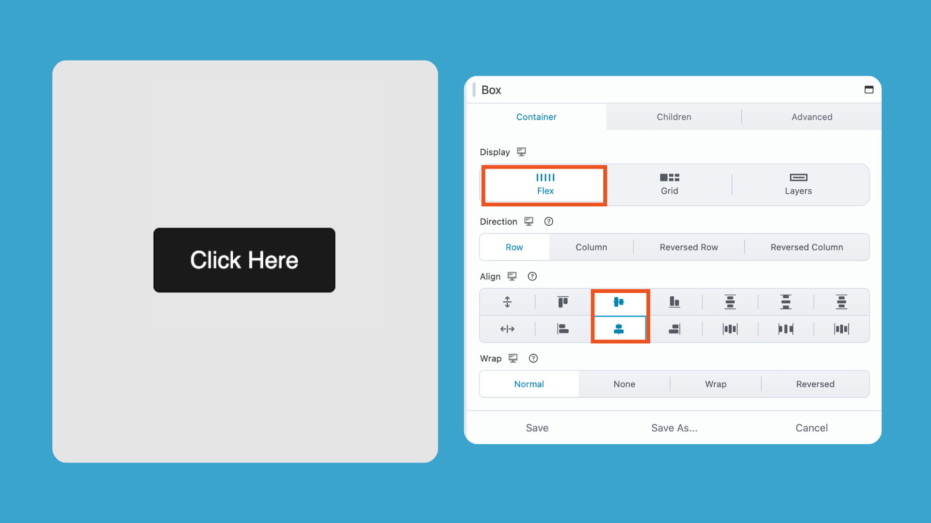
Step 2: Enable Flex Layout
In the Box Module settings, go to the Container tab and set:
Display → Flex
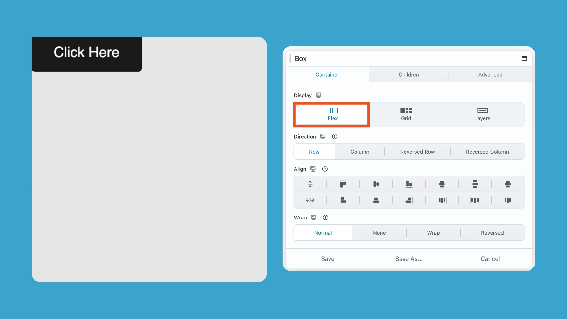
Step 3: Set Layout Direction
This controls how multiple items flow inside the container:
- Row → items sit side-by-side horizontally
- Column → items stack vertically (best for centered layouts like hero sections)
- Row Reverse → items flow in reverse horizontal order
- Column Reverse → items stack vertically in reverse order
Step 4: Align Content
Set alignment controls:
- Align → Center (Vertical)
- Align → Center (Horizontal)
This centers all content inside the Box Module on both axes:
When working with vertical alignment inside box module layouts, you may also run into situations where content needs to sit at the bottom of a container instead of the center.
In that case, see: How to Push Content to the Bottom of a Box in Beaver Builder
Why centering in WordPress gets confusing
Traditional page layouts rely on rows, columns, and manual spacing. That works well for structural layout, but can struggle with precise alignment.
Modern layout systems like Flexbox are designed for this. Beaver Builder’s Box Module gives you direct control over Flexbox, making it easy to center anything cleanly and consistently.
How This Fits Into a Faster Workflow
The bigger payoff comes when you start saving your centered layouts as templates. Build a hero section with a properly centered heading and CTA once, save it, and reuse it.. The alignment is already set. You’re just swapping content.
For more on that approach, see our guide on the Beaver Builder client site workflow.
Related Guides
- The Beaver Builder Box Module Guide
- How to Use the Box Module (Step by Step Video Tutorials)
- Build Faster Layouts in Beaver Builder: Skip the Rows and Columns
- How to Push Content to the Bottom of a Box in Beaver Builder (Flexbox Solution)
- Bento Grid Design in WordPress with Beaver Builder’s Box Module
- Struggling with CSS Grid? Turn This On In Beaver Builder
- 60+ New Box Module Templates for Faster WordPress Layouts
Frequently Asked Questions
You can center content in Beaver Builder using the following methods: module alignment (for simple text or buttons), column settings (for basic layout positioning), or the Box Module with Flexbox (for more precise horizontal and vertical centering).
To center multiple elements (like a heading + button), place them inside a Box Module and use Flexbox settings with Direction set to Column and alignment set to Center.
The most reliable method is using the Box Module with Flexbox enabled. It allows precise horizontal and vertical centering without using margins or padding.
Flexbox is a layout system used in the Box Module that controls how elements are aligned, spaced, and positioned inside a container.
2 Comments
Our Newsletter
Our newsletter is personally written and sent out about once a month. It's not the least bit annoying or spammy.
We promise.
Try Beaver Builder Today

Related articles
How to Fix Spacing Issues (Beaver Builder Box Module)
-
July 22, 2026
How to fix inconsistent spacing in Beaver Builder's Box Module? Go to Global Settings and enable "Apply to Box." This...
Beaver Builder Maintenance Mode: How to Set It Up
-
July 13, 2026
Beaver Builder Maintenance Mode helps you keep your website looking professional while you work behind the scenes. Whether you’re redesigning…
Beaver Builder 2.11: Popup Module, Maintenance Mode, and Settings Snapshots
-
July 7, 2026
Beaver Builder 2.11, also known as Kariba, is now available and delivers some exciting updates: a new Popup Module for…
Join the community
We're here for you
There's a thriving community of builders and we'd love for you to join us. Come by and show off a project, network, or ask a question.
Since 2014
Build Your Website in Minutes, Not Months
Join Over 1 Million+ Websites Powered By Beaver Builder.
Great breakdown of the three centering methods! I’ve been defaulting to row/column padding hacks for years, and switching to the Box Module with Flexbox made a noticeable difference especially for responsive layouts. The step-by-step for enabling Flex and setting alignment directions is exactly what I needed. Thanks for the clear comparison.
This is exactly the clarification I needed. I’ve been relying on row/column padding hacks for centering for years, and switching to the Box Module with Flexbox makes the whole process so much cleaner. The step-by-step breakdown of Direction vs. Align settings was especially helpful. That distinction is easy to overlook. Thanks for putting this together!