
How to Build Card Layouts in Beaver Builder (Flexbox + Box Module Tutorial)
 -
April 27, 2026
-
April 27, 2026
If you’re using the Beaver Builder Box Module to build responsive layouts, you’ve likely noticed two things: it’s incredibly powerful and it comes with a learning curve.
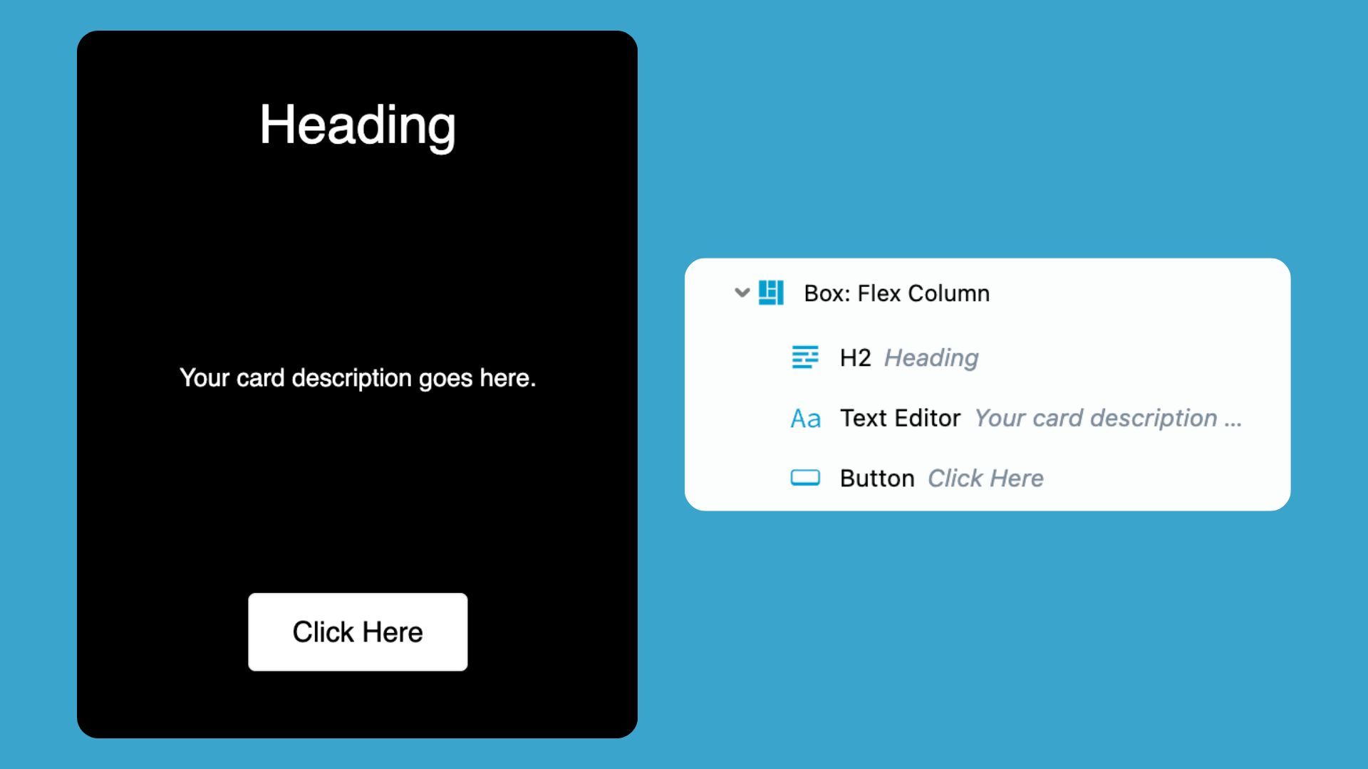
That’s exactly why we hosted a live Box Module training session focused on flexbox fundamentals and real-world card layout building. In this session, we built a responsive 3-card layout step-by-step and answered questions from the Beaver Builder community in real time.
Table of Contents
- Watch the Live Box Module Training (Flexbox + Card Layouts)
- Beaver Builder Box Module FAQs (Answered from the Live Training)
- Are there pre-made Box Module templates available?
- Do I need to use rows with the Box Module?
- When should I use the Box Module instead of rows and columns?
- What are flex grow and flex shrink?
- What are “children” in the Box Module?
- Is there a limit to how many Box Modules I can use?
- How does mobile responsiveness work when using the Box Module?
- What about Beaver Builder accessibility?
- Final Thoughts: Why the Box Module Matters
- Want More Live Trainings Like This?
This article highlights some of the key takeaways from that training along with the most common questions users asked so you can understand not just how the Box Module works, but why it works the way it does.
Watch the Live Box Module Training (Flexbox + Card Layouts)
In this live training, Leah Finch, Beaver Builder Content Marketer, demonstrates how to build modern card-based layouts using the Box Module and flexbox in Beaver Builder:
You’ll learn how to:
- Build a responsive 3-card layout from scratch
- Use the Outline Panel to manage complex structures
- Understand parent vs child container relationships
- Align content using flexbox principles
- Fix common layout issues (spacing, alignment, and stacking)
- Make layouts fully responsive across devices
Beaver Builder Box Module FAQs (Answered from the Live Training)
Below are the most common questions from the live session, along with answers to help you apply these concepts in your web design projects.
Are there pre-made Box Module templates available?
Beaver Builder provides several ways to get started quickly with pre-designed Box Module layouts:
- Pre-built modules such as callouts and bento-style layouts
- Layout examples inside the Box Module course library
- Full-site templates available through Assistant Pro
These templates are especially useful when learning how flexbox-based structures behave in real designs:
Do I need to use rows with the Box Module?
You do not need to use rows with the Box Module. This is because the Box Module is a container that works inside rows or as a standalone layout system. You can use it either way depending on what the design calls for. That flexibility is a big part of what makes it more useful than traditional rows and columns for complex builds.
When should I use the Box Module instead of rows and columns?
Rows and columns are ideal for basic page structure. The Box Module handles layout control and is the better choice when you need:
- Complex or nested layouts
- Flexible spacing and alignment control
- Advanced responsive behavior
Here is a simple rule of thumb:
- Rows and columns = layout structure
- Box Module = layout control and flexibility
You might also like to read this article: Build Faster Layouts in Beaver Builder: Skip the Rows and Columns
What are flex grow and flex shrink?
Flex grow and flex shrink are core flexbox properties that control how elements behave inside a container.
- Flex grow determines how much an item expands to fill available space
- Flex shrink determines how much an item reduces when space is limited
For example, in a Box Module card layout:
- If all cards have equal grow values, they share space evenly
- If one card has a higher grow value, it becomes larger relative to the others
Together, these properties make it possible to build flexible, responsive card layouts without relying on fixed widths.
What are “children” in the Box Module?
A “child” refers to any Box Module nested inside another Box Module. The outer container is the parent, and the nested container is the child. You can manage all child items together using the Children tab in the parent container.
You can override these settings for a specific child by opening that child’s own Box Module settings panel.
This parent-child structure is key to building responsive card layouts in Beaver Builder, where each card typically acts as a child container inside a parent row.
Is there a limit to how many Box Modules I can use?
There is no strict limit on how many Box Modules you can use in your layout, but as your design becomes more complex, organization becomes critical.
That’s where the Outline Panel comes in:
- Quickly navigate deeply nested structures
- Rename and label containers
- Maintain clarity in large layouts
For advanced builds, the Outline Panel is one of the most important tools for keeping your workflow efficient and your layouts easy to manage.
How does mobile responsiveness work when using the Box Module?
The box module makes it easier to build responsive layouts for mobile devices. In the live training, we demonstrated how to:
- Switch layout direction from row → column
- Adjust spacing for smaller screens
- Stack card layouts for mobile devices
For example, a horizontal 3-card layout on desktop can automatically transform into a vertical stacked layout on mobile with just a simple setting change.
What about Beaver Builder accessibility?
Accessibility is an important part of modern web design, and it goes deeper than what’s covered in this Box Module training. We covered Beaver Builder Accessibility in a previous training with accessibility expert Amber Hines. Watch our free 5-part video series here: Beaver Builder Accessibility Best Practices
Final Thoughts: Why the Box Module Matters
The Box Module is often considered an advanced feature in Beaver Builder, but it unlocks a much more modern way of thinking about layout design.
Instead of relying on rigid rows and columns, you gain access to a flexbox-based system that allows you to:
- Build responsive card layouts with precision
- Control spacing and alignment at a granular level
- Create reusable, scalable design systems
- Adapt layouts naturally across devices
Once you understand how flexbox works inside the Box Module, it quickly becomes one of the most powerful tools in your Beaver Builder workflow.
Want More Live Trainings Like This?
We’re planning more live trainings based on real questions from the Beaver Builder community. If this session was helpful, let us know what you’d like to see next.
And if you haven’t already, be sure to watch the replay and build your own card layouts using the Box Module and flexbox principles covered in this training.
1 Comment
Our Newsletter
Our newsletter is personally written and sent out about once a month. It's not the least bit annoying or spammy.
We promise.
Try Beaver Builder Today

Related articles

Beaver Builder AI: Build WordPress Layouts with AI (Now in Alpha)
 -
June 10, 2026
-
June 10, 2026
Hey everyone! Big news. After a long time of building behind the scenes, Beaver Builder AI is here. The alpha…
How Beaver Builder Products Work Together to Build Flexible WordPress Websites
-
May 21, 2026
Building a WordPress website often means stitching together a theme from one developer, a page builder from another, and a…

From Azeroth to WordPress: How Warcraft Tavern Uses Beaver Builder
 -
May 19, 2026
-
May 19, 2026
Since releasing Beaver Builder 12 years ago, a feeling will come up from time to time that just never gets…
Join the community
We're here for you
There's a thriving community of builders and we'd love for you to join us. Come by and show off a project, network, or ask a question.
Since 2014
Build Your Website in Minutes, Not Months
Join Over 1 Million+ Websites Powered By Beaver Builder.
Helpful walkthrough! Card layouts make content look clean and organized, and your step-by-step approach with Beaver Builder makes it much easier for beginners to design professional-looking pages without coding. Great resource for improving website design.