
Are you ready to take your website design to the next level and unleash your creativity? Beaver Builder’s Box module is here to help you take your website design to new heights!
The Box module is a powerful tool within Beaver Builder’s page builder that enables you to add customizable containers to your website. With the support of Flexbox, CSS Grid, and Layers, you can tailor your layouts to suit your design needs, whether you’re looking to highlight important content, showcase products or services, or simply add visual interest to your pages.
Whether you’re a seasoned web designer or just starting out, the Box module offers endless possibilities for creating stunning and dynamic layouts. Say goodbye to cookie-cutter websites and hello to customizable designs that help you to showcase your skills and wow your clients.
In this blog post, we’ll explore the versatility and creative potential of the Box module, revealing how it can level up your web design projects.
Table of Contents:
- What is the Box Module?
- Flexbox vs CSS Grid
- When to Use Flexbox?
- When to Use CSS Grid?
- Box Module Usage Examples
- How to Add The Box Module
- Get Started Quickly with Box Module Presets
- Box Module Container Settings
- Conclusion
What is the Box Module?
The Box module functions much like a row or column, serving as a container. It utilizes either flexbox or CSS grid, allowing you to create complex, fluid, and flexible layouts. You can nest, stack, and organize boxes in both horizontal and vertical orientations, as well as in a grid to create complex structures:
Flexbox and CSS Grid, two distinct CSS layout models, play pivotal roles in shaping the Box module’s functionality:
- Flexbox is best for one-dimensional layouts, where items need to be arranged in a row or a column with flexibility in sizing and alignment.
- CSS Grid is suitable for two-dimensional layouts, offering precise control over both rows and columns, allowing for more intricate designs.
As of Beaver Builder 2.8, Box allows you to add customizable containers to your website with ease. Whether you’re highlighting important content, showcasing products or services, or simply adding visual interest to your pages, the Box module offers endless possibilities for creativity.
Box Module Key Features and Benefits
- Customizable Design: With the Box module, you have full control over the appearance and styling of your containers. From adjusting colors and borders to adding linking to the entire box, the possibilities are endless.
- Versatility: Whether you’re a seasoned designer or a novice, the Box module offers versatility and ease of use. With its intuitive interface, you can create stunning designs without any coding knowledge.
- Responsive Design: Worried about how your containers will look on different devices? The Box module is designed to ensure that your designs are responsive and look great on all screen sizes.
- Seamless Integration: The Box module seamlessly integrates with other Beaver Builder modules, allowing you to create cohesive and visually appealing layouts for your website.
All users of our page builder, including the Lite version, will have access to advanced Flex, Grid, and Layers options within the Box Module. Next, we will take a look at the key differences between Flexbox and Grid.
Flexbox vs CSS Grid
Flexbox and CSS Grid are both layout models in CSS, but they serve different purposes and have distinct characteristics:
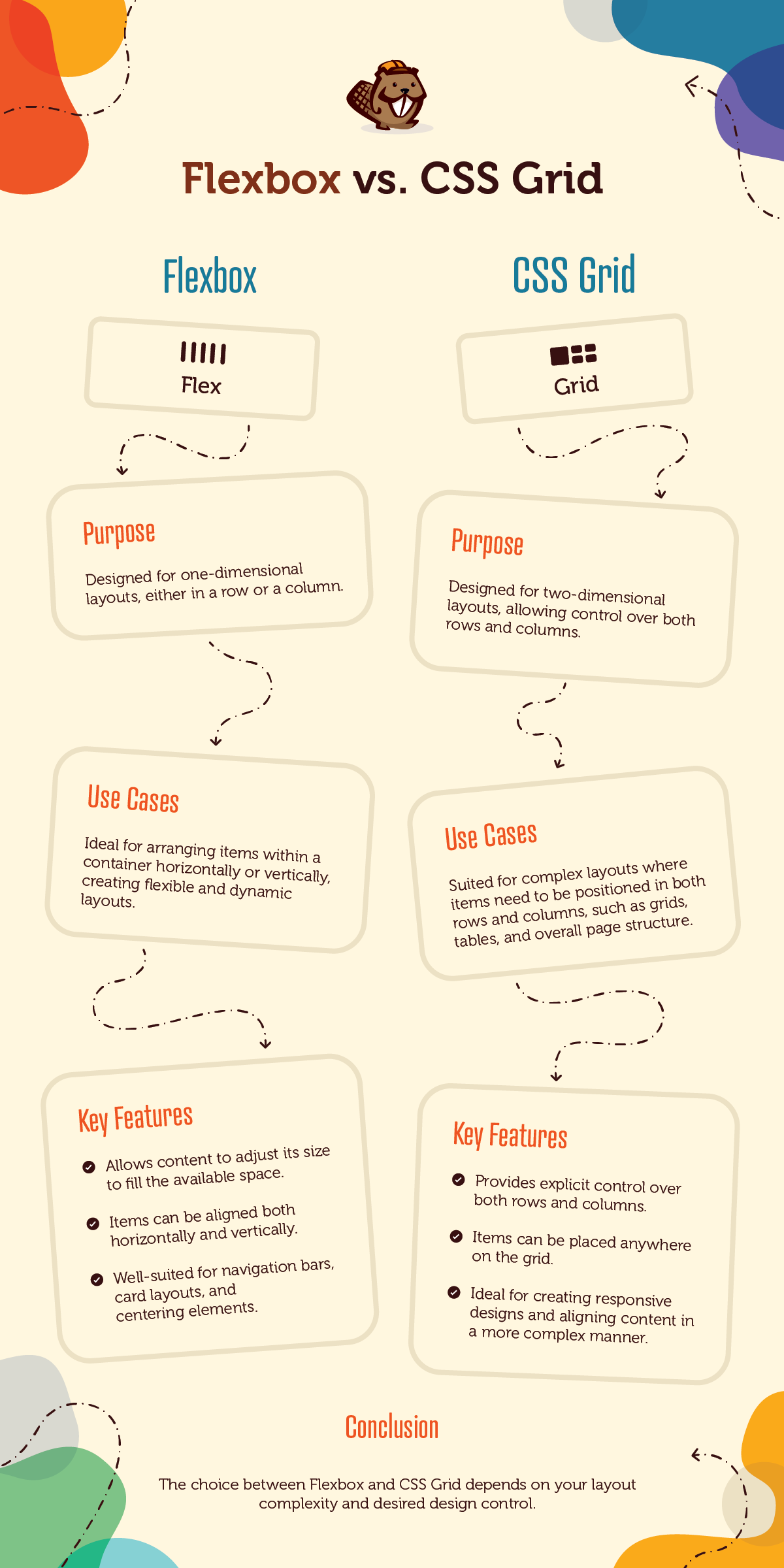
- Flexbox:
- Purpose: Designed for one-dimensional layouts, either in a row or a column.
- Use Cases: Ideal for arranging items within a container horizontally or vertically, creating flexible and dynamic layouts.
- Key Features:
- Allows content to adjust its size to fill the available space.
- Items can be aligned both horizontally and vertically.
- Well-suited for navigation bars, card layouts, and centering elements.
- CSS Grid:
- Purpose: Designed for two-dimensional layouts, allowing control over both rows and columns.
- Use Cases: Suited for complex layouts where items need to be positioned in both rows and columns, such as grids, tables, and overall page structure.
- Key Features:
- Provides explicit control over both rows and columns.
- Items can be placed anywhere on the grid.
- Ideal for creating responsive designs and aligning content in a more complex manner.
Moreover, these layout models often work hand in hand to produce comprehensive layout solutions. For instance, flexbox can be seamlessly integrated within individual grid items to manage their internal structure, leveraging the combined benefits of both models for optimal design outcomes.
When to use Flexbox?
Flexbox, short for Flexible Box Layout, is a game-changer in the world of web design. It’s a powerful CSS layout model that makes arranging elements on a webpage a breeze. Imagine you’re building a website and you want to align some boxes horizontally or vertically. With Flexbox, you can do that easily.
Flexbox lets you control the layout of elements within a container in one direction—either vertically or horizontally. So, whether you’re building a navigation bar, a gallery of images, or a list of items, Flexbox gives you the tools to arrange them exactly how you want:
Typically, Flexbox properties are applied to the parent element, affecting how its children are positioned. But the best part is, each child can have its own layout rules, giving you incredible flexibility and control over your design.
With Flexbox, you can customize the spacing between elements, control how they wrap onto new lines, and even adjust their alignment and justification within the container. It’s like having a magic wand for web layout!
To really understand Flexbox, it’s important to grasp the concept of the “flex” property. This property determines how much space each element takes up in relation to the others. So, whether you want one element to grow and take up more space, or shrink to fit its content, Flexbox has got you covered.
When to use CSS Grid?
CSS Grid is another powerful layout system in CSS that revolutionizes the way web designers structure and organize web content. Unlike traditional layout methods such as floats or positioning, CSS Grid allows for the creation of two-dimensional grid-based layouts with precision and flexibility.
With CSS Grid, designers can define rows and columns and then place elements within these defined areas, providing granular control over the layout, alignment, and spacing of the content:
One of the key advantages of CSS Grid is its ability to handle complex layouts with ease. Whether designing multi-column websites, grid-based galleries, or responsive web applications, CSS Grid offers a versatile solution for structuring content in a visually appealing manner.
Additionally, CSS Grid simplifies the process of creating responsive designs by allowing designers to define how grid items respond to different viewport sizes, making it easier to create layouts that adapt seamlessly to various devices and screen resolutions.
CSS Grid is particularly useful when building modern, responsive websites that require intricate layouts and precise control over design elements. It is an excellent choice for projects where flexibility, scalability, and maintainability are paramount.
Box Module Usage Examples
The Box module opens up a world of creative possibilities for designers. Here are some examples of how this module can be utilized to enhance your website layouts:
- Effortless Centering: Achieve perfect alignment by effortlessly centering content both vertically and horizontally within your boxes, creating visually appealing and balanced layouts.
- Nested Box Layouts: Dive into the world of intricate design by nesting boxes within boxes, allowing for the creation of complex and dynamic layouts.
- Responsive Grids: Design responsive grid layouts that automatically adjust to different screen sizes, ensuring a seamless and optimized user experience across devices.
- Grid-based Structures: Utilize the Box module to craft sophisticated grid-based layouts that serve as the foundation for your entire webpage, providing structure and clarity to your content.
- Card Layouts: Get creative with your content presentation by leveraging the Link option in the Box module to create sleek and modern card layouts that enhance user engagement and readability.
- Effortless Stacking: Easily stack modules on top of each other without the need for custom CSS, streamlining your design process and ensuring seamless integration of content elements.
How to Add the Box Module
Ready to start using the Box module in your web design projects? Here’s a quick guide to help you get started:
1. Access the Box Module
Launch Beaver Builder on the page where you’d like to add the box module. Click on the “+” icon to open the Content Panel, then select the Box module and drag it to the desired location on the page. Alternatively, you can choose a module alias to get started quickly.
Note that the Box module should be placed inside a row. If you try to drag the Box module onto the page without first placing it inside a row, a row will be automatically created for you.
2. Customize Your Layout
Once you’ve added the Box module, you can start customizing it to suit your needs. Experiment with different displays, Flex, Grid, or Layers, until you achieve the desired layout.
3. Add Content
Next, add content to your box(es). This could include text, images, buttons, or even another box module.
To nest boxes within boxes, simply drag a Box module into another Box module. This makes it easy to create intricate layouts. Moreover, you can seamlessly combine both flexbox and CSS grid to design sophisticated layouts.
4. Preview and Publish
Finally, preview your design to ensure everything looks exactly how you want it. Once you’re satisfied, hit the publish button to make your changes live on your website.
Get Started Quickly With Box Module Presets
Along with the Box Module itself, you will notice that we have added the following Module Aliases that can be used to help you get started quickly:
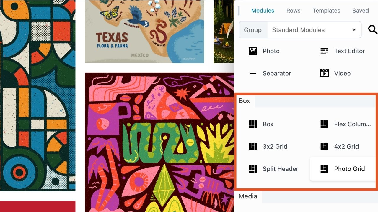
- Flex Columns: This preset creates a horizontal row of three flex boxes situated within the parent box.
- 3×2 Grid: A layout structure using grid boxes consisting of three columns and two rows inside the parent box.
- 4×2 Grid: A layout structure of grid boxes consisting of four columns and two rows within the parent box.
- Split Header: This structure is a grid defining 3 columns with a centralized photo module and menu modules on either side.
- Photo Grid: This layout is made up of a 4×3 grid and photo modules.
While we aim to make the Box module as user-friendly as possible, we strongly recommend having a solid grasp of Flexbox and CSS Grid. Our hope is that you will find Module Aliases provide a convenient shortcut for quickly building layouts using the Box Modules on the page.
Box Module Container Settings
When it comes to crafting captivating website layouts, the Box module offers a wealth of versatile container settings that empower designers to control display, alignment, and spacing with precision. Let’s dive into the key features and settings of the Box module’s container options:
Display Options
The Box module provides three distinct display types: Flex, Grid, and Layers, each offering unique advantages for layout customization. While Flex excels in one-dimensional layouts, Grid offers precise control over rows and columns, and Layers enable layered designs for enhanced visual appeal.
Note that your Box Module’s settings options will change depending on what type of display you have selected:
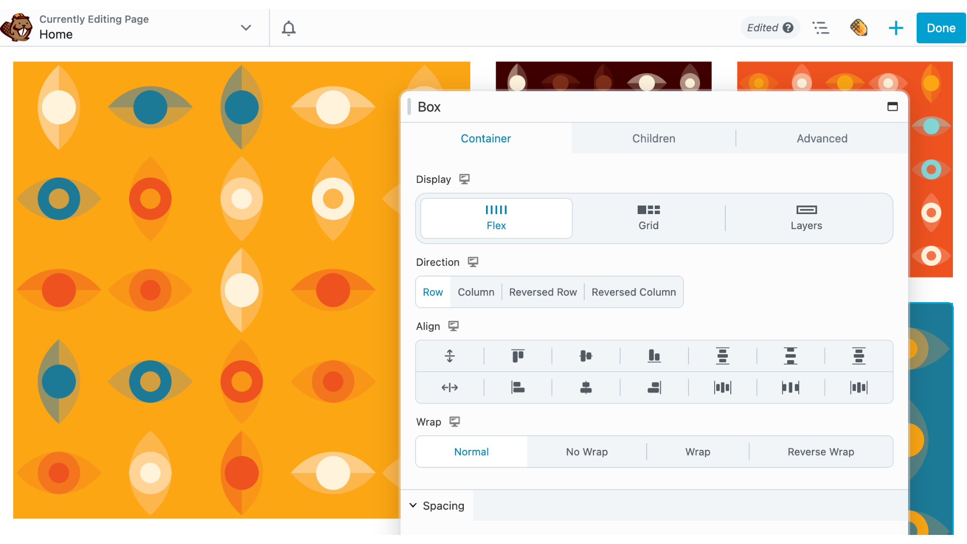
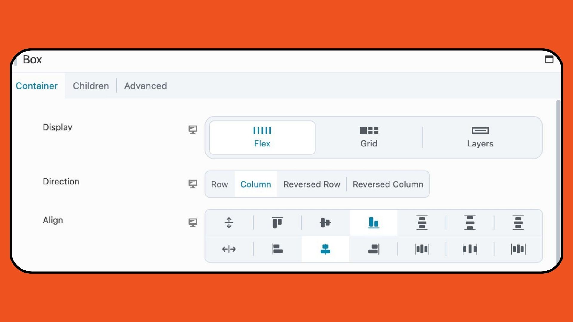
Flex Display
With the Flex option, designers can organize items within a box either horizontally or vertically, leveraging CSS Flexbox for flexible sizing and alignment. The Direction, Align, and Wrap settings further enhance layout control, ensuring seamless arrangement of content elements:
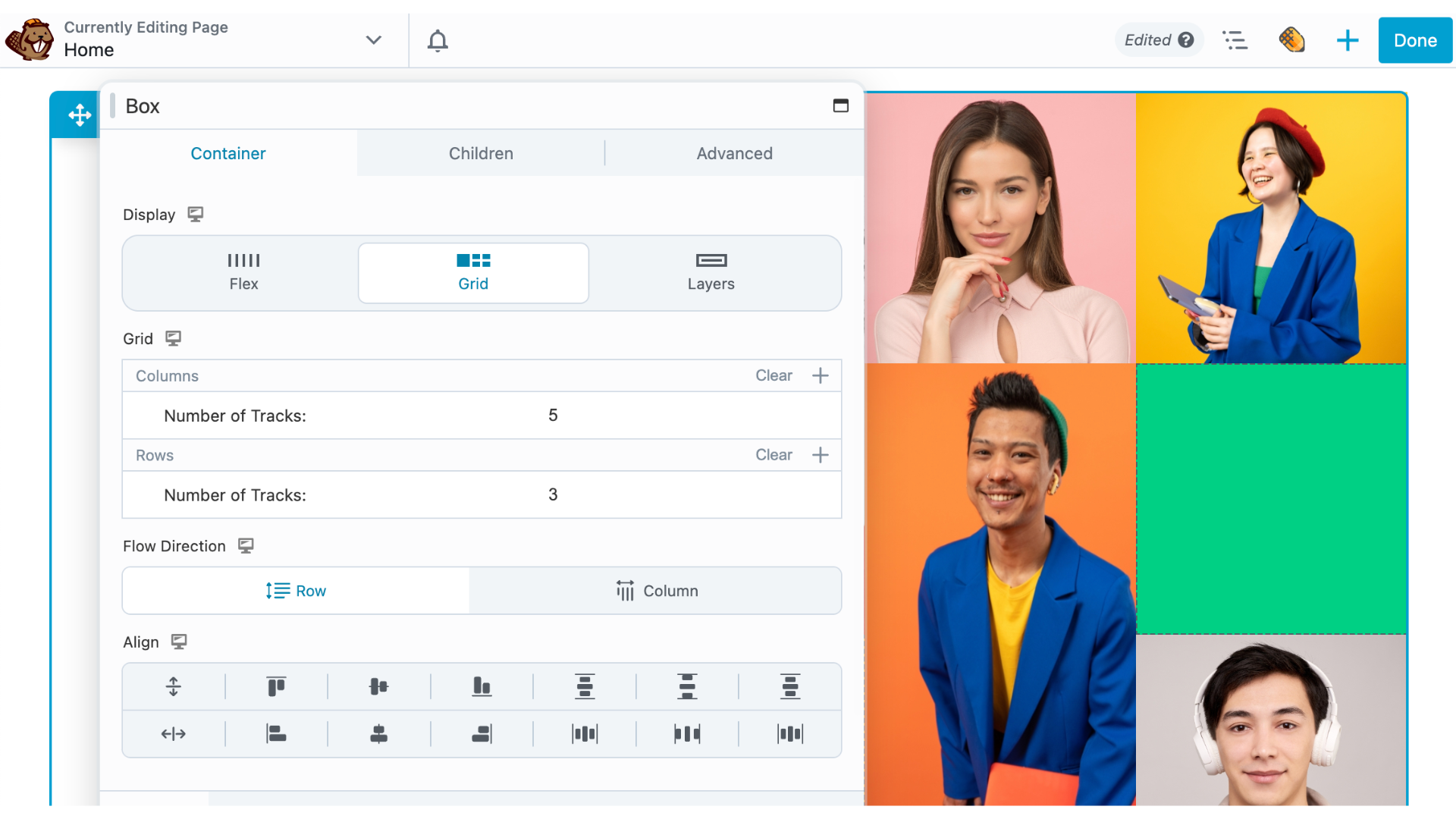
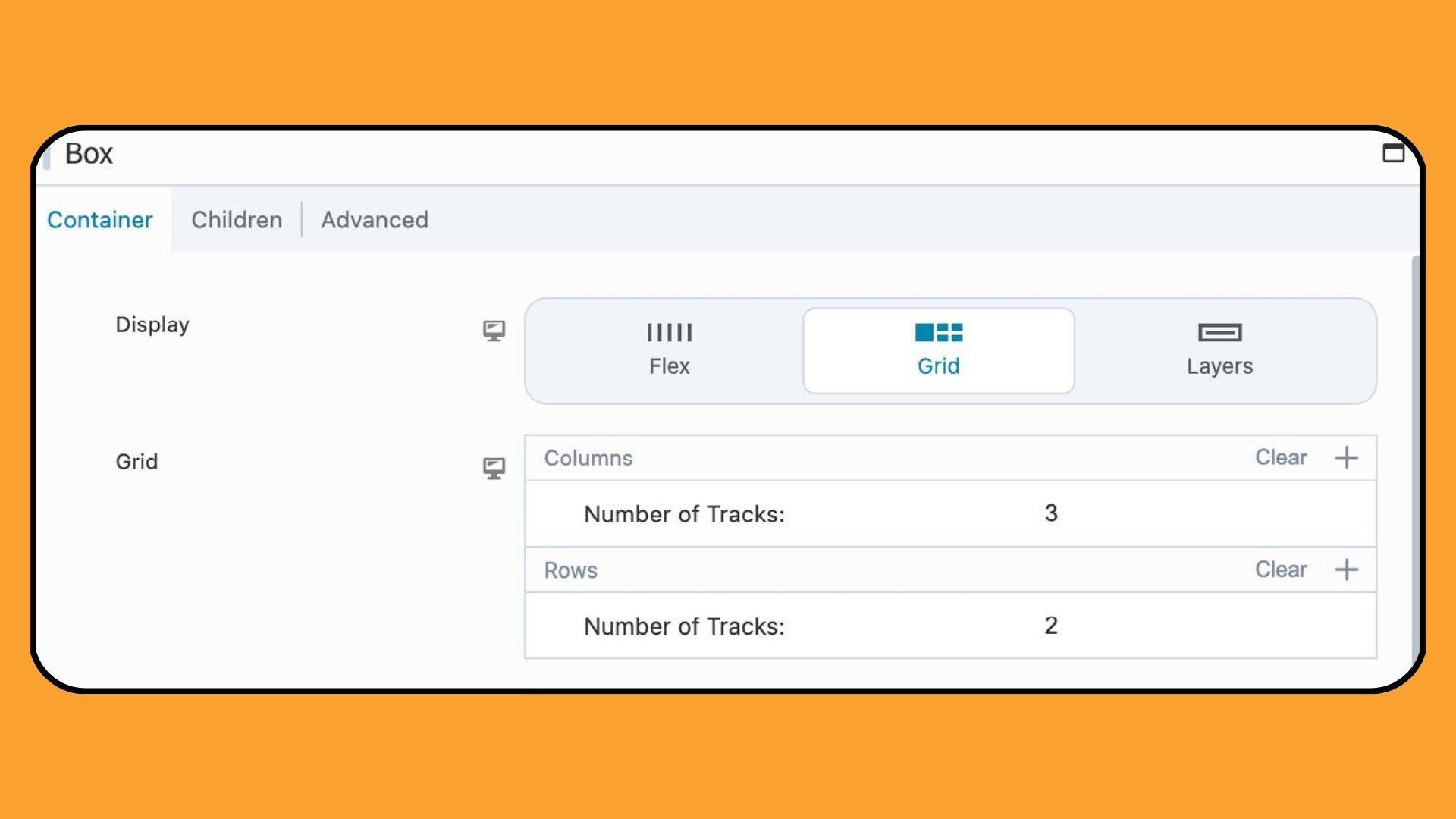
Grid Display
Utilizing CSS Grid, the Grid option facilitates intricate grid-based layouts with customizable rows and columns. Designers can specify the number of tracks, adjust flow direction, and fine-tune alignment for pixel-perfect designs that captivate and engage visitors:
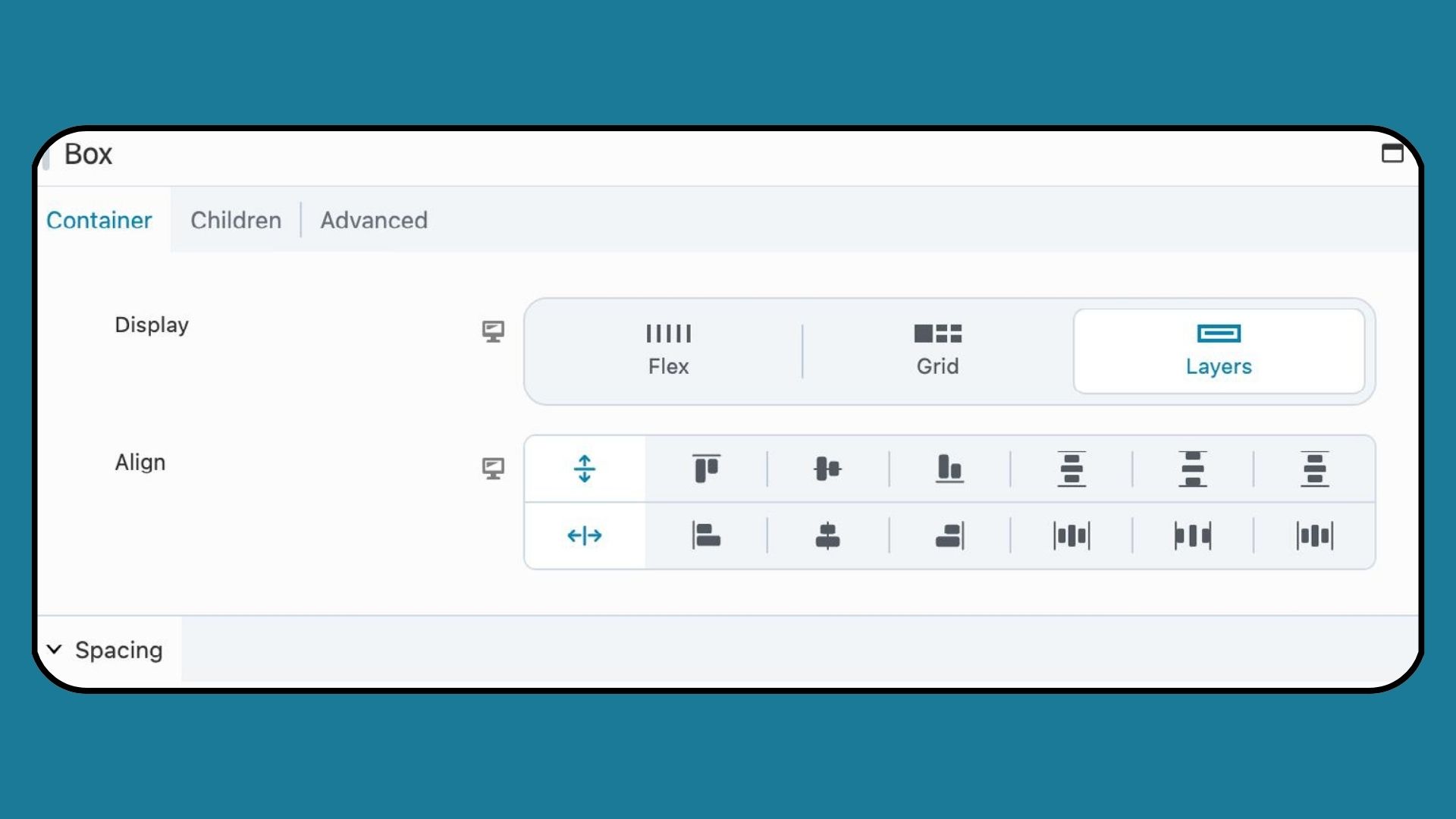
Layers Display
For layered layouts, the Layers option allows items within a box to be organized in a stacked format, ideal for adding text overlays or visual elements to images. By adjusting alignment settings, designers can achieve optimal placement for a polished and professional look:
Universal Settings
The next four Container Tab sections, Spacing, Sizing & Placement, Appearance, and Linking, are universal settings applicable to every Box display type:
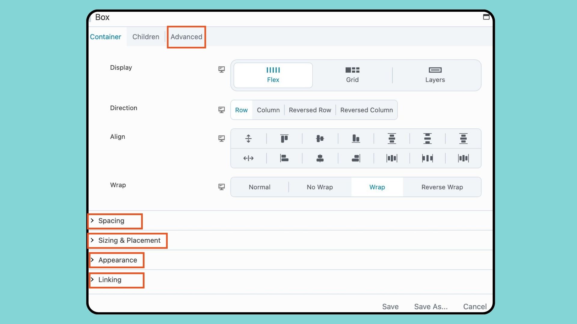
Note that all Advanced Tab settings are also the same for every display type.
Spacing and Sizing & Placement
Fine-tuning spacing and sizing is made simple with the Box module’s comprehensive settings. From controlling the gap between items with Flex and Grid layouts to specifying aspect ratio, padding, and width/height, designers have full control over the visual presentation of their content.
Appearance and Linking
Enhancing the visual appeal of boxes is effortless with customizable text color, background color, border, and box shadow settings. Additionally, designers can add links to boxes for seamless navigation, making it easy to create interactive card layouts that elevate user experience.
What’s Next? Learn How to Use the Box Module
The Box Module gives you complete control over your layouts, letting you create designs that are precise, flexible, and visually striking. No matter your experience level, mastering it can elevate your website from blogs to e-commerce to corporate sites.
Explore More Beaver Builder Box Module Articles:
- How to Use the Box Module (Step by Step Video Tutorials)
- Build Faster Layouts in Beaver Builder: Skip the Rows and Columns
- How to Center Content in Beaver Builder (Flexbox Guide)
- How to Push Content to the Bottom of a Box in Beaver Builder (Flexbox Solution)
- Bento Grid Design in WordPress with Beaver Builder’s Box Module
- Struggling with CSS Grid? Turn This On In Beaver Builder
- 60+ New Box Module Templates for Faster WordPress Layouts
Related Questions
Flexbox allows you to arrange and align elements within a container, regardless of their size or potential changes. The flexible nature of a flex container ensures that flex elements expand to fill available space and shrink to avoid overflow when necessary.
You can mix CSS Grid and Flexbox within the same layout to leverage their respective strengths for different parts of the design. For example, you might use CSS Grid to create the overall structure of your layout, and then use Flexbox within specific grid items to control the alignment and distribution of content within those areas. This combination allows for greater flexibility and precision in designing complex layouts.
Flexbox is versatile for most layout scenarios, but it’s not ideal for complex grid layouts or bidirectional layouts. Consider using CSS Grid for advanced grid control or when dealing with dynamic content. Additionally, be mindful of browser compatibility and performance considerations when deciding whether to use Flexbox for your layout needs.
You can center content vertically and horizontally by setting the Box Module to Display: Flex, choosing the appropriate Direction (row or column), and adjusting Justify Content and Align Items settings. Aspect ratios or min-height settings can help maintain responsive centering.
Rows and Columns are structural layout elements, but they have limited control over item alignment and spacing. The Box Module provides full Flexbox and Grid control, giving you precise layout flexibility inside any container.
6 Comments
Our Newsletter
Our newsletter is personally written and sent out about once a month. It's not the least bit annoying or spammy.
We promise.
Try Beaver Builder Today

Related articles
Beaver Builder AI: Build WordPress Layouts with AI (Now in Alpha)
 -
June 10, 2026
-
June 10, 2026
Hey everyone! Big news. After a long time of building behind the scenes, Beaver Builder AI is here. The alpha…
How Beaver Builder Products Work Together to Build Flexible WordPress Websites
 -
May 21, 2026
-
May 21, 2026
Building a WordPress website often means stitching together a theme from one developer, a page builder from another, and a…

From Azeroth to WordPress: How Warcraft Tavern Uses Beaver Builder
 -
May 19, 2026
-
May 19, 2026
Since releasing Beaver Builder 12 years ago, a feeling will come up from time to time that just never gets…
Join the community
We're here for you
There's a thriving community of builders and we'd love for you to join us. Come by and show off a project, network, or ask a question.
Since 2014
Build Your Website in Minutes, Not Months
Join Over 1 Million+ Websites Powered By Beaver Builder.
This looks like a cool idea, but you’re going to need to provide a much more in depth guide for how to use the box module.
I just installed beaver 2.8 and the box module is incomprehensible even with the couple of videos available.
Interesting! Thank you for all the info!
Hello Jennifer,
I just finished reading your insightful piece on the Beaver Builder Box Module, and I’m genuinely impressed by the depth of information provided. The way you’ve broken down the module’s capabilities, especially its integration with Flexbox and CSS Grid, offers a clear understanding of how it can be utilized to create more dynamic and responsive designs. Your detailed exploration into the module’s features, such as customizable design, versatility, and responsive design capabilities, highlights its potential to revolutionize web design projects.
I’m particularly intrigued by the examples you’ve provided on using the Box Module for various design scenarios. It’s clear that this tool offers a significant advantage for designers looking to push the boundaries of creativity and efficiency.
Given the comprehensive nature of your review, I’m curious about your personal experience with the Box Module in practice. Have you encountered any challenges or limitations when using it for complex web design projects? And how does it compare to other design tools you’ve used in terms of user-friendliness and functionality?
Thank you for sharing such a valuable resource. Your review has certainly piqued my interest in exploring the Box Module further.
Thank you!
Thank you so much for that useful information. Appreciate it!!!
Fantastic read! Can we effectively combine Flexbox and CSS Grid within the Box module for creating dynamic and visually appealing layouts? Thanks Jennifer.
Yes! You can. 🙂