
We are thrilled to announce the latest update to Beaver Builder, version 2.8, which introduces an exciting new feature – Global Styles.
Global Styles provides you with the capability to define your styling preferences for elements and colors within the Beaver Builder page builder. These global styles are then made available throughout your entire website, enhancing your web design workflow.
In this article, we’ll take a closer look at what Global Styles has to offer. Then, we’ll show you how to use Global Colors to elevate your web design experience.
Table of Contents:
What Are Global Styles?
Global Styles is a powerful new feature in Beaver Builder 2.8 that allows you to set styling preferences for elements and colors across your Beaver Builder layouts.
You get the flexibility to customize your website design to match your design preferences. Whether you prefer a clean and minimalist look or a bold and vibrant style, Global Styles allows you to tailor the look and feel of your website with ease.
With just a few clicks, you can set your preferred styling for text, headings, links, buttons, and colors, ensuring a cohesive and professional look throughout your site:
This exclusive feature, available only in the premium version of Beaver Builder’s page builder, grants you the flexibility to customize elements and colors effortlessly within Beaver Builder:
- Global Elements – Set styles for various html elements that are controlled by Beaver Builder such as Text, Headings, Links, and Buttons.
- Global Colors – Establish a cohesive color palette accessible throughout Beaver Builder, simplifying color selection in Global Styles and other color pickers.
No more manually adjusting styles for each element on every page – Global Styles simplifies the design workflow, allowing you to focus on creativity while maintaining consistency across your website.
How Do I Set Global Styles in Beaver Builder?
One of the key benefits of Global Styles is how it streamlines the design process. Instead of manually adjusting styles for each element on every page, Global Styles allows you to set your preferences once and apply them globally.
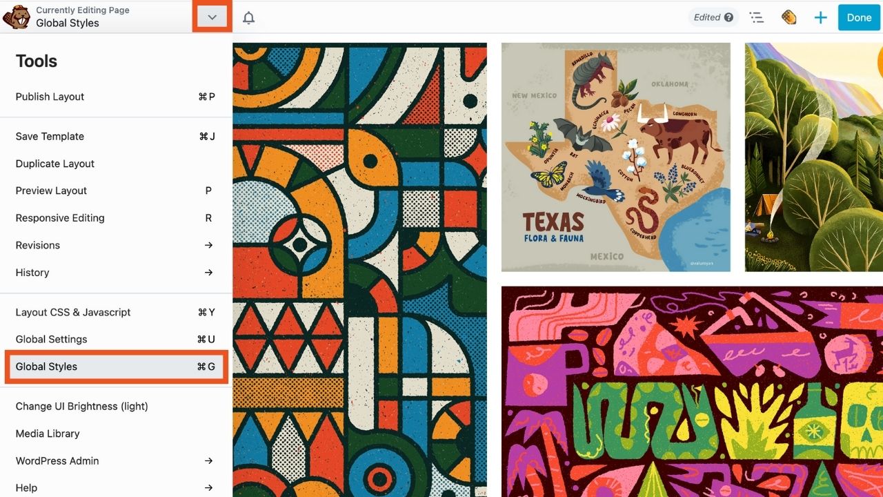
To set Global Styles within Beaver Builder, click Launch Beaver Builder to open up the Beaver Builder editor.
Next, navigate to the Tools menu, found by clicking the arrow in the Top Bar in the upper left corner of your editing screen. Scroll down and select “Global Styles” from the list:
This will open the Global Styles settings popup box:
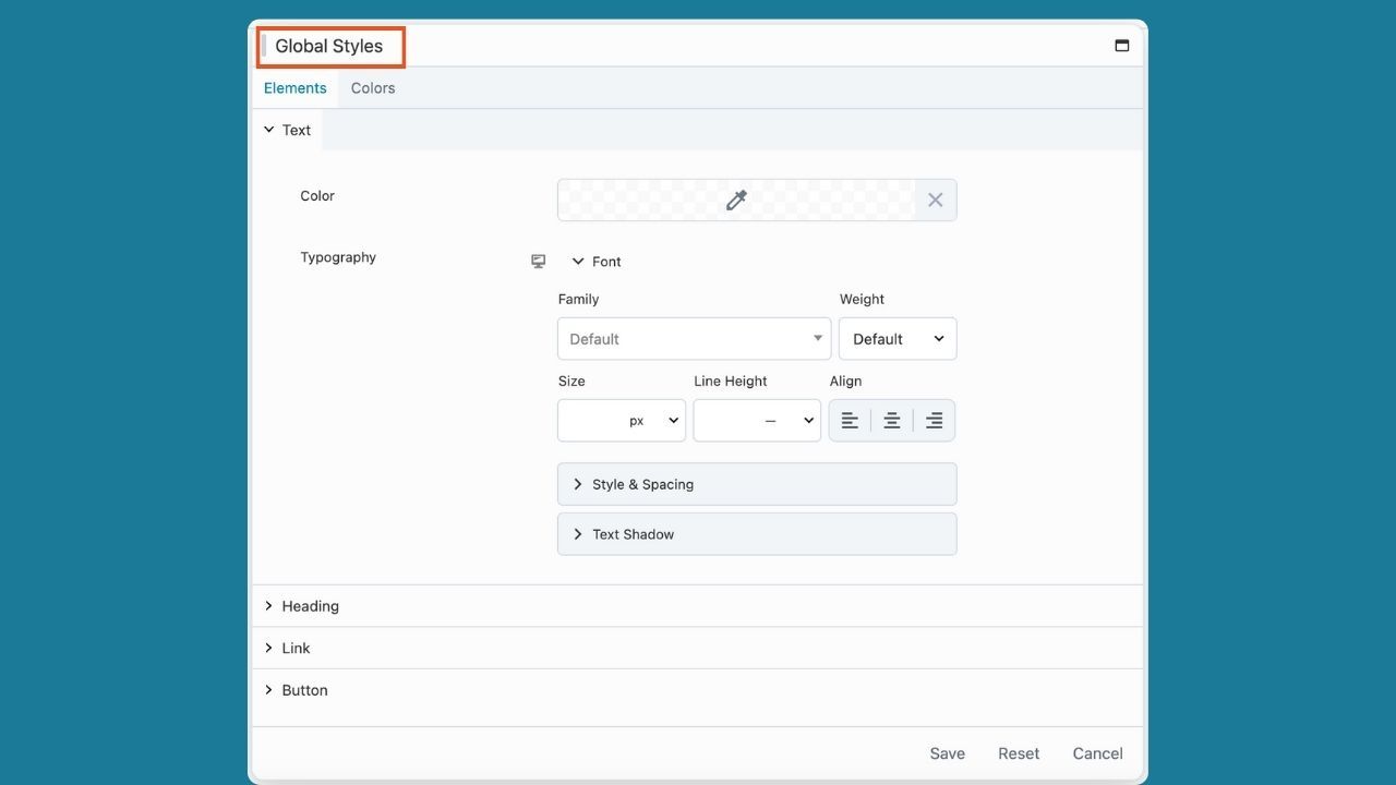
Let’s take a look at how you can use these style settings, Elements and Colors, to customize your site design.
Step 1. Set Global Elements
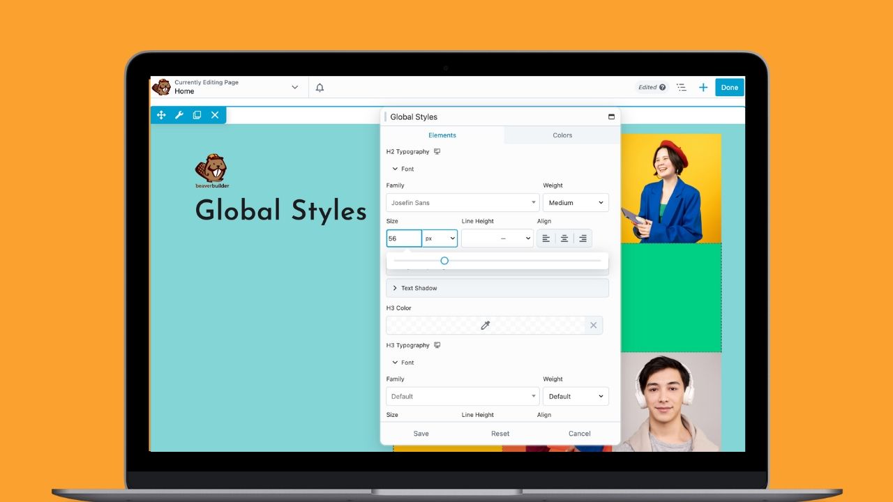
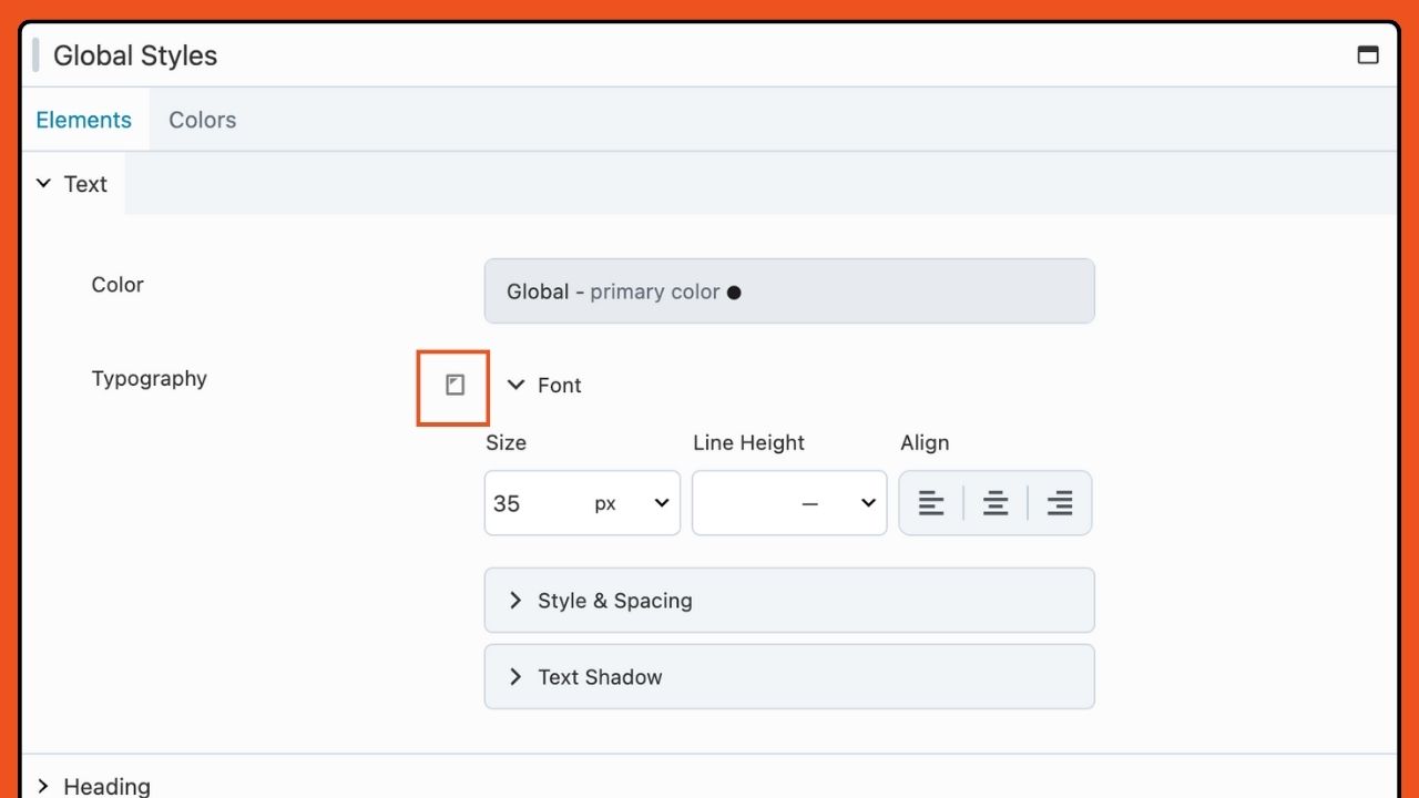
First, let’s explore the Elements tab. Here you can set up global styles for elements like text, headings, links, and buttons. The available styling options consist of a color picker, typography settings, and for buttons, there are choices for borders and radius adjustments.
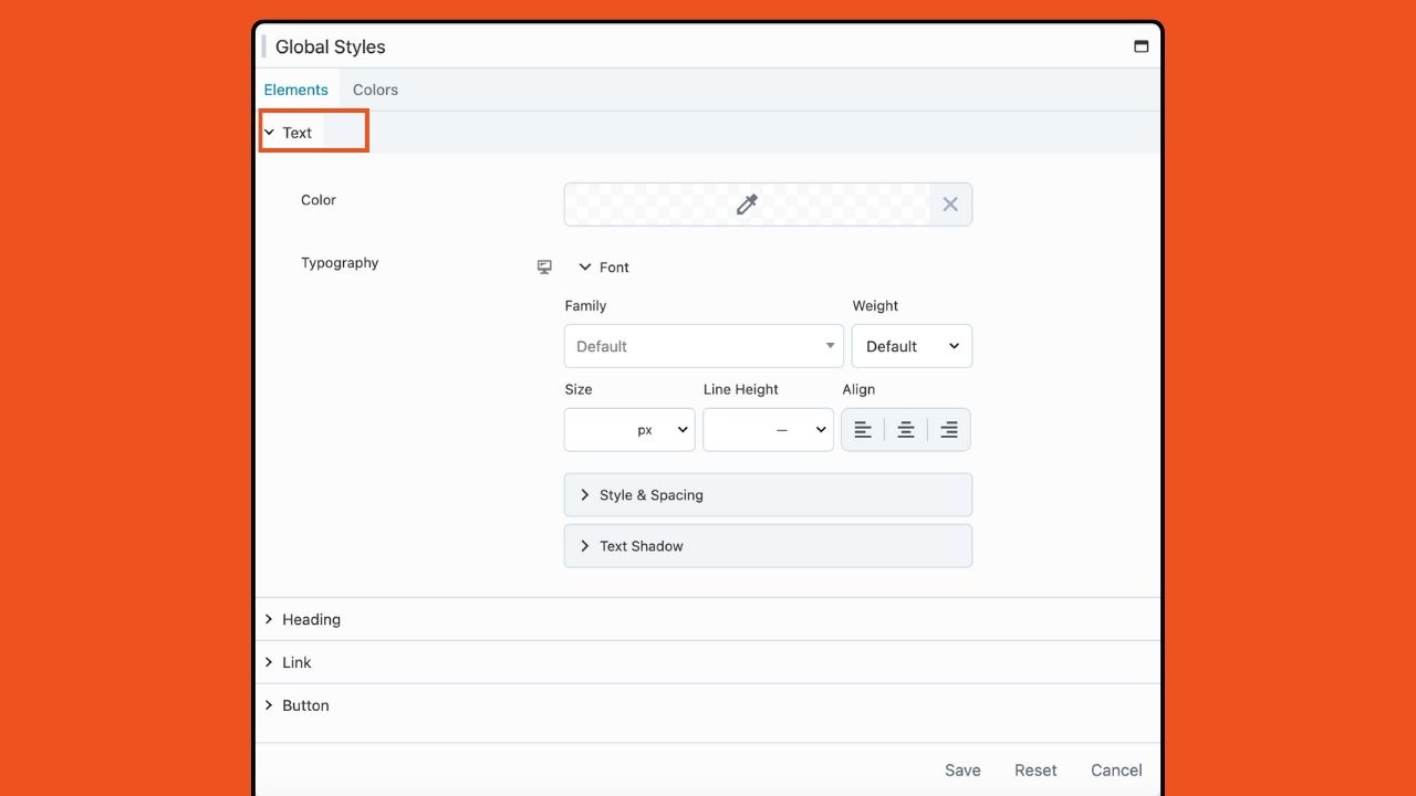
- Text – Global Text styling options enable you to customize text enclosed within <p> and <span> tags. Choose the text color using the color picker tool and adjust typography settings, including font, style & spacing, and text shadow:
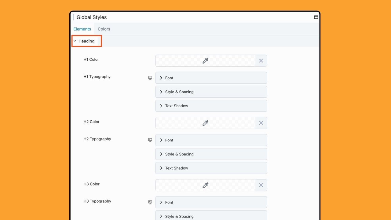
- Headings – The global Heading styling options allow you to customize all heading tags individually (<h1>, <h2>, <h3>, <h4>, <h5>, and <h6>). These settings provide the same customization options as the Text settings:
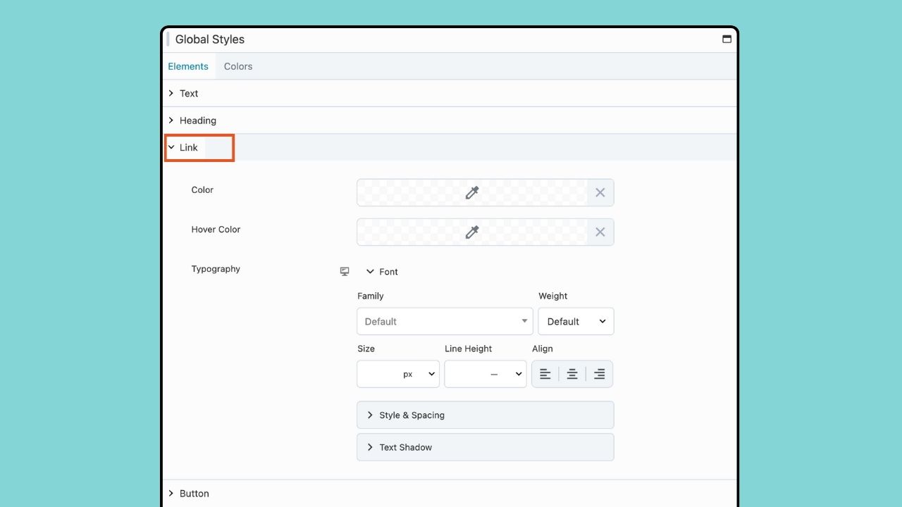
- Links – The global Link styling options enable you to customize the appearance of HTML links, which also includes an additional color picker for link hover color. Keep in mind that if you haven’t configured any global styling for Links, the Text global styling will be will be utilized instead:
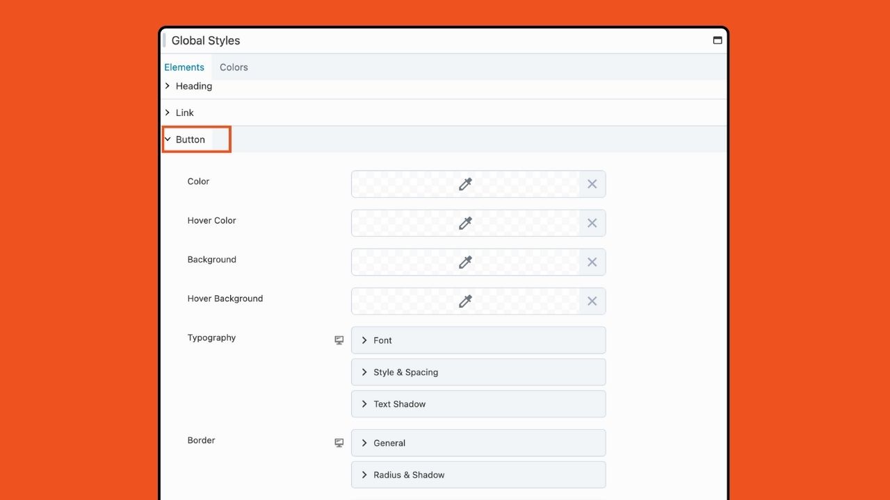
- Buttons – With the global Button styling options, you can customize the appearance of button tags (<button>) and any HTML link utilizing the fl-button class. Adjust colors, typography, and border options to achieve your desired button style:
Keep in mind that the Element styling set here is applied universally to all modules on your website that lack preconfigured styling options. However, you have the flexibility to override these styling choices on a case-by-case basis using the module-specific styling options.
Step 2. Set Global Colors
The Colors tab enables you to establish a unified color palette accessible throughout your entire website. These colors can be easily accessed within your Beaver Builder layouts using the color picker tool and a color field connection.
To add a global color, head over to Global Styles within the Tools menu and select the Colors tab:
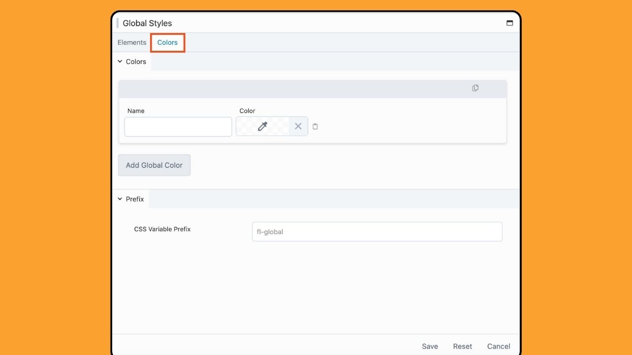
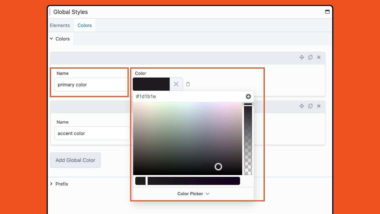
Then, assign a name to your color, such as “primary color,” and choose your desired shade using the color picker:
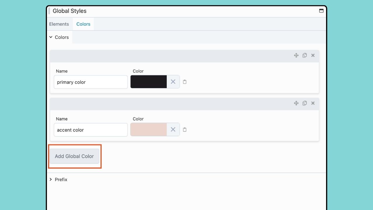
To include additional colors, simply click the “Add Global Colors” button or duplicate an existing color item:
Global Colors are flexible. The move, duplicate and delete icons make it easy to work with your color palette within the Global Styles settings:
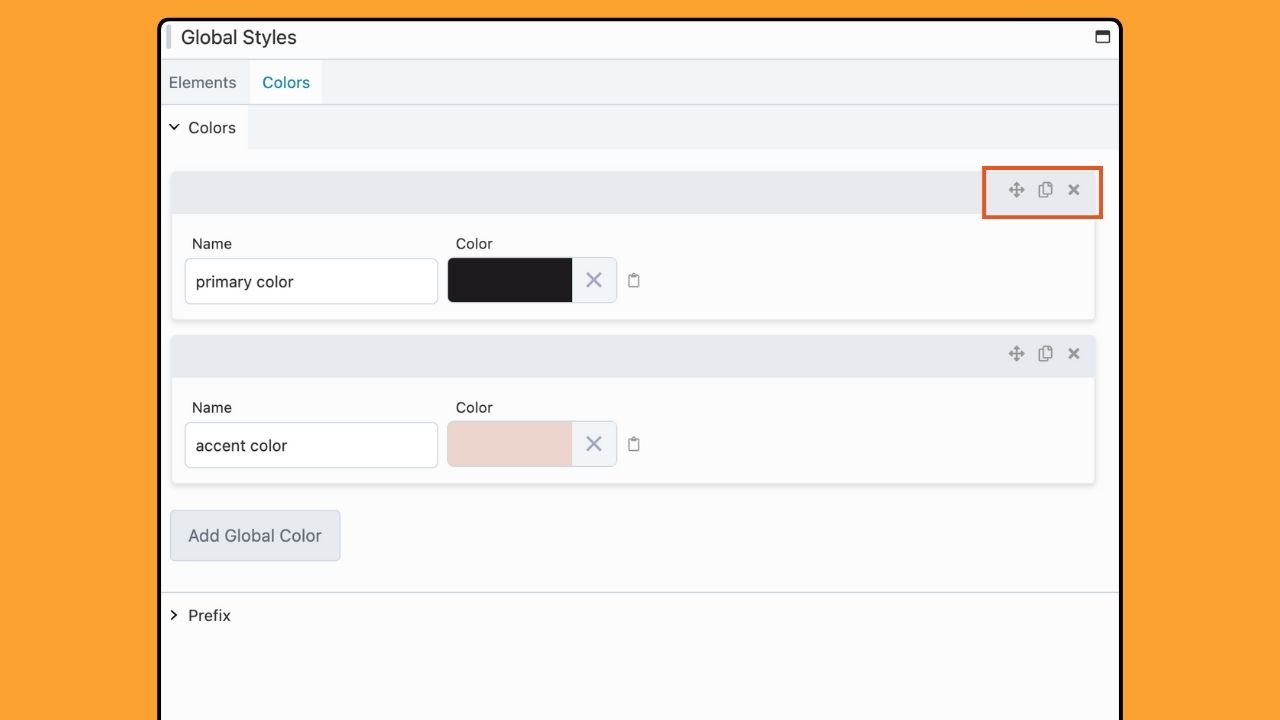
You can organize your colors by dragging and dropping them into your preferred sequence using the Move icon located in the upper right-hand corner of the color item you want to reposition.
Should you no longer need a specific color, deleting a Global Color item is a breeze. Just click the Delete icon in the upper right-hand corner of the color item you wish to remove.
How To Apply Global Colors In Beaver Builder
Now that we’ve acquainted you with the Global Styles settings in Beaver Builder, let’s dive deeper into harnessing the power of Global Colors to elevate your web design workflow.
Once your global color choices are set, they are made available across your Beaver Builder layouts, ensuring a seamless and cohesive design experience.
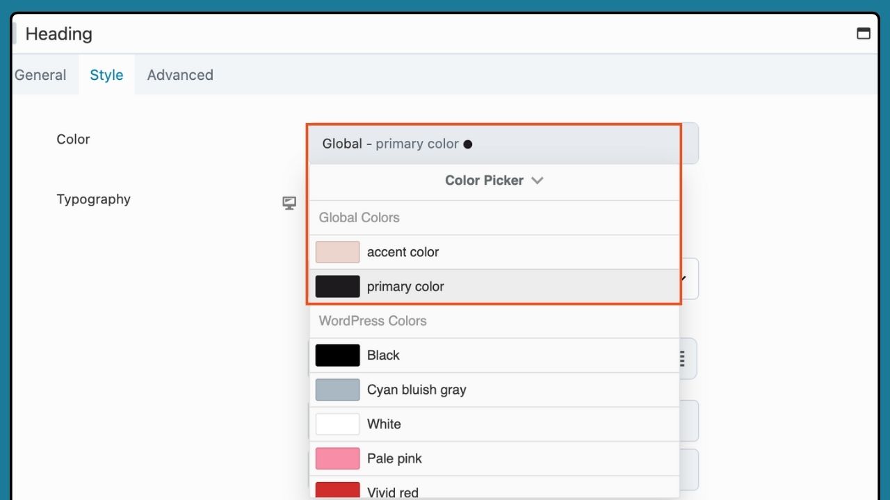
To apply a global color, simply access the Settings Window for a row, column, or module. Then, locate the Color option and click the Field Connection Toggle.
Next, choose the desired global color from the Field Connection Menu:
With Global Colors, you have the tools to effortlessly maintain a consistent and visually appealing website design.
Set Global Styles Beaver Builder Responsive Mode
Once you’ve set your global styling preferences for Desktop view, you can toggle the responsive settings icon to switch between device sizes. Whether you’re adding new pages, sections, or modules, your predefined styles are readily available no matter the screen size.
For example, next to the Typography heading there’s an icon for responsive settings. Click this icon to add different settings for extra large, large, medium and small devices:
Alternatively, you can choose Responsive Mode from the Tools menu or by using the keyboard shortcut.
If you choose not to add settings for each device size, the desktop settings will apply to all.
Getting Started with Global Styles
Getting started with Global Styles is easy. Simply update your Beaver Builder plugin to version 2.8, and you’ll find the Global Styles feature within the plugin settings. From there, you can define your preferred styling for text, headings, links, buttons, and colors, all from one centralized location.
By centralizing styling preferences with Global Styles, you’ll experience a significant improvement in your workflow. Say goodbye to repetitive styling tasks and hello to a more efficient and streamlined website design process. Now, with Global Styles in Beaver Builder, you can focus more on creativity and less on repetitive tasks.
Conclusion
With the introduction of Global Styles in Beaver Builder 2.8, designing beautiful and professional websites has never been easier. Whether you’re a seasoned web designer or beginner, Global Styles is just what you need to speed up your workflow.
Upgrade to Beaver Builder 2.8 today and experience the power of Global Styles for yourself!
Our Newsletter
Our newsletter is personally written and sent out about once a month. It's not the least bit annoying or spammy.
We promise.
Try Beaver Builder Today

Related articles
Beaver Builder 2.11: Popup Module, Maintenance Mode, and Settings Snapshots
 -
July 7, 2026
-
July 7, 2026
Beaver Builder 2.11, also known as Kariba, is now available and delivers some exciting updates: a new Popup Module for…

Beaver Builder AI: Build WordPress Layouts with AI (Now in Alpha)
 -
June 10, 2026
-
June 10, 2026
Hey everyone! Big news. After a long time of building behind the scenes, Beaver Builder AI is here. The alpha…

How Beaver Builder Products Work Together to Build Flexible WordPress Websites
-
May 21, 2026
Building a WordPress website often means stitching together a theme from one developer, a page builder from another, and a…
Join the community
We're here for you
There's a thriving community of builders and we'd love for you to join us. Come by and show off a project, network, or ask a question.
Since 2014
Build Your Website in Minutes, Not Months
Join Over 1 Million+ Websites Powered By Beaver Builder.