
Today most internet browsing takes place on handheld devices such as smartphones and tablets. This means it’s essential that you know how to use Beaver Builder to make WordPress responsive.
A responsive website is one that adapts to the size of the device it is being viewed on so that your website will look great and be easy to use on any device, no matter how small or large.
Beaver Builder can help you make WordPress responsive thanks to its responsive editing tools. The page builder gives you full control over how your website looks regardless of what device visitors use.
In this article, we’re going to discuss the importance of responsive websites. Then, we’ll show you how to use Beaver Builder to make WordPress responsive in four steps. Let’s get to it!
Table of Contents:
Why You Need a Responsive Website
The concept of a responsive website is simple. It’s a site that should look and function flawlessly (or as close as possible) on a broad range of devices, including mobile.
The smaller the screen, the more difficult it becomes to create a design that’s easy to navigate and that looks good:
As we mentioned earlier, most users browse websites primarily through mobile devices. That means if a website doesn’t function properly on a small screen, or it provides a poor user experience, it’s not going to be popular. In other words, you’ll get less traffic, a higher bounce rate, and fewer conversions.
Modern responsive pages rely largely on what we call ‘breakpoints’. You can configure elements on a page to modify their style and functionality depending on the resolution they’re viewed at and set multiple breakpoints. This enables you to create designs that work for more types of devices.
Doing this manually requires you to be adept when it comes to web design and development. The good news is that Beaver Builder incorporates a responsive editor mode that makes this process so much easier.
How to Use Beaver Builder to Make WordPress Responsive (4 Steps)
One of the best parts about using Beaver Builder to build WordPress sites is that the included templates are fairly responsive without the need to do a lot of extra work. However, we still recommend that you test every design and module to see how it looks across devices before publishing your .
In the following sections, we’ll show you how to test your Beaver Builder designs for responsiveness. First, let’s talk about responsive layouts.
Step 1: Use Beaver Builder Templates
The easiest way to make WordPress responsive with Beaver Builder is to use one of our pre-set layouts. Beaver Builder ships with a wide variety of page templates you can use on your website. This includes options for Landing Pages, Content Pages, and Micro Pages:
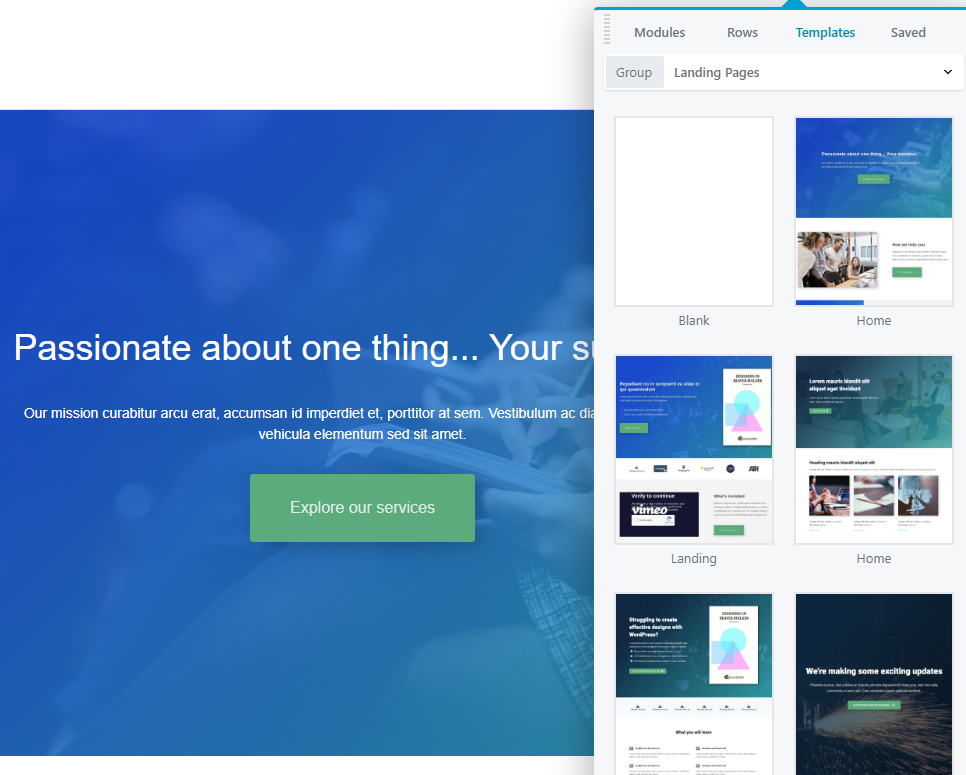
These layouts are fully customizable and you have options for almost every type of page. You can use a template that resembles the type of design you want to use. Then, you’re able to customize the layout by tweaking the modules, re-arranging them, or adding new elements to the page.
The primary advantage of using Beaver Builder templates is that they’re fully responsive. This means they’re configured to look great across all types of devices and screen resolutions.
In any case, you should never publish a page before testing its responsiveness yourself. Beaver Builder enables you to do this using its responsive editing tool.
Step 2: Use Responsive Editing Mode
When you use Beaver Builder, you get to see exactly how a page will look on the front end while editing it. However, by default, the Beaver Builder editor only shows you what the pages will look like on a full screen at a sizable resolution:
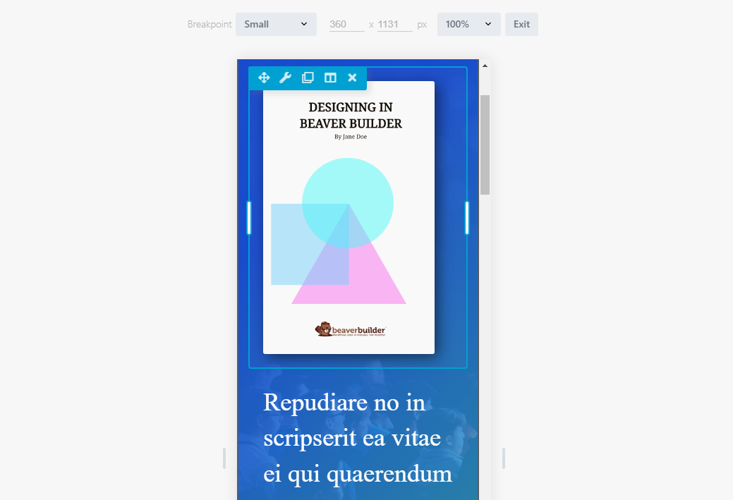
If you want to see what a layout will look like on different-sized screens, you’ll need to use Beaver Builder’s responsive editing mode. You can access this mode from the Tools menu in the top-left corner of the screen or by pressing the R key.
Once you open responsive editing mode, you’ll be able to see four unique breakpoints for the layout you’re designing. Each breakpoint comes with a preset resolution. For example, the Small breakpoint triggers for screens with a resolution below 360 x 1131 by default:
You can change the breakpoints for the different layouts you want to design. The Beaver Builder editor works the same regardless of which resolution you’re working with. The only difference is that the layout itself will change since you’re working with less space.
Beaver Builder includes four breakpoints, so you have a greater degree of control over how your pages look for devices of every size.:
- Extra Large: This breakpoint is for devices with a screen width of 1200px or more.
- Large: This breakpoint is for devices with a screen width of 993px to 1200px.
- Medium: This breakpoint is for devices with a screen width of 769px to 992px.
- Small: This breakpoint is for devices with a screen width of 768px or less.
Each breakpoint can look very different depending on the design choices you make. To see how that works, let’s take a look at how you can make individual elements responsive using Beaver Builder.
Step 3: Make Individual Elements Responsive
As we’ve discussed, the main way in which Beaver Builder enables you to make WordPress responsive is by using a set of breakpoints. Each breakpoint represents how a page will look depending on the resolution you use to view it.
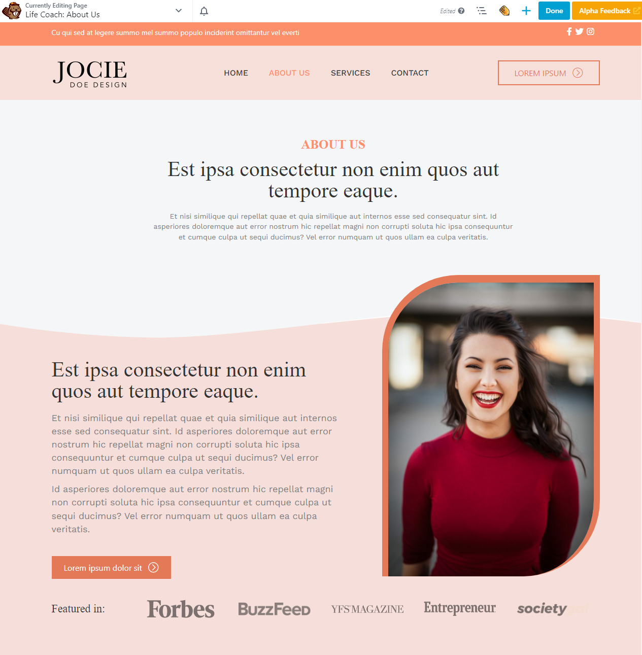
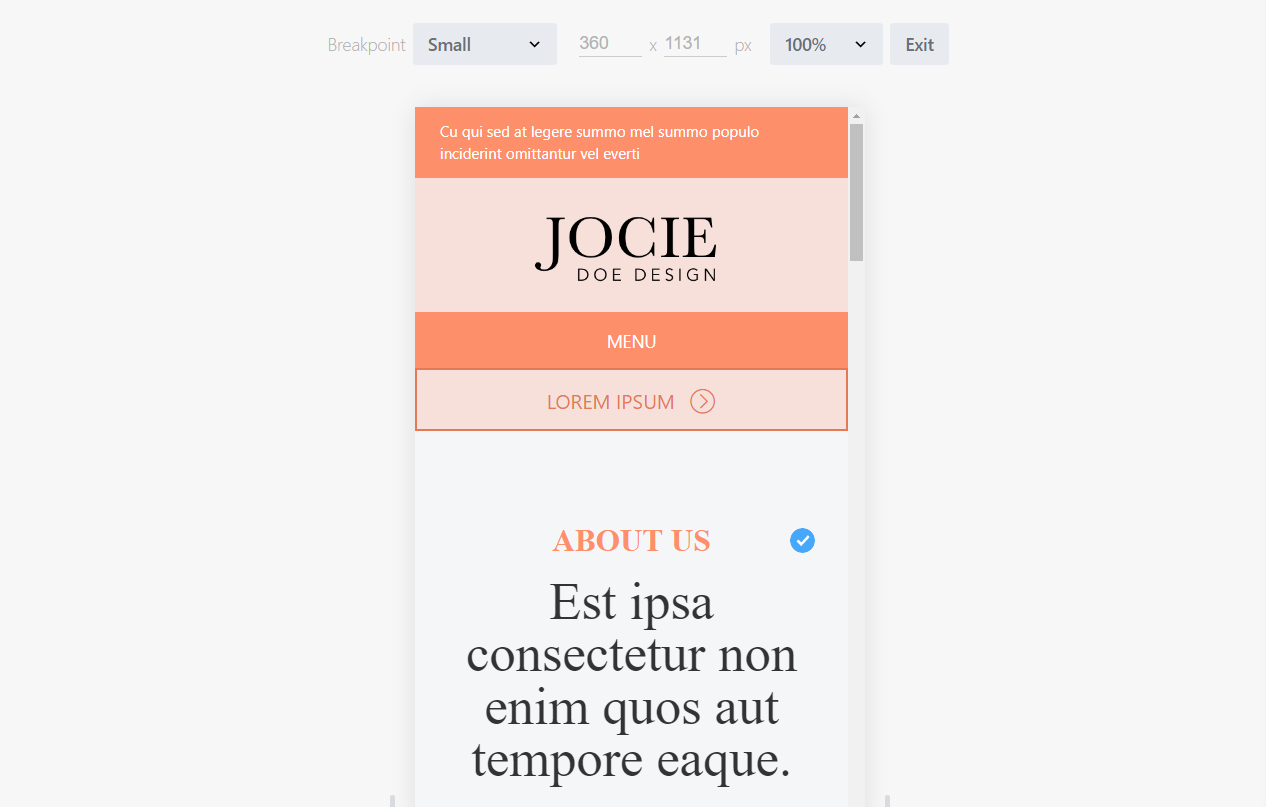
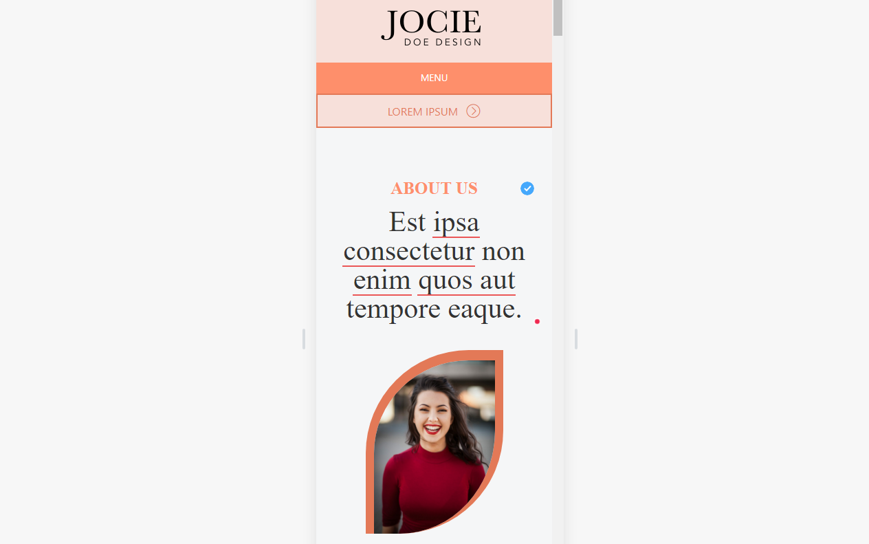
Aside from breakpoints, Beaver Builder also enables you to modify the order or ‘stacking’ of elements and columns across different resolutions. In an earlier example, we showed you an About Us page that includes an employee headshot midway down the screen. If we’re customizing this page’s layout for smaller resolutions, we can move that image up, so that the column stacking reverses order on mobile devices:
The stacking order for one breakpoint doesn’t affect the others. This means you can have the same page look entirely different, both in terms of design and functionality for visitors with different resolutions.
In practice, that’s not the best idea. Your website should look cohesive across all devices. However, you can re-arrange the elements if you think it will improve the mobile experience. For example, you might choose to display calls to action earlier on smaller resolutions so users don’t have to scroll down the page to take action.
If you look at the settings screen for individual columns or modules, you can also configure their visibility. The Visibility settings enable you to omit elements from specific breakpoints, which can be useful when working with smaller resolutions:
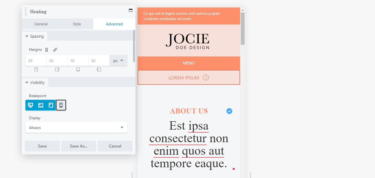
On top of that, you can configure elements to display for everyone or for logged-in or out users. However, these visibility features are geared towards membership websites, so you can likely ignore them when it comes to making your designs more responsive.
Step 4: Set Responsive Default Text Styles
One thing you may notice while using responsive editing is that text sizes and styles don’t change across breakpoints. This can be a valid design choice as large text is easier to read on smaller devices. However, if you want to customize how the text looks across different resolutions, you can do so within the Beaver Builder rows, columns or modules. Alternatively, if you have the Beaver Builder Theme installed, you can set up text styles within the customizer.
For the latter, go to Appearance > Customize in the WordPress dashboard, then head into the Presets tab. From there, you get to configure the settings for both headings and general text.
To start with, go to General > Headings and select the All Headings option. The menu below enables you to configure the font family, weight, and format you want to use for headings H1 through H6:
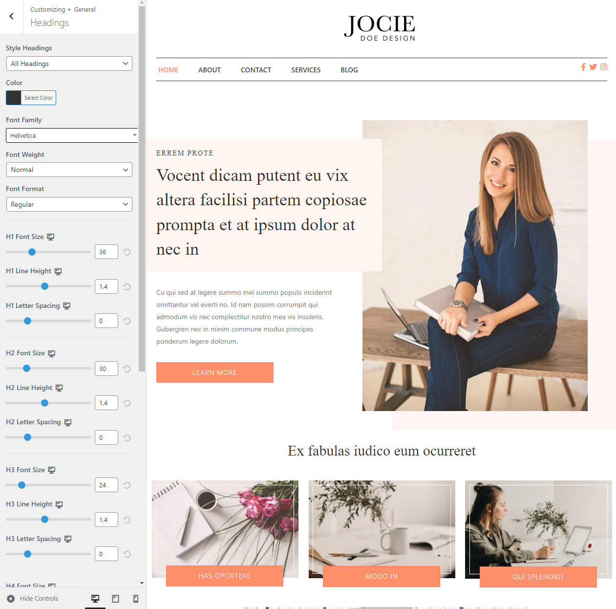
If you look at the bottom-left side of the screen, you’ll see you can switch the configuration from desktop to tablets and mobile devices. This means you can set different heading text styles for all three breakpoints.
To change the style for the general text, return to the General menu and go to the Text screen. Here you can configure the font family, weight, size, and line height for general text:
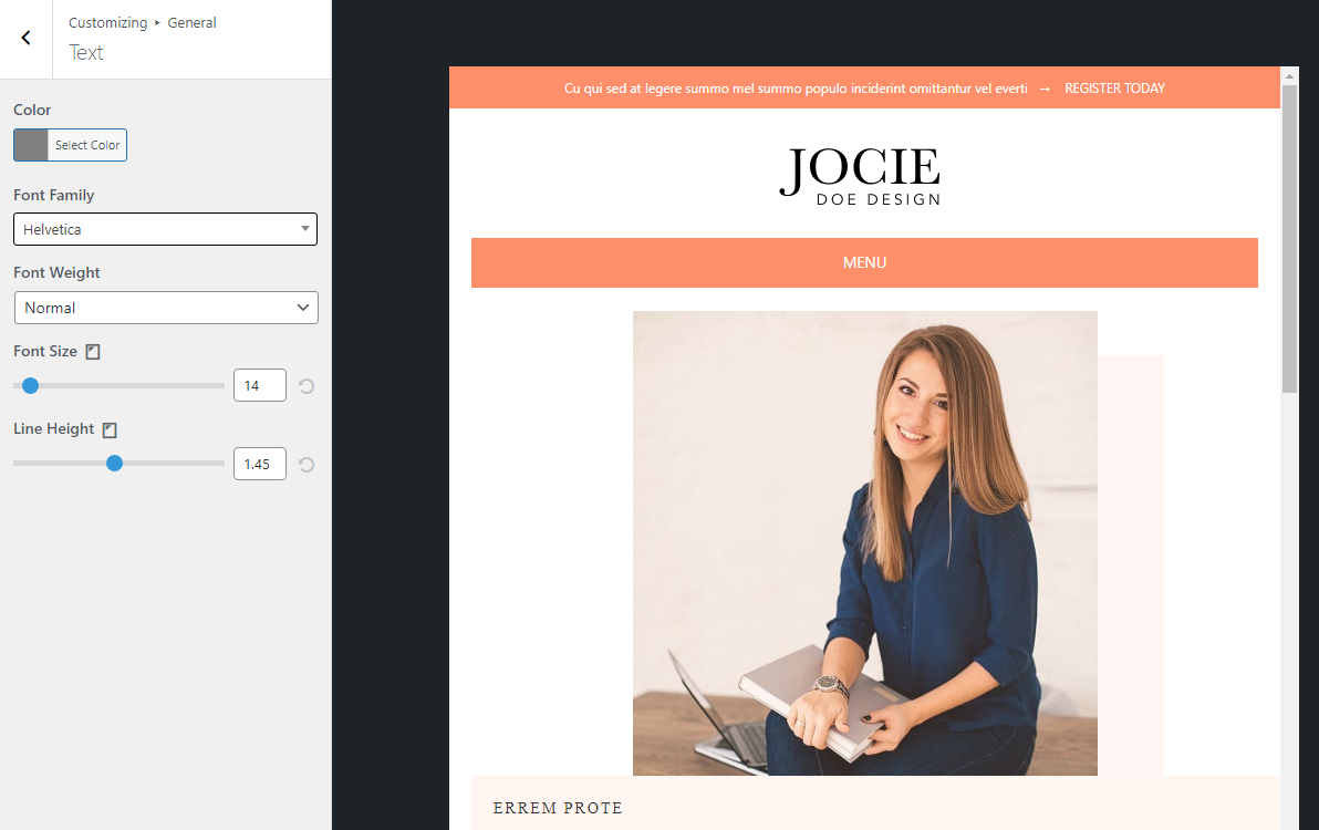
Just like with headings, you can configure the text styles for large screens, tablets, and mobile devices. The settings you apply here will appear inside the Beaver Builder editor when you’re using responsive mode. Make sure to test any changes you make to the text styles to see how they affect readability and continue tweaking them until you’re happy with the results.
Conclusion
There are a lot of ways to make modern websites responsive. If you use WordPress and Beaver Builder, the process is much simpler. Most Beaver Builder designs are responsive out-of-the-box. Moreover, you get access to tools that give you full control over how your website looks across different resolutions. That means you leave nothing up to chance when it comes to the mobile user experience.
If you’re new to Beaver Builder, you might not know how to use it to design responsive WordPress websites:
- Use Beaver Builder layouts.
- Use responsive editing mode.
- Make individual elements responsive.
- Set responsive default text styles.
Related Questions
Is WordPress Responsive by Default?
Whether your WordPress website is responsive or not will largely depend on what theme you choose to use. Without a theme, WordPress is basically a blank slate. That means you need to make sure that you choose a theme that’s both responsive and highly customizable.
Why Is My WordPress Site Not Responsive?
If your WordPress website doesn’t look good on mobile devices, you might not be using a responsive theme. Using a theme with a responsive design should provide a much better experience for users, and it’ll require less customization on your end. You can also use page builders such as Beaver Builder to make WordPress responsive.
Is Beaver Builder Mobile Friendly?
Beaver Builder offers a variety of tools and features that make it a mobile-friendly WordPress page builder. You can use responsive editing to change how your pages look across different resolutions. The page builder also comes with fully responsive page templates you can use to kickstart designs.
Our Newsletter
Our newsletter is personally written and sent out about once a month. It's not the least bit annoying or spammy.
We promise.
Try Beaver Builder Today

Related articles
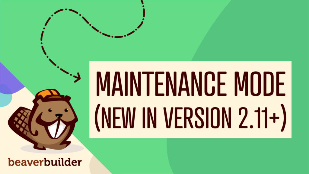
Beaver Builder Maintenance Mode: How to Set It Up
 -
July 13, 2026
-
July 13, 2026
Beaver Builder Maintenance Mode helps you keep your website looking professional while you work behind the scenes. Whether you’re redesigning…
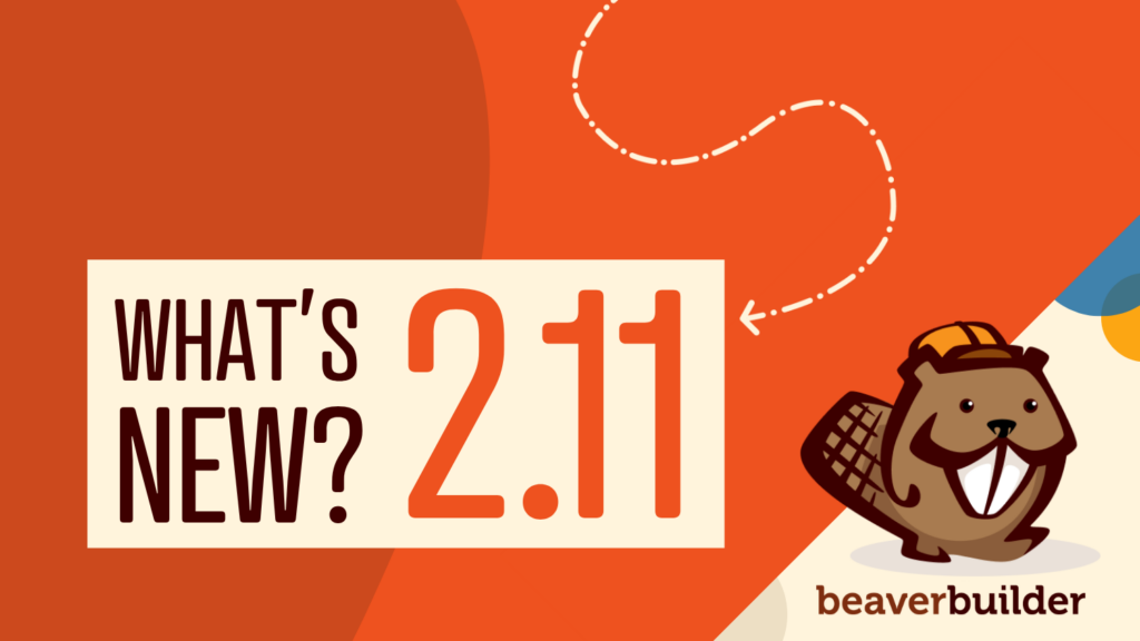
Beaver Builder 2.11: Popup Module, Maintenance Mode, and Settings Snapshots
-
July 7, 2026
Beaver Builder 2.11, also known as Kariba, is now available and delivers some exciting updates: a new Popup Module for…
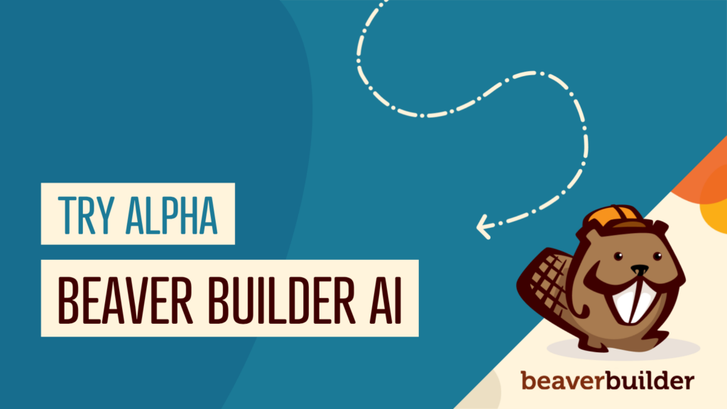
Beaver Builder AI: Build WordPress Layouts with AI (Now in Alpha)
 -
June 10, 2026
-
June 10, 2026
Hey everyone! Big news. After a long time of building behind the scenes, Beaver Builder AI is here. The alpha…
Join the community
We're here for you
There's a thriving community of builders and we'd love for you to join us. Come by and show off a project, network, or ask a question.
Since 2014
Build Your Website in Minutes, Not Months
Join Over 1 Million+ Websites Powered By Beaver Builder.