

Add a light and dark mode toggle to your WordPress site with Beaver Builder AI and the free Dark Mode Toggle skill. Attach the skill to your MCP-connected AI chat, share your design ideas, and your agent will help you build the design system, the toggle, and your pages. Beaver Builder AI is included with Plus, Professional, and Unlimited plans.
Why You Should Consider Creating a Dark Mode Toggle for WordPress Sites
Ever opened a website on your tablet at night and felt like you were staring into a flashlight? Now imagine walking outside with that same device, where a dark page suddenly becomes impossible to read. One setting doesn’t fit every situation.
With Beaver Builder AI, you can build both versions around the same design system, so your pages share the colors that change when someone flips the toggle.
If you offer WordPress web design services, a dark mode toggle is a useful extra you can bring to your client sites. It gives visitors more control over how they view the site and gives you another thoughtful feature to include in your next project.
How the Dark Mode Toggle Works
Before we get into the setup, let’s look at how the design system handles your colors, how the browser chooses light or dark mode, and how custom modules can make the build easier.
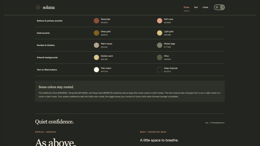
The toggle switches your site between two sets of colors: one for light mode and one for dark mode. Beaver Builder AI keeps those colors in a shared design system, so connected backgrounds, text, links, and borders update together.
On the first visit, the site checks the color preference your browser reports through prefers-color-scheme. This usually reflects your device’s light or dark appearance setting. If you already use dark mode on your device, the site can follow that preference automatically.
Visitors can override that setting with the toggle. The skill’s script saves their choice in the browser using localStorage, so it carries across pages and future visits in that browser, as long as storage remains available. Their selection takes priority over the device setting.
Custom modules make the page-building part easier. The AI can build a complete section with its styles already pointing to the design system’s colors. A card’s background, heading, border, and links can all follow the selected theme without connecting each color through separate module settings.
You still get editable content in Beaver Builder. Text, links, images, and repeating items remain available in the custom module’s settings panel, so everyday edits don’t require digging into code.
Native Beaver Builder modules work too, but their individual color settings need design-system connections. A background set to a fixed white stays white when the theme changes. A background connected to a theme-aware color switches with the rest of the page.
The skill brings these pieces together: the shared colors, the toggle’s styles, and the script that checks and remembers preferences.
The easiest way to work on the details is to have your agent generate a style guide to review both palettes and check how they look before building out the rest of the site.
Get Started With Beaver Builder AI
There are a few different ways to work with Beaver Builder AI. For this project, an MCP connection lets your agent work across the site, including its pages, design system, and Themer layouts.
If you’re new to Beaver Builder AI or want to explore the basics, watch our free Beaver Builder AI course on YouTube. It walks you through the different workflows and how to get connected.
Using the Dark Mode Toggle Skill
Drag the Dark Mode Toggle skill into your AI chat with Beaver Builder AI connected through MCP. Then ask your agent to help you build a site with light and dark modes.
The skill guides your agent through creating a design system that supports both themes, adding the toggle, and building pages that use those shared colors. It will ask about your design preferences along the way, so you can give it a clear direction or leave room to experiment.
As with any AI-created website, the more useful guidance you give the agent, the better it can reflect your vision. Share your brand colors, fonts, examples of sites you like, and a little about your audience. Those details help the agent create something that feels like your business, with more thoughtful design choices and fewer generic defaults.
You don’t need to have every detail figured out before you start. Part of the fun of vibe coding is using the agent to explore ideas along the way. Ask it to suggest colors, explain a design choice, or preview a few options before you commit. Your guidance can evolve as you see what works.
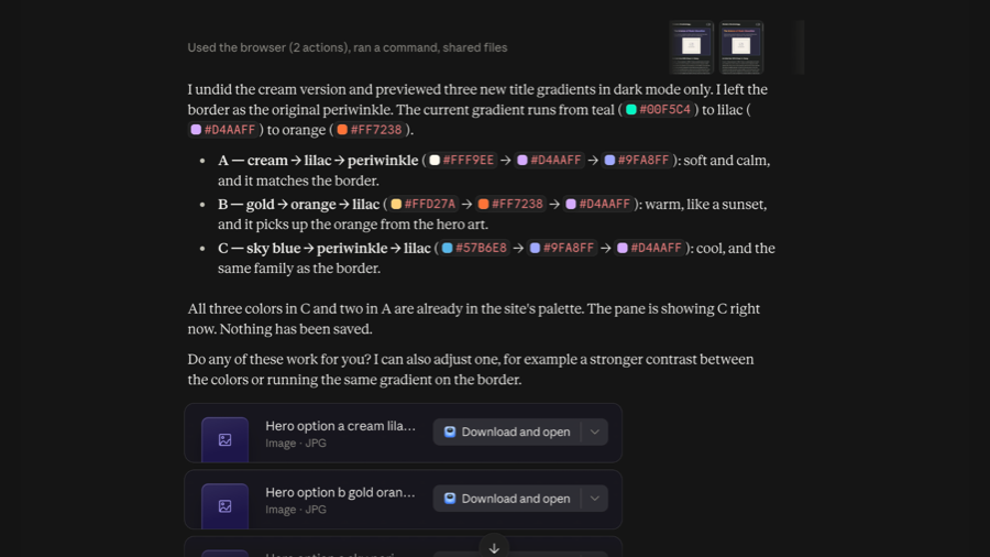
The screenshot below shows what that back-and-forth can look like. The agent suggests three heading gradients for dark mode, explains how each fits the existing palette, and previews an option before saving. You can compare the options, ask for adjustments, and choose what works for your site.
Set Up Your Site-Wide Header With Beaver Themer
Your header is a natural home for the dark mode toggle. Visitors can find it alongside your logo and navigation, wherever they are on the site.
Beaver Themer lets you create that header once using the Beaver Builder editor, then choose where it appears. Set its location to the entire site for a shared header, or apply it to specific pages.
For this project, ask your AI agent to include the toggle in your Themer header and connect its colors to the same design system as your pages. That keeps the header in sync when visitors switch between light and dark mode. Future header edits happen in one layout and carry through wherever it’s used.
For the full setup, see our guide to creating headers and footers with Beaver Themer.
Try a Dark Mode Toggle on Your WordPress Site
A dark mode toggle gives visitors a choice and adds a thoughtful touch to your next client project. With Beaver Builder AI and the dark mode toggle skill, you can build light and dark palettes around your own brand.
Try it on a test site, give your agent some design direction, and see how your pages look in both modes. You can keep refining the result in Beaver Builder as you go.
Beaver Builder AI is included with our Plus, Professional, and Unlimited plans, with a 30-day money-back guarantee on initial purchases.
Frequently Asked Questions
What’s the difference between a design system and a design token?
A design token is a named value, such as your background color, text color, or heading size. Your design system brings those tokens together with shared styles and design guidance.
For dark mode, the same color token can have two values. A background token might use white in light mode and charcoal in dark mode. Pages connected to that token pick up the appropriate color when someone switches themes.
Does every color need to change in dark mode?
No. The skill separates colors that change with the theme from colors that stay fixed. Text, backgrounds, and borders usually need theme-aware colors to stay readable. A brand swatch or decorative detail might keep the same color in both modes.
The goal is to choose what works in each theme, rather than simply invert every color.
How does Beaver Builder AI handle images when visitors switch to dark mode?
Using a custom module gives your AI agent room to build the image-switching behavior into the section. You can provide separate light and dark versions of a logo or illustration and ask the agent to show the appropriate version for the active theme.
The skill includes styles for this, so images can follow both the browser’s initial preference and a visitor’s choice with the toggle. It can also use inline SVG graphics that follow a shared text color.
Regular photos don’t automatically get recolored. You can keep the same photo in both modes or supply an alternative when the design calls for it.
Can I add dark mode to an existing design system?
Yes. The skill can review your existing design system and add dark color values, toggle styles, and the theme script while preserving your current rules.
The main thing to check is how your existing pages use color. Elements connected to theme-aware tokens can follow the toggle. Fixed colors may need updating. Because the design system is shared between the two modes, review the changes on a staging site before applying them across your client’s pages.
Do I have to use custom modules?
No, native Beaver Builder modules can work too. Their color settings need to connect to the appropriate design-system colors.
Custom modules make this workflow easier because the AI can build a complete section with those color references already in its styles. You still get settings fields for everyday content edits, including text, links, and images.
Will the toggle remember a visitor’s choice?
Yes, when browser storage is available. The script saves the selection in that browser and uses it across pages and future visits on the same site.
If there’s no saved choice, the site follows the color preference reported by the browser. Clearing or blocking browser storage can prevent the selection from being remembered.
Will dark mode work with third-party plugins and embedded content?
Not automatically. The toggle changes elements connected to your design system. A plugin widget, embedded form, or iframe may use its own styles and theme settings.
Check those elements separately in both modes. They may need additional styling or a dark mode option from the provider.
Beaver Builder AI purchases are backed by a 30 day risk free guarantee.

Start here

Beaver Builder AI Demo
Build a page with AI on a site that already has Beaver Builder and Beaver Themer installed. Free AI credits included.
Our Newsletter
Our newsletter is personally written and sent out about once a month. It's not the least bit annoying or spammy.
We promise.
Try Beaver Builder Today

Related articles
How to Convert Base44 design to WordPress using Claude and Beaver Builder AI
 -
October 13, 2026
-
October 13, 2026
In this article, I share how I moved a landing page design from Base44 to WordPress using Claude and Beaver…
How to Convert Figma Design to WordPress (Claude + Beaver Builder AI)
 -
October 9, 2026
-
October 9, 2026
How do you turn a Figma design into a WordPress site without rebuilding every section by hand? It’s a common…
How to Build an Editable WordPress Header and Footer With AI
-
October 2, 2026
Headers and footers are among the most repetitive parts of building a WordPress website. AI can speed up the process,…
Join the community
We're here for you
There's a thriving community of builders and we'd love for you to join us. Come by and show off a project, network, or ask a question.


Since 2014
Ready to build?
The WordPress page builder agencies and freelancers have trusted since 2014. Now with AI.