
Responsive web design is no longer a “nice-to-have.” People move between phones, tablets, laptops, and desktops all day, and they expect your site to keep up flawlessly. If a layout breaks, text becomes unreadable, or buttons are hard to tap, they leave.
The good news?
Building a responsive site no longer means writing custom CSS, setting breakpoints by hand, or wrestling with media queries. Modern tools handle that work for you.
With the right responsive website builder, you can design flexible, mobile-friendly pages visually without touching code. This guide shows you how to approach responsive web design using Beaver Builder, even if you’re not a developer.
What Responsive Web Design Really Means
Responsive web design means your layout adapts smoothly across desktop, tablet, and mobile, without breaking, shrinking awkwardly, or forcing users to zoom and scroll sideways.
When your site is truly responsive, you can:
- Deliver a clean layout on every device
- Keep text readable without zooming
- Make buttons easy to tap on mobile
- Avoid awkward spacing or horizontal scrolling
It’s not just about shrinking content. It’s about designing intentionally for how people actually browse today.
Bonus Read – How to Systemize Your Web Design Business with Beaver Builder’s Powerful Tools
Why You Can Design Responsive Websites Without Code
In the past, responsive layouts required custom CSS and constant testing. Today, modern tools handle that complexity for you.
A visual responsive website builder lets you:
- Design layouts for desktop, tablet, and mobile separately
- See changes instantly as you edit
- Adjust spacing, typography, and structure visually
- Focus on design decisions instead of code logic
This approach is particularly useful if you’re a designer, freelancer, or website builder for business owners who want control without technical overhead.
How Beaver Builder Makes Responsive Web Design Easier
Beaver Builder is designed to keep responsive layouts simple, flexible, and editable long after launch.
When you work with Beaver Builder, you:
- Switch between desktop, tablet, and mobile views instantly
- Make device-specific adjustments without breaking layouts
- Use clean, structured output that supports performance and SEO
- Build on a system that works with premium WordPress themes and custom setups
If you’re working on dynamic layouts or client sites, tools like Beaver Themer give you even more control without adding complexity.
Tired of Responsive Design Feeling Complicated?
We help you build pages that look right on desktop, tablet, and mobile, without code or second-guessing. You design it once; we make it easy to adjust everywhere.
How to Design a Responsive Website Without Writing Code
Here’s how that workflow looks step by step.
Start With a Mobile-Ready Layout Structure
In Beaver Builder, responsive design begins with rows and columns that are built to adapt. When you create a layout, you’re working with flexible structures that naturally resize and stack based on screen size.
When setting up your layout:
- Keep column counts reasonable
- Group related content together
- Think in sections, not individual elements
A clear layout structure in Beaver Builder makes every responsive adjustment easier later. It makes it easy, especially when you’re building from a responsive starting point like Beaver Builder website templates.
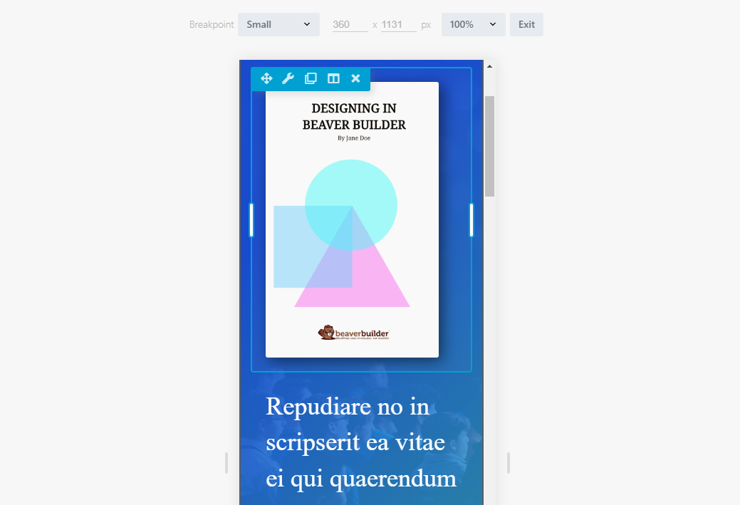
Switch Between Devices While You Design
Beaver Builder lets you toggle between desktop, tablet, and mobile views while editing your page. This allows you to see exactly how your layout behaves on each screen size—without guessing.
From these device views, you can:
- Adjust column stacking for smaller screens
- Reposition content visually without breaking structure
- Simplify layouts for mobile users
Instead of forcing one design to fit all devices, you design intentionally for each one.
Apply Mobile-First Thinking Inside the Editor
Mobile-first design becomes much more practical when you can actually design in the mobile view instead of guessing how things will scale down later. In Beaver Builder, you can focus on the mobile view early and make sure the most important content appears clearly on smaller screens.
This helps you:
- Prioritize key content for mobile users
- Reduce visual clutter on small screens
- Build layouts that feel natural on touch devices
Once the mobile layout works, you expand and enhance it for larger screens.
Fine-Tune Spacing for Better Readability
Spacing is one of the most overlooked parts of responsive web design. Beaver Builder’s responsive spacing controls let you adjust padding and margins for each device without affecting other views.
You can:
- Reduce padding on smaller screens
- Increase spacing around buttons for touch
- Remove unnecessary gaps on mobile layouts
These small adjustments greatly improve readability and usability.
Need More Control Over Responsive Layouts?
Use Beaver Themer to create responsive headers, footers, and dynamic layouts that adapt automatically, without adding complexity.
Use Responsive Typography That Actually Reads Well
Beaver Builder allows you to control typography settings per device, so your text stays readable everywhere.
You can improve readability by:
- Adjusting font sizes per device
- Tweaking line height for mobile screens
- Keeping headings clear and consistent
Responsive typography ensures your content is easy to scan, especially on phones.
Keep Images and Media Responsive
When you add images and media in Beaver Builder, they automatically adapt to their container. This prevents overflow and keeps layouts intact across screen sizes.
You make media responsive by:
- Allowing images to scale naturally
- Avoiding oversized assets on mobile
- Ensuring videos stay within their layout
This keeps your site fast and visually balanced across devices.
Common Responsive Web Design Mistakes You Can Avoid
Even with the best mobile website builder, problems appear if responsiveness isn’t intentional.
Avoid these common mistakes:
- Designing only on desktop
- Hiding too much content instead of restructuring it
- Using fixed spacing everywhere
- Ignoring touch-friendly sizing
When you design responsively from the beginning, these issues rarely become problems later.
How to Test Your Responsive Website Before Launch
Before publishing, always test your layouts thoroughly.
Your quick checklist:
- Switch between desktop, tablet, and mobile views
- Resize the browser window manually
- Check spacing, text size, and alignment
- Test on real devices if possible
This step is essential, especially when building sites for clients or businesses.
Who This No-Code Responsive Approach Is Best For
Designing responsive websites without code is ideal if you’re:
- A freelancer building multiple client sites
- An agency using a website builder for agency workflows
- A business owner managing their own website
- A designer who wants flexibility without complexity
This approach works especially well when paired with reliable themes. Beaver Builder integrates smoothly with many options, including free and premium Beaver Builder–friendly themes and performance-focused frameworks like GeneratePress for page builders. It also works well if you rely on responsive website templates but still want control over customization.
Final Thoughts: Responsive Web Design Without the Stress
Responsive web design no longer requires technical expertise or endless testing cycles. With the right visual tools, you can design layouts that adapt naturally, stay editable, and work across every device.
By using a modern responsive website builder like Beaver Builder, you focus on layout, usability, and clarity, not code.
That means faster builds, fewer fixes, and websites that actually work for real users.
Our Newsletter
Our newsletter is personally written and sent out about once a month. It's not the least bit annoying or spammy.
We promise.
Try Beaver Builder Today

Related articles

How to Display a Beautiful Events List with Beaver Builder’s Loop Module
 -
May 4, 2026
-
May 4, 2026
If you use Beaver Builder on your site and need to display a list of events, you can use the…
Why You Should Avoid Nulled WordPress Plugins and Themes
 -
March 10, 2026
-
March 10, 2026
When you’re building a site, whether for yourself, a business owner, or a client, premium WordPress plugins can feel like…

25 Best Digital Marketing Tools to Grow Your Business Online
-
February 19, 2026
Digital marketing evolves quickly, and businesses that want to scale need the right set of tools to simplify workflows, automate…
Join the community
We're here for you
There's a thriving community of builders and we'd love for you to join us. Come by and show off a project, network, or ask a question.
Since 2014
Ready to build?
The WordPress page builder agencies and freelancers have trusted since 2014.