
Last updated on March 27, 2026 by Jennifer Franklin
Beaver Builder 2.10 brings over 60 new Box Module Templates to speed up WordPress page building and improve layout consistency. These professionally designed templates let you drop in heroes, bento grids, testimonials, callouts, and other key designs with minimal setup.
Each template uses the Box module’s Flexbox, CSS Grid, and nested layout tools to deliver clean and modern designs. This update is ideal for agencies, freelancers, and site owners who need faster builds and flexible structure in their WordPress workflows.
Let’s look at how these new Box Module Templates streamline your workflow and elevate the way you build WordPress layouts.
Table of Contents
- How the New Box Module Templates Improve Your Workflow
- How to Access the New Box Module Templates
- What You Can Build with the New Box Module Templates
- Box Module Upgrades You May Have Missed in the 2.10 Release
- The Strategic Benefit for WordPress Designers and Agencies
- Try the New Box Module Templates in Beaver Builder 2.10 Today
How the New Box Module Templates Improve Your Workflow
The new templates in Beaver Builder 2.10 are designed to speed up your workflow, reduce repetitive setup work, and improve layout consistency:
Here’s how they make an immediate impact:
Instant Design Inspiration That Eliminates Creative Block
Starting from scratch wastes time and often leads to inconsistent results across different pages and projects within your WordPress site. The new box module templates solve this problem by providing expertly crafted starting points that follow strong layout principles and accessibility standards from the moment you insert them.
You can choose from pre-built heroes that command attention, testimonial layouts that build trust, author blocks that humanize your content, and bento grids that organize information with visual hierarchy. Each template serves as both a functional starting point and an educational resource that demonstrates effective layout techniques you can adapt to future projects.
Built with the Box Module for Maximum Flexibility and Control
These templates use the Box module rather than relying on rigid column structures that limit your design options. The Box module gives you the power to nest boxes within boxes, customize spacing with precision, or switch between Flexbox and CSS Grid layouts depending on your specific design requirements.
This architectural approach delivers complete control over complex WordPress layouts while maintaining clean markup and excellent performance across all devices and screen sizes.
Faster Beaver Builder Workflows That Scale Across Projects
The box module templates dramatically reduce build time by letting you insert a polished design foundation and then adjust content and styling to match your brand. This workflow improvement becomes even more valuable when you’re managing multiple client projects or building template libraries for your agency’s recurring design patterns.
You can establish consistent visual systems across pages while still customizing each layout to serve its specific purpose and audience within your WordPress site. The time you save on initial structure and spacing decisions compounds across every page you build throughout your projects.
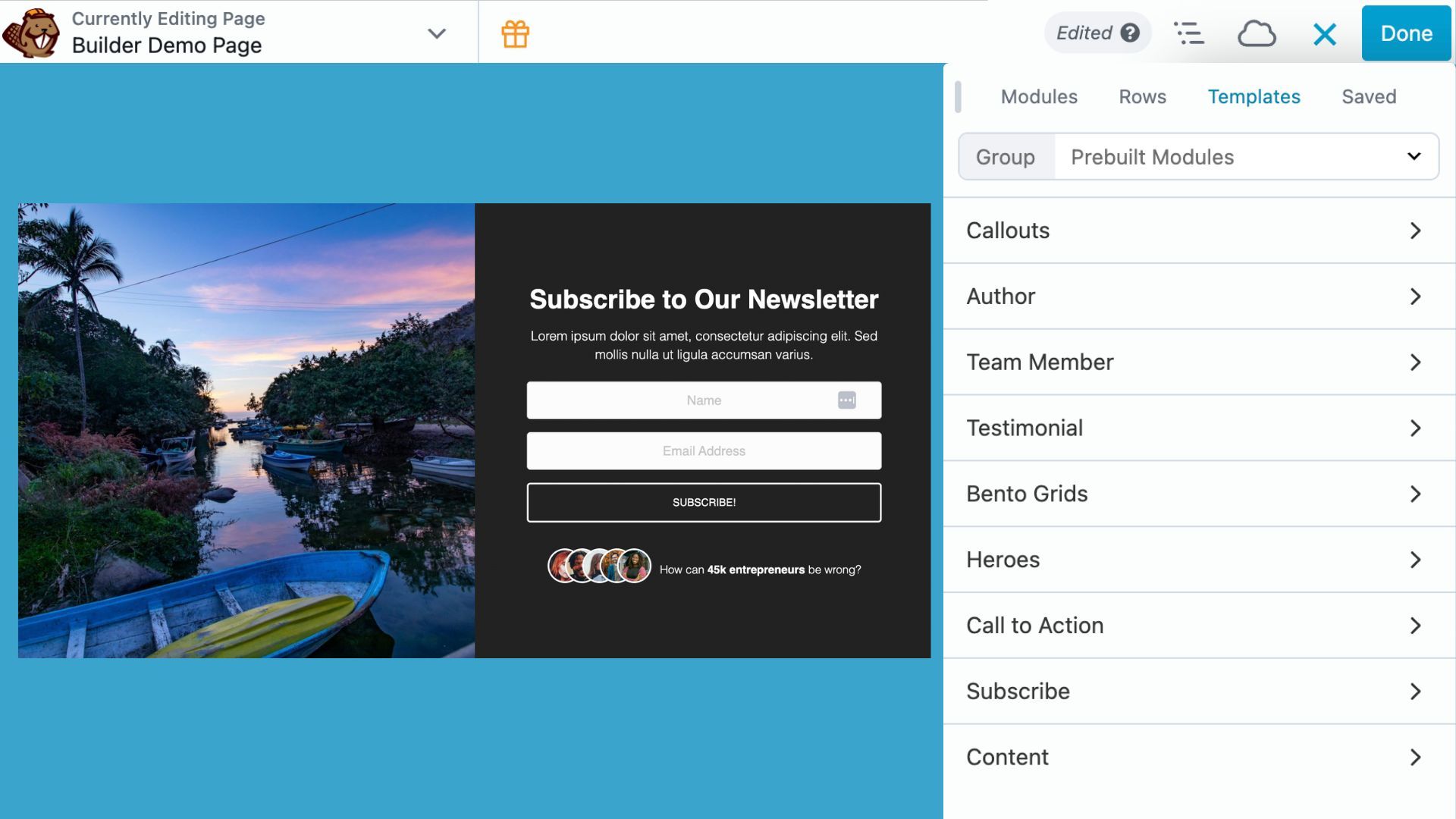
How to Access the New Box Module Templates
Accessing the new Box Module Templates takes only a few clicks inside Beaver Builder:
- Open the Content Panel
Click the + icon in the top-right corner while editing a page or post. - Select the Templates Tab
Choose Templates, then click Pre-built Modules to filter box module templates. - Choose a Template Category
Select from the following categories: Callouts, Author, Team Member, Testimonial, Bento Grids, Heroes, Call to Action, Subscribe, and Content. - Insert a Template
Click and drag any template onto your page. It loads instantly with all styles and settings applied.
Each template opens with fully editable modules. You can adjust colors, alignment, spacing, and structure to match your design needs. There are no locked settings or rigid limitations, everything is open for customization.
What You Can Build with the New Box Module Templates
Get a head start on modern, professional WordPress pages with pre-designed templates and design patterns. Here’s what’s possible:
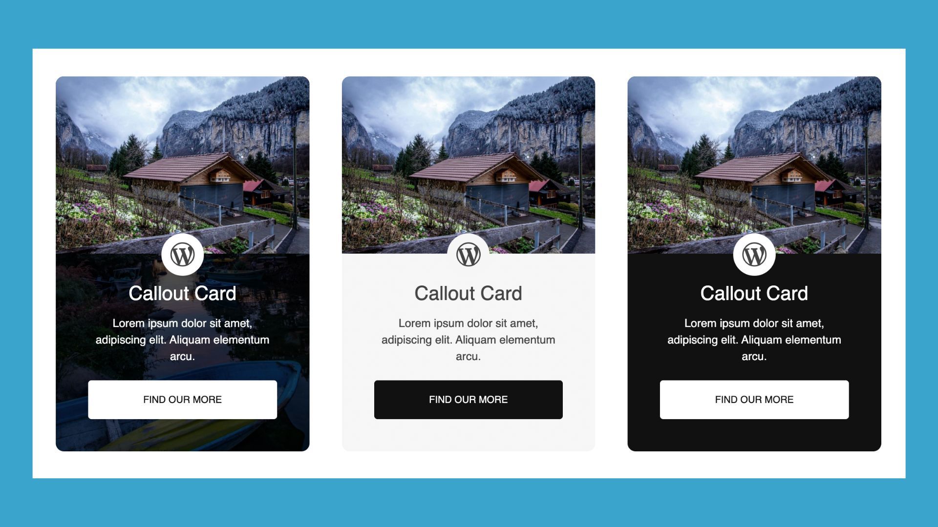
Callouts
Draw attention to important messages, offers, or takeaways:
Author & Team Profiles
Highlight the people behind your brand with photos, bios, and social links:

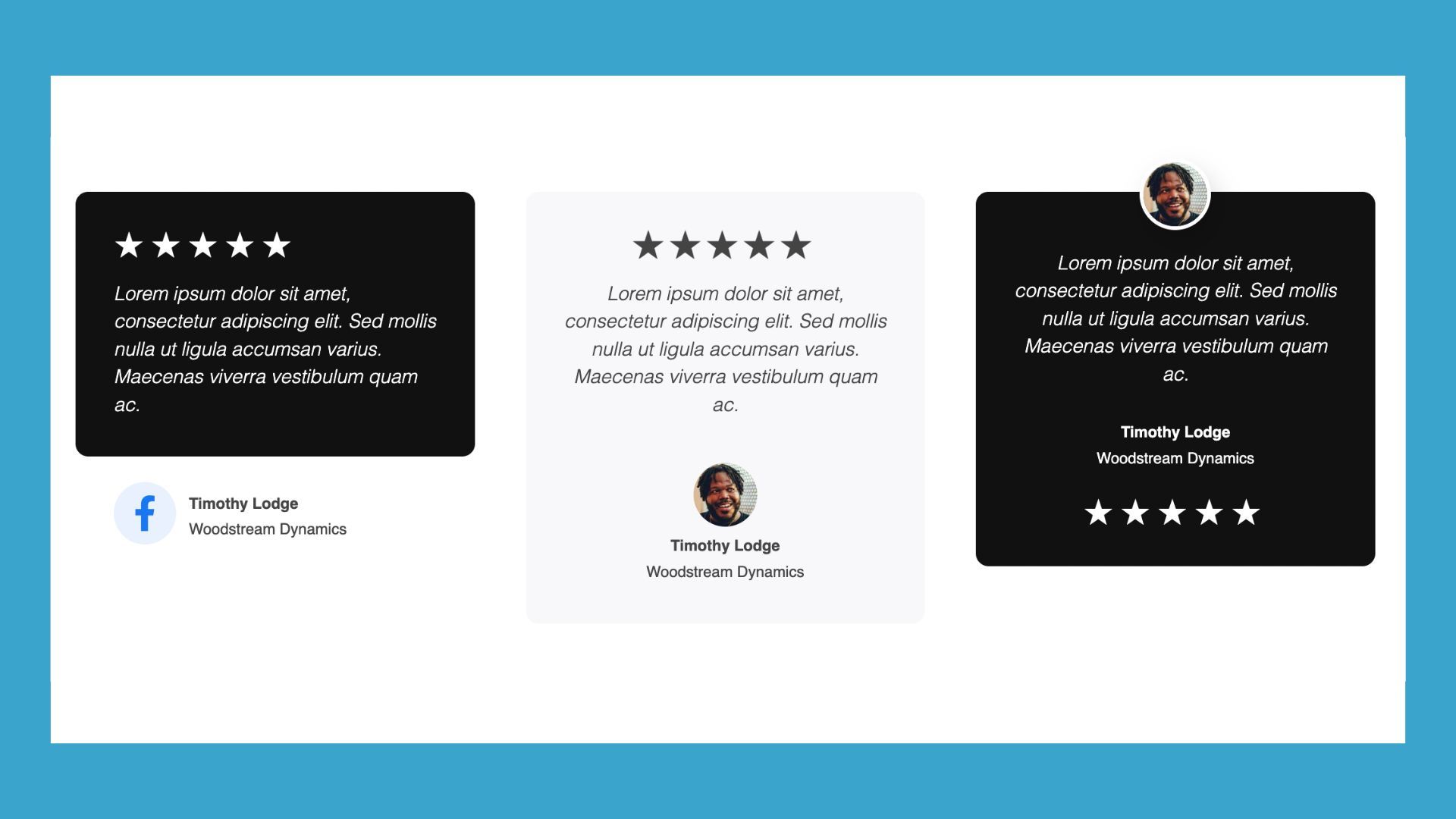
Testimonials
Showcase customer quotes, ratings, and author info to build trust:
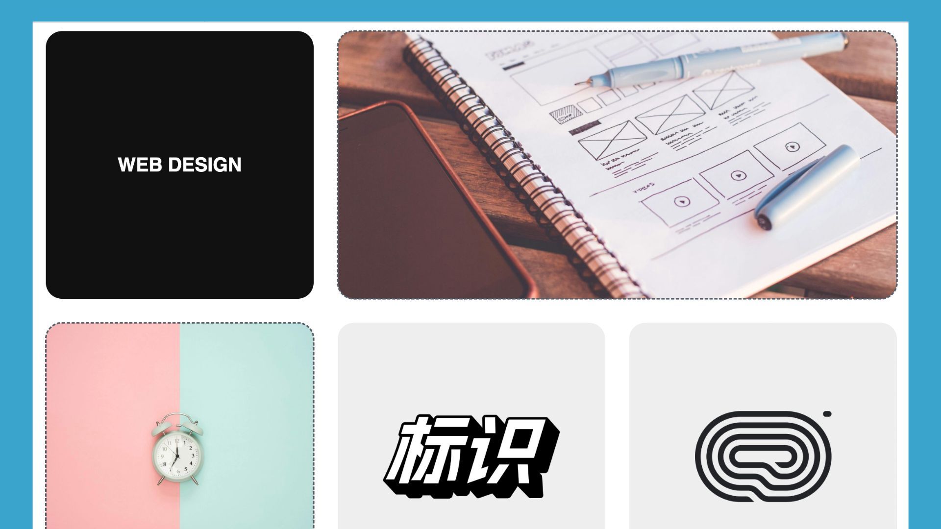
Bento Grids
Organize content in dynamic, asymmetric layouts that break free from standard grids:
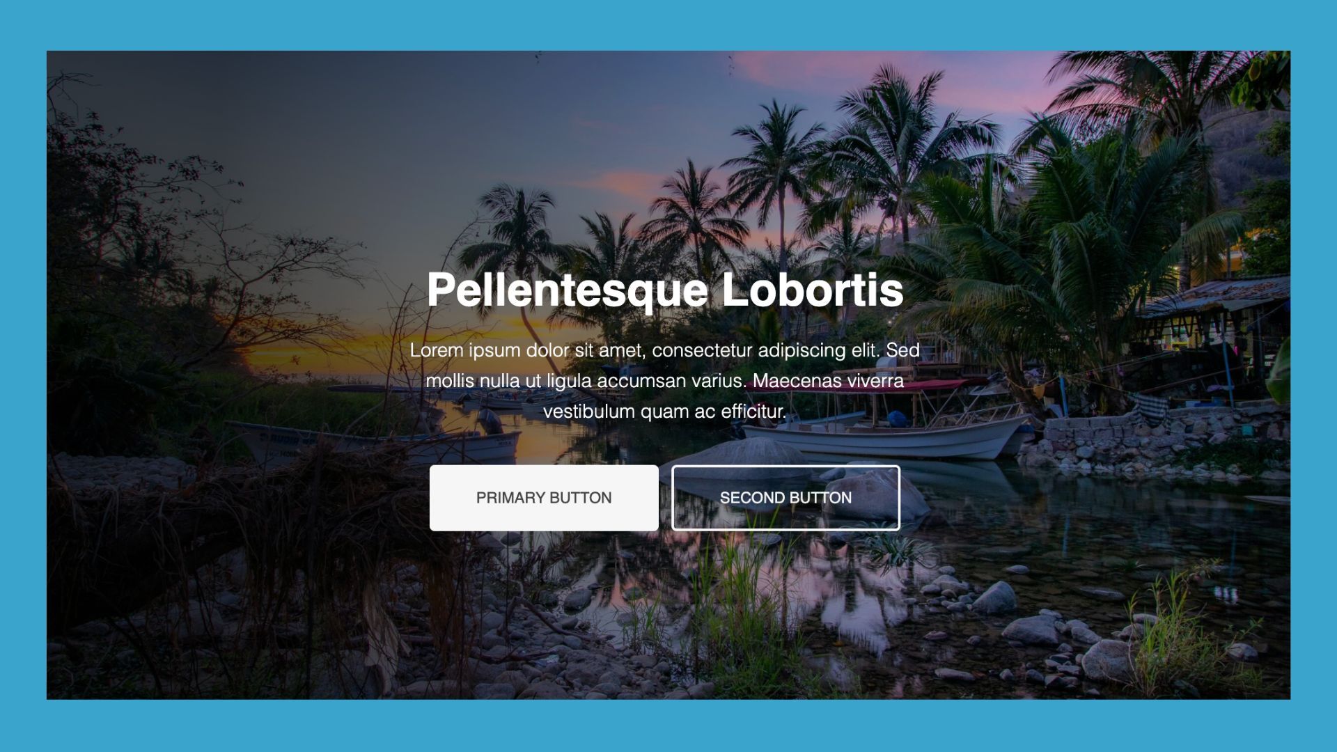
Hero Sections
Make a strong first impression with bold headlines, supporting text, calls-to-action, and background images or videos:
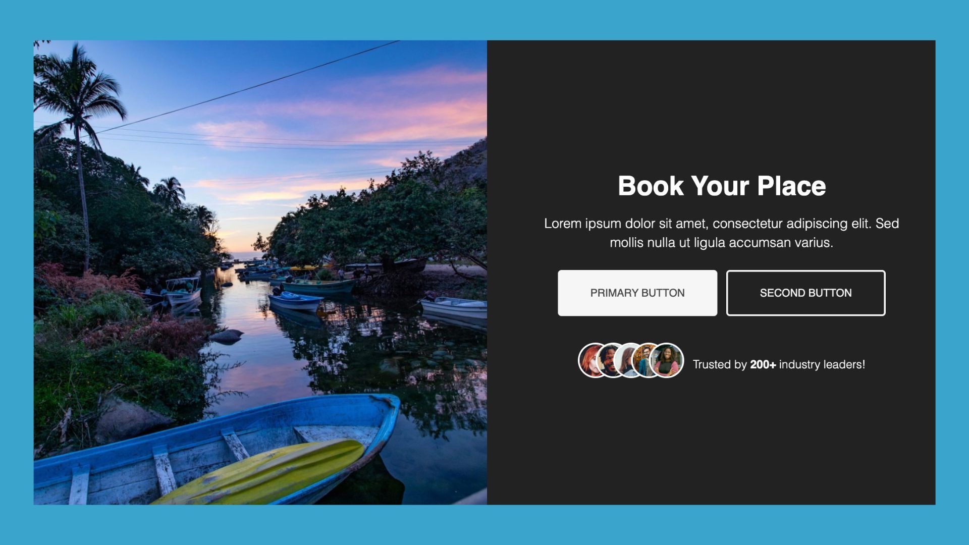
Call to Action
Encourage visitors to take the next step with focused messaging and buttons:
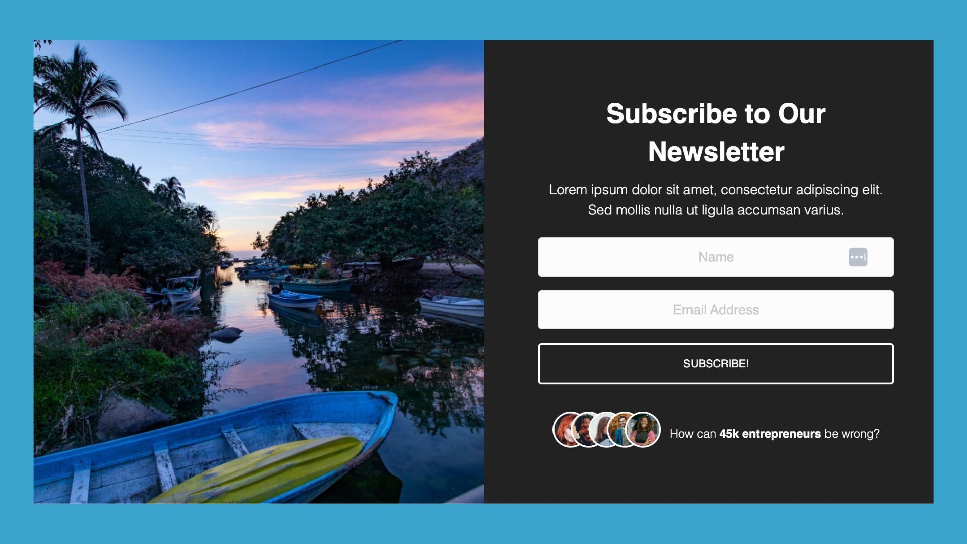
Subscribe
Grow your email list with clean, high-converting opt-in designs:
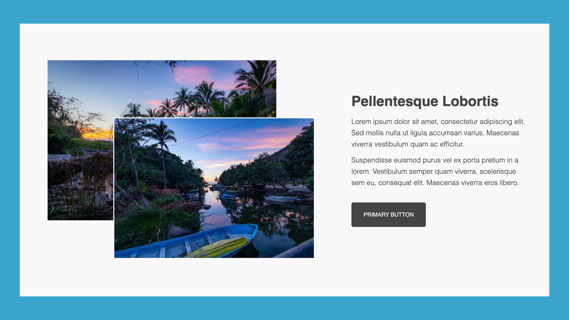
Content
Add flexible text-and-media layouts that enhance readability and visual flow:
All templates are fully customizable, responsive, and designed to work beautifully across desktop, tablet, and mobile. Start building pages faster and smarter with layouts professional designers rely on.
Box Module Upgrades You May Have Missed in the 2.10 Release
Beaver Builder 2.10 doesn’t just add templates, it also brings important refinements to the Box module itself that improve how you work with layouts daily.
Global Row Spacing Now Applies to Box Modules
When you enable the “Apply to Box” option in Global Settings, global row spacing will now automatically apply to Box modules placed in the top-level layout area:
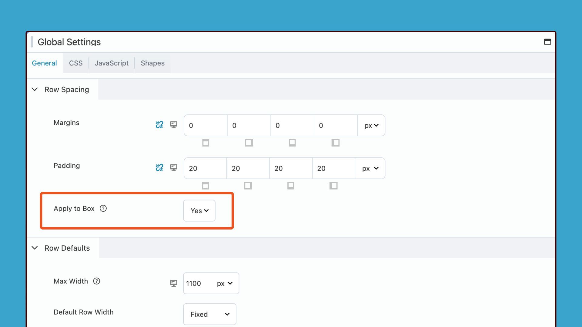
This change creates consistent spacing across your entire page without requiring manual spacing adjustments on every individual Box module you add. For new sites, this setting activates by default to ensure spacing consistency from the moment you start building your WordPress pages. For sites upgrading from version 2.9, the setting remains disabled to maintain backward compatibility and prevent unexpected spacing changes to your existing layouts that were built without this feature.
Grid Guidelines Provide Visual Layout Assistance
A new grid icon appears in the Box Module settings popup and gives you instant access to visual alignment tools that simplify complex layouts.
Clicking the grid icon toggles a visual overlay of grid guidelines directly on your layout that shows you exactly how your Grid layout divides the available space:
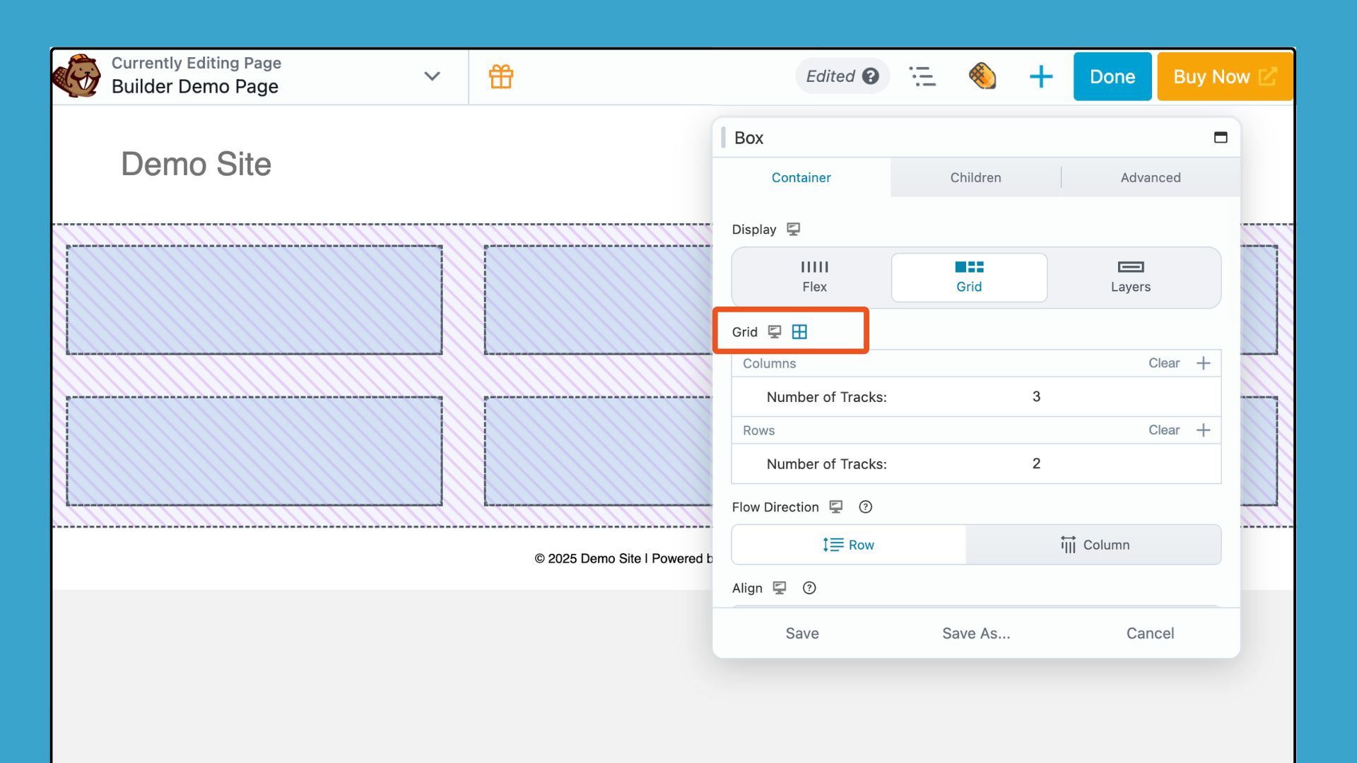
This visual feedback gives you a more intuitive way to align and structure content as you build without requiring mental calculations or trial-and-error adjustments. The grid guidelines prove perfect for designers who prefer a visual approach to grid-based layouts and need to see column tracks, row tracks, and grid gaps before adding content into specific areas.
These refinements make the Box module even more powerful and demonstrate Beaver Builder’s commitment to improving the tools you already use rather than just adding new features without refining existing capabilities.
The Strategic Benefit for WordPress Designers and Agencies
The Box module is one of Beaver Builder’s most powerful tools. It gives you unlimited layout flexibility without custom code or messy workarounds. The new templates showcase its best capabilities and reveal techniques many users overlook.
You can build pages faster because each template provides a polished starting point. You skip repetitive structure work and stay focused on design, not setup. The Box module also creates clean markup, which improves performance compared to nested rows, columns, or custom HTML.
These templates also help you create a consistent visual system that scales across projects. Build a library of customized templates tied to your brand and reuse them for future client sites. Beaver Builder 2.10 reduces technical friction so you can focus on content, branding, and user experience, not layout mechanics. You keep full creative control because each template is a flexible foundation, not a rigid design.
Advanced Customization Options That Extend Template Functionality
Every Box module template includes the full set of Beaver Builder customization options. You can refine typography with custom fonts, weights, sizes, and line heights to perfectly match your brand. Background settings allow you to layer colors, gradients, and images using the multi-layer background feature, adding depth, texture, and visual hierarchy to your design.
Border and shadow controls help define edges and highlight key elements, while spacing controls let you fine-tune padding and margins with responsive settings for every device size. Flexbox and CSS Grid options give you complete control over alignment, wrapping, and stacking across different screen widths. You can even add animations to guide attention and create more dynamic page flows.
These tools ensure you never feel limited by a template’s starting point. You can transform any layout into a completely custom design that fits your project. Each template also serves as a hands-on learning example, showcasing Box module techniques that speed up your real-world production work.
Try the New Box Module Templates in Beaver Builder 2.10 Today
Get Beaver Builder 2.10 and start exploring the new Box Module templates to see how they streamline your workflow. Add them to a development or staging page so you can experiment freely without affecting your live site. Tweak structure, spacing, colors, and alignment to match your brand and see how each layout adapts as you customize it.
These templates help you build beautiful, flexible WordPress pages faster than ever. The time you spend learning the Box module becomes an investment that pays off across every project you build.
Explore More Beaver Builder Box Module Articles:
- The Beaver Builder Box Module Guide
- How to Use the Box Module (Step by Step Video Tutorials)
- Build Faster Layouts in Beaver Builder: Skip the Rows and Columns
- How to Push Content to the Bottom of a Box in Beaver Builder (Flexbox Solution)
- Bento Grid Design in WordPress with Beaver Builder’s Box Module
Our Newsletter
Our newsletter is personally written and sent out about once a month. It's not the least bit annoying or spammy.
We promise.
Try Beaver Builder Today

Related articles
Beaver Builder AI: Build WordPress Layouts with AI (Now in Alpha)
 -
June 10, 2026
-
June 10, 2026
Hey everyone! Big news. After a long time of building behind the scenes, Beaver Builder AI is here. The alpha…

How Beaver Builder Products Work Together to Build Flexible WordPress Websites
 -
May 21, 2026
-
May 21, 2026
Building a WordPress website often means stitching together a theme from one developer, a page builder from another, and a…

From Azeroth to WordPress: How Warcraft Tavern Uses Beaver Builder
 -
May 19, 2026
-
May 19, 2026
Since releasing Beaver Builder 12 years ago, a feeling will come up from time to time that just never gets…
Join the community
We're here for you
There's a thriving community of builders and we'd love for you to join us. Come by and show off a project, network, or ask a question.
Since 2014
Build Your Website in Minutes, Not Months
Join Over 1 Million+ Websites Powered By Beaver Builder.