Behind the Scenes of Our Website Redesign
Hello Beaver Builder family! We’re excited to officially announce the launch of our new website redesign.
I’d like to take you on a behind-the-scenes journey of our process to give you a perspective on why we did things the way we did, and maybe you can get some helpful tips along the way too.
Let’s dive right in!
New Brand Style Guide
When Brent and I first sat down to discuss this project, we knew that we wanted to start with a new Brand Style Guide so that we could implement this new branding throughout all our assets.
We wanted something that was definitely unique that when someone saw it… they immediately recognized it was Beaver Builder.
Number 1, the new style had to evoke Fun! We try to keep things pretty light-hearted here… I mean our company mascot is a Beaver. 😁
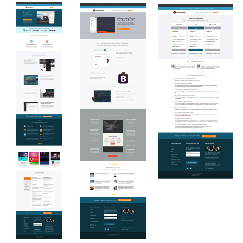
Our old site had a darker tone and lacked the energy we were looking for.
(Screenshots from old site)
We wanted the colors and font to be Clean, Bright, and Playful.
Lastly, we wanted an essence of the Outdoors without feeling like a camping website.
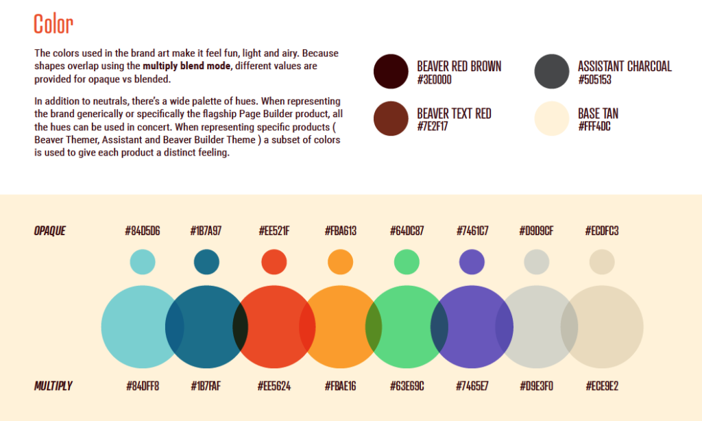
So we decided to use colors to help portray that (tan, green, blue, orange, red, grey) to help bring in some colors of the forest of trees, blue skies, lakes, campfires, sun, stones, hiking trails, etc.
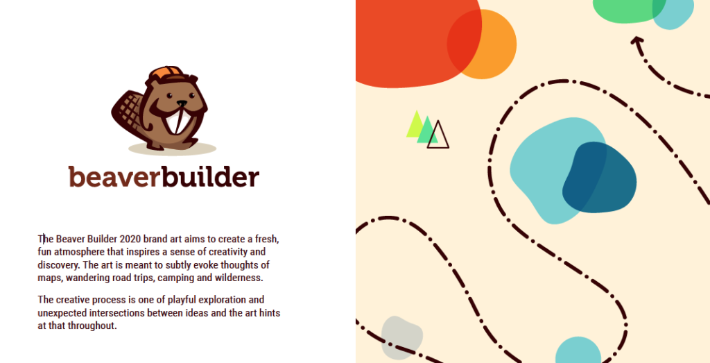
(Screenshot from Brand Style Guide)
Here is the paragraph that explains it more eloquently from our Brand Style Guide:
- “The Beaver Builder 2020 brand art aims to create a fresh, fun atmosphere that inspires a sense of creativity and discovery. The art is meant to subtly evoke thoughts of maps, wandering road trips, camping, and wilderness. The creative process is one of playful exploration and unexpected intersections between ideas and the art hints at that throughout.”
Search for a Design Agency
With our new Brand Style Guide created we were ready to find a designer to help implement our vision.
We wanted to outsource to a design agency to assist us with this project because Brent was tied up with Assistant and Beaver Builder projects.
I reached out to 3 different design companies to test them out and provided them each with a simple test project to see which one would come out on top.
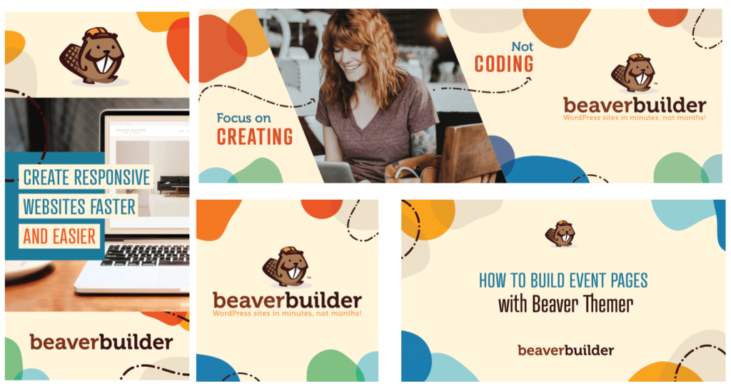
The task was to use our new Brand Style Guide to create some display ad graphics. Even though they all had the exact same instructions and resources they all came up with vastly different interpretations of the same information.
We had a clear winner! Spark27 Creative, by Katie Elenberger.
(see screenshots of her initial design concepts below)
We met with Katie, for an initial website consultation meeting and immediately recognized the great team chemistry between us all.
She clearly understood the vibe we were going for and thus, we knew she was the right fit.
Tested New Branding
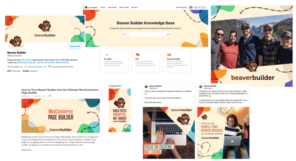
With our new design team selected we were off to the races to test it in the wild. We had Katie and Team help create the following:
- Social Media profile banners
- YouTube Channel Thumbnail Images
- Banner for Beaver Builder Lite
- Knowledge Base Site backgrounds and icons
- Community Forum Site
- Facebook Ad Graphics
- Google Display Ad Graphics
- Blog Post Featured Images
We implemented these things throughout 2020, and overall it was well-received and converted well. So that gave us the green light to press forward.
Website Assessment
We did an extensive analysis of our old website to see what was working and identify areas that needed improvement.
Here were some of the things that were completed during the assessment:
- performed a heat map test
- analyzed conversion rates per page
- read feedback from the Beaver Builder community
- gathered suggestions from WordPress peers
- reviewed support tickets
A big thing that stood out was the site navigation needed to be adjusted, specifically, where to place Beaver Themer?
Beaver Themer was a new add-on product that came after Beaver Builder several years later. Thus, we didn’t have a proper place for this information and instead had it as an announcement bar at the top of the site.
(Screenshot of old site announcement bar)
User feedback was they had a hard time finding information about Beaver Themer and didn’t know how to add the product to their shopping cart from the pricing page.
We also introduced a new product called “Assistant” back in 2019 and didn’t have a proper area for it either.
As a result, we needed a new site structure that could be flexible in the event we wanted to add more products in the future.
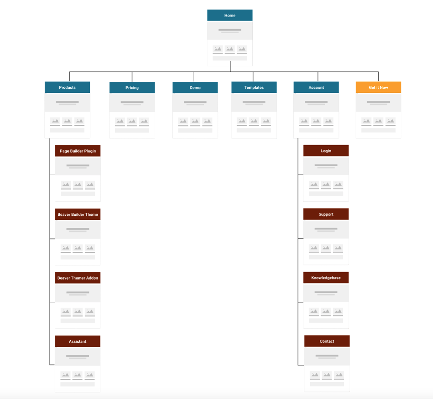
We adjusted our sitemap to add “Products” to our navigation and moved some lower converting pages to the footer.
We also felt like the site needed a dedicated “Page Builder” product page to allow us to move some of the content that was existing on the homepage to its own landing page.
(Screenshot of proposed new sitemap)
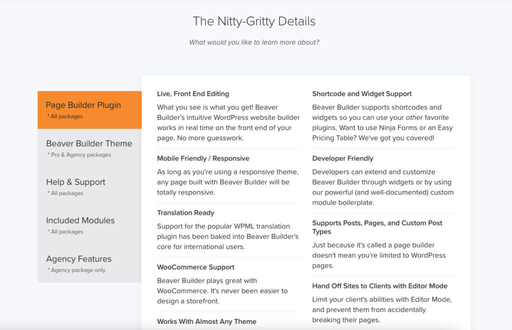
The other thing that stood out was how copy-heavy our old site was.
We wanted to clean up the copy, but not go far off from what we had because the content was converting well.
(Screenshot of copy heavy area from old site)
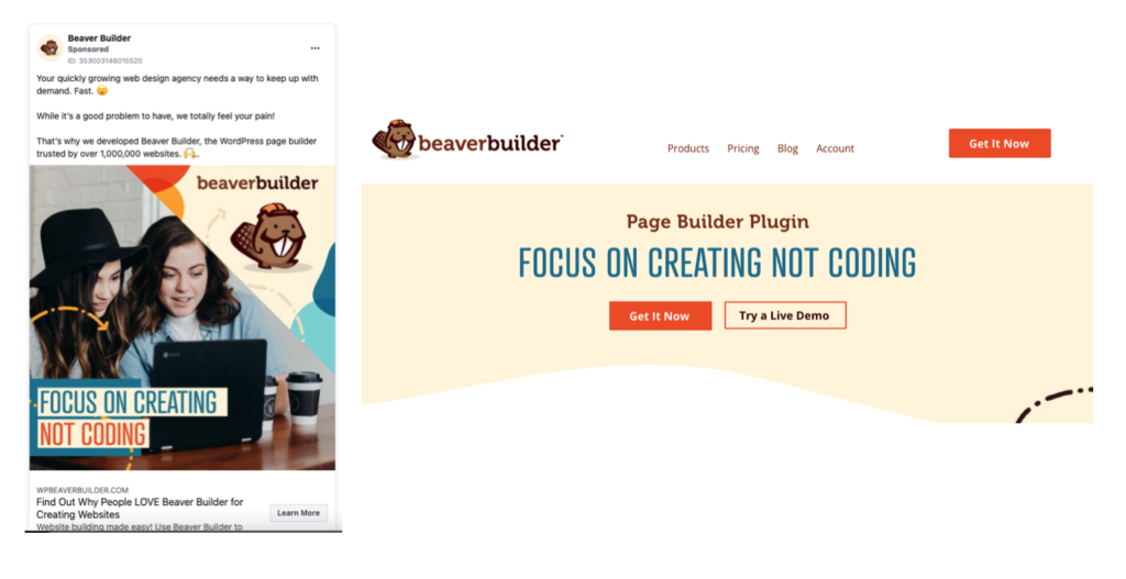
We also ran some Facebook Ads to test some headlines and phrases like “Focus on Creating Not Coding” ultimately ended up on the new site.
With our new sitemap and content copy finalized we were ready to move to the design process.
Phase 1 of New Design
Redesigning a company website felt like a massive undertaking since our site has about 65 pages in total not to include blog post layouts, archive layouts, etc.
We decided to break up the project into 2 phases for a couple of reasons.
- It would help speed up the process of designing, building, and launching the site.
- We would have fewer pages to analyze and optimize after launch.
- Get community and user feedback to implement changes of Phase 1 designs.
- Finally, we can take all our lessons learned and apply them to Phase 2.
For Phase 1 we decided to narrow it down to designing a couple of key “front-facing” pages.
All the other pages like Contact, Support, Blog, etc. would wait until Phase 2.
While we know this isn’t conventional practice, as most companies change the entire site in one sitting… we felt this would work better for us.
Overall, this part of the project went very smoothly because we had already done the work in the previous steps to vet out any major changes.
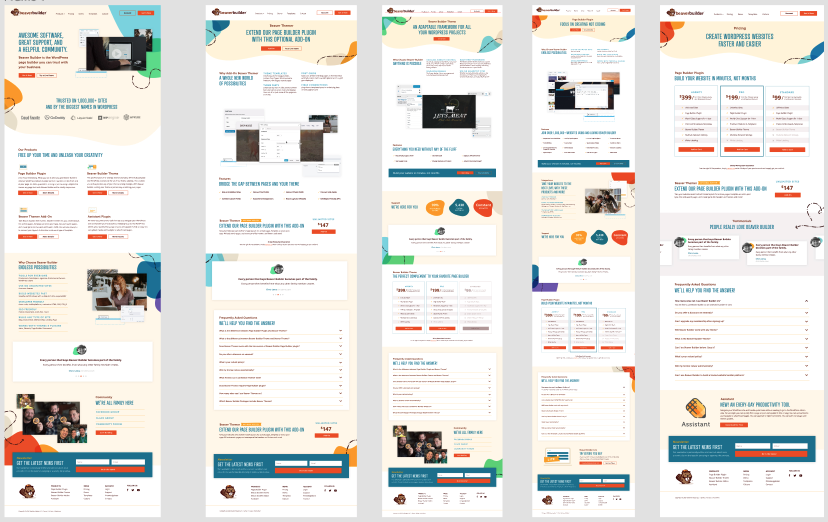
We conducted weekly project meetings to talk through things and within a couple of weeks, we had new design concepts to review from Katie.
(Screenshots of original concept designs)
It was literally night and day! The new designs were brighter, cleaner, easier to navigate, and just overall felt refreshing.
Building New Site and Launch!
When it came to building the site we decided to do it internally. Robby volunteered to do it because he helped build the original site and was very familiar with all the nuances it had.
He cloned the existing site and built the new page layouts using Beaver Builder on a staging site and prepped it for launch.
We had the new site built and ready for a couple of weeks but didn’t pull the trigger until recently. I think it was a combination of nerves and the fear of the unknown.
Ultimately, it was time to rip off the band-aid and go for it! So we launched the new site last week (quietly without any announcement) to allow us time to catch little things before the rest of the world did. But it was hard to keep it a secret for long 😉
So What’s Next?!
This is just the beginning… now comes even more work ahead. We will be performing new heat map tests, split tests, analyzing data, SEO analysis, performance tests, gather community feedback, and start Phase 2.
Whew! This was a long journey… a lot of work went into this, that required a whole bunch of people to come together to create what you see. We want to thank the entire Beaver Builder Team, Spark27 Creative, all our friends, and the community who helped us along the way.
Feel free to provide constructive feedback below to help make the new site even better.
21 Comments
Related articles
5 Common WordPress Site Mistakes (And How to Fix Them)
Building a WordPress site is an exciting project, but without careful planning it’s easy to run into common WordPress site…
How to use Beaver Builder Box Module (with Easy Video Tutorials)
The Beaver Builder Box Module allows you to create stunning layouts with ease. By leveraging Flexbox and CSS Grid, the…
Best Practices for Holiday Landing Pages (Beaver Builder Tips)
Curious about the best practices for holiday landing pages? The holiday season presents a golden opportunity for businesses to engage…
Join the community
We're here for you
There's a thriving community of builders and we'd love for you to join us. Come by and show off a project, network, or ask a question.
Since 2014
Build Your Website in Minutes, Not Months
Join Over 1 Million+ Websites Powered By Beaver Builder.
 Free Beaver Builder Templates! Get started at




How did you guys do the transitions/separators between the rows? Are those background images aligned to bottom to make the change to white or just an svg? Coolest part honestly
Thanks John! Someone from our team will get back to you regarding your question.
Hey John! Yup, you called it. We’re some custom white SVG shapes to make the row effect. 🙂
Super cool! Great design refresh. We love Beaver Builder and without it we wouldn’t be were we are as an agency.
Thanks Ben… and without awesome Agency owners like you we wouldn’t be in business =)
A very necessary change for your website: good idea! The older one was not longer trending.
Bravo.
Thank you Christian… we agree it was overdue for a refresh =)
Love it guys! It’s really nice to see Beaver go through the journey of building a site.
I absolutely couldn’t run my business without your product and support team.
Thank you we appreciate the feedback. Will share with the rest of the team =)
Niiiiice!
“But it was hard to keep it a secret for long”
Oops, indeed, we noticed the changes before your announcement and we couldn’t help but share the news (and our love) on Twitter…
I loved reading your behind-the-scenes journey of your process and I find it very bold to do it in 2 different phases when, as you said it, everyone aims to do it in 1.
The beaver was already friendly but I think it’s even more now, with your new style guide. Very well done to you all guys! It really is a beautiful and efficient redesign! 🙂
Thanks Cynthia for all the social media love! We appreciate your support in sharing our content.
We like to go against the grain over here… and always test new ideas out.
Appreciate the positive feedback!
Great redesign that shows off some of the best features of Beaver Builder! Plus, I enjoyed seeing the process of developing the site. Thanks!
Thanks Allan! Since this was well-received maybe I’ll write some more articles like this in the future.
This is all great for you guys, and BB has provided me the access to roll out rapid development which I love.
However, when are new pre-built templates for Beaver Builder going to be released? The options have been the exact same for years and years.
https://www.wpbeaverbuilder.com/wordpress-templates/
Hi David we released some new landing page templates, and content page templates in 2020. We’re working on some new templates for Beaver Builder and Beaver Themer for 2021.
Site looks great. My concern is the rising number of website accessibility lawsuits being threatened by watchdogs, activists and NGOs. The new Beaver Builder site is out of compliance with WCAG 2.0 guidelines, so I’m trying to find out if the company has plans to build in any accessibility checks to Beaver Builder and Beaver Themer. Any status on this? Thanks.
Hi Scott, accessibility is a priority to us and we address any issues as we become aware of them. Certain modules though will never be accessible (for example, any module that contains a slider). While accessibility is a priority, it’s up to the person building the site using our tools to make it compliant as well. If you see any areas that we can improve when it comes to accessibility, feel free to submit a support ticket and we will be happy to look into it. There was also an independent review about Beaver Builder’s accessibility. You can read about it here: https://www.abrightclearweb.com/beaver-builder-accessibility/
> the rising number of website accessibility lawsuits being threatened by watchdogs, activists and NGOs
Scott, you mention the WCAG 2.0 compliancy requirements as though it is an interrogation of the website owners. Inclusivity and representation is extremely important. No less important than any other law or or policy that promotes the rights of others. Would you construct a multi-story building without an elevator where only able-bodied people could use? Would you open a business without a wheelchair accessible front door?
Your website is not any different. The website owners must take the responsibility to accommodate for all of their users. Marginalization should not be tolerated. Beaver Builder is a feature-rich, fantastic tool to use for rapid development from staging to production – the technology behind the tool is a separate from your website governance. Governance needs to be applied to the website process, and if the policies are not being followed then there needs to be accountability from the web developers – not from the technology.
Wow, that’s cool !!!
I really liked the changes, it was easier to find the information! Right at home we already see the main products, much better.
But the best was to learn from this post showing each phase of the redesign stage.
Thanks for sharing!!!!
Thanks Andre for the feedback. I think I might do a follow-up post in the future =)