
The highly-anticipated launch of Beaver Builder 2.8, also known as “Alpine”, is here!
Beaver Builder 2.8 brings the power of flexbox and CSS grid to the new Box Module, alongside the introduction of Global Styles functionality. Additionally, this release incorporates notable enhancements, including the North Commerce module and integration with Popup Maker, with minor improvements to key modules like Menu, Post Carousel, Post Slider, and Photo.
In this post, we’ll introduce the new Beaver Builder 2.8 update. Then, we’ll show you some of the best new features.
Table of Contents:
- An Introduction to Beaver Builder 2.8
- 5 New Features and Updates for Beaver Builder 2.8
- Box Module: Building Precision with Flexbox and CSS Grid
- Global Styles (Premium Feature)
- NorthCommerce Module
- Popup Maker Integration
- Minor Updates to Modules, Tools Menu, and Loop Settings
- Conclusion: Power-Packed Features for Enhanced Web Building
- Related Questions
An Introduction to Beaver Builder 2.8
At Beaver Builder, we continue to update our user-friendly page builder plugin, simplifying the process of creating and customizing WordPress websites. Regardless of your skill level, our drag-and-drop visual editor, pre-designed page templates, Global Settings, and more enable you to quickly create your website projects:
In Beaver Builder 2.7, we added a new responsive editor to preview mobile device views. We also replaced the breakpoint dropdown menu with more user-friendly icons.
The 2.7 update brought the ability to customize the code settings for specific rows, columns, or modules. We also made it possible to select multiple post types. Finally, Beaver Builder 2.7 fully integrated with ACF Blocks, giving you access to an advanced content editing experience.
When you update to Beaver Builder 2.8, you’ll unlock the power of flexbox, CSS grid, and layers within our new Box Module. We also make it possible to apply Global Styles, add North Commerce content without shortcodes, and integrate more fully with PopUp Maker, giving you an easier editing experience.
5 New Features and Updates for Beaver Builder 2.8
Beaver Builder 2.8 is our first update for 2024 and packs quite a few powerful features inside. Let’s explore some new additions that will make this update a game-changer.
1. Box Module: Building Precision with Flexbox and CSS Grid
By updating to Beaver Builder 2.8, all users of our page builder, including the Lite version, will have access to advanced Flex, Grid, and Layers options within the Box Module:
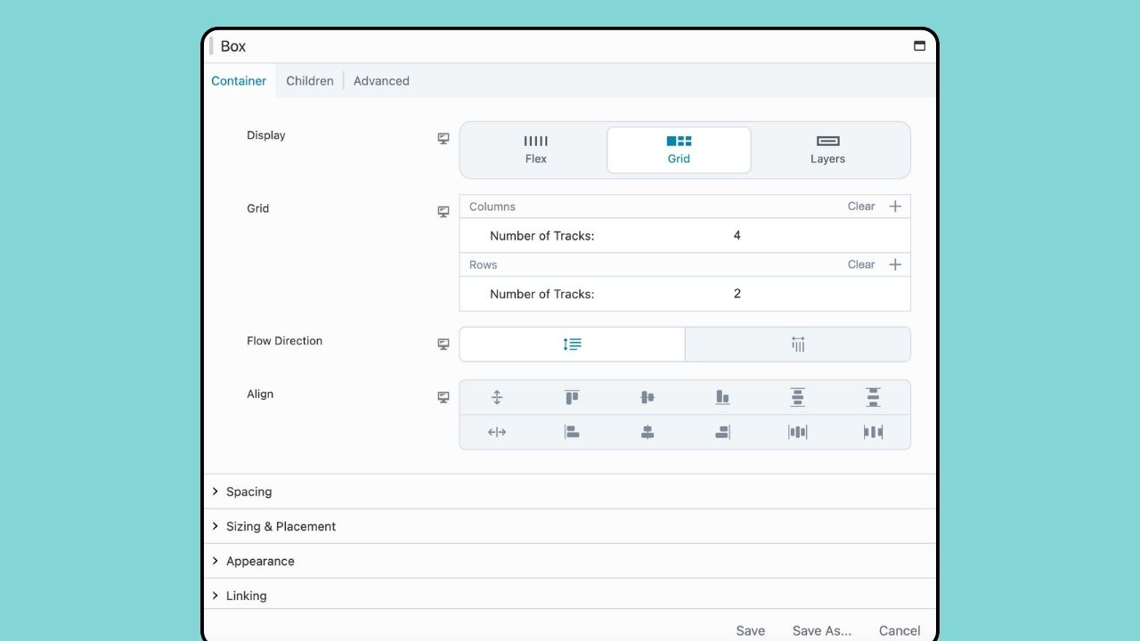
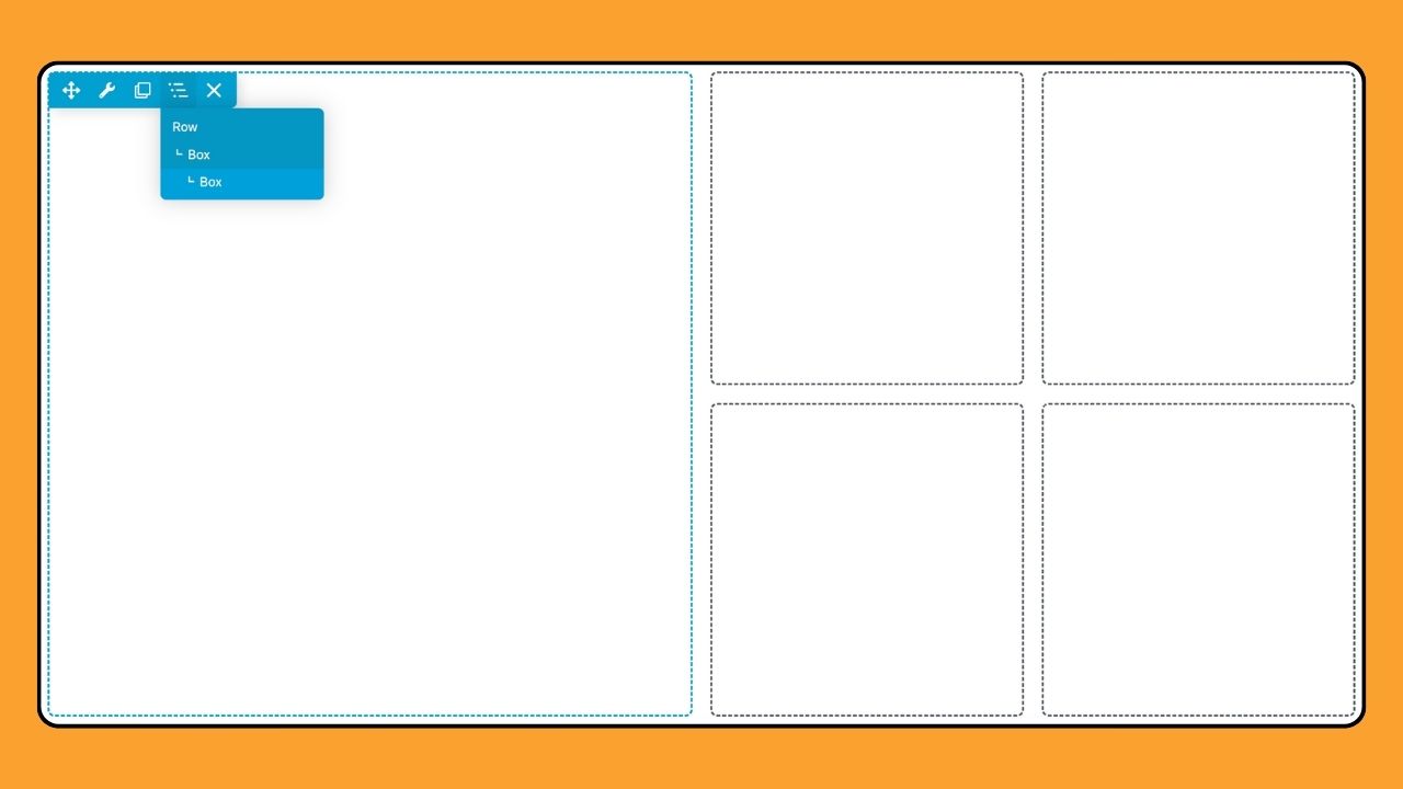
The Box module functions much like a row or column, serving as a container. It utilizes either flexbox or CSS grid, allowing you to create complex, fluid, and flexible layouts. You can nest, stack, and organize boxes in both horizontal and vertical orientations, as well as in a grid.
Flexbox and CSS Grid are both layout models in CSS, but they serve different purposes and have distinct characteristics:
- Flexbox – Ideal for one-dimensional layouts arranging items in a row or a column with flexibility in sizing and alignment.
- Grid – Suitable for two-dimensional layouts, offering precise control over both rows and columns, allowing for more intricate designs.
In many cases, these layout models can complement each other. For example, one might use flexbox within individual grid items to handle their internal structure, combining the strengths of both models for comprehensive layout solutions like this:

To add the Box Module when editing with Beaver Builder, click the Plus symbol (+) located on the Top bar to open the Content Panel. Click on the Modules tab to access all Standard Modules and scroll down to the “Box” section:
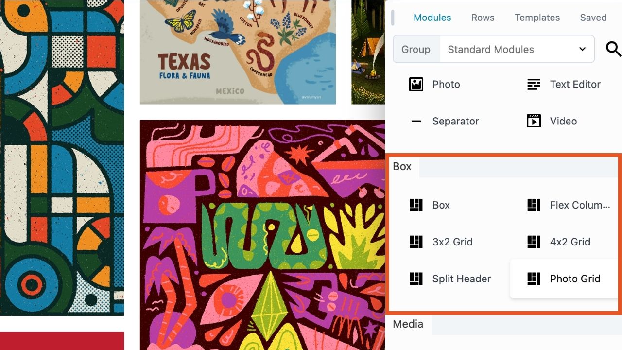
Along with the Box Module itself, you will notice that we have added several presets that make it easier to get started:
- Flex Columns – This preset creates a horizontal row of three flex boxes situated within the parent box.
- 3×2 Grid – A layout structure using grid boxes consisting of three columns and two rows inside the parent box.
- 4×2 Grid – A layout structure of grid boxes consisting of four columns and two rows within the parent box.
- Split Header – This structure is a grid defining 3 columns with a centralized photo module and menu modules on either side.
- Photo Grid – This layout is made up of a 4×3 grid and photo modules.
While we aim to make the Box module as user-friendly as possible, we strongly recommend having a solid grasp of Flexbox and CSS Grid. Using our new box module, you can take your web designs even further!
2. Global Styles (Premium Feature)
Beaver Builder already supports Global Settings that allow you to configure default values for options such as row max-width, margin/padding, breakpoints, and custom code (CSS & JavaScript) which are then applied globally on your site. In addition, you can override the majority of these settings on a per row, column and module basis via their settings.
The new Global Styles feature, available exclusively in the premium version of Beaver Builder’s page builder, provides you with the ability to define styling preferences for both elements and colors across Beaver Builder:
- Global Elements – This tab allows you to set styles for various html elements that are controlled by Beaver Builder such as Text, Headings, Links, and Buttons.
- Global Colors – This tab allows you to set up a global color palette that is made available in the color picker in Global Styles or anywhere else you can select colors.
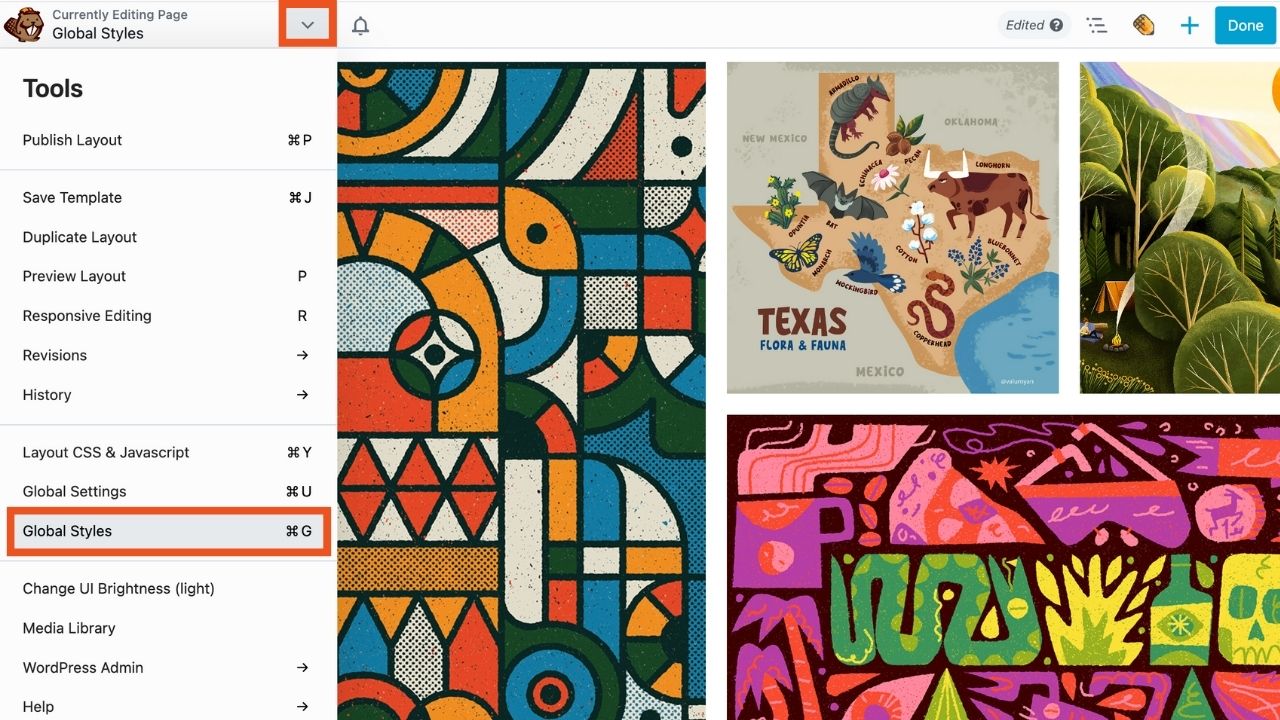
To access Global Styles, open the Tools menu by clicking the arrow in the Top Bar in the upper left corner of your editing screen, and select “Global Styles” as shown:
The Elements tab allows you to define global styling for elements such as text, headings, links, and buttons:
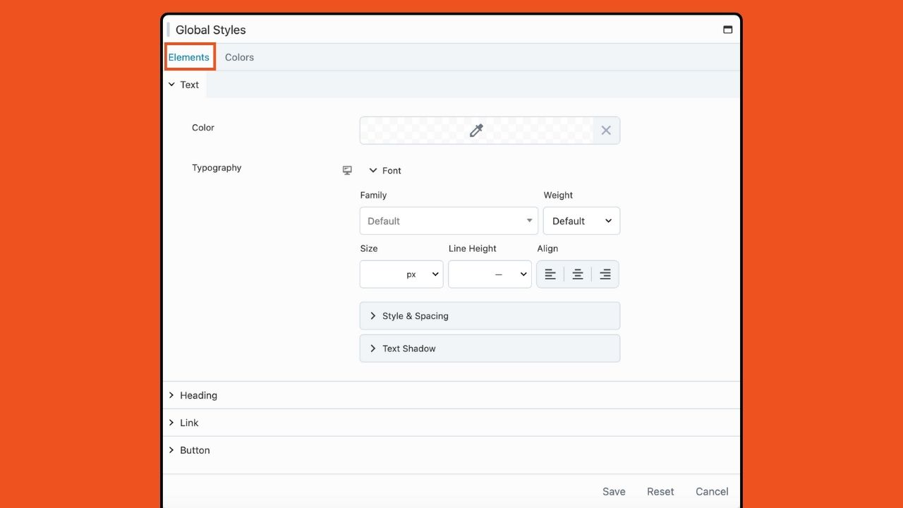
All modules on your website that lack preconfigured styling options inherit global styling. You can override these styling options on a case-by-case basis using the module styling options.
The Colors tab allows you to generate a global color palette that is available throughout your entire website:
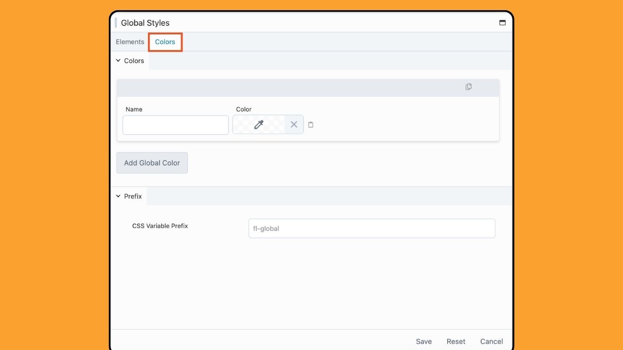
You can easily access these colors within your Beaver Builder layouts through the color picker tool. Furthermore, the colors you establish convert into CSS Variables, enabling their integration into custom CSS.
With this update, you can effortlessly customize the elements and colors of your website on a global scale. These global styles remain accessible throughout your entire website, enhancing your page builder workflow.
3. NorthCommerce Module
So far, we’ve discussed how Beaver Builder 2.8 introduces two new features, the Box Module and Global Styles, to make building complex layouts more user-friendly.
Beaver Builder 2.8 also introduces a module for North Commerce, an e-commerce plugin for WordPress that helps users build high-converting online stores quickly and easily:
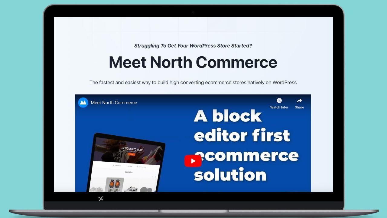
For example, you can now display the results of North Commerce shortcodes without having to enter or use any shortcodes. Instead, you can use the new North Commerce module, similar to our WooCommerce module, to easily display your content.
This new module will give you more control and speed up your workflow when working with NorthCommerce.
4. Popup Maker Integration
In Beaver Builder 2.8, we’ve also introduced an integration with Popup Maker, a plugin designed for WordPress websites that enables users to create and manage popups:

Essentially, you are now able to use our page builder to design the content for your popups
It will also render a popup inside Beaver Builder while editing as well as the ability to select a popup in the link field to trigger a popup when a link is clicked.
Once you install and activate the Popup Maker plugin, the Popup Maker post type (popups) will be automatically enabled within the Beaver Builder settings.
5. Minor Updates to Modules, Tools Menu, and Loop Settings
Lastly, Beaver Builder 2.8 includes the following minor additions:
- Menu Module – The Link padding option now supports the responsive toggle; adds a new padding option for responsive toggle settings.
- Post Carousel & Post Slider – Adds Excerpt Length option to both modules enabling you to set the content length.
- Tools Menu – Includes the ability to open and interact with the WordPress Media Library within the Beaver Builder User Interface.
- Photo Module – Add Object Fit and Position options to the style tab.
- Loop Settings – Adds the option to filter by current author and current logged in user.
- Row, Column, and Module Overlays – Updated to be consistent across node types.
- Outline Panel – Also got an update on this release to work more smoothly.
Conclusion: Power-Packed Features for Enhanced Web Building
Updating to Beaver Builder 2.8 unlocks a more robust and customizable page-building experience. The Box Module introduces advanced layout options with Flexbox and CSS Grid, while Global Styles simplifies color management.
To recap, here’s what you can look forward to in Beaver Builder 2.8:
- Box Module
- Global Styles
- NorthCommerce Module
- Popup Maker Integration
- Minor Updates to Modules, Tools Menu, and Loop Settings
Upgrade to Beaver Builder 2.8 today to take advantage of these exciting new features. As always, our support team is here to help if you have any questions or need assistance.
Related Questions
What Is the Latest Version of Beaver Builder?
As of February 2024, Beaver Builder 2.8 is the latest version of our plugin. It supports integration with NorthCommerce and Popup Maker plugins. You’ll also find a brand new Box Module that allows you to easily build layouts using flexbox, CSS grid, and layers.
What Does Beaver Builder Do?
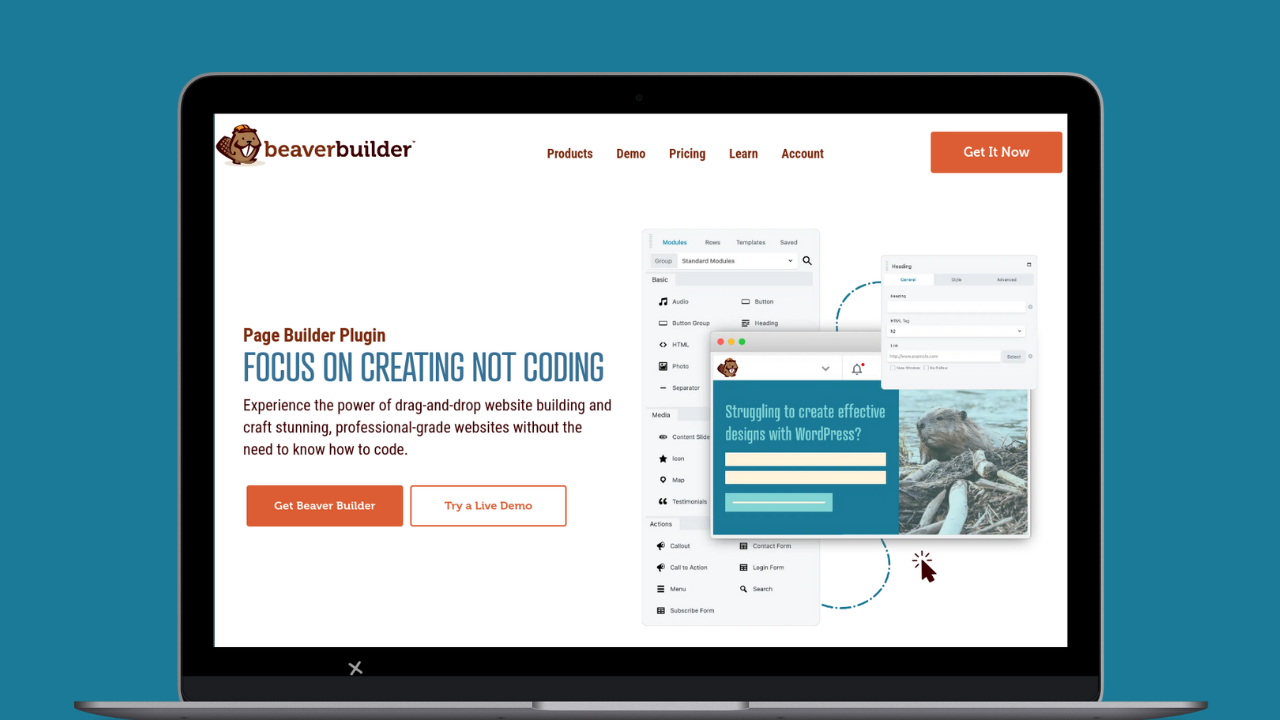
Beaver Builder is a suite of web design products for WordPress made up of a Framework Theme, Page Builder plugin, and Theme Builder that enables users to create and customize websites effortlessly through drag-and-drop functionality. Craft stunning, professional-grade websites without the need for coding expertise.
4 Comments
Our Newsletter
Our newsletter is personally written and sent out about once a month. It's not the least bit annoying or spammy.
We promise.
Try Beaver Builder Today

Related articles

Beaver Builder AI: Build WordPress Layouts with AI (Now in Alpha)
 -
June 10, 2026
-
June 10, 2026
Hey everyone! Big news. After a long time of building behind the scenes, Beaver Builder AI is here. The alpha…

How Beaver Builder Products Work Together to Build Flexible WordPress Websites
 -
May 21, 2026
-
May 21, 2026
Building a WordPress website often means stitching together a theme from one developer, a page builder from another, and a…

From Azeroth to WordPress: How Warcraft Tavern Uses Beaver Builder
 -
May 19, 2026
-
May 19, 2026
Since releasing Beaver Builder 12 years ago, a feeling will come up from time to time that just never gets…
Join the community
We're here for you
There's a thriving community of builders and we'd love for you to join us. Come by and show off a project, network, or ask a question.
Since 2014
Build Your Website in Minutes, Not Months
Join Over 1 Million+ Websites Powered By Beaver Builder.
Fantastic news! I’ve been looking forward to a more intuitive way to style bottles across BB pages.
Does upgrading from BB 2.7.4.4 to 2.8 require the use of the new Box/Grid module for current content?
No. You can start using the Box module after you upgrade, but nothing will change on your existing pages. You can also continue using rows, columns, and modules as you were before. Using the Box module is totally optional.
Thanks, Robby, for the confirmation! Beaver Builder rocks!!!!