
Beaver Builder 2.12: Filter Module, Design & Code Tabs, and a New Icon Picker
 -
November 13, 2026
Beaver Builder 2.12, also known as Tarbela, is now available. It adds a Filter module that lets visitors search, filter, and sort Posts and Loop layouts without a page reload, new Design and Code tabs for rows, columns, and modules, and a rebuilt Icon Picker. It also includes fixes for Components, Design Systems, and Loop modules.
Here’s what’s new in Beaver Builder 2.12:
Table of Contents
- Filter Module: Search and Filter Posts Without Reloading
- Design and Code Tabs for Rows, Columns, and Modules
- A Redesigned Icon Picker
- Custom Modules Render Without the Beaver Builder AI Plugin
- Workflow and Performance Improvements
- New Developer Hooks and Filters
- Bug Fixes and Security
- Frequently Asked Questions
- Get Started with Beaver Builder 2.12
Filter Module: Search and Filter Posts Without Reloading
The new Filter module sits on the same page as a Posts or Loop module and filters it in place. You’ll find it in the Actions category. Add it to your layout, connect it to your Posts or Loop module, and choose the filters:
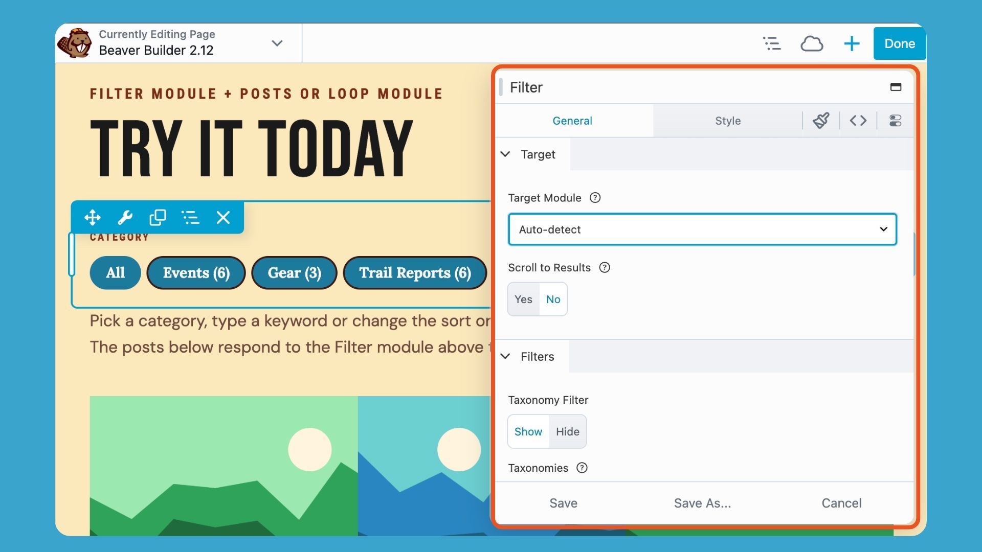
Filter module features include:
- Taxonomy filters: Filter by category or tag using buttons or a dropdown.
- Search as you type: Results narrow as visitors enter a search term.
- Sorting: Visitors can change the sort order.
- AJAX updates: Results refresh without reloading the page.
- Shareable URLs: Visitors can bookmark or share a filtered view.
- Back button support: The browser’s back button returns to the previous filter state.
If AJAX isn’t available, the module falls back to a standard page reload.
The Filter module also works on Beaver Themer archive layouts. Developers can let it filter the repeater items in their own custom modules.
Use it for portfolios, resource libraries, team directories, and blog archives. Because it works with Posts and Loop layouts, you can add filtering to a design you’ve already built.
Design and Code Tabs for Rows, Columns, and Modules
Rows, columns, and modules now include two new settings tabs that make it easier to customize elements visually or directly edit their code.
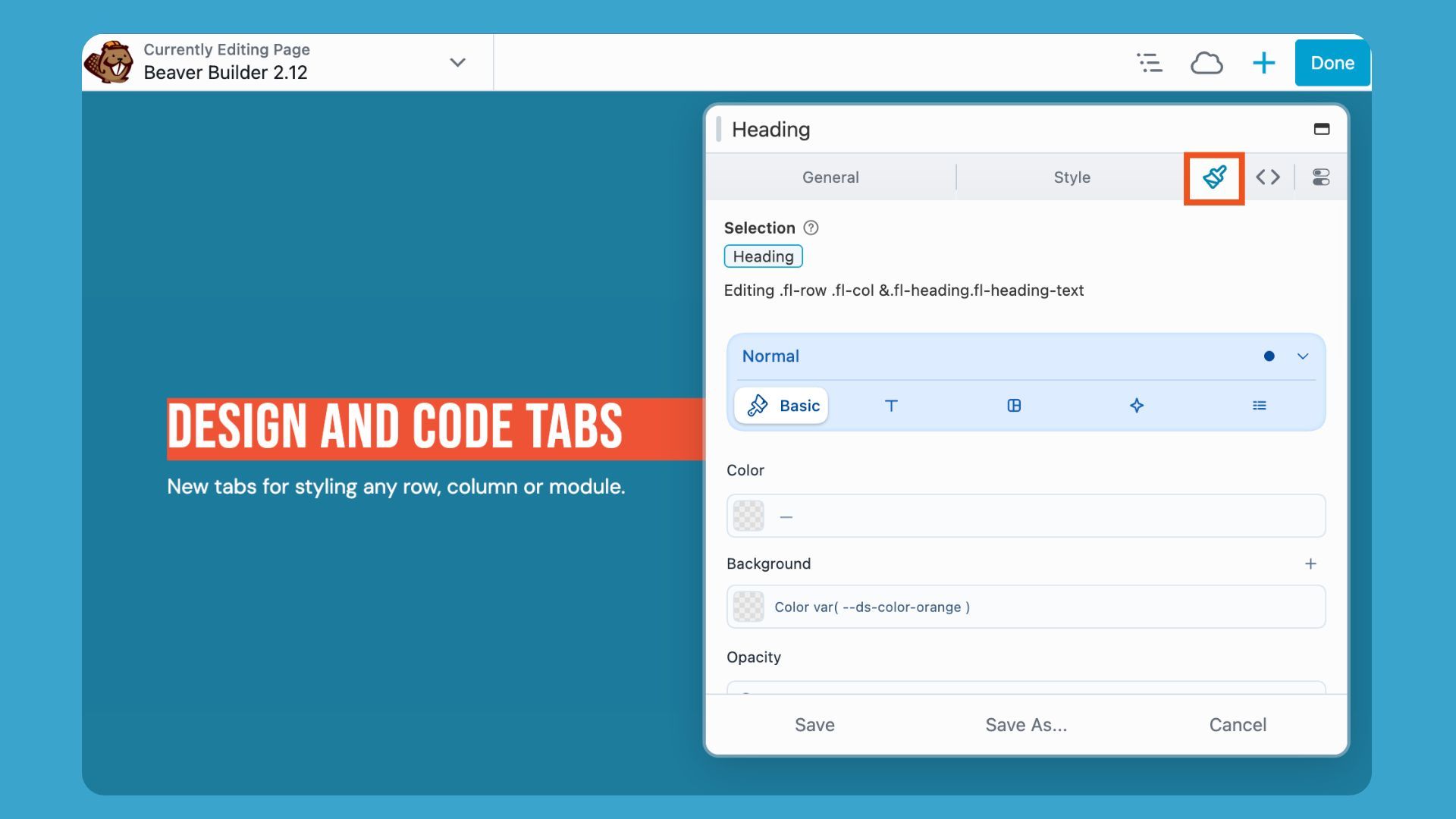
- Design tab: Select an element on the page and use visual controls to customize its appearance.
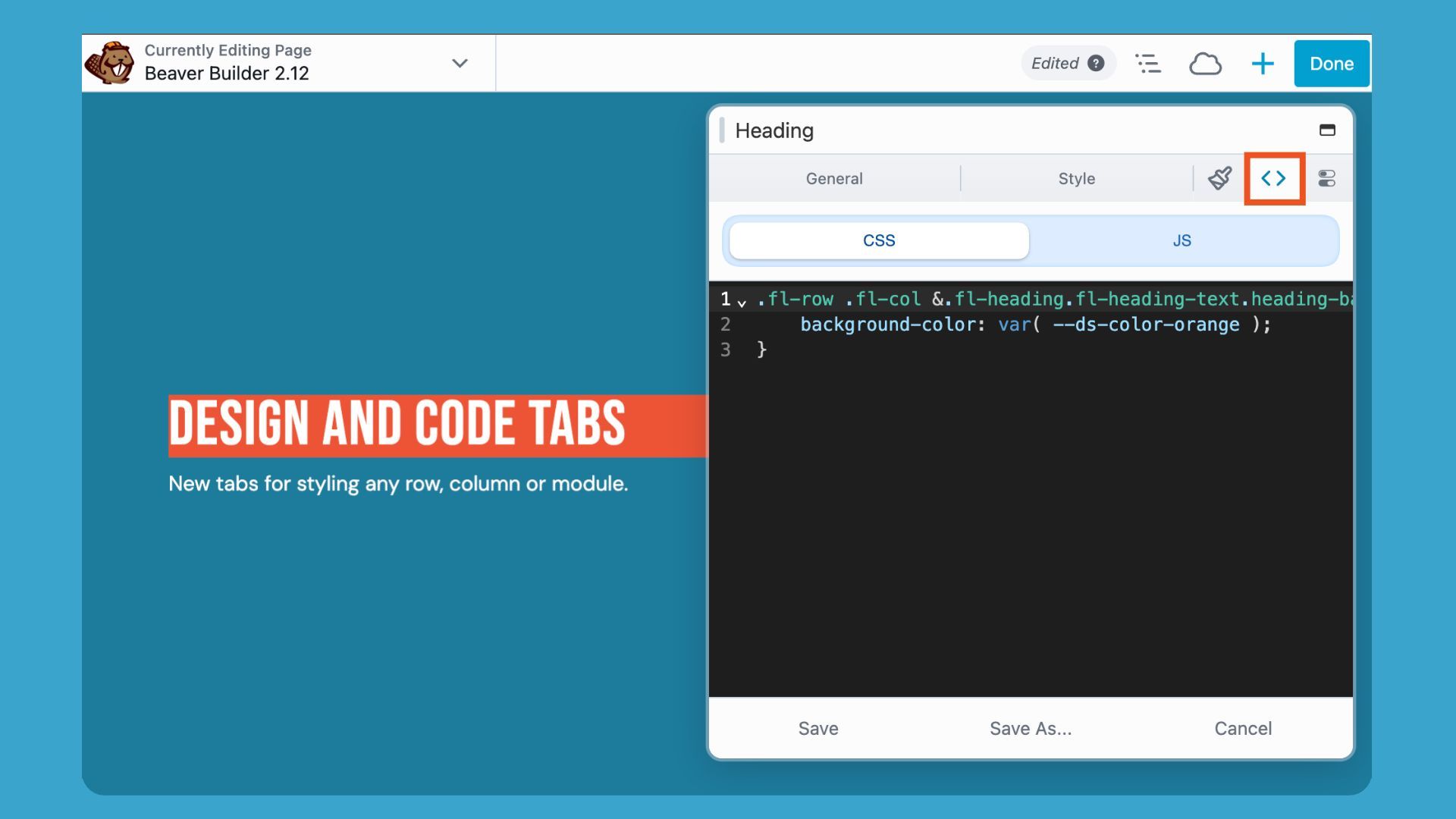
- Code tab: Edit the element’s CSS and JavaScript in one place.
Both tabs are enabled by default on new installs. If you’re updating an existing site to version 2.12, you can enable them under Beaver Builder > Settings > Advanced > Enable Design and Code Tabs. You’ll also need to enable the Code Settings tab.
The Design and Code tabs are available in Beaver Builder premium, but are not included in Beaver Builder Lite.
A Redesigned Icon Picker
The Icon Picker has been redesigned with a new React interface that makes browsing and finding icons easier.
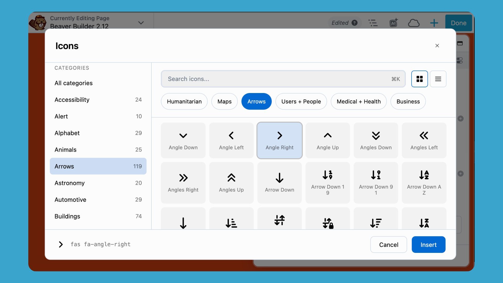
- Category sidebar: Browse icons by category instead of scrolling through one long list.
- Icon names: See each icon’s name directly below it.
- Grid and list views: Switch between layouts to find the view that works best for you.
- Search: Quickly find icons across the entire library.
Font Awesome has been updated to version 7.3.1. Font Awesome Pro users also get access to the Sharp and Sharp Duotone icon families.
Custom Modules Render Without the Beaver Builder AI Plugin
Beaver Builder now includes the assets needed to display custom modules and Design System styling. This means pages built with Beaver Builder AI retain their appearance even if the Beaver Builder AI plugin is removed or was never installed on the site.
This is especially useful when you build a site with Beaver Builder AI and hand it off to a client. These improvements are available in paid versions of Beaver Builder, but not Beaver Builder Lite.
Workflow and Performance Improvements
Faster publishing for global rows and modules
Publishing a global template previously required scanning every layout on the site. The new indexing approach makes the lookup nearly instantaneous, significantly speeding up the publishing process.
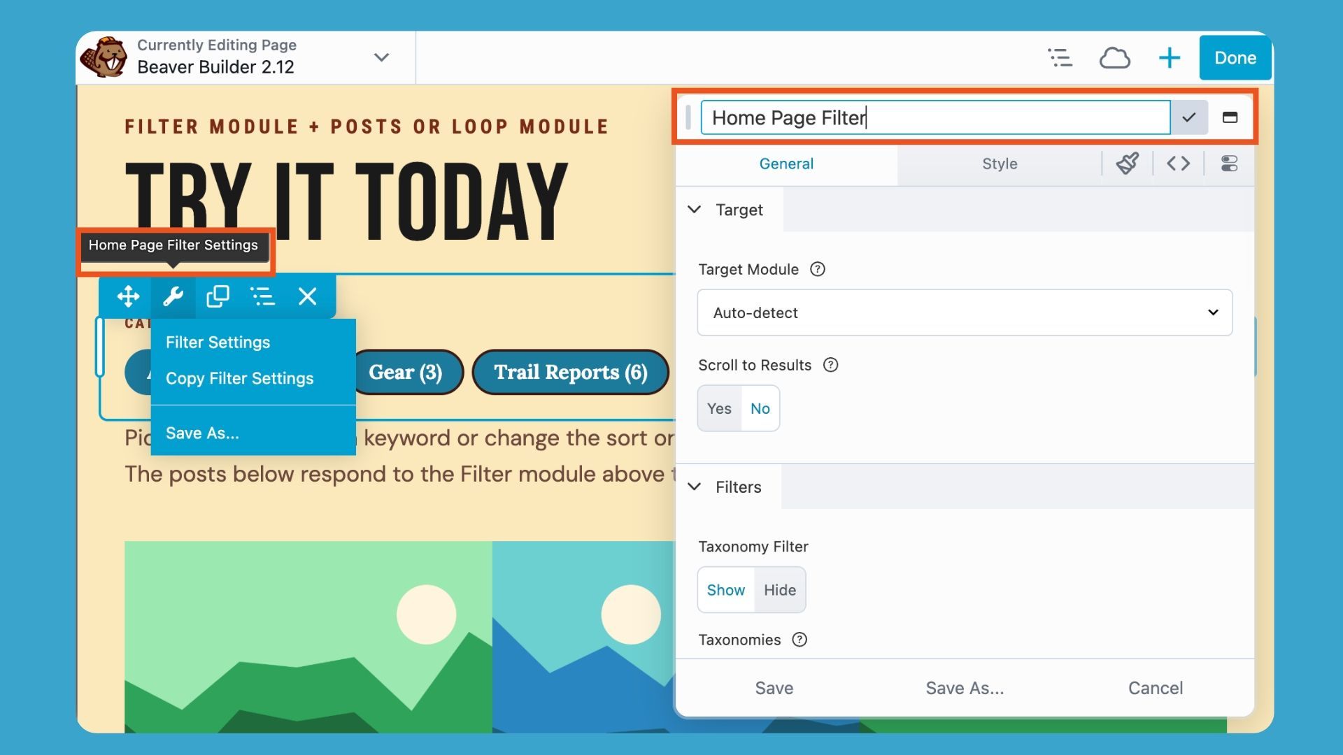
Custom labels are easier to identify
When you assign a custom label to a row, column, or module, that label now appears in the settings header, Outline Panel, and canvas overlay, without the module type appended to it. You can also rename the node directly from the settings header:
Choose Row or Box for dropped modules
A new Global Settings option lets you choose what wraps a module when you drop it into an empty area of your layout. Choose between a Row (the current default behavior) or a Box.
An onboarding tour that adapts to your setup
The onboarding tour now adjusts to the features available on your site. When Beaver Builder AI is active, the tour includes a new “Build with AI” step highlighting the AI Chat button. It also includes steps for Beaver Cloud, Assistant, and Query Monitor when those features are enabled. If none are enabled, the tour remains unchanged.
New Developer Hooks and Filters
Beaver Builder 2.12 adds two extension points:
- fl_builder_dynamic_node_merge_child_settings: A new filter that lets extensions apply a per-instance merge to Component child nodes. It works the way the existing fl_builder_dynamic_node_merge_settings filter does for Component root nodes.
- willDropNodeTemplate: A new JavaScript hook that lets extensions intercept saved row, column, module, and template drops, the same way willDropModule works for module drops.
Bug Fixes and Security
Beaver Builder 2.12 also includes fixes for Design Systems, components, loop queries, builder settings, and more. The release improves reliability across the editing experience and addresses a security issue involving the Convert to Component admin action.
For the complete list of changes and updates, see the Change Logs page.
Frequently Asked Questions
Beaver Builder 2.12 adds a Filter module for Posts and Loop layouts, Design and Code tabs for rows, columns, and modules, a redesigned Icon Picker, Font Awesome 7.3.1, new developer hooks, and fixes for Components, Design Systems, module behavior, and security.
Add a Posts or Loop module to your page, then add the Filter module from the Actions category. Connect it to your loop, choose a taxonomy, and pick buttons or a dropdown.
Go to Beaver Builder > Settings > Advanced and enable “Enable Design and Code Tabs.” Code Settings must also be enabled. The tabs are on by default for new installs.
The Design and Code tabs are only available in paid versions of Beaver Builder.
Get Started with Beaver Builder 2.12
Log in to your account to download the Beaver Builder 2.12 and update your site.
New here? Discover Beaver Builder and see how our drag-and-drop page builder can help you build professional WordPress websites.
Need help? Explore these resources to get the most out of Beaver Builder:
- Official Beaver Builder Support
- Beaver Builder Documentation
- Beaver Builder Tutorials and Online Courses
- Beaver Builder Community Facebook Group
What are you most excited to try in Beaver Builder 2.12? Let us know in the comments!

Start here

Beaver Builder AI Demo
Build a page with AI on a site that already has Beaver Builder and Beaver Themer installed. Free AI credits included.
Our Newsletter
Our newsletter is personally written and sent out about once a month. It's not the least bit annoying or spammy.
We promise.
Try Beaver Builder Today

Related articles

How to Turn a Screenshot Into a WordPress Page With AI
-
October 29, 2026
Have you ever had a client send you a screenshot and ask you to make their website look like it?…
Create a Dark Mode Toggle in WordPress
 -
October 15, 2026
Add a light and dark mode toggle to your WordPress site with Beaver Builder AI and the free Dark Mode…

How to Convert Base44 design to WordPress using Claude and Beaver Builder AI
 -
October 13, 2026
In this article, I share how I moved a landing page design from Base44 to WordPress using Claude and Beaver…
Join the community
We're here for you
There's a thriving community of builders and we'd love for you to join us. Come by and show off a project, network, or ask a question.


Since 2014
Ready to build?
The WordPress page builder agencies and freelancers have trusted since 2014. Now with AI.