")
How to Push Content to the Bottom of a Box in Beaver Builder (Flexbox Solution)
 -
March 18, 2026
-
March 18, 2026
How do you get a button to stay pinned at the bottom of a card? It’s a common problem where the button often refuses to move to the bottom of the card, no matter what you try.
To push content to the bottom of a Beaver Builder Box Module, set the box to Display: Flex, Direction: Column, Align: Space Between, and define a container height using a minimum height or an aspect ratio.
This article is written to help solve that problem. You will learn how to use the Box Module and Flexbox settings to push content to the bottom of a container, including step-by-step instructions using both minimum height and aspect ratio techniques. By the end, you’ll be able to create clean, balanced, and responsive card layouts where buttons and other content stay exactly where you want them.
Just getting started with the Box Module? Check out this guide: The Beaver Builder Box Module Guide – Learn what the Box Module is, why it exists, and how it can transform your layouts.
Why the Button Won’t Move
The Box Module uses Flexbox, a modern CSS layout system that distributes space inside a container.
The key rule to remember:
Flexbox needs space to distribute.
If the Box Module has no defined height, Flexbox collapses everything toward the top. Alignment or justification settings won’t work because there’s no space for them to act on.
Many users try spacers, padding, or fixed pixel heights. These work temporarily but create fragile layouts. Changing the text, screen size, or duplicating the card can break the design.
The Two-Part Solution
To push a a button (or any module) to the bottom of a Box Module, you need two things:
- Flexbox settings that tell the container how to distribute its space
- A defined height so Flexbox has space to work
For height, you have two options:
- Minimum Height — simple, fixed, works well for single cards or hero sections
- Aspect Ratio — flexible, scales with container width, perfect for card grids
The right choice depends on your layout which we will cover below.
Step-by-Step: Setting Up the Box Module
Start by building your card structure inside a Box Module. The setup is the same regardless of which height method you choose.
Step 1: Add your content to a Box Module
Place your content inside the Box Module in this order:
- Heading
- Button
Your structure in the panel should look like this:
Box
├ Heading
└ Button
At this point everything should stack at the top.
Step 2: Enable Flexbox
Open the Box Module settings. Set the display mode to Flex to turn the box into a flex container:
- Display: Flex
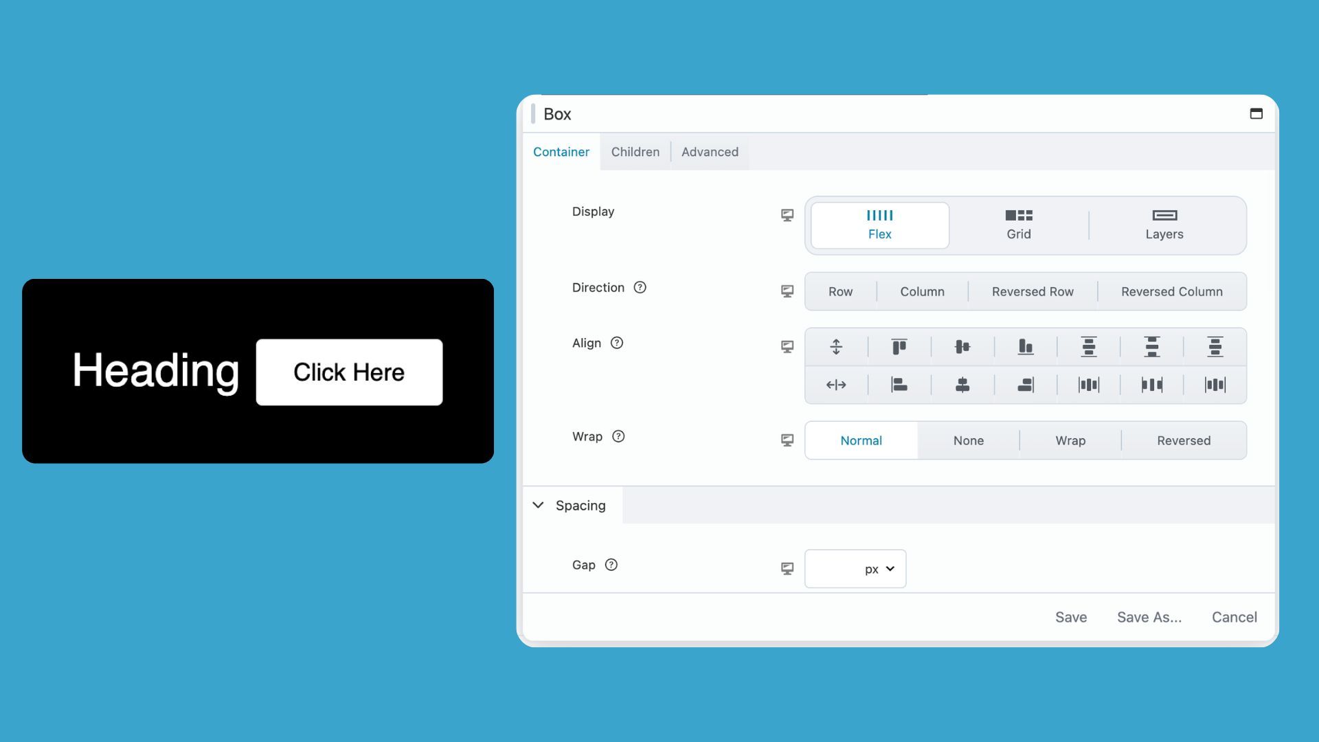
Then set direction to Column. This stacks items vertically:
- Direction: Column
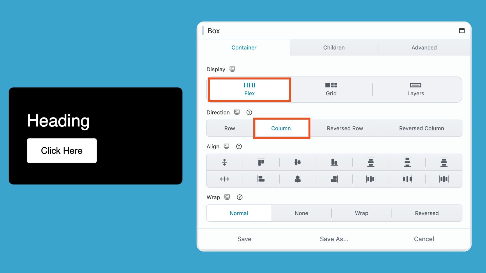
The box is now ready to distribute space. It just doesn’t have any yet:
Step 3: Set Align to Space Between
In the Box Module settings, apply this spacing rule to the content:
- Align: Space Between
- Align: Center (optional if you would like to center the modules)
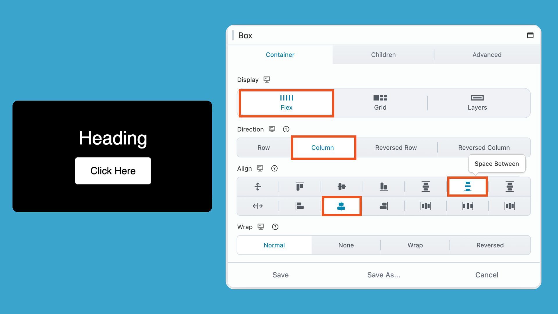
The Space Between setting tells Flexbox to push the first element to the top and the last element to the bottom, then distribute any remaining space in between.
Your layout still looks compressed at this point which is normal. We haven’t given the container height yet; we will add that next using one of two options.
Option A: Use a Minimum Height
Setting a minimum height is the straightforward approach. It works well when your cards have a predictable size and you want a specific pixel height.
In the Box Module settings, set the minimum height under Sizing & Placement in the Container tab:
- Min Height: 350px (or whatever suits your design)
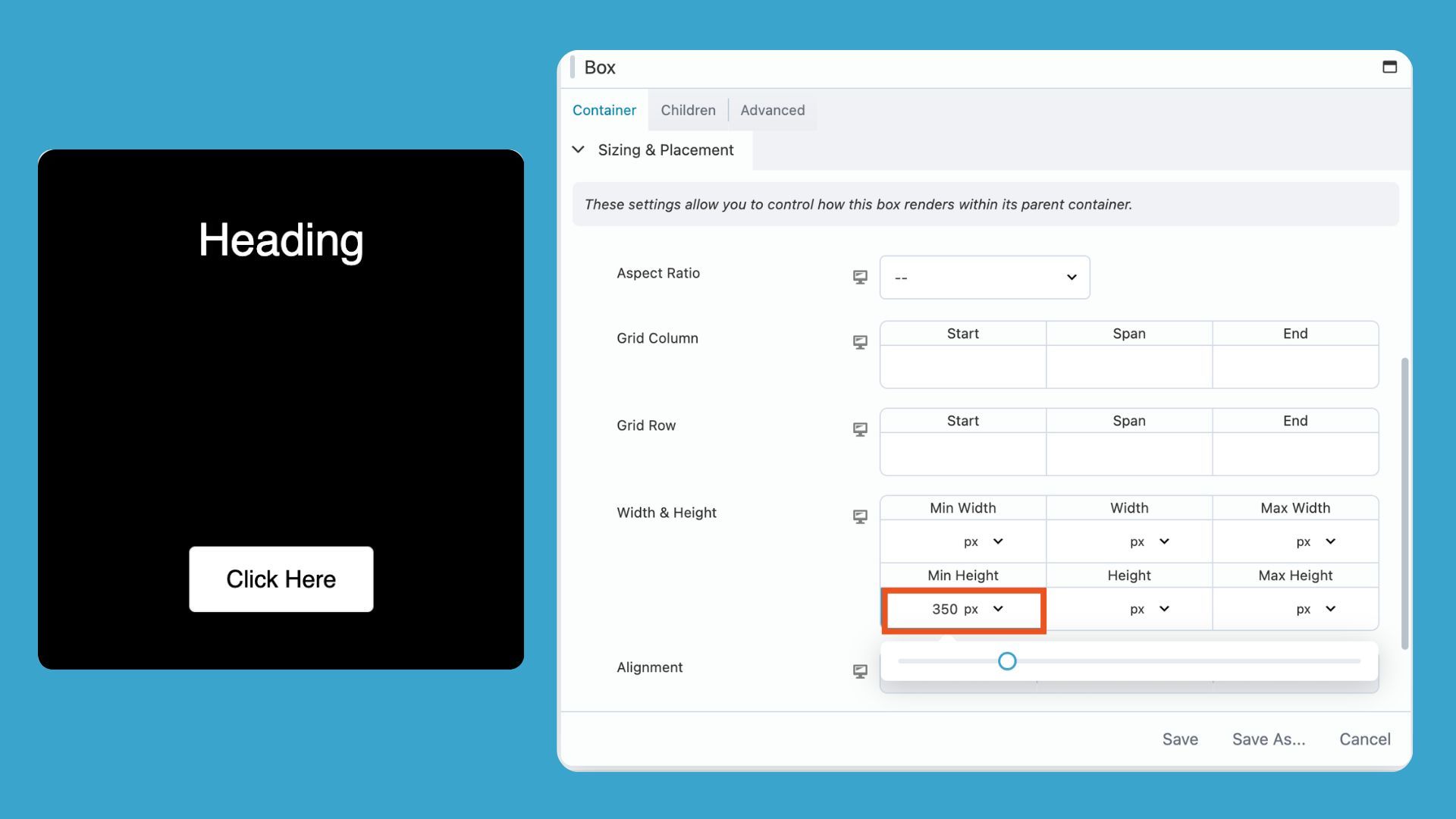
The moment you add this, Flexbox has room to work. Your button drops to the bottom and the heading stays at the top. The space between them fills automatically.
When to use this height option: Single-card layouts, hero sections, or any situation where you want a fixed minimum canvas.
The tradeoff: On mobile, that minimum height may feel too tall. Check your responsive settings and dial it down for smaller screens if needed.
Option B: Use an Aspect Ratio
Aspect ratios are the more modern approach. Instead of setting a fixed pixel height, you define the height as a proportion of the container’s width. The box scales up and down with the layout.
In the box module settings, set the aspect ratio under Sizing & Placement in the Container tab:
- Aspect Ratio: 4:5
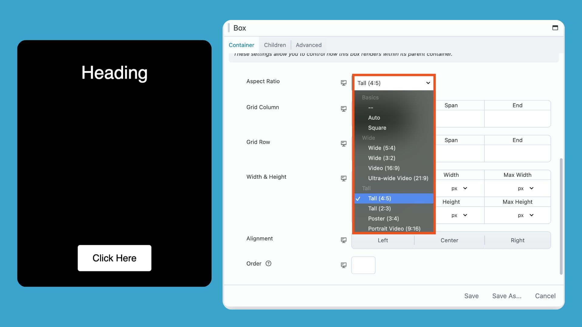
With a 4:5 ratio, a 400px-wide card becomes 500px tall. If that same card shrinks to 300px on a tablet, it becomes 375px tall. The proportions stay consistent. Flexbox always has height to work with.
When to use this: Card grids, pricing tables, feature blocks, or any layout where multiple cards sit side by side and you want them to scale together.
The tradeoff: Very long content can overflow the container if the aspect ratio doesn’t accommodate it. Adjust the ratio or add top and bottom padding to give text room to breathe.
Why Setting Height on the Row Doesn’t Work
This is a common stumbling block, so it’s worth mentioning.
You might think that giving the Row or outer container a minimum height will fix the button alignment, but it usually doesn’t. That’s because Flexbox only distributes space inside its own container. In this case, the Box Module is the flex container, not the Row. Setting height on the Row doesn’t actually give Flexbox the room it needs to push your button to the bottom.
Therefore, the solution is to set the height directly on the Box Module. That’s where the layout lives, and that’s where Flexbox can do its job.
What If You Want a Heading and Description at the Top?
So far we have created a pretty simple layot. Problems start to arise as we add more modules. For example, let’s say we want a heading and description at the top of the card. If we simply add a text module to the box, our layout looks like this:
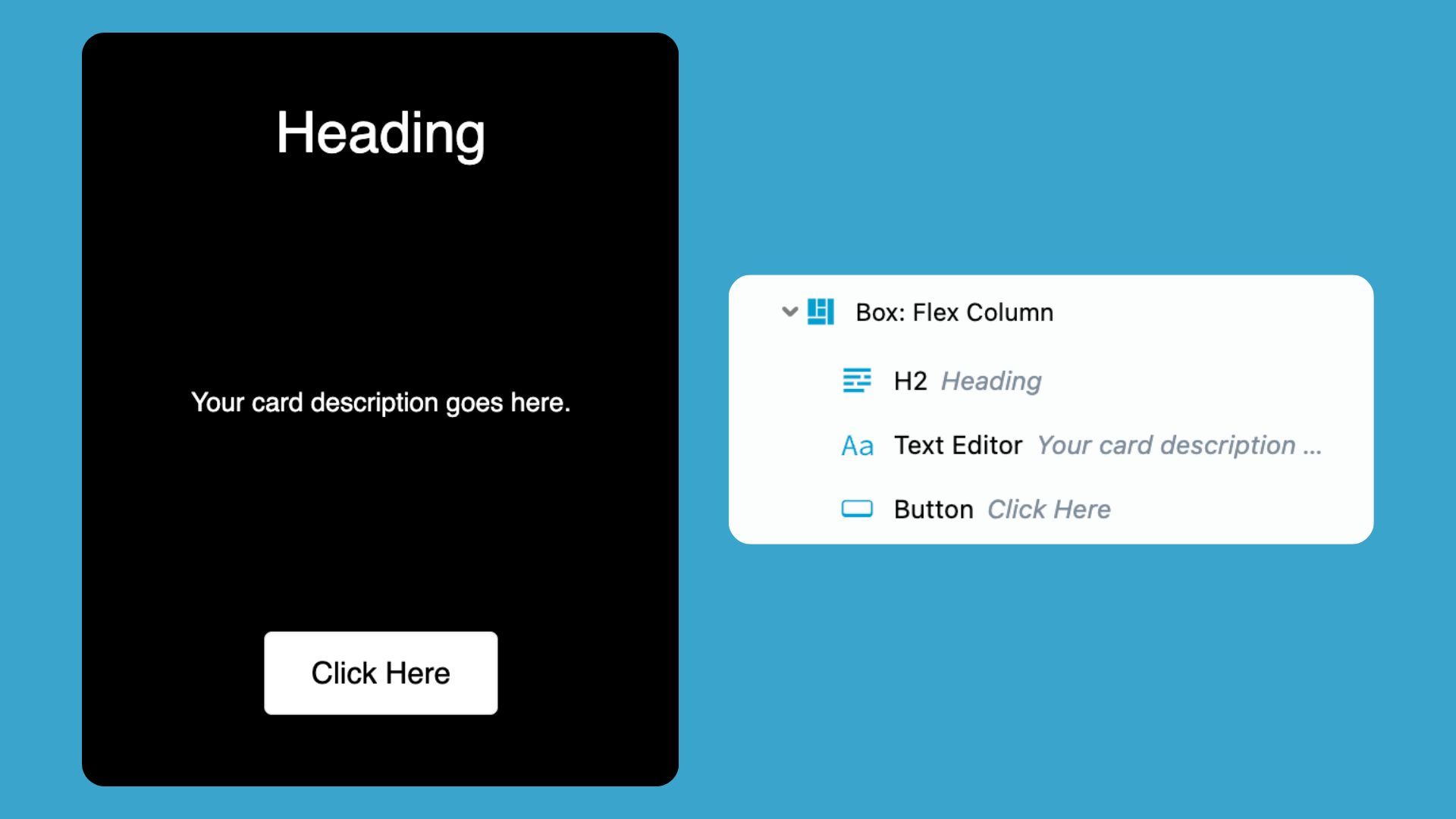
Instead of placing the heading and description directly inside the main card, we will need to first add another Box Module inside the card box and then place the heading and text modules inside of it.
Your structure should look like this:
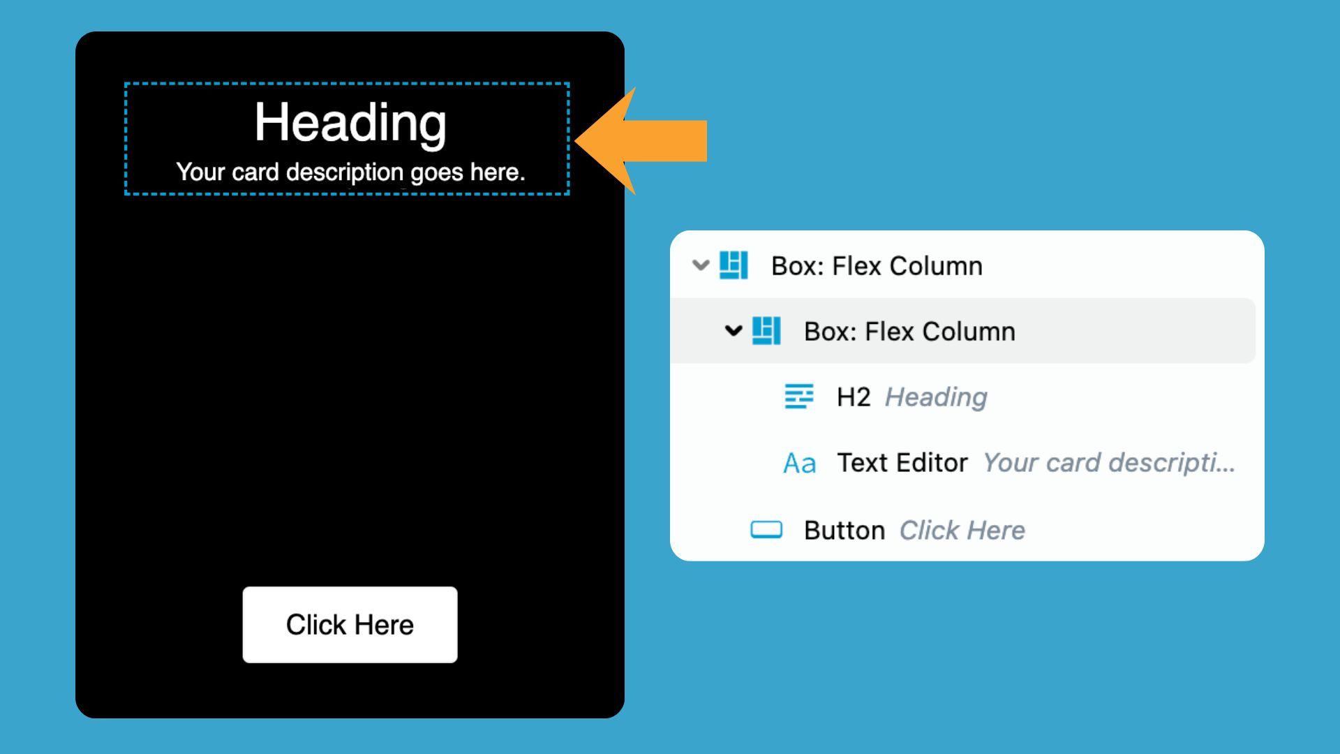
Card layout using nested box modules; outline panel showing the hierarchy.
The Card Box controls the overall layout, while the Content Box keeps the heading and description grouped together.
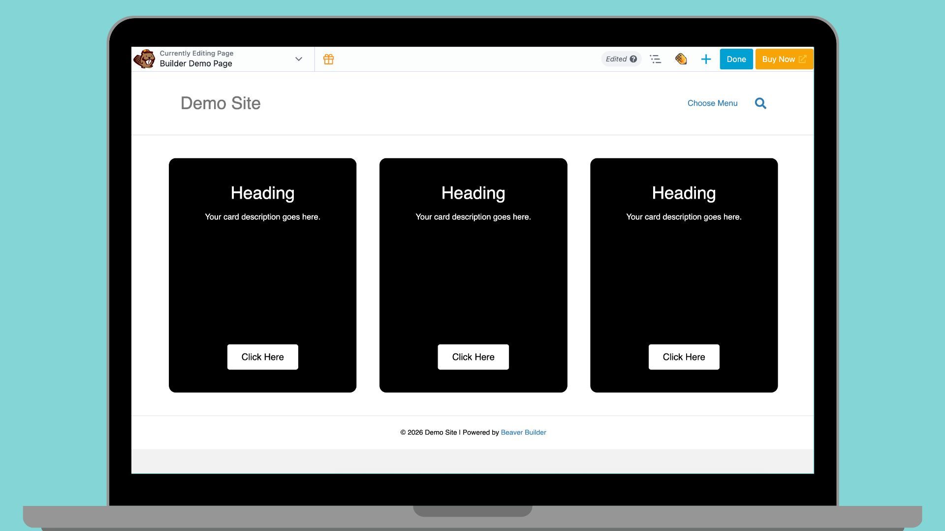
What the Finished Layout Looks Like
With either method in place, your card should now behave like this:
Box (Flex, Column, Space Between, Height defined)
Heading
Description text
(flexible space)Button
The heading and text stay at the top. The button stays at the bottom. The space between them expands and contracts based on the container size:
Quick Reference: Key Settings
| Setting | Value |
| Display | Flex |
| Direction | Column |
| Align | Space Between, Center |
| Min Height (option 1) | 350px or as needed |
| Aspect Ratio (option 2) | 4:5 or as needed |
A Better Mental Model for the Box Module
If the Box Module still feels unpredictable, the mental model might be the issue. Traditional page builders trained us to think in rows and columns. A row holds columns. Columns hold modules. That structure is baked into how most WordPress builders work.
The Box Module works differently. We need to to think in containers and items instead. The container controls how items flow. It decides the direction, the spacing, and the alignment. The items just sit inside it and follow the rules.
Where This Pattern Fits in Real Projects
This technique works anywhere you need content at the top and an action at the bottom such as:
- Feature cards. Varying description lengths no longer break the alignment. Every button sits on the same line.
- Pricing tables. The call-to-action button stays anchored at the bottom of each tier, no matter how many feature bullets are listed above it.
- Testimonial blocks. A quote sits at the top. The attribution, name, or rating sits at the bottom. Clean and consistent across every card.
- Promotional panels. Headline and supporting copy at the top. A CTA button locked to the bottom. Background fills the space proportionally.
- Service blocks. Each service description varies in length. The “Learn More” link still lines up across the row.
Final Thoughts
This layout pattern appears in many professional WordPress projects. Without it, buttons can fail to align, cards may look uneven, and CTA buttons in pricing tiers can float awkwardly in the middle. By mastering this technique, you ensure clean, consistent, and visually balanced layouts every time.
Explore More Beaver Builder Box Module Articles:
- The Beaver Builder Box Module Guide – Learn what the Box Module is, why it exists, and how it can transform your layouts.
- How to Use the Box Module (Step by Step Video Tutorials) – Hands-on videos walking you through the Box Module settings.
- Build Faster Layouts in Beaver Builder: Skip the Rows and Columns – Learn how to build layouts with the Box and Loop Modules.
- 60+ New Box Module Templates for Faster WordPress Layouts – Ready-to-use templates to speed up your page design
Frequently Asked Questions
The container needs a defined height before Flexbox can distribute space. If you’ve applied Space Between but nothing has shifted, the box might not have height to work with. Add a minimum height or an aspect ratio to the Box Module and the layout should update immediately.
The decision to use minimum height or aspect ratio depends upon your layout. Minimum height works well for single cards or sections where you want a specific pixel floor. Aspect ratio is better for card grids and repeating layouts where you want proportional scaling across screen sizes. Either method works. Aspect ratio is the more modern approach and requires less adjustment at different breakpoints.
Flexbox distributes space inside its own container. The Box Module is the flex container, not the row. Height applied to the row sits outside that container, so Flexbox doesn’t register it. Set the height directly on the Box Module.
This is where aspect ratios can run into trouble. Long content may overflow a container with a fixed ratio. You have two options: add top and bottom padding inside the Box Module to give content room to breathe, or increase the aspect ratio to accommodate more text. If content length varies significantly across cards, a minimum height is often the more forgiving choice.
Our Newsletter
Our newsletter is personally written and sent out about once a month. It's not the least bit annoying or spammy.
We promise.
Try Beaver Builder Today

Related articles
Build Beaver Builder Sites with AI
-
March 12, 2026
Building a WordPress website still involves many repetitive steps such as writing copy, structuring layouts, generating images, and refining design…
Build Dynamic WooCommerce Archive Pages with Beaver Builder’s Loop Module and ACF
-
March 11, 2026
Default WooCommerce archive pages are functional, but can be clunky. They give you minimal control over layout, and displaying custom…
How to Nest Components in Beaver Builder: Build a Design System That Scales
-
March 3, 2026
In the last tutorial, we built a component from scratch. Now we’re taking it a step further by nesting components…
Join the community
We're here for you
There's a thriving community of builders and we'd love for you to join us. Come by and show off a project, network, or ask a question.
Since 2014
Build Your Website in Minutes, Not Months
Join Over 1 Million+ Websites Powered By Beaver Builder.