
CSS Grid is powerful, but it can be hard to work with when you can’t clearly see your layout. Beaver Builder 2.10 introduced a simple solution: a built-in grid overlay inside the Box Module.
Beaver Builder’s Grid icon toggles a visual grid guidelines overlay inside the Box module. It helps you align content, spot spacing issues, and build CSS Grid layouts more accurately without guessing. Enable it anytime while working with Grid display mode.
In this article, you’ll learn where to find the Grid icon, how to turn on the overlay, and when to use it while working with CSS Grid layouts.
Table of Contents
- What the Grid Overlay Does
- Where to Find the Grid Overlay Icon
- When to Use Beaver Builder CSS Grid Overlay
- Before and After: The Difference The Grid Overlay Makes
- Common Mistakes the Grid Overlay Helps You Catch
- Conclusion
- Frequently Asked Questions
What the Grid Overlay Does
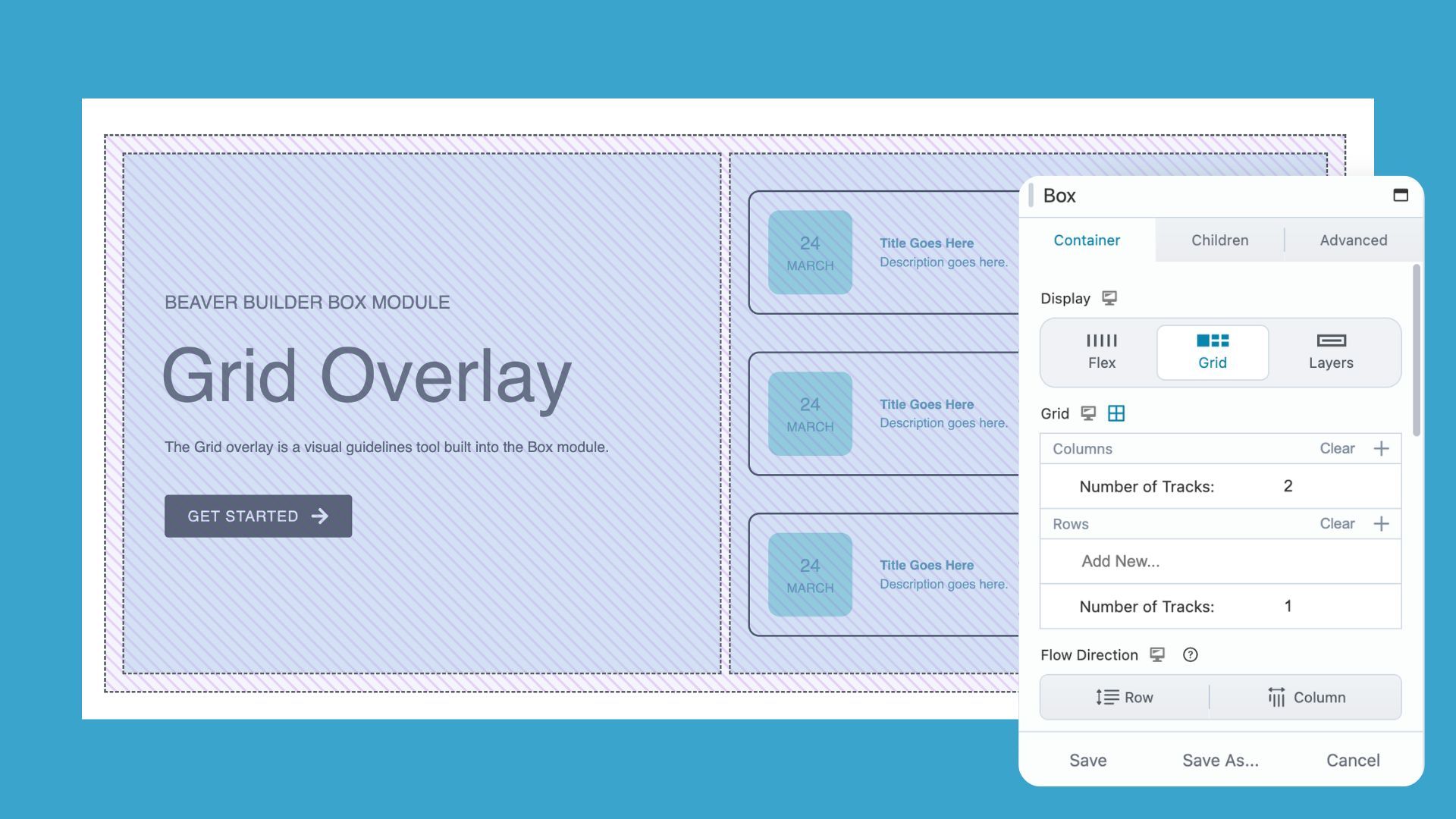
The Grid icon in the Box Module toggles a visual guidelines overlay directly on top of your CSS Grid layout, making the invisible structure of your grid visible.
In this example, the outer Box Module is set to a 2-column, 1-row grid.
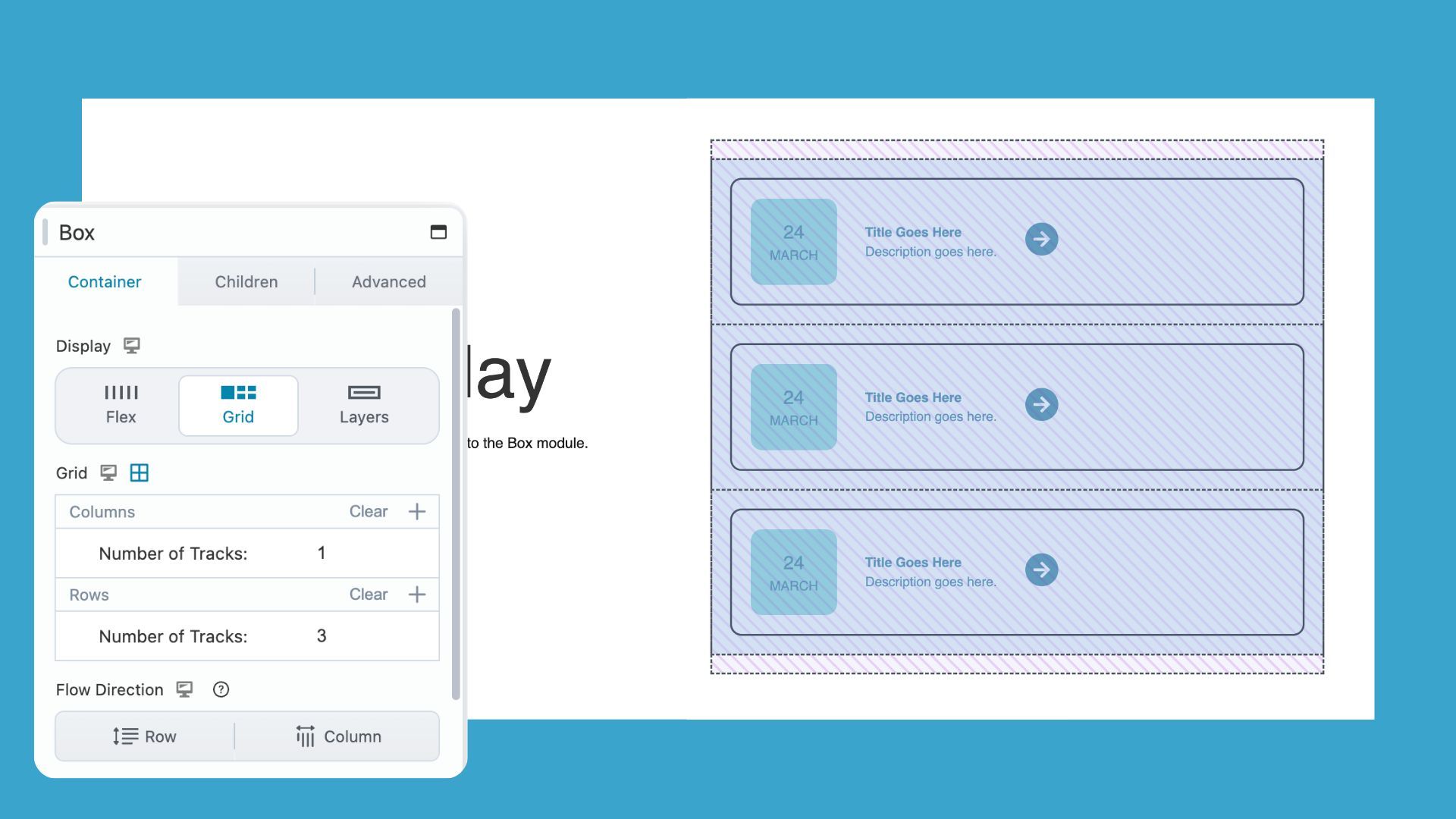
The inner Box module on the right is set to a 1-column, 3-row grid, clearly showing how content stacks within the grid when the overlay is enabled:
Enable the overlay and you can:
- Align content precisely — see where grid lines fall so you can place elements with confidence.
- Spot spacing inconsistencies — confirm whether your gaps are uniform or just look close enough.
- Understand element relationships — see how items relate to each other and to the grid itself.
- Debug layout issues faster — identify misalignment in seconds instead of digging through settings.
Where to Find the Grid Overlay Icon
If you’ve never noticed the Grid icon before, you’re not alone. It sits quietly in the Box module settings. Here’s where to find it and how to enable it:
1. Open a Box Module and Set It to Grid
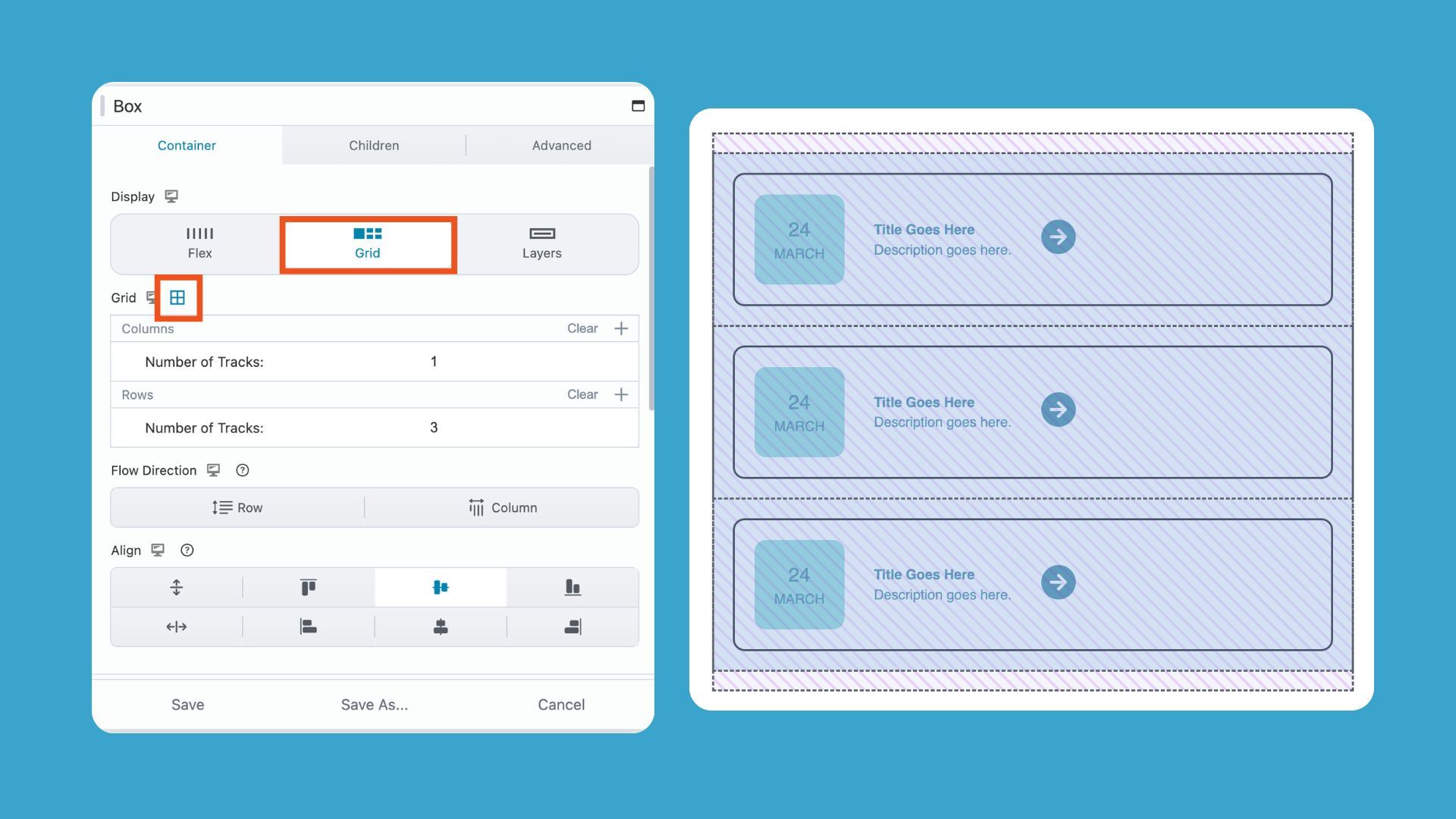
Click on any Box module in your layout to open its settings. Navigate to the Container tab and and set Display to Grid.
The Grid icon only appears when the Box Module is set to Grid. If your module is set to Flex or Layers, the icon won’t be visible.
2. Find the Grid Icon in the Box Module Settings
Once Grid display is active, a new Grid section will appear below the Grid Display. The Grid icon sits to the right of this heading and looks like a small grid or table symbol:
3. Click the Grid Icon to Toggle the Overlay On
Click the Grid icon once to enable the overlay. Visual guidelines appear immediately over your layout, showing:
- Column lines
- Row lines
- Gap spacing
Click the icon again to hide the overlay whenever you want a clean view. Note: the overlay disappears when you close the Box Module settings.
When to Use Beaver Builder CSS Grid Overlay
The Grid overlay is a handy visual guide for solving common layout problems and checking your designs quickly. Here’s when you might find it most useful:
When Things Don’t Line Up
If an element looks slightly off, turn the overlay on before adjusting margins or padding. Most of the time, the misalignment is immediately visible, and you’ll know exactly what to fix.
When Spacing Feels Inconsistent
Gap values that look correct in the settings panel don’t always appear uniform in the layout. The overlay shows actual spacing visually, letting you compare gaps at a glance instead of cross-referencing numbers.
When You’re Working With Column Spans
Column spans are easy to misconfigure. The overlay reveals exactly how far an element stretches across the grid, making it simple to confirm your spans are behaving as intended.
When You’re Learning CSS Grid
CSS Grid can be abstract, and reading about rows and columns only goes so far. The overlay turns these concepts into something you can see in real time, helping you build intuition and confidence with Grid layouts.
Before and After: The Difference The Grid Overlay Makes
Sometimes the layout feels “off,” but it’s hard to pinpoint why. The Grid overlay takes the guesswork out of design, letting you see your structure clearly before making adjustments:
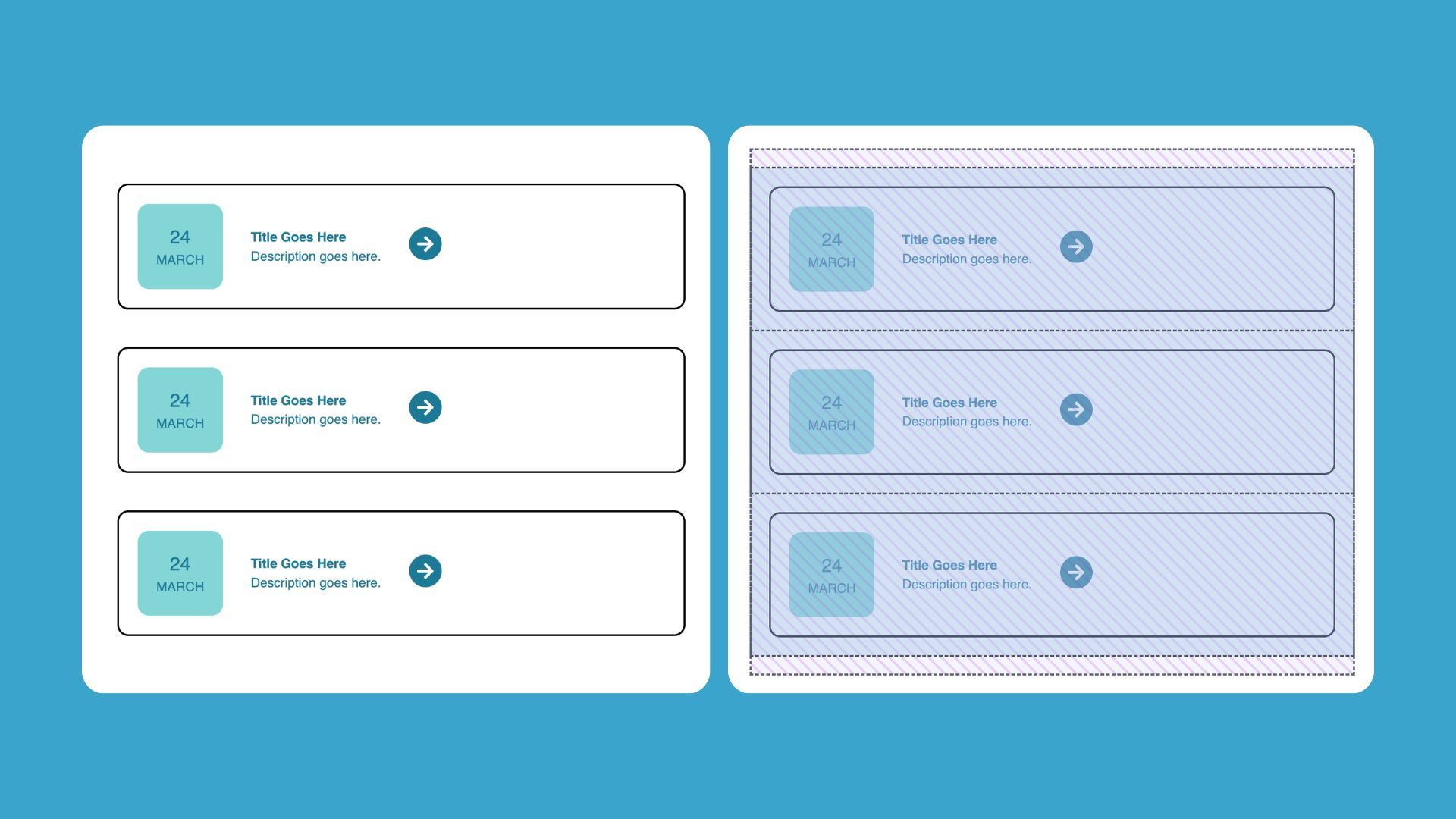
Without the overlay: You’re guessing. You adjust a value, refresh, adjust again. You can feel that something’s wrong but you can’t see why.
With the overlay: The structure is right in front of you. You can see which column an element sits in, whether the gap matches on both sides, and whether a span reaches where you intended.
The overlay doesn’t change your layout; it just makes it visible, so you can design with confidence.
Common Mistakes the Grid Overlay Helps You Catch
Before you start troubleshooting your layout, the Grid overlay can help you spot common mistakes that are easy to miss by eye alone:
- Unintended column spans — what looks centered might actually stretch across extra columns.
- Uneven gaps — spacing that seems uniform can be off; the overlay makes inconsistencies obvious.
- Misaligned content — items that appear centered may fall off the grid, especially when combining auto-placement with manual positioning.
- Collapsed rows — the overlay reveals rows shrinking unexpectedly when content isn’t behaving as expected.
Conclusion
Small but powerful, the Grid overlay makes your layout visible and intuitive. Enable it, work with structure in sight, and design with confidence every time.
Explore More Beaver Builder Box Module Articles:
- The Beaver Builder Box Module Guide
- How to Use the Box Module (Step by Step Video Tutorials)
- Build Faster Layouts in Beaver Builder: Skip the Rows and Columns
- How to Push Content to the Bottom of a Box in Beaver Builder (Flexbox Solution)
- 60+ New Box Module Templates for Faster WordPress Layouts
- Bento Grid Design in WordPress with Beaver Builder’s Box Module
- Struggling with CSS Grid? Turn This On In Beaver Builder ← You are here
Frequently Asked Questions
The Grid overlay is a visual guidelines tool built into the Box module. When you toggle it on, it displays your CSS Grid structure directly over your layout so you can see exactly how elements are positioned.
Open any Box module set to Grid display, then look for the Grid icon in the module toolbar. Click it to toggle the overlay on or off. It appears instantly over your layout without changing any settings.
The Grid overlay is part of Beaver Builder’s Box module, which was introduced with CSS Grid support. If you don’t see the Grid icon in your toolbar, check that you’re running a current version of Beaver Builder and that your Box module display is set to Grid.
Misalignment usually happens because of incorrect column spans, uneven gap values, or when elements aren’t explicitly placed and the grid positions them automatically. Turning on the Grid overlay makes the structure visible, and most alignment issues become obvious as soon as you can see the actual grid lines.
Our Newsletter
Our newsletter is personally written and sent out about once a month. It's not the least bit annoying or spammy.
We promise.
Try Beaver Builder Today

Related articles

How to Push Content to the Bottom of a Box in Beaver Builder (Flexbox Solution)
 -
March 18, 2026
-
March 18, 2026
How do you get a button to stay pinned at the bottom of a card? It’s a common problem where…

Build Beaver Builder Sites with AI
-
March 12, 2026
Building a WordPress website still involves many repetitive steps such as writing copy, structuring layouts, generating images, and refining design…
Build Dynamic WooCommerce Archive Pages with Beaver Builder’s Loop Module and ACF
-
March 11, 2026
Default WooCommerce archive pages are functional, but can be clunky. They give you minimal control over layout, and displaying custom…
Join the community
We're here for you
There's a thriving community of builders and we'd love for you to join us. Come by and show off a project, network, or ask a question.
Since 2014
Build Your Website in Minutes, Not Months
Join Over 1 Million+ Websites Powered By Beaver Builder.