
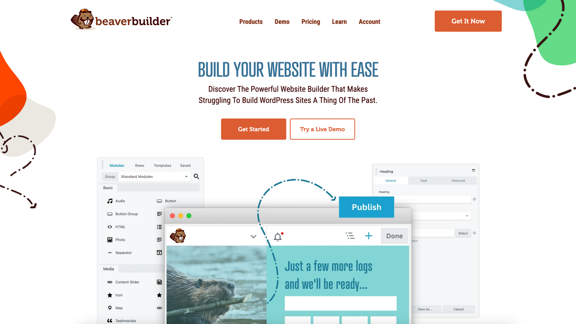
How to Build a Responsive Website With Beaver Builder (And Why You Should)
 -
April 4, 2019
-
April 4, 2019
You probably know that the majority of web traffic originates from mobile devices rather than personal computers, leading to new best practices in website development and design. In addition, Google enforces mobile standards with its mobile-friendly test. Failing that test can have an effect on search results. If you want the sites you build to compete effectively, they must be fully responsive.
“Responsive” means a website has to look good and function smoothly and pass usability standards on smaller screens and in mobile browsers. Sites that are designed and tested only on desktop computers rarely provide a good user experience on devices where screen real estate is limited.
In today’s fast-moving digital world, having a responsive website is no longer optional – it’s a foundation for online success.
With over 58% of global website traffic coming from mobile devices, businesses that fail to optimize for all screen sizes lose users before they even start browsing.
A responsive design ensures your site automatically adapts to mobile, tablet, and desktop screens, improving usability, conversions, and brand credibility.
This guide walks you through why responsive websites matter, best practices, and how tools like Beaver Builder make the process easier than ever.
In this post, we’ll discuss some best practices in responsive design and then show you how to streamline the process with Beaver Builder. Besides the built-in responsive capabilities of the Beaver Builder Plugin and Theme, the plugin’s responsive editing mode lets you tweak your layouts while viewing your pages on large, medium, and small devices.
Let’s get to work!
Why Responsive Websites Are Essential Today
1. Mobile Usage Is Dominating
There are more than 6.8 billion people who use smartphones worldwide, and mobile is now the primary device for browsing. If your site requires zooming, pinching, or horizontal scrolling, users are likely to abandon it almost immediately. This is where mobile – first website design becomes important, designing for mobile first makes sure your content always shines.
2. Google Prioritizes Mobile-Friendly Websites
Google uses mobile-first indexing, meaning the mobile version of your site determines how it ranks. A responsive design helps you achieve:
- Better search visibility
- Faster load speeds
- Lower bounce rates
3. Higher Conversions & Better User Experience
A responsive, clean layout ensures your content remains readable and spaced well across all screens. Studies show that a 1-second delay can reduce conversions by up to 20%, making optimization critical.
To enhance UX further, consider how your structure, spacing, and modules behave at different breakpoints. For deep layout improvement, check out this guide: Improve your website layout with Beaver Builder
The Key Elements of Responsive Design
There’s no one-size-fits-all approach to ensure that a website looks and functions well on small screens, but here are some key elements you should pay attention to when building a responsive website:
- Device size. It’s not feasible to have a different version of your site for every screen size and resolution imaginable, so design tends to be based on categories of screen width: large (desktop), medium (tablet), and small (phone).
- Layout. Beaver Builder automatically moves rows of columns on the large screen to vertically stacked columns as screen size decreases. You can change the stacking order and tweak other aspects of the layout to better shift from horizontal to vertical orientation at smaller screen sizes.
- Spacing. It’s important to use plenty of white space at every screen size, but on a mobile device it’s crucial to ensure that users have room to interact with the various parts of your site.
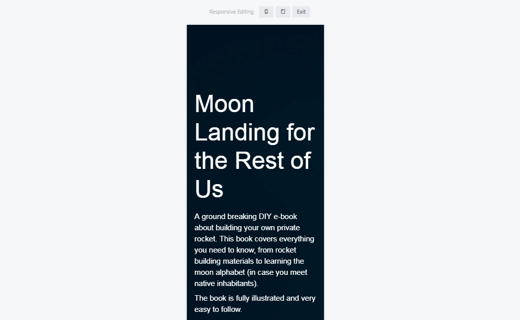
- Visibility. Given how little space you’re working with on mobile devices, sometimes you can enhance the user experience on mobile devices by hiding some of the elements that appear on the large-screen version. Of course you want to retain the most important information, but the full site might have elements such as images that don’t add any value to the small-screen version.
Responsive design would take a lot of coding without tools that automatically adjust layout and spacing. Beaver Builder’s built-in responsive capabilities meet the Google mobile-friendly test, so all you have to do is tweak settings to enhance the user experience at each screen size.
Choosing the Right Tools to Create a Responsive Website
We’ve already talked about the natural fit of the Beaver Builder plugin with responsive design and its ability to tweak your layouts efficiently. The Beaver Builder plugin has a lot of other things going for it, too.
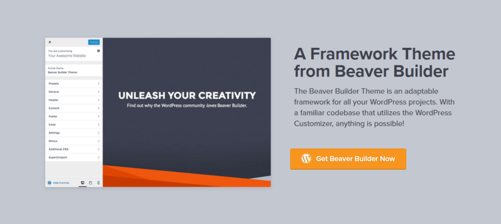
It’s also important to choose a responsive theme for your WordPress site to control the responsiveness of your header, footer, and sidebar areas, and one that’s compatible with the Beaver Builder plugin. There are many WordPress themes available, but of course we’re partial to our own Beaver Builder Theme, because it’s cleanly coded, loads fast, and is fully integrated with the Beaver Builder plugin.
If there’s no theme that offers the degree of responsiveness and customization you want, we also offer Beaver Themer, a way to build responsive layouts in parts of the page that are normally controlled by the theme.
Best Practices for Responsive Design
Modern responsive design is not just about resizing elements, it includes:
Fluid Grids
Layouts built with percentage-based widths adapt to all screens.
Flexible Images
Images scale automatically without breaking the layout.
CSS Container Queries
Recommended by leading UX resources, container queries make components adapt based on the element’s size, not just the screen size.
Prioritized Mobile Content
Start with essential elements, it aligns perfectly with the mobile-first website design approach and helps keep load times fast.
Testing on Real Devices
Even with the best wp page builder plugin, always test your designs on phones and tablets to ensure real-world usability.
Business Benefits of Responsive Websites
1. Stronger Brand Credibility
A polished, device-friendly website helps you look professional and trustworthy, especially for companies using WordPress themes for business.
2. Better Performance Across Devices
From desktops to tablets and emerging devices, your website remains accessible and functional.
3. Reduced Development Costs
Rather than maintaining separate versions, a single responsive design is faster and cheaper to manage.
How to Build a Responsive Website with Beaver Builder in 6 Steps
Here’s where you see how easy it is to design mobile-friendly WordPress websites with Beaver Builder. You might also like to watch this video with updates on the Beaver Builder responsive editor:
Step 1: Install the Plugin and Choose a Layout Template
Beaver Builder comes with many professionallly designed WordPress templates to choose from. You’ll find landing pages, industry-specific designs (such as for fashion and agency sites), and specific types of content pages, including a ‘subscribe’ and a ‘coming soon’ page). All of these templates are designed from the ground up to be fully responsive on mobile devices.
If you have your own page design in mind, just start dragging rows and module into the layout area.
Step 2: Design Your Pages Using Responsive Editing
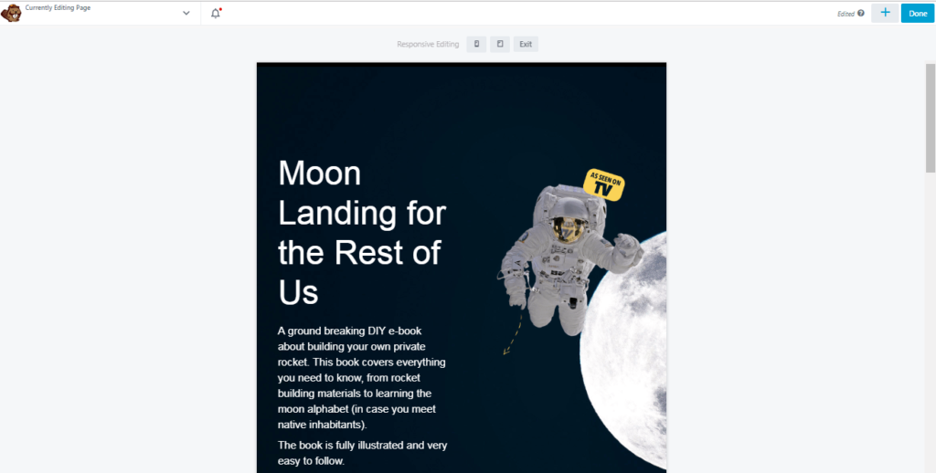
After you’ve modified a layout template or designed the basics of the layout you want, check the page’s responsiveness by going into Beaver Builder’s Responsive Editing mode. To access this on any page, select the Tools menu and choose Responsive Editing or just use the keyboard shortcut “R”:
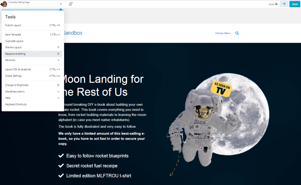
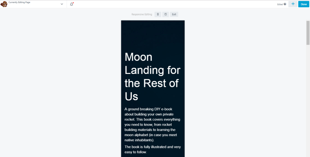
After you enter Responsive Editing Mode, you can see what your page looks like on smaller screens:
Use the icons at the top of the page to toggle between extra-large, large, medium and small device sizes:
As you’re editing the page, move from one screen width to another to see the result of your layout. This system lets you focus your efforts on the version of your site most visitors are likely to see, but you can also ensure that users have a smooth viewing experience on other devices.
Step 3: Customize Global Responsiveness Settings
If you want more control over how Beaver Builder adjusts settings for responsiveness, open the Tools menu and click Global Settings to change options related to site-wide responsiveness:
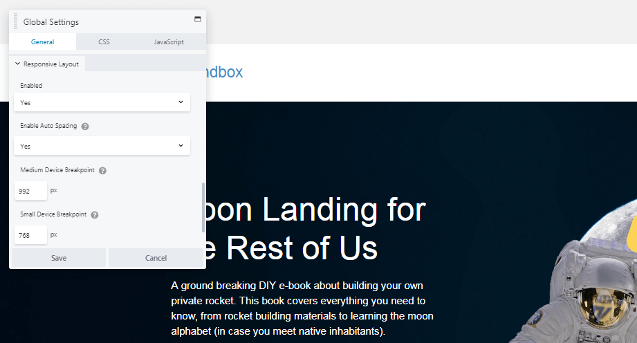
One option is to disable responsive behavior on your site. In most cases, responsiveness should be enabled. It’s also a good idea to leave Auto Spacing enabled. Auto spacing automatically adjusts the margins and padding between elements on smaller screens to avoid content that’s overly crowded or too spaced apart. With auto spacing disabled you’ll probably have to do a lot more manual tweaking.
In addition, you can set custom breakpoints here. If your Medium Device Breakpoint is set to 900px, for example, screens wider than that display the large-screen version of your pages. Screens with a width less than 900px but still greater than the Small Device Breakpoint displays the medium version of your pages.
Step 4: Tweak Font Sizes Based on Device Type
In addition to the global settings that affect your entire site’s responsive behavior, there are plenty of ways you can adjust specific settings for responsive layout on a particular page or post.
For example, you can specify different font sizes for each type of device. To see this in action, open an element for editing that includes text and click the Style tab:
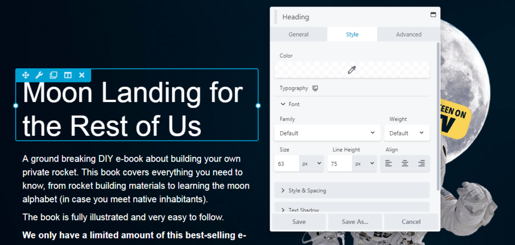
In the Typography section expand the font category to change the default font size. Now click on the device icon next to Typography, and you’ll switch over to the medium-width (tablet) editor:
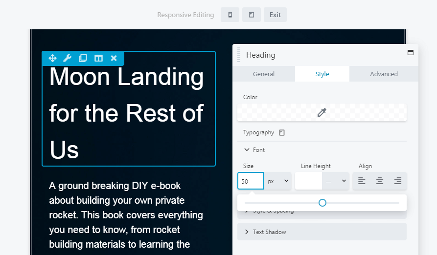
Now you can set a different size for the font that will only apply to medium screen sizes. Click on the icon again, and you can do the same in the small-width (mobile) editor:
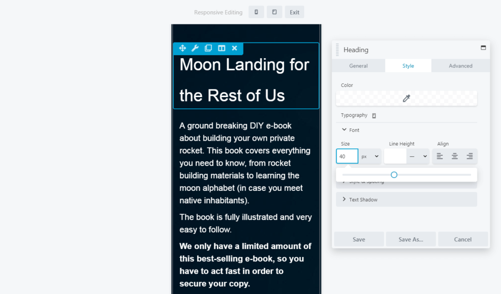
You can tweak the other font settings here as well, such as line height and alignment, and your changes appear only on the device type you indicate.
Besides using these responsive editing icons in your regular layouts, you can make all these changes in Responsive Design Mode as well, so you can directly see the changes.
Step 5: Tweak Column Stacking Behavior
Beaver Builder lets you create complex column layouts, and as screen width gets smaller, Beaver Builder moves horizontal columns to vertical columns in a predefined stacking order.
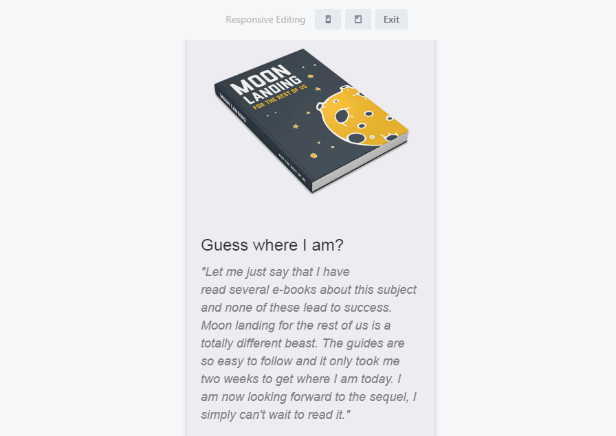
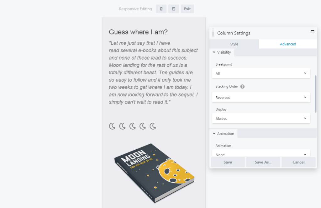
It’s a good idea to double-check and sometimes customize the stacking behavior of individual columns to ensure the content flow still works in a vertical orientation. Let’s look at an example of a page section featuring two columns:
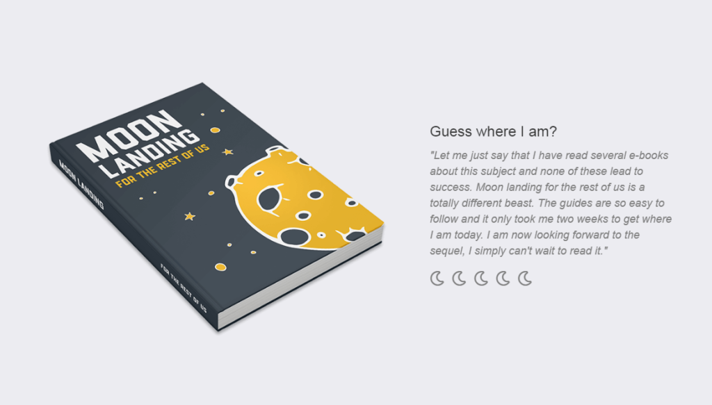
By default, on the mobile version of this page the image of the book shifts to position itself above the text on smaller screens:
To change that stacking order, select one of the modules in the column and click Edit Column > Column Settings. Then click the Advanced tab and look for the Stacking Order option:
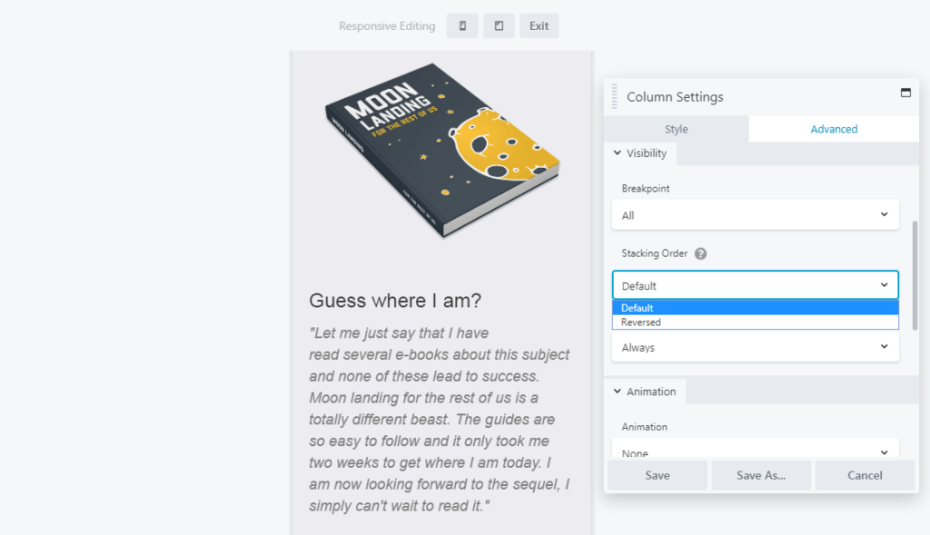
You can switch from Default to Reversed to change the way the column is ordered. In our example, the paragraph now appears above the image:
You can even prevent column stacking entirely by setting specific column widths for each device size on the Style tab, using either the responsive icon next to the setting or Responsive Design Mode, as described in previous steps.
Step 6: Hide Individual Elements on Specific Device Sizes
As carefully as you design each version of your page, some elements such as images add more to design than to content, and smaller layouts might work better if they’re hidden.
Here’s an example of how to hide specific elements on medium and/or small devices. Open any element for editing, click the Advanced tab, and look for the Visibility section:
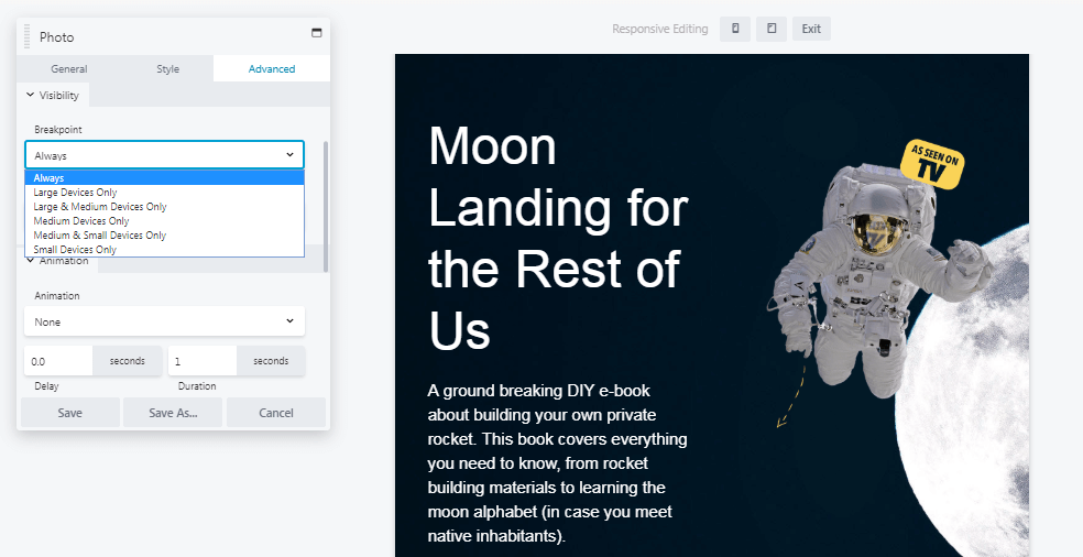
Expand the Breakpoint menu and choose the device sizes on which this element will be visible. If you choose Large & Medium Devices Only, the element is hidden on small devices:
You can also use this feature to create elements that will only appear on a specific device size, such as a custom call-to-action button that’s only visible on mobile devices.
Following these steps give you nearly total control over how your site looks and functions on screens of various sizes. All that’s left is to start designing! If you run into any difficulties while building your responsive site, you’ll find plenty of detailed instructions in the Beaver Builder knowledgebase.
How Beaver Builder Makes Building Responsive Websites Easier
Website creators, freelancers, and agencies often rely on Beaver Builder because of:
- Drag and drop editing
- Responsive settings for every module
- Global styling that adapts automatically
- Compatibility with leading website builder themes
Whether you’re designing for a brand or using a website builder for agency workflows, Beaver Builder makes scaling easy.
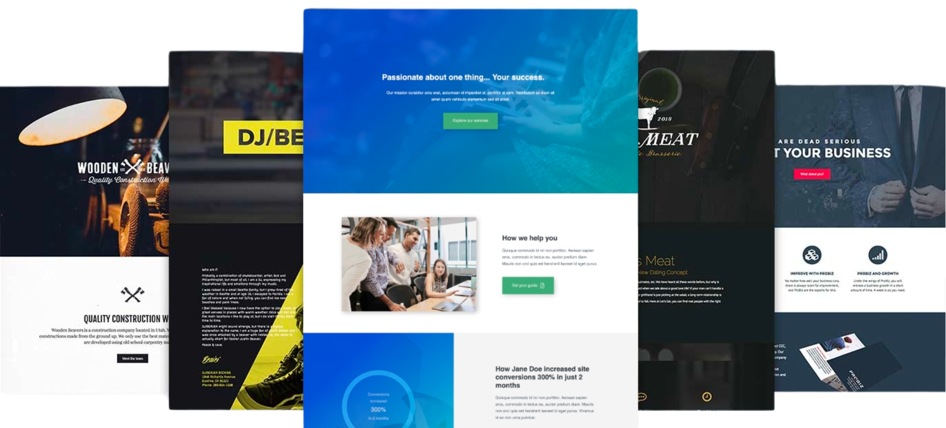
Explore real-world examples here: Websites built with Beaver Builder
These examples showcase what’s possible when responsive design meets a flexible builder.
Additional Tips Inspired by Modern UX Principles
Based on industry references and UX research:
- Use min/max scaling (e.g., the CSS clamp() function) to maintain readable typography.
- Avoid hiding too much content on smaller screens, prioritize instead.
- Simplify navigation, especially for mobile users.
- Keep interactive elements large enough for thumb browsing.
These practices improve performance and accessibility while elevating user satisfaction.
Conclusion
These days responsive websites are a requirement, not an option. Chances are that many visitors will view your site on a phone or other mobile device. If you want their experience to be just as good as a desktop browser, you have some work to do.
As we’ve shown, building a fully responsive WordPress site doesn’t have to be a challenge. With the right tools – such as Beaver Builder and its associated framework theme – you can make your site mobile-friendly in six steps:
- Install the plugin and choose a template.
- Design your pages using responsive editing.
- Customize global responsiveness settings.
- Tweak font sizes based on device type.
- Configure column stacking behavior.
- Hide individual elements on specific device sizes.
Responsive website design isn’t simply a technical upgrade; it’s a vital business strategy for improving visibility, conversions, and customer experience. With mobile traffic dominating, brands that invest in responsive layouts outperform their competitors across every metric.
Using Beaver Builder, website builder themes, and the right UX principles, you can build a site that’s flexible, visually appealing, and optimized for all devices.
Do you have any questions about how to design your responsive website effectively? Ask away in the comments section below!
12 Comments
Our Newsletter
Our newsletter is personally written and sent out about once a month. It's not the least bit annoying or spammy.
We promise.
Try Beaver Builder Today

Related articles

Beaver Builder AI: Build WordPress Layouts with AI (Now in Alpha)
-
June 10, 2026
Hey everyone! Big news. After a long time of building behind the scenes, Beaver Builder AI is here. The alpha…
How Beaver Builder Products Work Together to Build Flexible WordPress Websites
 -
May 21, 2026
-
May 21, 2026
Building a WordPress website often means stitching together a theme from one developer, a page builder from another, and a…

From Azeroth to WordPress: How Warcraft Tavern Uses Beaver Builder
 -
May 19, 2026
-
May 19, 2026
Since releasing Beaver Builder 12 years ago, a feeling will come up from time to time that just never gets…
Join the community
We're here for you
There's a thriving community of builders and we'd love for you to join us. Come by and show off a project, network, or ask a question.
Since 2014
Build Your Website in Minutes, Not Months
Join Over 1 Million+ Websites Powered By Beaver Builder.
Thanks – great tutorial with some useful tips for a newbie – it is all beginning to make sense!
I love that BB makes creating mobile friendly in parallel so very easy! It has literally changed the way we design and build sites these days. And while EVERY single site today needs to be 100% responsive, regardless of the audience, watch out for statements like “You probably know that the majority of web traffic originates from mobile devices rather than personal computers”. We have sites where visits from devices is as low as 20% – it really depends on 1. the type of site it is and 2. the audience.
You make a great point Gerard. Thank you
Great tutorial. I would like to know more about responsive image sizes.
For example, I have a background banner image at the top of the page (1800 x 900 px) with some text floating over the top. I would like a smaller background banner image to load on a mobile phone, not the full sized image.
I know WordPress creates smaller images each time you add a new image to the Media Library. Does Beaver Builder serve up the smaller image sizes automatically or do I have to go into the responsive edit mode and chose the smaller sized image?
Hi Mark, with Beaver Builder you have the option to upload separate background images for Desktop, Tablet, and mobile devices. Next to the section where you upload a background photo, there is a little computer screen icon. When you click on that it will show you the tablet icon, and mobile icon. That will indicate the option for you to upload different photos for each device size. Hope that helps.
One area I don’t see covered is how to set background image in a row. If this is not set right, they won’t scale properly on different screen sizes. It’s not always necessary to create different breakpoint versions if you use Attachment > ‘scroll’ and Scale > ‘fill’. But do you have any advice on how to use Advanced > ‘Spacing’ and ‘Padding’ with PX – % – VH – VW on responsive settings?
Hi Rick, you can upload separate background images for Desktop, Tablet, and mobile devices. There is a little computer screen icon when you click on that, it will indicate the option for you to upload different photos for each device size.
I see that when layout changes in mobile view are changed, it changes all they way up to desktop and so there is a bit of misconception that each icon is its own canvas. Are there plans to do this…make it possible to have different layouts for desktop,
tablet and mobile?
I am having the same problem as Justin who commented on Sept. 14 at 5:33am.
Why would the changes I made on mobile and tablet roll up to effect the desktop? How do I fix this so that doesn’t happen?
Hi Emily, can you contact our Support Team so we can look into this for you. https://www.wpbeaverbuilder.com/beaver-builder-support/
Could you explain why the changes I make to the smaller screen sizes, now show up on my full-screen size?
Hi Eva, if you reach out to our support team we will be happy to look into this for you. https://www.wpbeaverbuilder.com/beaver-builder-support/