
How to Create a Material Design About Page Using Beaver Builder and Hestia
Having a properly designed About page can do a lot for the overall image of your business online.
But there’s a problem…
Let’s face it, the standard out-the-box page look that WordPress gives you won’t cut it if what you’re aiming for is impact. What you basically get there is just a classic page layout with one main content block for the body of the page (and that’s regardless of the theme you’re using).
We can do better! And, as you would expect, we’re going to do it with:
- your favorite page builder (and ours too),
- a free Hestia theme (Hestia was built with Beaver Builder compatibility in mind, but this method should work with any quality theme).
In this guide, I’m going to show you, step by step how to build a great material-design About page. Here’s the final effect that we’re going for:
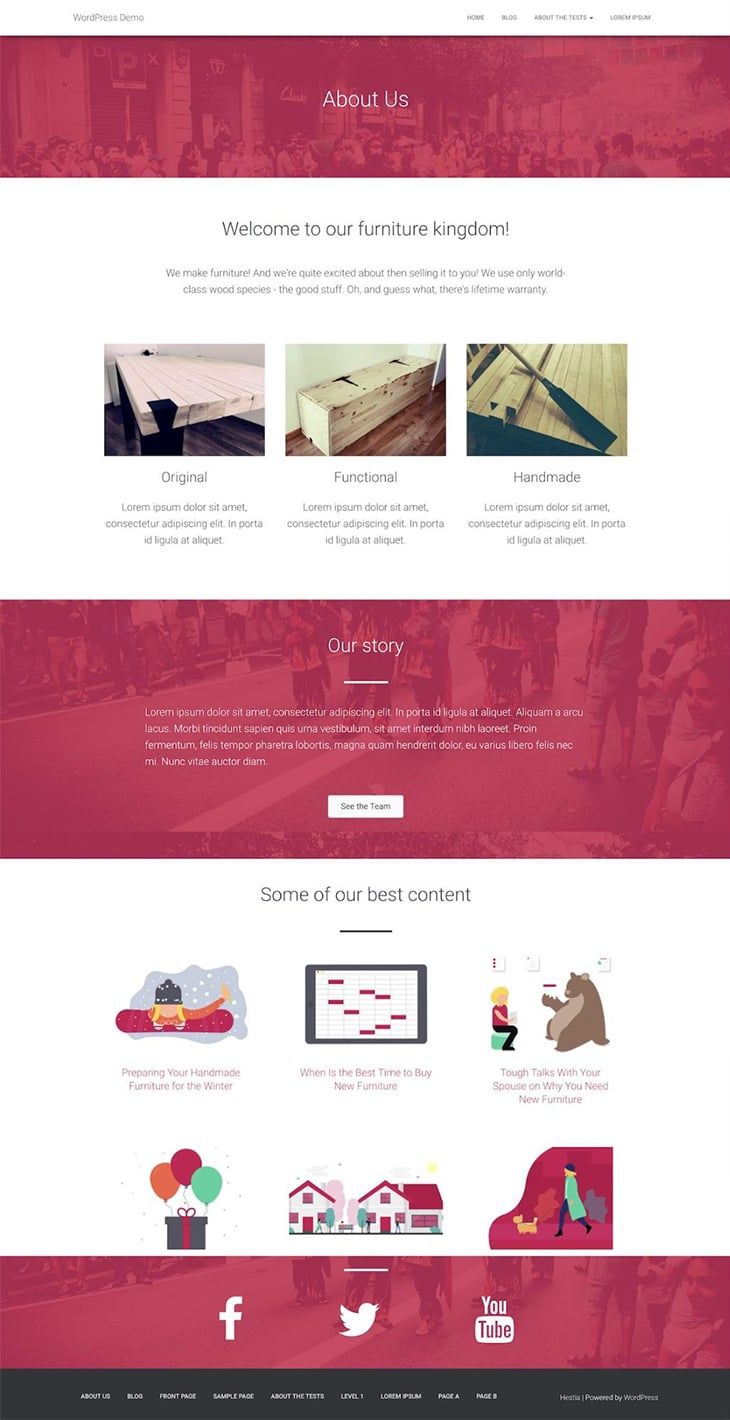
Creating a page like this is much simpler than it would at first seem. Here’s the step by step:
The things that a good About page needs
When building an About page, you should aim to achieve a handful of key objectives:
- introduce the visitor to your business/brand,
- tell your story,
- summarize what the business does briefly,
- showcase your top products and/or content,
- tell people where they can learn more about you.
Here’s how it all falls into place:
Start by getting Beaver Builder and the Hestia theme
If you haven’t already, click here to get your hands on Beaver Builder. You can also use the free version (from here), but this will limit the types of content blocks that you’ll be able to place on your About page.
Hestia is a free theme, and you can download it from here (or find it directly via your WordPress dashboard).
So why Hestia exactly? Full disclosure, I work for the company that built the theme; that is also why I know that Hestia integrates with Beaver Builder pretty nicely (it was actually created with page builders in mind) and it’s also one of the few officially supported themes by Beaver Themer.
Note. As I mentioned, this method is not exclusive to Hestia, and it should work with 90% of other themes as well, at least the quality ones (wink!).
With Beaver Builder (either pro or free) and Hestia installed on your site, you can begin creating the actual page:
Create a blank About page
The initial steps are nothing surprising if you’ve been using WordPress for a while:
Start by creating a new page normally.
To make sure that you get the full Beaver-Builder-optimized experience, switch the page template to “Page Builder Full Width”. Save the draft.
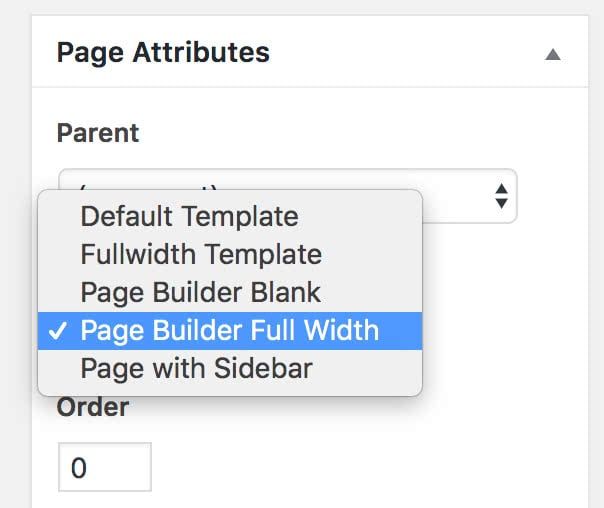
This will get rid of most of the theme’s default styling, leaving only the header and the footer.
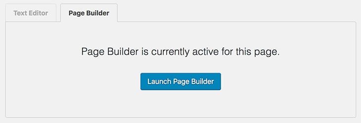
Now it’s time to launch Beaver Builder.
Create the main heading and welcome block
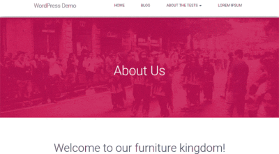
First, it’s a good idea to put “About Us” somewhere at the top of the page.
Let’s do that by creating a new 1-column row.
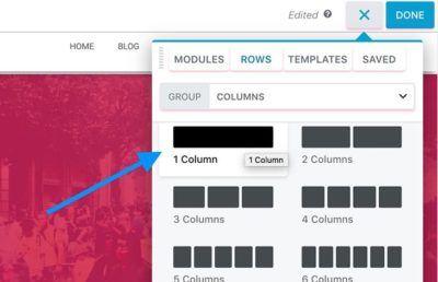
To make it look awesome, let’s set it to Full Width with Fixed Content Width. Like so:
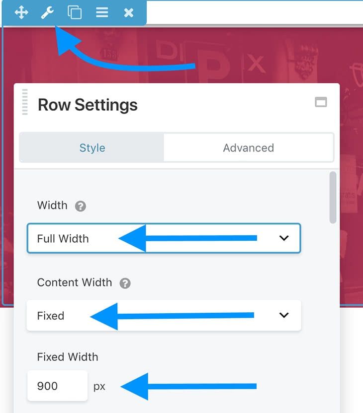
Let’s also place a nice-looking image in the background:
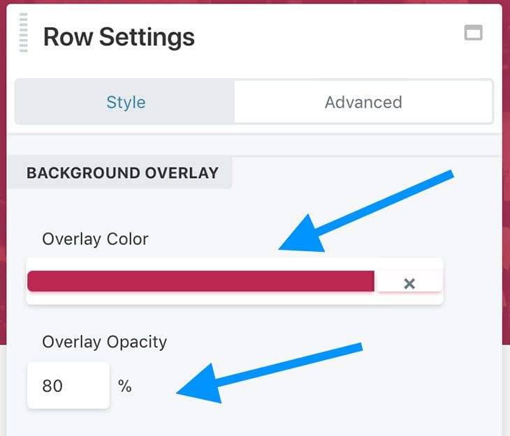
To make it look more uniform, let’s add a background overlay. The color is up to you and the official colors of your brand.
Setting the Opacity to 80%-90% usually works best.
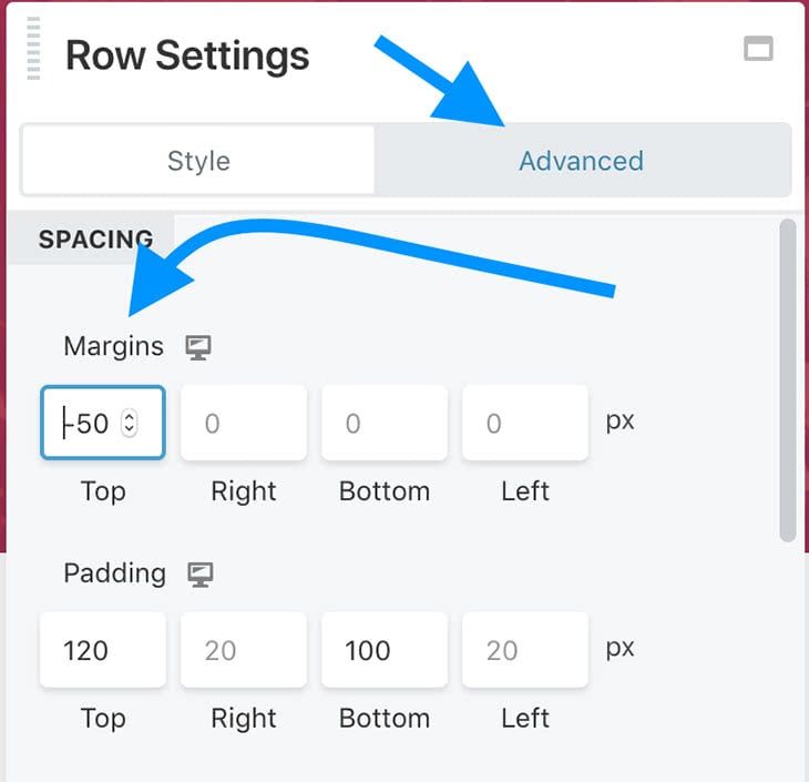
One final thing about this row; let’s switch the tab from Style to Advanced, and adjust the top margin. For the Hestia theme, if you want your new block to span all the way from the top menu bar, you should set the top margin to around -50px. To make the row a bit taller, you can also set the top and bottom padding values.
Next, let’s add an actual Heading block to the row. This is where you’ll probably want to put “About Us”. Let’s also set the text color to white for extra visibility.
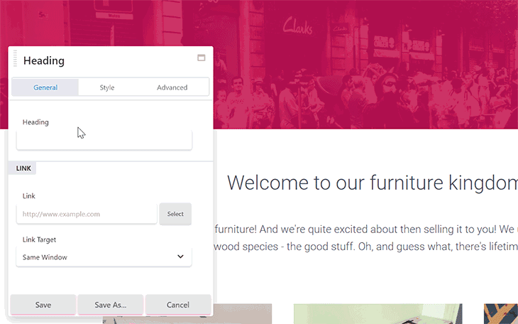
With the main page heading done, let’s add a welcome block.
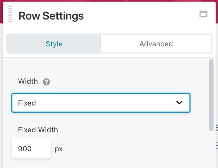
For that, we’re going to include another 1-column row. This time, let’s set the width to Fixed.
Inside that row, let’s add two modules:
- Heading – for the title of the welcome message
- Text Editor – for the actual message
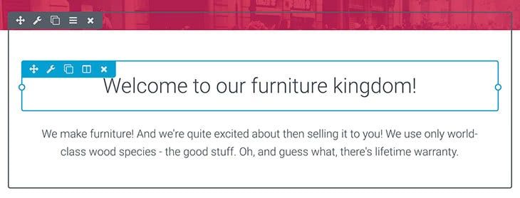
The great thing about Hestia’s integration with Beaver Builder is that you don’t need to adjust any settings of those modules to make them look great. All that’s needed is adding your copy. Like I did here:
Tell something about your products or services
It’s now time to tell people what your business is about. This usually involves showcasing your products, services, or telling people why they should do business with you in general.
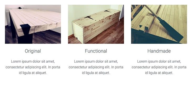
A popular method to do that is to place three visual content blocks side by side. Something like this:
To get this effect, we’re going to start by adding a new row, but this time a 3-column one.
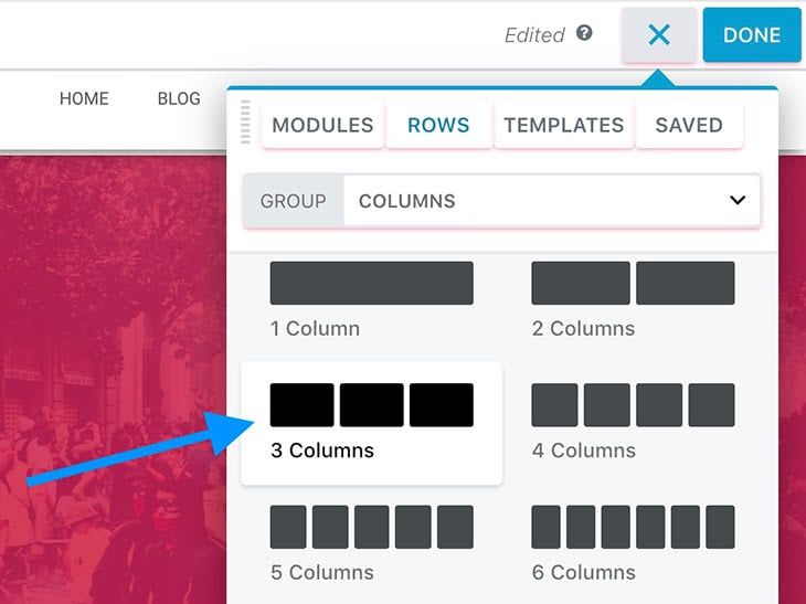
To make everything more readable, it’s also a good idea to increase the width of the whole row. In my case, the Fixed width of 1100px seems to be just right.
Now let’s start populating the individual columns. The exact modules I used are:
- Photo
- Heading
- Text Editor
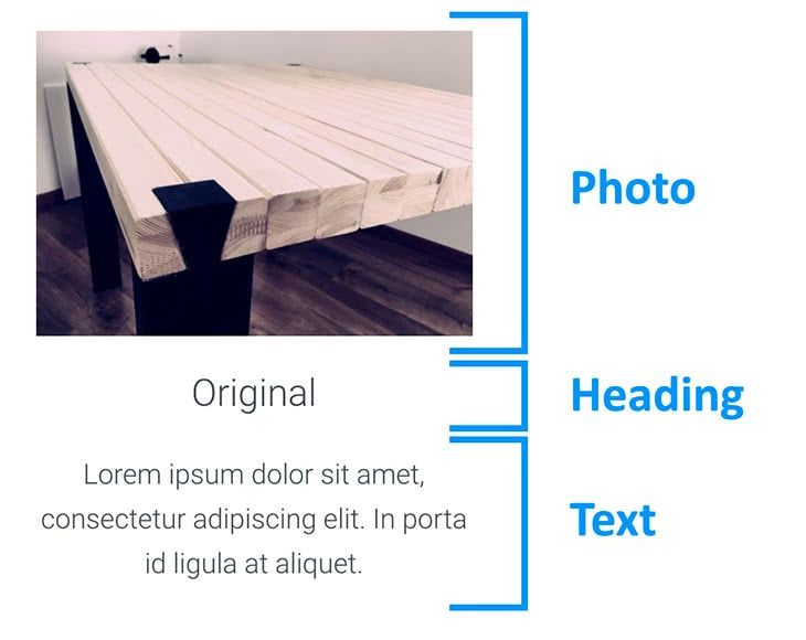
The settings of each module are pretty much default. You don’t need to adjust much to make it look awesome. And, of course, the exact images and copy you put in those blocks is up to you.
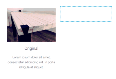
So that’s the first column. The easiest way to create the other two is to actually duplicate each of the modules and drag and drop them into place. Like so:
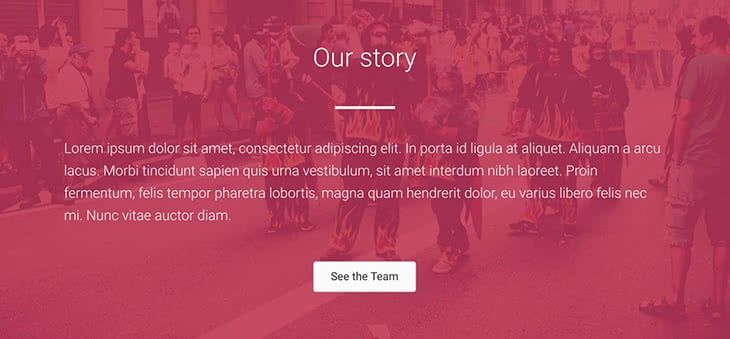
Tell your story
Since it’s an About page that we’re building, it’s a good idea to devote a separate section on the page to tell the story of how your business started, who’s part of the team, and so on.
To keep the design of the whole page consistent, we can reuse the first row – the one with the page’s main heading.
Simply scroll to the top of the page and duplicate the first row. Then, drag it down right where you need it. Like so:
Now you can edit the heading and change it from “About” to something like “Our Story” or whatever else makes sense.
For some added flair, I also like to put a Separator directly below the heading.
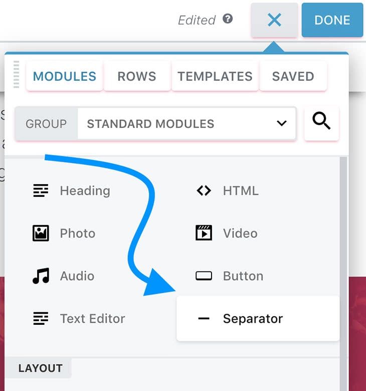
The only settings I change are:
- Color – white (#ffffff)
- Height – 4px
- Width – Custom
- Custom Width – 10%
These give me the effect you can see above.
The final two modules that make up my story section are a simple Text Editor (for the actual story; text color changed to white), and a Button (for the call to action).
Here’s the complete block:
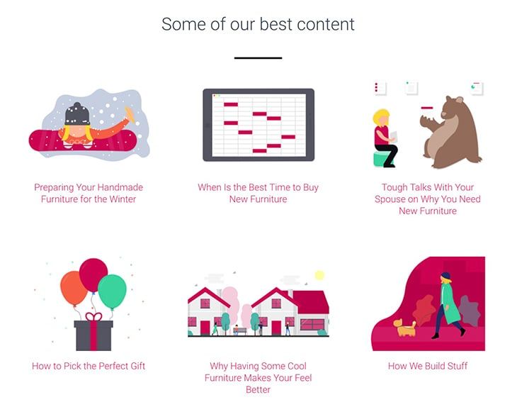
Showcase your top content
Your About page is a great place to promote some of your top content. After all, since the visitor has decided to click through and see your About page, they’ve proven to be highly engaged and interested in who’s behind the site. Therefore, they’re probably going to be interested in seeing more of your content as well – especially the very best of your content!
To show them that, we can do some cool Beaver Builder trickery:
First, open your main WordPress dashboard again in a new browser tab and go to Posts. Create a new category for your posts and call it “featured” or “best”. Go through your published posts and pick 3-6 posts that you consider being the best. Add them to that new category.
Back to Beaver Builder. Create a new 1-column row. First, just add a new Heading there and a Separator for good measure.
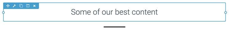
The Heading is on its default settings and the Separator is set, again, to the height of 4px and custom width of 10%. This time, the color of the separator is set to black (#000000).
Now the best part, the actual posts we are going to add through a module called Posts.
This module is really clever. It allows you to select a layout for your posts, decide whether or not to display the posts’ featured images, set how many posts to display, filter the actual posts, and much more.
Here’s the final effect on my page:
The settings I went with; starting on the Layout tab:
- Layout → Masonry
- Equal Heights → Yes
- Post Alignment → Center
- Image → Show
- Image Size → Hestia Blog
- Author → Hide
- Date → Hide
- Comments → Hide
- Content → Hide
The Style tab:
- Post Border Type → None
The Content tab:
- Filter → Categories → “Featured” (this will make sure that only the posts assigned to that category will be displayed)
The Pagination tab:
- Pagination Style → None
- Posts Per Page → 6
Many of the above settings (and especially the last Pagination tab) are up to you – based on how many posts you’d like to showcase and if you have attractive featured images to go along.
Encourage people to follow you on social media
Lastly, to close off the whole page, let’s encourage your visitors to follow you on social media. To make that happen, let’s reuse the “story” block that we worked on a minute ago.
First, duplicate that whole “story” row and drag it all the way to the bottom.
Next, change the heading copy to something more social-media-related, also delete the original Text Editor and Button modules.
In their place, let’s add a new module – Icon Group. This one is perfect for the job, since we can showcase a handful of individual social media icons and link them to your profiles.
Let’s start with the settings of the whole module. Particularly, let’s switch to the Style tab and set these:
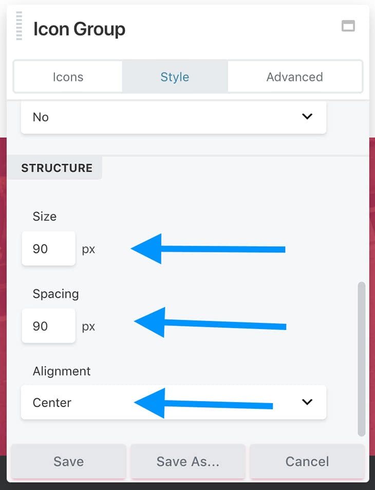
As with most settings, this comes down to your personal preference, but the above values seem to guarantee good clarity and readability of the whole block.
Let’s switch back to the Icons tab. This is where we can add the individual icons.
To do that, click on Edit Icon and then Select Icon. What you’ll see is a nice searchable panel with loads of icons to choose from. What I need first is a Facebook icon:
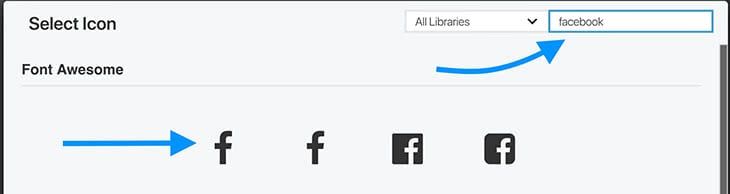
After selecting the icon, don’t forget to set the Link parameter to point to a given social media profile of yours.
Lastly, you can switch to the Style tab and adjust the various color settings of the icon to make everything fit.
When you’re done, click on Save.
You can add multiple icons here by clicking on Add Icon and repeating the process. I ended up using three icons, for Facebook, Twitter and YouTube.
Here’s the final effect:

Done!
At this point, your material-design About page is done!
Here it is again it all its glory:
Another bonus is that you can reuse that page for other purposes as well. With some small tweaks, you can use it as a product landing page, or even your homepage.
10 Comments
Our Newsletter
Our newsletter is personally written and sent out about once a month. It's not the least bit annoying or spammy.
We promise.
Try Beaver Builder Today

Related articles
How to Build Card Layouts in Beaver Builder (Flexbox + Box Module Tutorial)
If you’re using the Beaver Builder Box Module to build responsive layouts, you’ve likely noticed two things: it’s incredibly powerful…
How to Center Content in Beaver Builder (Flexbox, Rows & Modules Guide)
Wondering how to center content in Beaver Builder? The most reliable way is to use the Box Module with Flexbox:…
Struggling with CSS Grid? Turn This On in Beaver Builder
CSS Grid is powerful, but it can be hard to work with when you can’t clearly see your layout. Beaver…
Join the community
We're here for you
There's a thriving community of builders and we'd love for you to join us. Come by and show off a project, network, or ask a question.
Since 2014
Build Your Website in Minutes, Not Months
Join Over 1 Million+ Websites Powered By Beaver Builder.
About page plays a important role for any kind of blogs. It should reflect the purpose of your blog about what the blog represents. By the way your page builder is great and i know some of my friends using it.
Not just for the “about” page, this is really a nice write-up on using Beaver Builder in general for novice web developers. I’ve been using Hestia for a while, but shied away from the builder for what I thought was a lack of control. This explains it very nicely. Thanks!
Thank you for this good tutorial.
I wanted to download the above mentioned Beaver Builder template, but both links in your article are are leading to 404-page.
Hmm. Thanks for the heads up and sorry about that. We’ll check to see if the link can be fixed.
Thanks for the article. Is there a reason that the Opacity setting will be greyed out under Row Settings? I can’t seem to get the slider to move.
Thanks you busy beavers, you guys continue to make this stuff not only easy but valuable.
I’m thoroughly confused.
Almost a year ago I bought the pro version, hoping to finally get my websites fixed after the Headway disaster.
Busy as I am (and beginning Alzheimers), I cannot figure out where to start.
I looked on YouTube for tutorials, NOTHING at all!
This post here is my worst nightmare, having to buy and install and LEARN SOMETHING ELSE! WHY????
I kinda expected at least a few current tutorials. All I see is the prominently places “Get Beaver Builder Now” buttons. I don’t think paying another $200 is going to help me.
🙁
Hi Christine. Sorry you’re having trouble. We don’t have a lot of current video tutorials, but we have an extensive Knowledge Base. You might want to check out The basics and New to Beaver Builder sections.
We do have some outdated video tutorials here. The BB user interface is an older version, but most of the information still applies. Thanks for the feedback. We can work on creating some new videos.
I’m using Hestia and Beaver Builder. When I create a new page the Hestia header with the page title (About, in this case) is pretty big and it’s impossible to move it or change it. I can change the color, but not the size or the font or anything else. How do I get that to either not show or be smaller? I didn’t publish the page because it looks awful.
Hi Pat, this sounds like a question that would be for the Hestia Theme developers. Have you tried contacting them to see if they can assist?