
How to Nest Components in Beaver Builder: Build a Design System That Scales
 -
March 3, 2026
-
March 3, 2026
In the last tutorial, we built a component from scratch. Now we’re taking it a step further by nesting components inside each other to create a complete design system.
If you’re just getting started, you may want to read the previous articles first:
- Part 1: What Are Beaver Builder Components? Beginner’s Guide to Reusable Layouts
- Part 2: How to Build Beaver Builder Components: Step-by-Step Tutorial
- Part 3: How to Nest Components in Beaver Builder (Made Simple) ← You are here
In this guide, we’ll walk you through everything you need to know about nesting Components, from the basic concepts to a practical step-by-step example that you can implement right away:
What Is Nesting?
Nesting means placing one component inside another. Instead of building a single reusable layout, you’re building a reusable system. Think of it like stacking building blocks: each block is independent, but combined they create something far more powerful.
The best way to approach nesting is to think in three levels:
- Small components — individual elements like buttons, badges, or icons
- Medium components — combinations like feature cards, testimonial blocks, or pricing tables
- Large components — complete page sections made up of multiple medium components
Your button component can live inside a card, which lives inside a section, which appears across multiple pages. One change at the base level flows through everything above it.
Nesting Components: A Real Design System Example
To make this practical, we’re going to build a simple but powerful design system in three stages:
- A Button Component
- A Card Component that contains the Button
- A Grid Layout made up of multiple Cards
This layered structure demonstrates exactly how nested components work, and why they’re so powerful for client sites.
Step 1: Build the Button Component
First, let’s build a button component. Add a Button module to your page and style it exactly how you want it to look across your entire site. You can set things such as the background color, padding, border radius, typography, and hover effects. These settings will become your standard button style.
Once you’re happy with how it looks:
- Click Save As.
- Give your component a name.
- Select Component from the Type dropdown.
- Click Save.
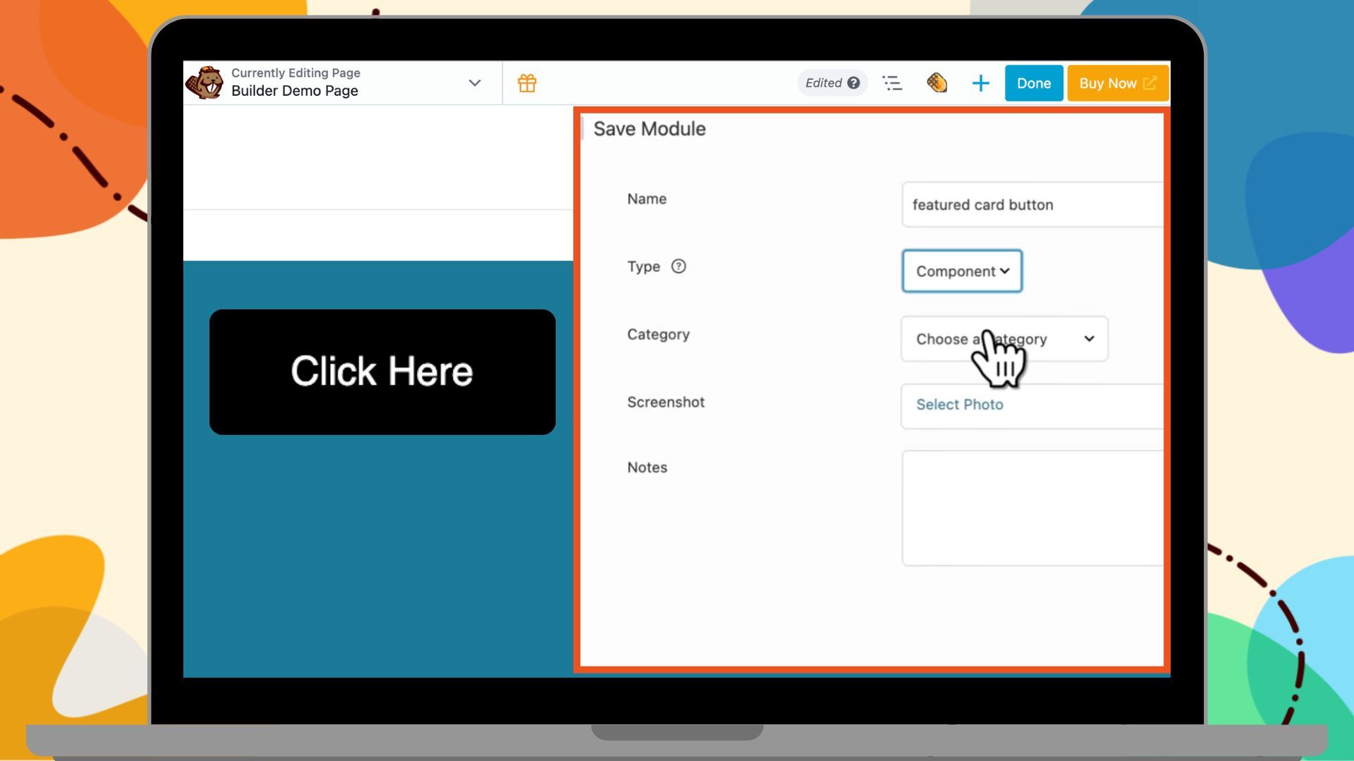
The component opens in a new tab. Now we need to enable what can be edited:
- Click the plug icon next to the button text field to make it editable.
- Do the same for the link field.
- Leave everything else locked such as colors, sizing, styling.
- Click Done → Publish.
Your button component is now ready.
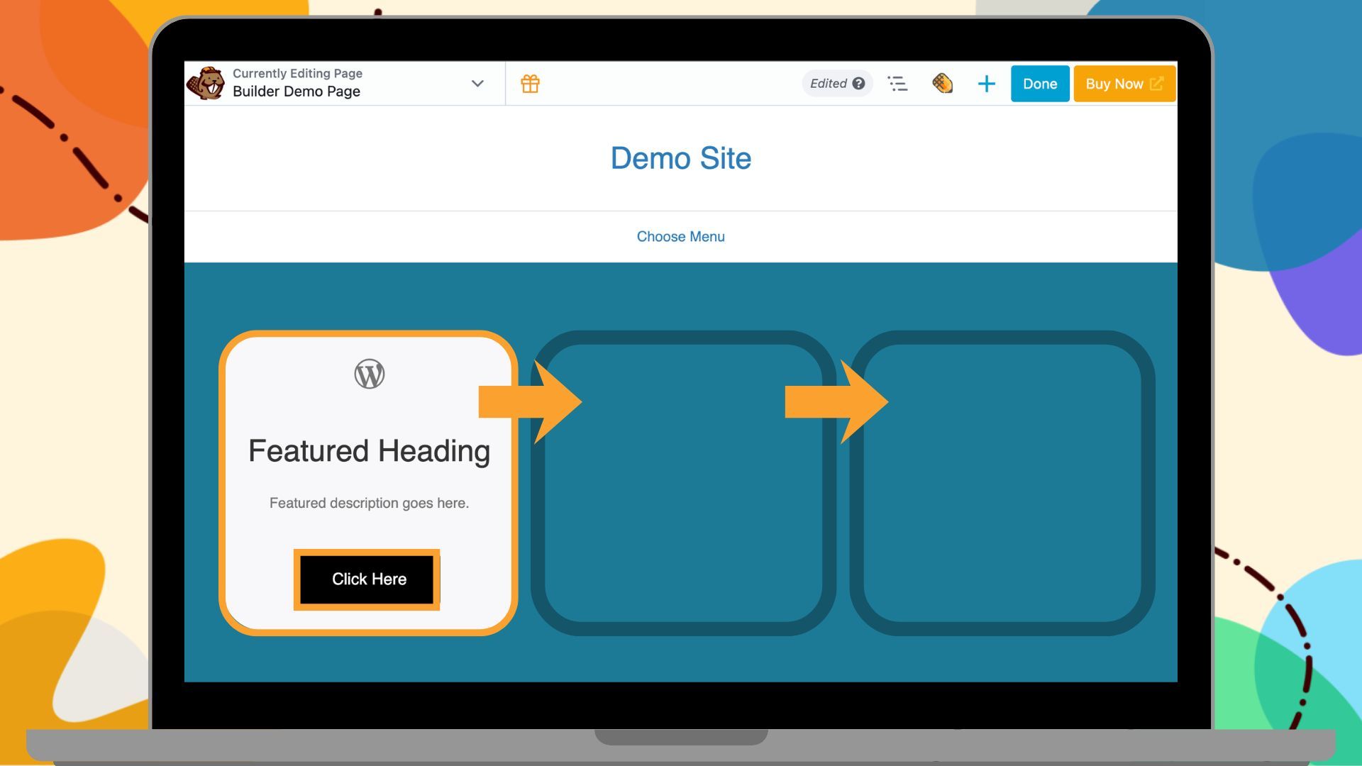
Step 2: Build the Card Component
Now that you have a button Component, let’s incorporate it into a feature card. Add a Box module to the page. Inside it, add:
- An Icon module at the top
- A Heading module
- A Text editor module for the description
This will form the main content of your feature card.
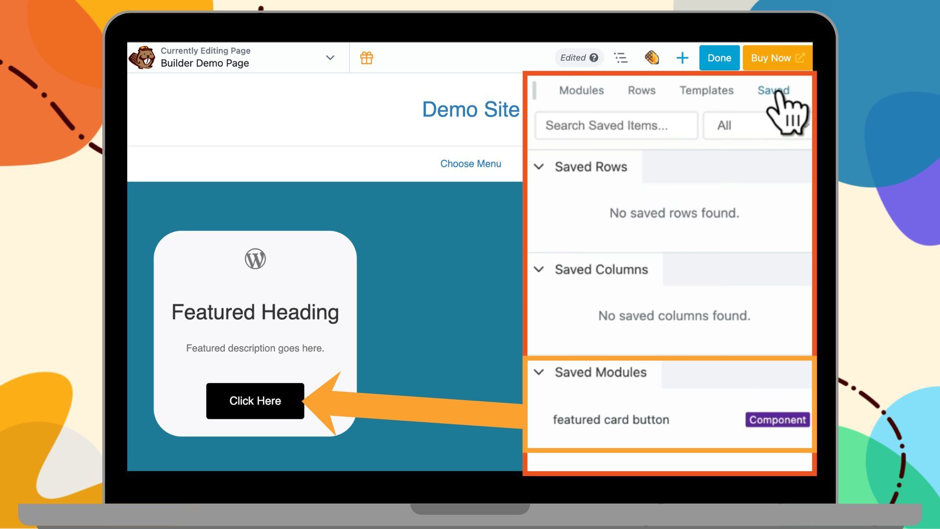
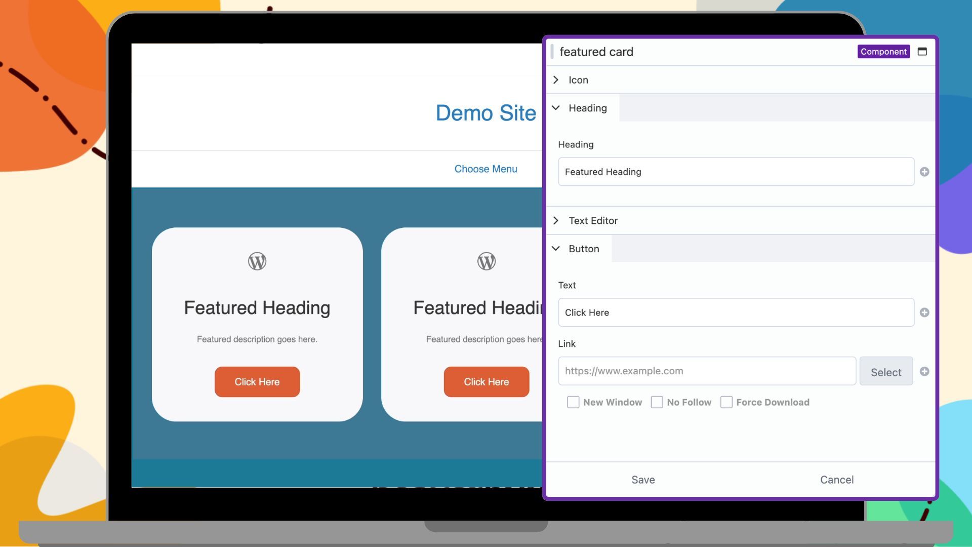
Now, instead of adding a regular button module, go to the Saved tab in the settings panel and drag your Button Component into the layout. Your card now contains a nested component:
Style the card by adjusting padding, background color, and spacing between elements until it looks the way you want. Click Save As, name it, choose Component, and click Save.
The component opens in a new editing tab. Now enable editing within each module by opening the module settings. For example:
- Icon module → Click the plug icon next to the icon field
- Heading module → Click the plug icon next to the text field
- Text module → Click the plug icon next to the content field
Leave the button as is since it has already been configured.
Click Done → Publish.
You now have a nested component: the Feature Card Component contains the Button Component inside it.
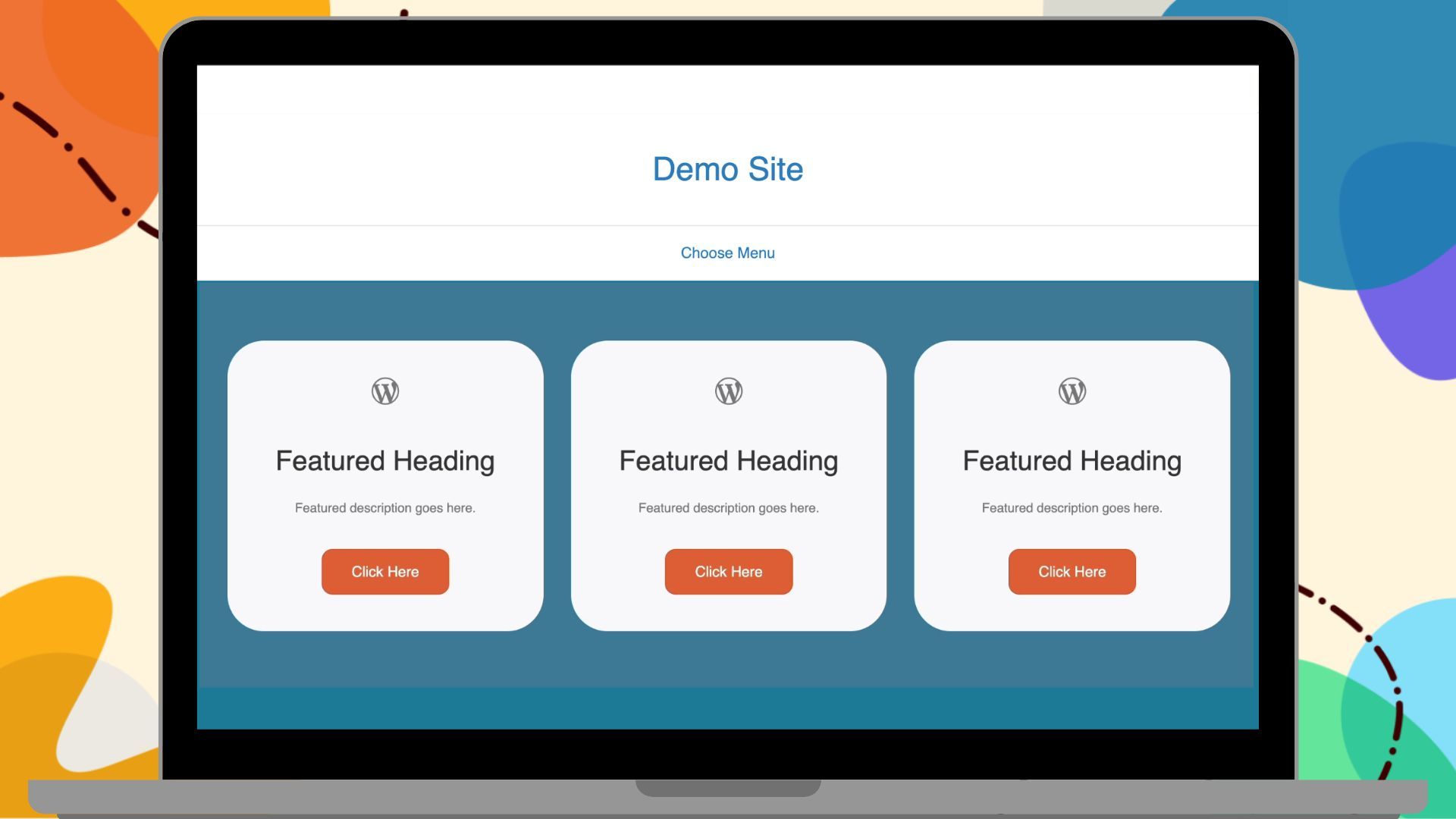
Step 3: Build the Feature Section
Now let’s scale up to a full section:
- Add a Box module to the page and set it to Grid.
- Set the display to three columns and one row.
- Open the Content Panel, navigate to your Saved tab, and drag the Feature Card Component into each column:
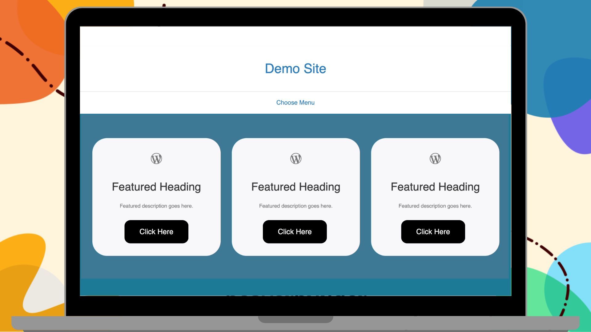
You now have three identical cards side by side. Each card contains editable content fields and a nested button, and all are locked to your design system.
If you’d like to reuse this layout elsewhere, save the entire section as a template or component.
Protect Your Design System from Client Edits
If you’re building this for a client and you don’t want them editing components directly, you will need to update the Beaver Builder User Access Settings:
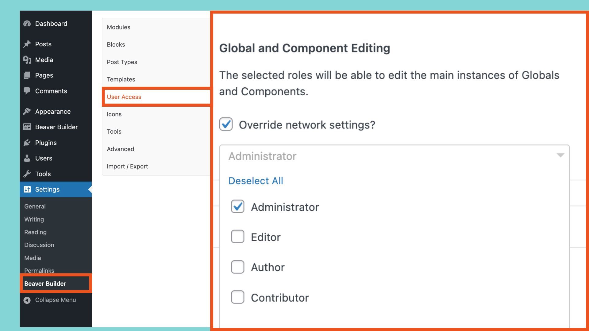
- From the WordPress dashboard, go to Settings > Beaver Builder > User Access.
- Control which user roles can edit components. For example, if your client won’t have admin access, deselect all user roles below Administrator.
- Click Save User Access Settings.
This protects your design system while still letting clients edit the content fields you’ve enabled.
The Real Power of Nesting Components
Let’s say you want to change the button color from black to orange across your entire site. You don’t need to edit every page or every card individually. Instead:
- Go to Beaver Builder > Saved Modules.
- Open the Button Component and launch the editor.
- Update the button color.
- Click Done and Publish.
That single update automatically flows through every card that uses the button, and every page that uses those cards:
At the same time, when your client edits the site, they only see the fields you’ve unlocked such as text, links, or other content fields. They can update content confidently, without ever affecting your design:
You control the design system; your clients control the content.
Unlinking a Beaver Builder Component
Need to make a one-off change to a single card without affecting everything else? Open the Beaver Builder editor, hover over the component you wish to unlink, click the wrench icon and choose Unlink Component. That converts the component back into regular modules you can fully customize independently.
Beaver Builder Component Best Practices
Here are some helpful tips when nesting components:
- Keep components focused: Each component should do one thing well. Avoid building overly complex components.
- Don’t over-nest: Two or three levels is ideal. Too many levels become hard to manage.
- Plan before you build: Think through which elements will be reused and how they’ll combine. A little upfront structure saves a lot of revision time later.
When to Use Nested Components
Any time you’re building the same layout type more than once, you should consider turning it into a nested component system. Common use cases include:
- Pricing tables — repeated card structures with consistent buttons
- Feature sections — multiple cards in a grid with consistent styling
- Testimonial grids — uniform layout with swappable content
- Team member sections — photo, name, title, and link in a repeating structure
Looking for inspiration? Check out our pre-built Box Module templates to see ready-made layouts you can adapt and nest in your projects.
Final Thoughts: Mastering Nested Components
Nested Components might seem like an advanced technique, but they’re really just a systematic way of thinking about reusable design elements. By building small pieces, combining them thoughtfully, and controlling how they can be edited, you create a flexible design system that makes your work faster and more consistent.
Miss an article? Catch up on the series:
- Part 1: What Are Beaver Builder Components? Beginner’s Guide to Reusable Layouts
- Part 2: How to Build Beaver Builder Components: Step-by-Step Tutorial
- Part 3: How to Nest Components in Beaver Builder (Made Simple) ← You are here
Our Newsletter
Our newsletter is personally written and sent out about once a month. It's not the least bit annoying or spammy.
We promise.
Try Beaver Builder Today

Related articles
How to Build Beaver Builder Components: Step-by-Step Tutorial
-
March 3, 2026
If you build client websites or large WordPress sites, you know the struggle: keeping layouts consistent while allowing edits on…
What Are Beaver Builder Components? Beginner’s Guide to Reusable Layouts
-
March 3, 2026
Are you rebuilding the same layouts over and over in WordPress? If so, Beaver Builder Components are about to save…
25 Best Digital Marketing Tools to Grow Your Business Online
 -
February 19, 2026
-
February 19, 2026
Digital marketing evolves quickly, and businesses that want to scale need the right set of tools to simplify workflows, automate…
Join the community
We're here for you
There's a thriving community of builders and we'd love for you to join us. Come by and show off a project, network, or ask a question.
Since 2014
Build Your Website in Minutes, Not Months
Join Over 1 Million+ Websites Powered By Beaver Builder.