
By Zack Pyle – SnippetNest.com
You’re just wrapping up building a beautiful 50-page website for a client and everything is going great, until you get the email:
“Our design team made some tweaks to the site design and we want to add rounded corners to all the product cards.”
You open the Figma file and see it calls for a border-radius of 1em.
So you open the first card’s settings, navigate to the Border section, and add the border radius. One down. Then you realize you have to do this same process on every single card across 50 pages, potentially hundreds of individual instances.
Your heart sinks. What the client thinks should have been a 2-minute styling change becomes hours of repetitive clicking through page after page, hoping you don’t miss any instances.
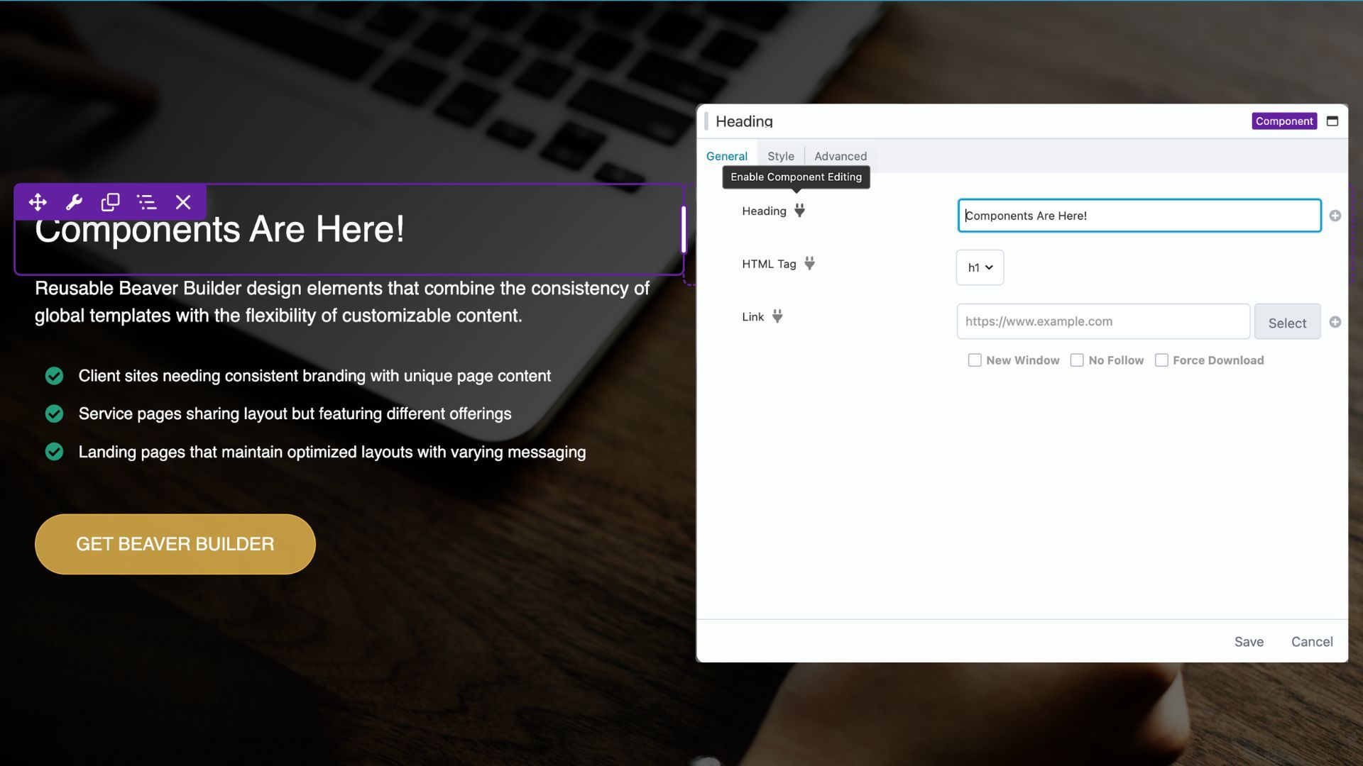
Beaver Builder Components Workflow
If you’re sitting there reading this thinking, “Well, I would just add some CSS to the card’s class…”, but then you open the card settings to check what class you used, only to discover with growing horror that you forgot to add a class before using that card dozens and dozens of times across the site. Now you’re back to the manual approach of adding a class to each instance before you can even write your CSS.
These kinds of scenarios play out in agencies and development teams every day. The larger your site grows, the more painful maintenance becomes.
This is where a Beaver Builder components workflow comes in to save the day. With components, that “2-minute” client request becomes a 2-minute change. Edit the component once, and it updates everywhere while preserving each page’s custom content:
Understanding Components
If you’ve ever found yourself dragging and dropping the same layout over and over, across multiple pages, only to later realize you need to update that design everywhere, then you’ll immediately appreciate what components bring to the table.
Think of components as smart templates that give you the best of both worlds: global consistency with the flexibility to customize specific elements on each page:
Component Anatomy
At its core, a Component is just a saved layout where you decide which settings can be edited on a per-page basis. It could be a module, column, or row. Unlike regular templates, which are static snapshots, or Global Templates, which update everywhere when edited, Components let you maintain design consistency while allowing controlled customization.
When you create a component, you use the component editor to designate which specific settings users can modify.
- Want to let content editors change the headline and button text but keep the styling locked down? No problem.
- Need to allow different background images but maintain consistent typography? Components make it simple.
How Components Compare to Globals and Templates
If you’re used to working with global modules or templates, components may feel unfamiliar at first, but they solve a very specific pain point. Here’s how they compare to other tools in your Beaver Builder workflow, moving from the most basic to the most advanced:
- Individual Modules, Columns, and Rows
Best for one-off sections that won’t be reused elsewhere. Use them when you’re building something unique for a single page with no need for reuse or global updates. - Templates
These are one-time copies. Once inserted, they’re disconnected from the source. They’re useful as starting points but a nightmare when you need to roll out a design update everywhere. Use regular Templates when you have a pattern you want to reuse as a base, but expect customization each time. - Global Templates
These give you full synchronization. Edit once, and the change appears everywhere. But they’re all-or-nothing. You can’t have unique content in each instance. Use Global Templates when you want identical content everywhere, such as a promo banner that must update sitewide. - Components
Components strike the perfect balance. Typically, you edit the design in one place and that update cascades globally, but each instance can still have unique content. Think of it as global styling and structure with local flexibility. Use Components for layouts that appear in multiple places with content variations.
The key phrase is “same design, different content.” If you want to change text, images, or minor styling while keeping the structure intact, Components are your solution.
The decision often comes down to maintenance expectations. If you anticipate needing to update the underlying design structure (adding new elements, changing layouts), components give you that power while preserving customizations made to individual instances.
PRO TIP: You can always “unlink” a component instance if you need to make significant one-off changes. This converts it back to regular modules, perfect for when you want to use a component as a starting point for something more customized.
Component Use Cases
The versatility of components really shines when you think about common website patterns. Here are some practical examples that work particularly well:
Section Intro Components are perfect for consistent section headings. Create a component with a heading, description, and a CTA button. Make the text content and links editable while locking down your brand colors and typography. Now every instance can have its own messaging while maintaining design consistency.
Card Components are a super common design element. Build a layout with an image, headline, description, and optional CTA button. Make the content fields editable while keeping spacing, typography, and styling locked. These work beautifully for things like features, services, etc.
Testimonial Components are perfect for social proof sections. Create a component with quote text, author name, title/company, and optional photo. Your marketing team can easily add different customer testimonials throughout the site while maintaining consistent styling.
CTA Banner Components are a necessity for marketing campaigns. Build a layout with background image, headline, supporting text, and of course a CTA button. Make the messaging and imagery editable but keep the design structure consistent. Your marketing team can launch new campaigns without breaking your carefully crafted conversion-focused design.
PRO TIP: the Box module is my go-to when creating components. As Beaver Builder’s most modern container module, it gives you the flexibility to build complex layouts with multiple modules inside, then save the entire group as a single component. The Box module is uniquely versatile. It can live inside a row like any other module, but it can also function as a top-level container instead of a traditional row. This lets you create your own “custom modules” built from Beaver Builder’s core modules with maximum layout flexibility.

Nested Components: Building Design Systems
Another powerful feature of Beaver Builder components is the ability to nest them inside each other, creating a true design system hierarchy with multiple levels of single source of truth. This approach gives you the flexibility to build complex, maintainable layouts that scale.
This is where Atomic Design comes in. If you’re not familiar with it, Atomic Design is a methodology for creating systems of UI components that can be reused and scaled—like LEGO bricks for your site.
For our purposes, Atomic Design basically breaks down the design into three key levels:
- Atoms – Basic elements like buttons or icons
- Molecules – Simple combinations like cards or form inputs
- Organisms – Complex sections like grids, headers, or CTA banners
Here’s how that maps to Beaver Builder in practice:
- Create a Button Component with editable text and link fields — that’s your Atom.
- Use that inside a Card Component that includes an image, heading, description, and button — a Molecule.
- Then, wrap three Card Components inside a Box module to create a repeating grid layout — that full section becomes an Organism.
- If this grid layout is something you’ll reuse across different pages, you can save it as a Beaver Builder Template for easy reuse.
At each level, you maintain clear structure and design consistency while allowing content flexibility. Need to update the button style across your entire site? Just edit the Button Component, and it cascades through all Card Components and any layouts that use them.
The Real Payoff
The real power becomes apparent when you need to update the underlying design. Unlike Figma where there’s a single master component, Beaver Builder lets you access the component editor from any instance. Simply click “Edit Component” from any instance (or access it from the backend under Page Builder), make your structural changes, and watch as every instance across your site updates while preserving the custom content you’ve added to each.
Components allow you to shift from building individual pages to building out systems. Instead of building 80 separate pages, you’re building a collection of flexible, reusable patterns that happen to create 80 pages. This mindset change is what separates scalable sites from maintenance nightmares.
Start small with your component journey. Pick one repeating pattern on your current project. Maybe it’s those cards we talked about, or a call-to-action section. Build it as a component, experience the workflow, and watch how it transforms your approach to site maintenance.
As WordPress sites grow more complex and client expectations rise, the old page-by-page approach becomes unsustainable. Components position Beaver Builder as more than just a page builder. It becomes a design system platform that scales with the site.
For agencies, this translates to happier clients, faster turnaround times, and the ability to take on larger projects with confidence. For freelancers, it means spending less time on tedious maintenance and more time on creative, high-value work.
This foundation gives you everything you need to start building a library of reusable components that will dramatically reduce your maintenance overhead while maintaining the design quality your clients expect.
Ready to Build Your First Component?
Now that you have learned how components can transform your workflow from tedious page-by-page editing to efficient design system management, it’s time to put this knowledge into practice.
In Part 2, we’ll walk through building a practical Section Intro Component from scratch. You’ll learn the complete workflow from planning and building the structure to using the Component Editor to define which fields editors can customize.
By the end, you’ll have a working component you can immediately use on your projects, plus the foundation to start building your own component library.
Continue to Part 2: Building Your First Component →
1 Comment
Our Newsletter
Our newsletter is personally written and sent out about once a month. It's not the least bit annoying or spammy.
We promise.
Try Beaver Builder Today

Related articles
How to Build Card Layouts in Beaver Builder (Flexbox + Box Module Tutorial)
 -
April 27, 2026
-
April 27, 2026
If you’re using the Beaver Builder Box Module to build responsive layouts, you’ve likely noticed two things: it’s incredibly powerful…
How to Center Content in Beaver Builder (Flexbox, Rows & Modules Guide)
-
April 17, 2026
Wondering how to center content in Beaver Builder? The most reliable way is to use the Box Module with Flexbox:…
Struggling with CSS Grid? Turn This On in Beaver Builder
-
April 3, 2026
CSS Grid is powerful, but it can be hard to work with when you can’t clearly see your layout. Beaver…
Join the community
We're here for you
There's a thriving community of builders and we'd love for you to join us. Come by and show off a project, network, or ask a question.
Since 2014
Build Your Website in Minutes, Not Months
Join Over 1 Million+ Websites Powered By Beaver Builder.
Great insight here. Components have completely changed how I build pages — faster, cleaner, and way more consistent. Excited to see where you take this in the next part.