
By Zack Pyle – SnippetNest.com
If you’re jumping straight into this tutorial, you might want to start with Part 1: How Components Simplify Page Builder Workflows to understand why components are such a game-changer for site maintenance and scalability.
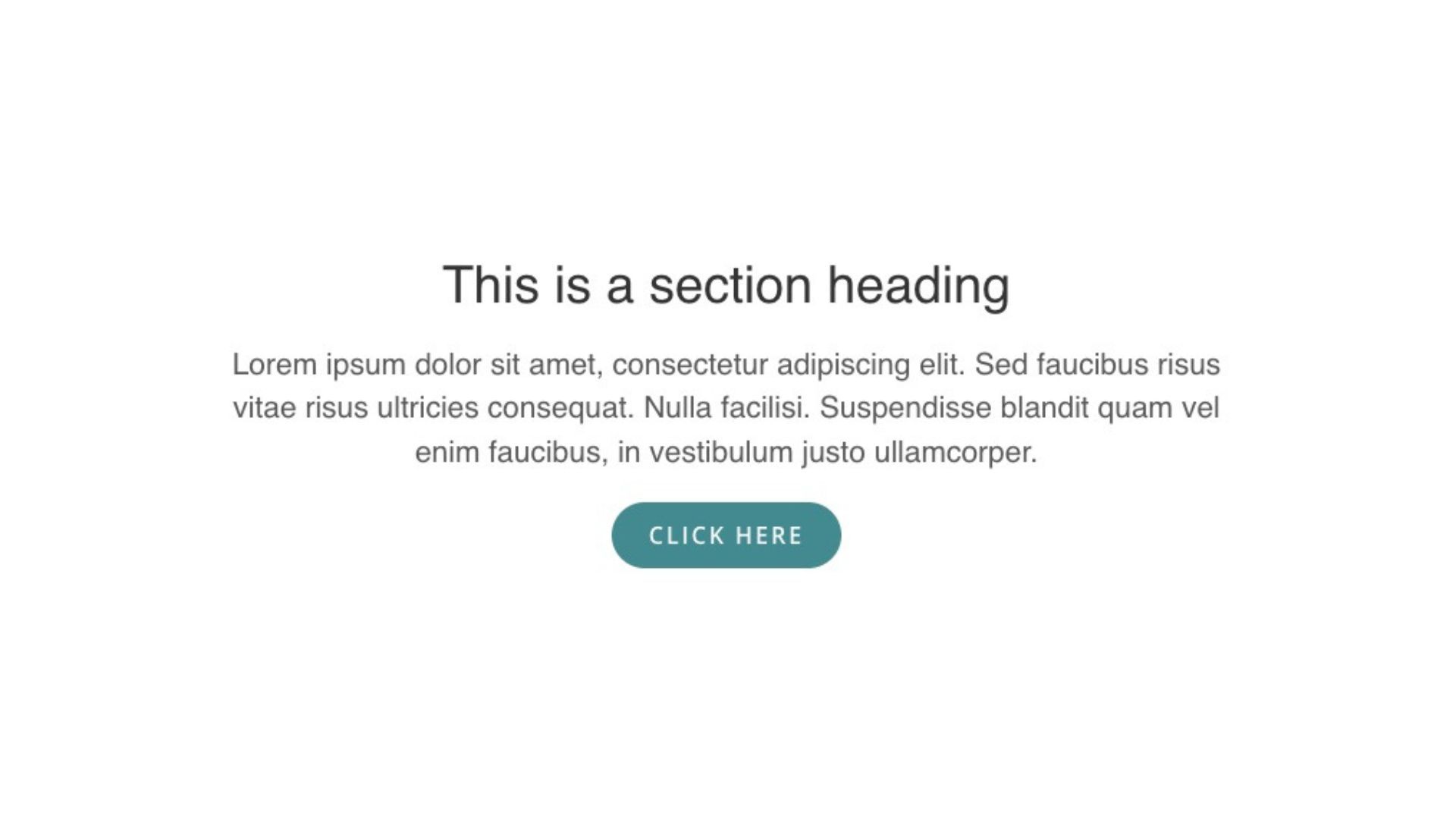
Let’s walk through creating a practical component that you can start using immediately. We’ll build the following flexible Section Intro Component, one of the most useful patterns for maintaining consistency across your site:
Want to check out the finished version before walking through how to make it? You can download the complete Section Intro Component from our Assistant library and import it into your test site to see the end result before we get started.
Planning Your Component
Before diving into Beaver Builder, spend a few minutes thinking through your Component strategy. For our section intro example, consider what elements need to be consistent versus what should be customizable.
- Consistent elements might include typography styles, spacing, button design, and overall layout structure.
- Variable elements could include the headline text, description copy, button text and link, and perhaps background imagery.
This planning phase helps you build efficiently, but don’t worry about getting everything perfect from the start. One of the biggest advantages of components is that you can modify the structure later and all instances will automatically update.
If you need to add optional elements later, just set their visibility to hidden by default so existing instances aren’t affected, or plan to customize them on each instance after publishing your changes.
Creating the Component
Let’s start by building a Section Intro Component directly on a page where you can see it in context. This gives you a better sense of how the component will look and work in real situations.
We’ll use the Box module as our container because it’s the most flexible modern module for structuring Components. Set it to a flex-direction of column and align-items of center:
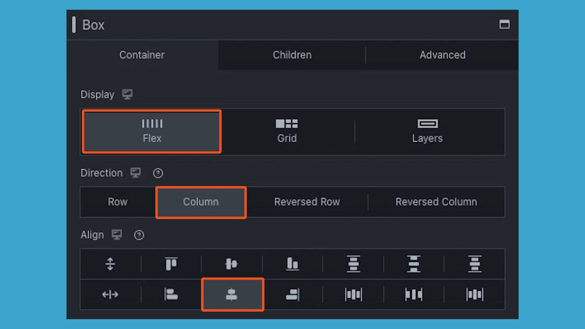
Then inside your Box, we’ll add another box so we can contain the width of our content. On this inner box, use the same display: flex, flex-direction: column, and align-items: center, and then add a max-width of somewhere around 700px to contain the text.
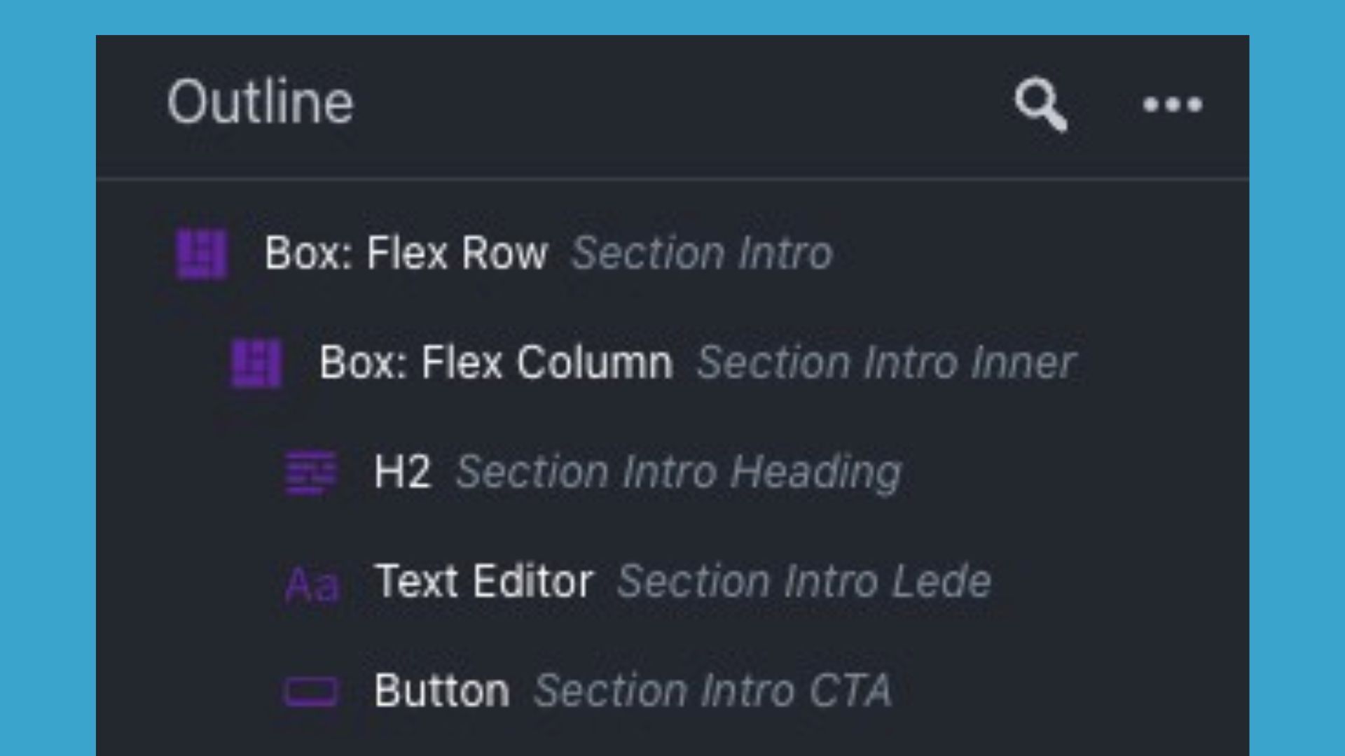
Inside this inner box, add a Heading module for your title, a Text module for your description, and a Button module for your CTA. Now style everything exactly as you want it to appear. Remember, if you choose a setting to be editable, that setting will become the default value for all instances of your component. Here is what this looks like from the Outline Panel view:
Once you’re happy with your design, now it’s time to save it as a component. On the Box module, you can either click “Save As” at the bottom of the settings modal, or use the new “Save As” option in the Wrench dropdown.
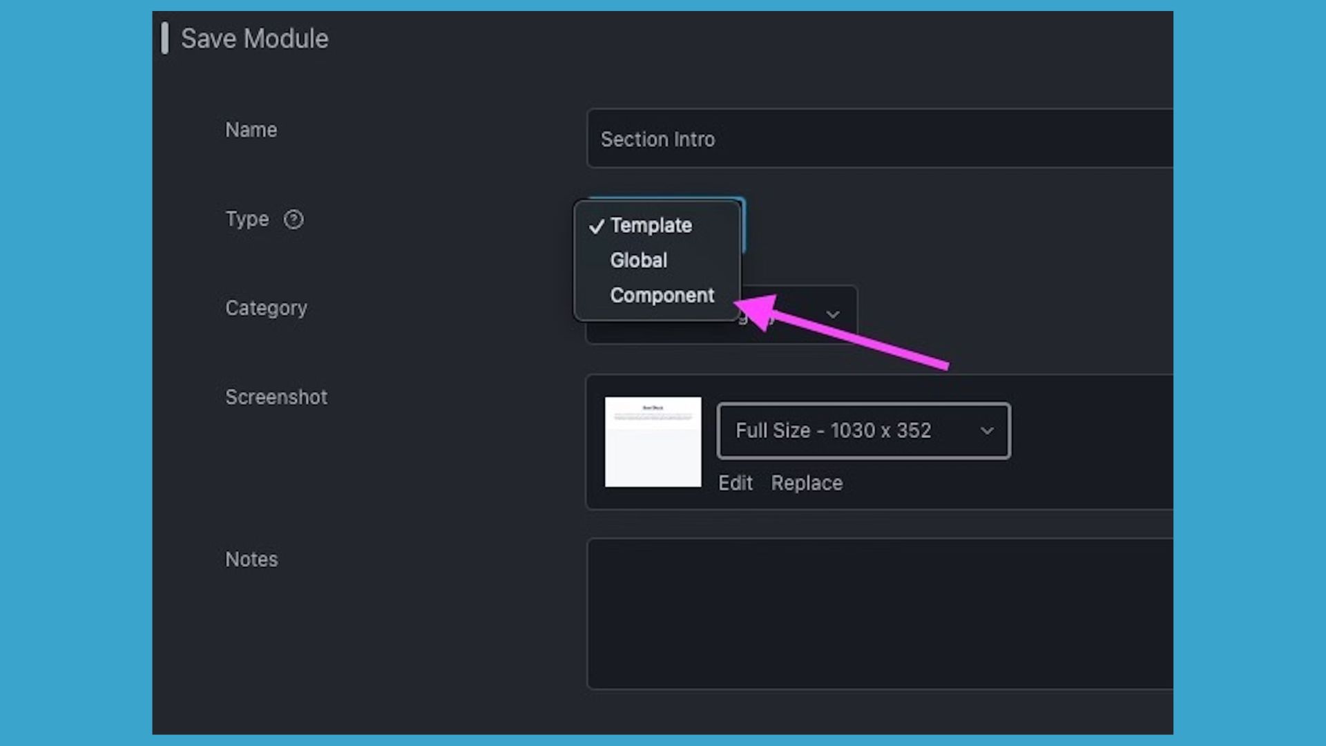
In the save dialog, give your component a descriptive name like “Section Intro,” select “Component” from the Type dropdown, and optionally add a category for organization and upload a screenshot. This screenshot will show in the Saved list, making it easy for you to identify which component you want to use in the future:
Defining Editable Fields
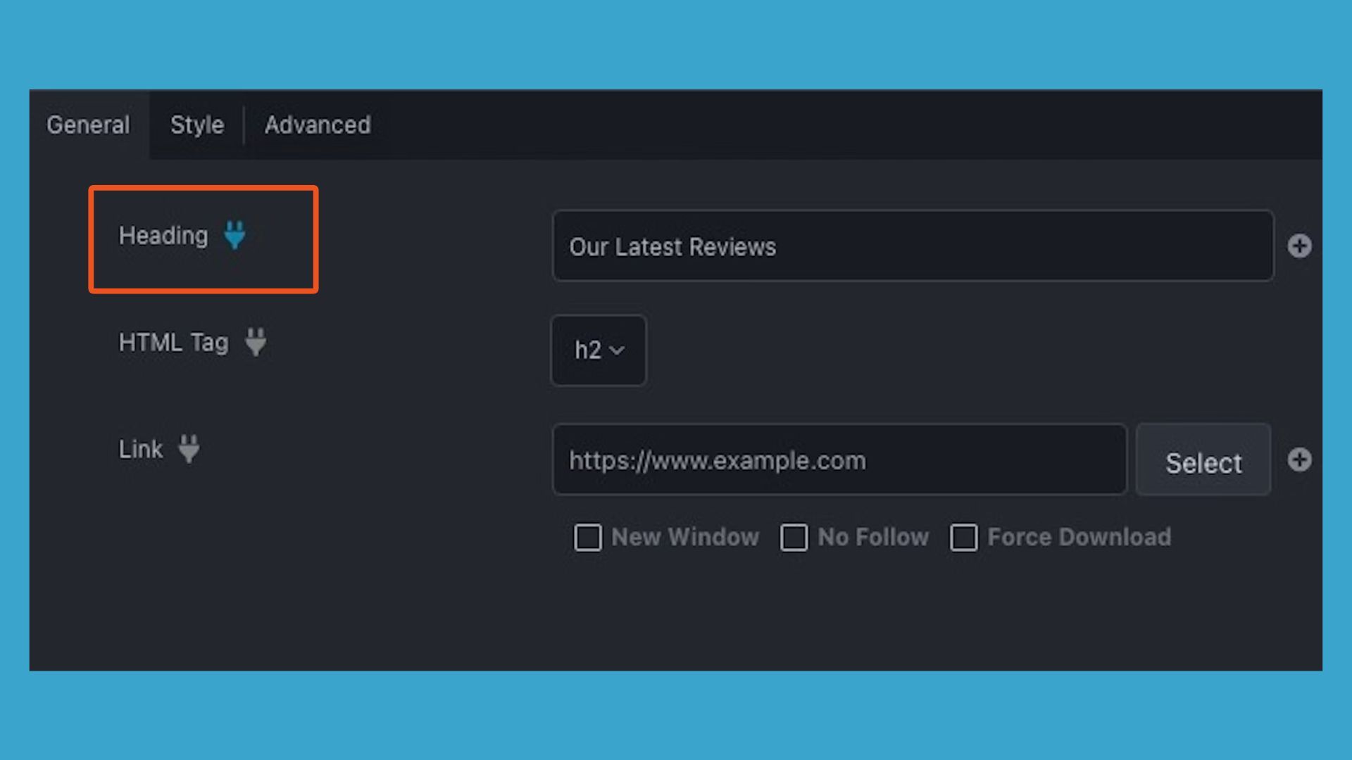
After clicking Save, Beaver Builder automatically takes you into the Component Editor. This is where the magic happens. You’ll see your layout with those helpful plug icons scattered throughout the interface.
For our Section Intro Component, click the plug icon next to the Heading module’s text field. It should turn blue, indicating this setting is now editable. Do the same for the Text module’s WYSIWYG content and the Button module’s text and link fields:
Here’s where you can get strategic about user experience. If you want content editors to be able to choose from preset button styles, make the button’s style field editable. In order to maintain strict brand consistency, leave styling fields locked.
If some sections don’t need a button, make the Display (visibility) setting editable so editors can toggle it on or off per instance.”
PRO TIP: Take advantage of the label field for each module within the component. If you change the Heading module’s label to “Section Title” and the Button module’s label to “Call to Action,” these friendly names will appear as section headers in the component settings modal instead of showing the module name like “Button” or “Heading,” making it much more contextually intuitive for content editors.
Advanced Component Usage (Utility Classes for Component Variations)
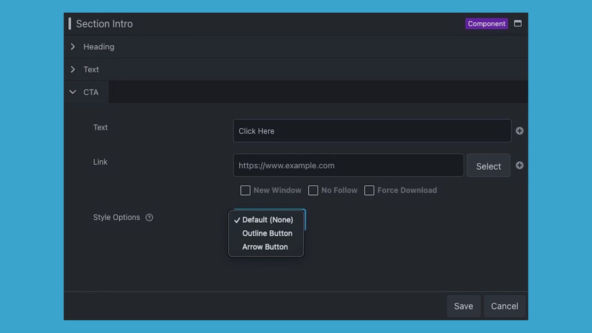
For even more advanced control over styling options, consider implementing a utility class-based approach. Instead of giving editors full access to styling controls, you can create predefined CSS classes and let them choose from a curated dropdown menu.
For example, if your component has a solid button as the default style, you could create utility classes like btn-outline for an outline button style and btn-arrow for an arrow button style, giving editors three consistent options to choose from.
The premium plugin Beaver Builder Component Class Dropdown plugin by SnippetNest is specifically designed for this workflow. It lets you define component-specific utility classes that appear in a “Style Options” dropdown for each component.
This keeps your variations organized and contextual (button components only show button-related options, card components only show card-related options, and so on). Each module within your component can have one style option selected, making it perfect for choosing between different visual treatments while maintaining design consistency:
Implementation and Testing
After configuring your editable fields, save your component. You’ll return to your original page, but now when you click on your Section Intro Component, you’ll see a streamlined settings panel showing only the fields you designated as editable, all organized under their friendly labels.
Test your component by dragging it onto different parts of your site. You’ll find it in the Saved section of your content panel, clearly marked with a “Component” label. Each instance can have completely different content while maintaining perfect design consistency.
Wrapping Up
Congrats! You’ve just built your first real-world Component. You’ve seen how simple it is to define which settings stay consistent and which can vary, giving your team a repeatable pattern that keeps design integrity intact while still empowering content editors.
This workflow shift is where the real scalability begins. Instead of designing every page from scratch, you’re now assembling them from reliable, tested building blocks. Each new Component you create, whether it’s a card, testimonial, or CTA banner, adds to your site’s growing design system, saving hours on future projects and ensuring brand consistency everywhere.
Want to Learn More? Check out this video:
- 00:23 – What Are Beaver Builder Components?
- 02:14 – How to Build a Component in Beaver Builder
- 04:50 – How to Nest Components in Beaver Builder
3 Comments
Our Newsletter
Our newsletter is personally written and sent out about once a month. It's not the least bit annoying or spammy.
We promise.
Try Beaver Builder Today

Related articles

Beaver Builder AI: Build WordPress Layouts with AI (Now in Alpha)
 -
June 10, 2026
-
June 10, 2026
Hey everyone! Big news. After a long time of building behind the scenes, Beaver Builder AI is here. The alpha…

How Beaver Builder Products Work Together to Build Flexible WordPress Websites
 -
May 21, 2026
-
May 21, 2026
Building a WordPress website often means stitching together a theme from one developer, a page builder from another, and a…

From Azeroth to WordPress: How Warcraft Tavern Uses Beaver Builder
 -
May 19, 2026
-
May 19, 2026
Since releasing Beaver Builder 12 years ago, a feeling will come up from time to time that just never gets…
Join the community
We're here for you
There's a thriving community of builders and we'd love for you to join us. Come by and show off a project, network, or ask a question.
Since 2014
Build Your Website in Minutes, Not Months
Join Over 1 Million+ Websites Powered By Beaver Builder.
I’ve built my own add control with Toolset. How can I pass parameters to a Component?
Super helpful guide — thanks for breaking down the process of building a component step by step. The clarity in how you modularize UI elements and manage states is really useful for developers getting into component-based design.
Great tutorial, Zack! This is super cool – components are bringing Beaver Builder to a completely new level.
I have a question about the possibilities of components: I’m wondering if we’ll be able to create layout container components where users can freely distribute and add their own modules within the structure defined with the box module in the component?
This would be incredibly powerful for creating reusable layout patterns while still giving editors complete control over the content that goes inside them. Think standardized grid systems, custom column layouts, or even complex nested structures that maintain spacing and alignment rules but let users populate them however they need.
Thanks for sharing this workflow – can’t wait to see where Beaver Builder takes components next!